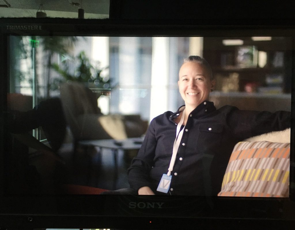
I’m constantly experimenting with common lighting setups and trying to make them better. There is no more common lighting setup than that of the talking head interview. Here are a couple of tricks I tried the other day that seem to work quite well.
FOREGROUND
In my work I’ve seen trends moving away from backlights, scratches and edges. Most of my clients and directors don’t want them. I’m okay with this. Often they are unnecessary, as their original purpose—which was to separate people from backgrounds when photographed on black and white film—is no longer a concern. (A person with brown hair will disappear into a red wall in a grayscale image, whereas this is less likely to happen in color.)
The traditional cheek scratch can be quite beautiful if done properly, but unfortunately the recipe varies based on the shape of a person’s face, the size of their ears, and the color of their hair. I’ve found myself having to tweak cheek scratches for each subject who sits in front of my camera, and this is generally not a good thing as interviews are often scheduled with very little time in between.
These days I focus on the one light I know I’m always going to use: the key light.
Long ago I learned not to use a small source when shooting interviews as their sharp shadows are unforgiving, requiring the light to be precisely set for every face. A side angle that works well for a person with a round face and small nose will not work for someone who has deep eyes and a long nose, but I am rarely afforded the time to make these adjustments. Recently, for example, I shot a project consisting of eight sit-down interviews spaced about ten minutes apart. There was little time for tweaking.
One method that I used for quite a long time involved a 4’x4′ frame of diffusion set close to the subject, often no more than 2-4′ away. I had noticed that the size of the source, in relation to its distance from the face, worked well in a 1:1 relationship, and I’ve followed that rule ever since, both consciously and unconsciously. For example, yesterday’s shoot employed a 6’x6′ source placed 6′ from the interview subject, although I didn’t realize I’d done this until after the shoot.
There are several reasons why I like to use large sources when lighting faces:
- Softness. Soft light works on everyone. It reaches into eyes and washes away imperfections. Most imperfections are revealed by their cast shadows. Eliminating or softening these shadows makes imperfections disappear. Facial features are enhanced by their shadows, so soft shadows underplay facial features that might be distracting.
- Specular highlights. A large source reflects in healthy, shiny skin and creates a subtle yet beautiful highlight. This is most obvious in dark skin, but it has a noticeable effect on light skin as well.
In the distant past I placed my sources high in the air, as the last thing I wanted to see was a horizontal nose shadow. Even though these are quite common in real life, nothing says “lit” faster to me than a sharp nose shadow that falls horizontally across the face. It feels sloppy and wrong to me. I’ve eased up on this perspective in recent years, but for my own work I avoid this whenever possible. Classic portraiture lighting sees the key light above and to the side of the subject, such that the nose shadow falls along the “smile line,” the invisible line drawn between the corner of the nose and the corner of the mouth. Placing a soft light higher than the subject’s head pushes facial modeling in a similar direction.
I also like to light with soft sources from below the lens. Light bounces off all the surfaces in a room, and this is most obvious in a set that has no ceiling: hair becomes unnaturally shadowed at the top of the head, and something feels wrong or off. It’s common to hang a dim light source or white reflective material over the top of a set to reintroduce the subtle highlights produced by a white ceiling. Light bouncing off the ground is less obvious when it’s missing, but when added it almost never feels wrong. In fact, when I’m at a loss as to how to light a bland room in an interesting way, I’ll almost always bounce a light off the floor or other flat surface, such as a tabletop.
(I’ve often wondered why ceilings are almost always painted white. As best I can tell, colored ceilings will dramatically shift the hue of ambient light in a room, while a neutral white ceiling ensures there is always some measure of white ambience such that walls appear, say, blue, but people within the room do not.)
For a long time I focused on using horizontal light sources, as they preserve chin shadows (often useful to hide a chin imperfection that one of my DITs referred to as “the gobbler”) while softening nose shadows. The sharper the nose shadow the more precisely it must be placed, while soft light is much faster to work with as it is very forgiving. Later, though, I experimented with vertical light sources: while those enhanced nose shadows, they also felt more “ambient” as the lack of a chin shadow made the direction of the light less obvious. It also felt more “ambient” as most soft ambient light comes from the side and below, so it does not cast a chin shadow.
Over time I’ve come to combine these lighting techniques. I’ll use a large soft sidelight that’s a little higher than eye level, in conjunction with bounced soft light below the lens that wraps the light around the front of the face. The combined look is that of window light from the side combined with ambient sunlight bouncing off the floor.
Here’s producer Courtney Harrell sitting in as a lighting reference:
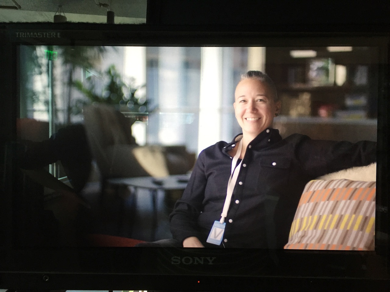
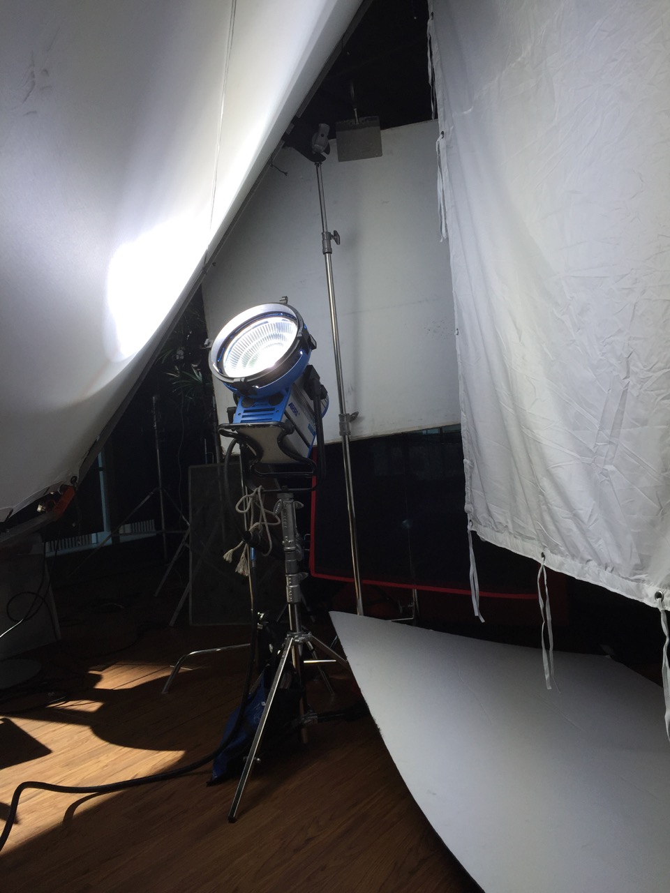
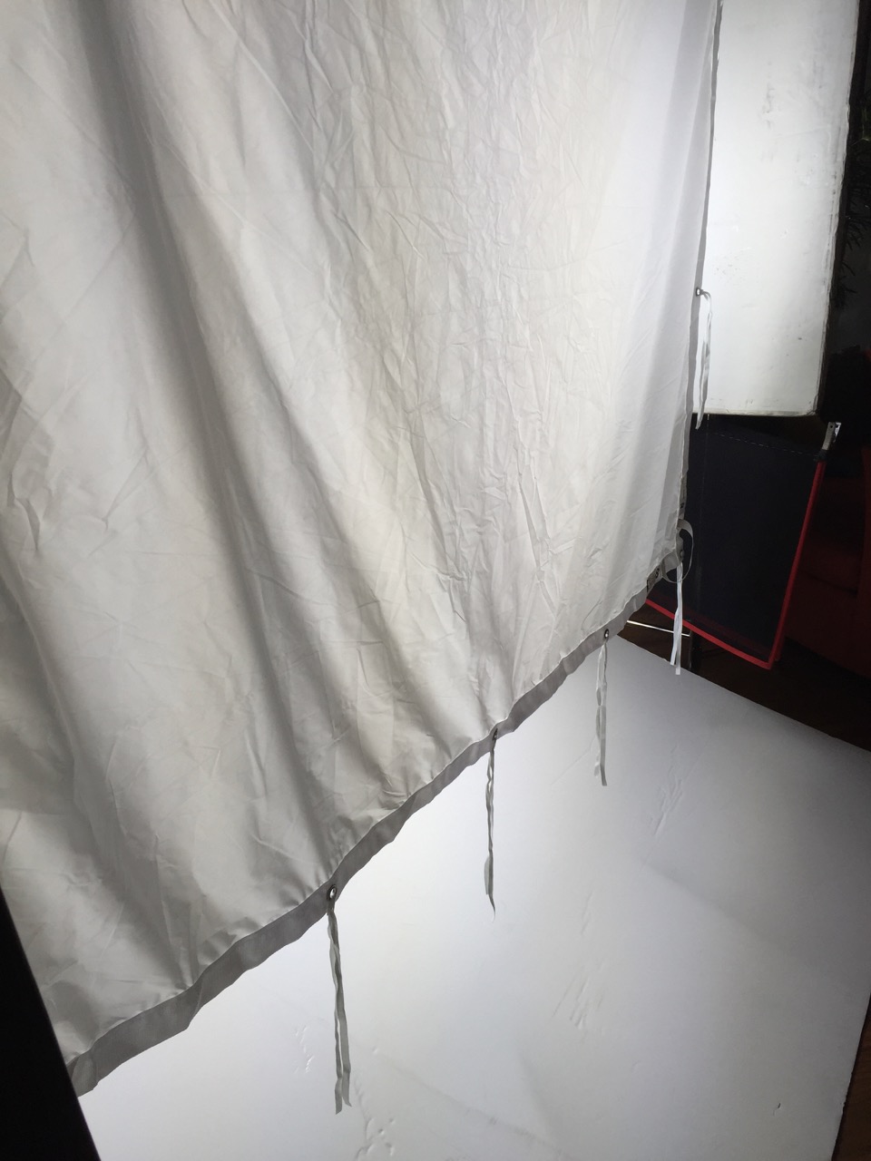
This is the kind of lighting setup that works for everyone. It’s handy when there’s no time to tweak between interviews, and/or you don’t know what the subjects will look like.
I’ll often overexpose skin by 1/2 stop to give it a bit of a glow. This works on cameras that don’t distort or easily clip bright skin tones, such as the Arri Alexa and Amira, RED One Dragon/Weapon, and the Sony F55/F5/FS7 cameras (in Cine-EI mode). I used to overexpose flesh tones by up to one full stop, but while this looked great on the on-set monitor the final product often looked less flattering when compressed to 8-bit color for broadcast or web distribution. This eliminated much of the subtle tone and hue detail on the bright side of the face.
BACKGROUND
Backgrounds can be a pain. They’re always present, and commercial and corporate clients often want them to sing, but many locations tend to not photograph well. The latest trend is to use lens flares and highlights to bring otherwise dull backgrounds to life, so I did my best to do exactly that in this 19th floor office location.
The camera was to move constantly back and forth on a 4′ slider, so I devised two tricks: one for intermittent flares and one for sparkles.
I knew I wanted to hide flare-causing items within the shot, so I ordered some old Zeiss Super Speeds (for their flare-ability) and set them to somewhere between T1.3 and T2, depending on the subject’s skin tone. This threw the background out of focus enough that I could hide some 1’x1′ mirrors in the background:
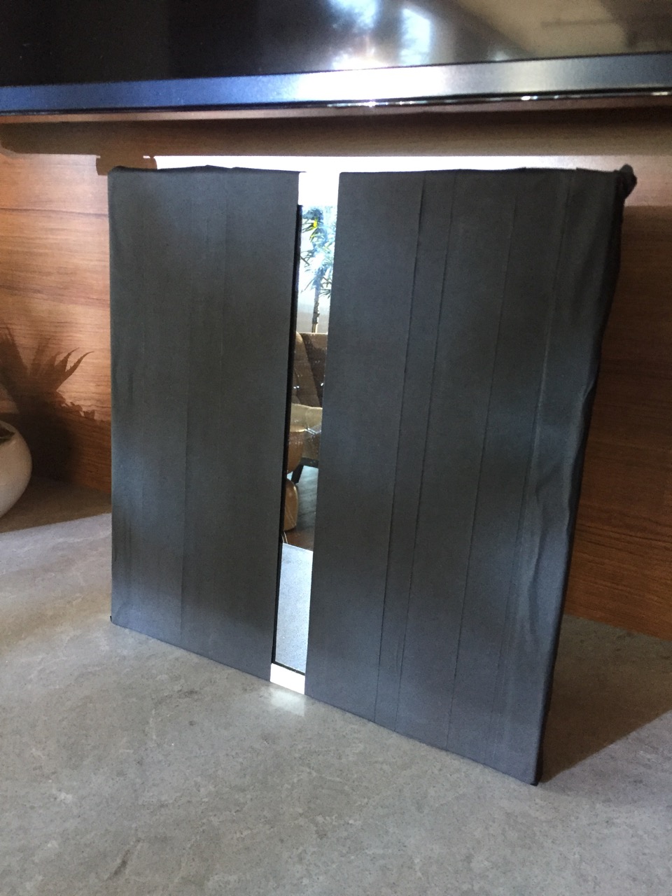
I had my grip cover them with black tape, leaving only a 1″ slit in the middle. We then propped them up in the background, where they appeared to be nondescript black squares, or tall thin shapes that resembled some sort of textured glass vase. We lit the background with JoLekos (Joker HMIs through Source 4 barrels) projected through some office plants that we found nearby, so we placed the mirrors to catch some of that light and aim it toward the camera at specific points in the camera move.
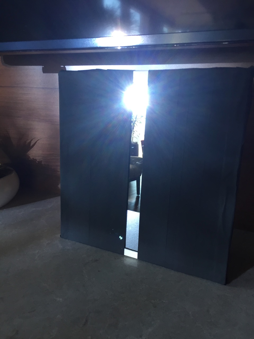
I had one mirror aimed into the lens for the left end of the slider; another for the right; and one just off center. I made sure that I had enough room at the end of the slider move to get out of the flare, so I didn’t sit on it for too long when I had to change camera direction, and we made the slit narrow enough that the flare came and went fairly quickly across a camera move of about 4-6″. I wanted a two second flare that came and went quickly, adding interest but not upstaging the interviewee.
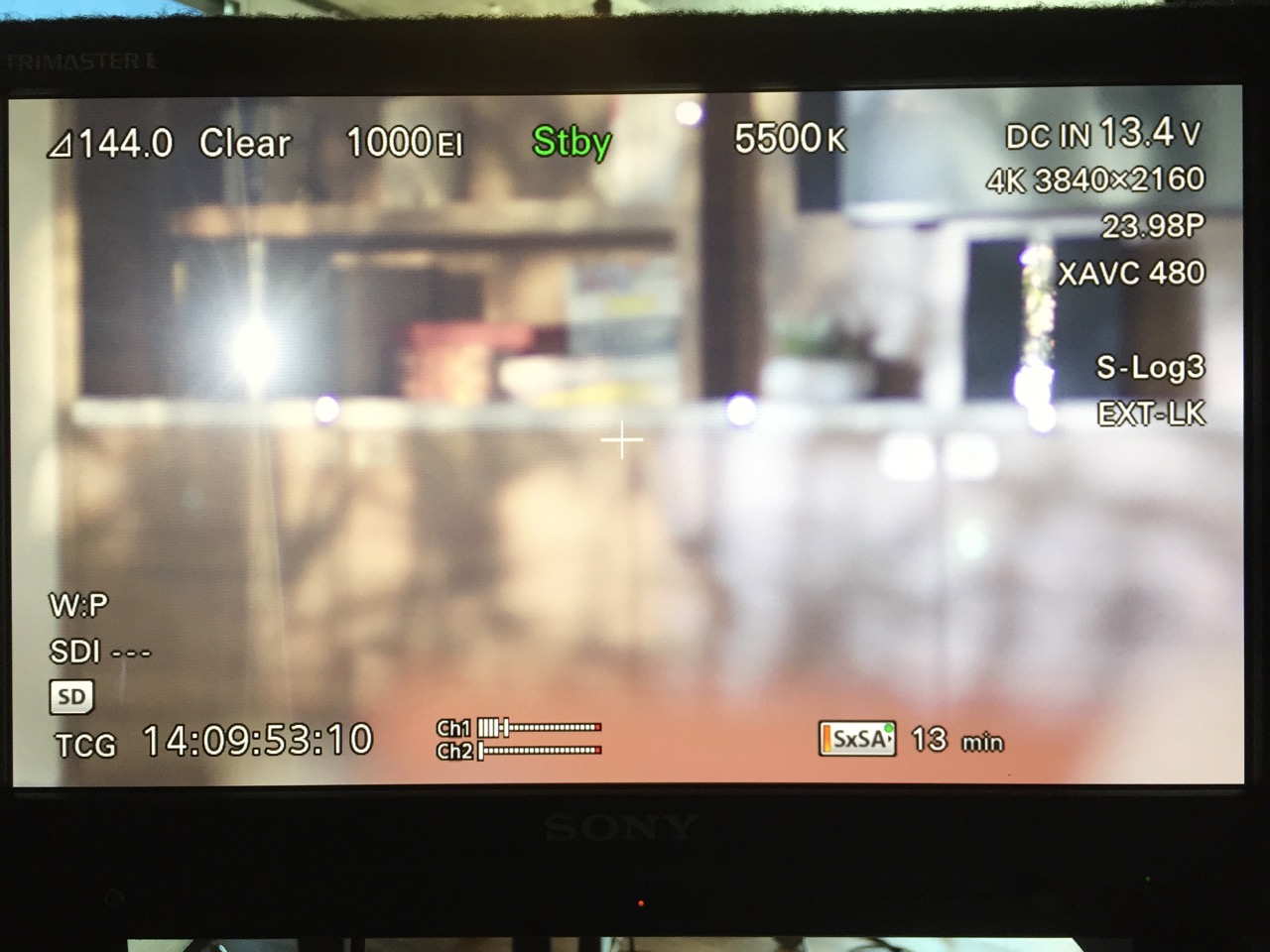
The couch in the foreground is soft, so focus is farther back than when we rolled. The final background was softer.
It occurred to me that some shiny round sparkles might add a bit more interest. I asked Courtney to send a PA to the nearest hardware store and buy some cheap 2″ round convex mirrors, which we then ran across the background wherever they could catch some of our fake dappled sunlight. The result was a series of tiny sparkly hits that drifted slowly through the frame during the camera move.
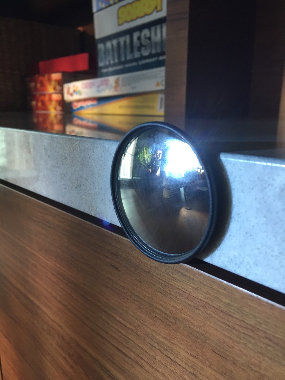
Unlike flat mirrors that have to be precisely aimed, convex mirrors will reflect any light in front of it across a wide angle of arc. If the camera saw the mirror, and the mirror saw the light, the camera would always see the light reflected in the mirror.
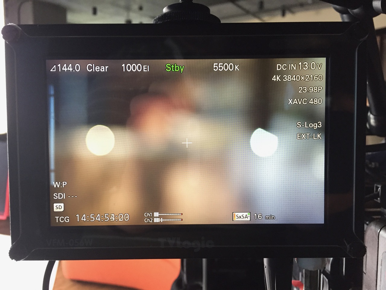
Our primary camera lenses were 50mm, 85mm and 135mm primes, and the background was 20-25′ away. My lighting gags were easily hidden within the frame thanks to the out-of-focus background, and an otherwise dull office break area came to life in a manner that was complimentary to people sitting on a couch and talking about themselves for 45 minutes at a stretch.
It’s always a challenge to make such things look interesting. While the subject matter may be riveting, it’s best to hedge one’s bets in case it isn’t. Backstopping the narrative with a pretty picture never hurts. And pretty pictures on their own help sell the narrative, as a well-wrapped package always enhances whatever is inside of it.
These convex mirrors are now a part of my regular kit. I look forward to placing them in backgrounds whenever I see the opportunity to create an out-of-focus sparkle. You should buy some for yourself sooner than later as they currently cost only $2 each. Once they catch on I’m sure they’ll be available at your nearest expendable supply store for $25 or more.
Filmtools
Filmmakers go-to destination for pre-production, production & post production equipment!
Shop Now