I never thought I’d type those words without something knife-like poking me in the back, but my new Apple TV helped change my mind.

Years ago, when the last ice age receded and I was working as a young second camera assistant, I saw a camera operator and first camera assistant get into a lot of trouble. We were shooting pickups for my first “big budget” feature (the beautifully lit but very graphic Texas Chainsaw Massacre III) in the desert north of Los Angeles, and each camera’s matte box contained a strong tobacco filter along with a metric ton of neutral density filters. The cameras were Arri BL4s without behind-the-lens filter slots, so all the filters went into the matte box, where they made the image extremely dark, instead of behind the lens, where they acquired dust specs more easily but didn’t block the operator’s view. (Panaflex cameras were built with a behind-the-lens filter slot for this purpose, but this was a later modification for Arriflex cameras.)
Avoiding lens flares is the responsibility of three people: the camera operator, the first camera assistant, and the key grip (or grip department in general). It’s the first assistant’s job to keep an eye on the lens as the lights go up, and if any bright spots appear in the glass they ask the grips to set up a “lenser” (a flag that blocks the offending light). The grip department generally keeps an eye on the lens as well, and often they’ll set up a lenser without being asked. Last but not least, the operator is expected to see the flare if it strikes the lens and affects the image, especially in the film days where they had the best view in the house. (This has changed in recent years: currently the operator has the smallest monitor and worst seat in the house.)
On this occasion no one noticed the sun smacking the “B” camera matte box and bouncing between the filters like a ping pong ball. The heavy ND obscured the operator’s vision, and the camera assistant and the grip department didn’t catch the portion of the camera move where the sun pierced the lens like a laser. When this shot came up in dailies the DP was not pleased.
These days, however, the operator might have been given a medal.
I believe it was Conrad Hall, ASC, in the DVD Visions of Light, who says that it’s the little “mistakes” that make images look more real. He was one of the first DPs to embrace the lens flare as a cinematic choice, and he did so decades ago. Now lens flares are the go-to technique for spicing up otherwise dull material. “Flare the lens” is the new “shake the camera.”
Any trick that’s overused can become a joke. Commercial gimmicks that worked well once are often repeated by creatives hoping to recapture that same magic. Lens flares can be everything from eye candy to phenomenal storytelling tools—this is no secret. The secret is: why do they work?
I’ve spent some time thinking about this lately. I have a couple of thoughts.
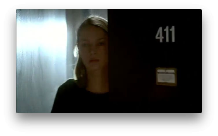
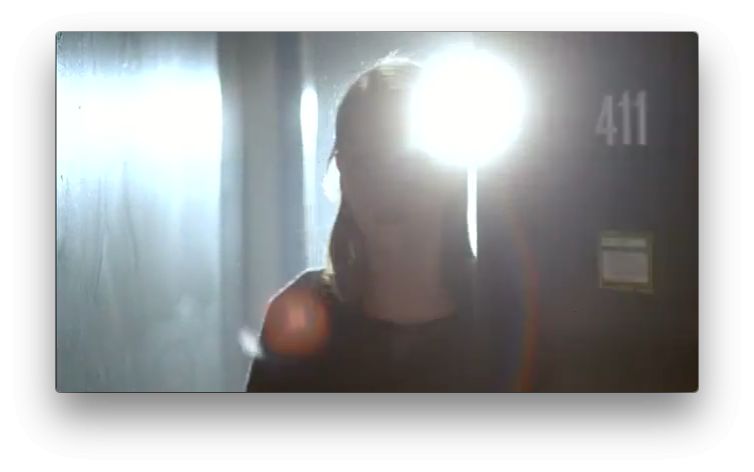
Lens flares obscure or reveal information. One of the more famous uses is the famous “door opening” shot from Jennifer 8, where Conrad Hall, ASC uses an overwhelming light source to temporarily blind us when introducing a blind character in an attempt to generate empathy for her situation.


Beyond hiding and revealing elements in the frame, lens flares contain very powerful depth perception cues that quickly define where the viewer is in relation to the subject. They can quickly draw the audience deeper into the image.
I wish I could say I was finally able to vocalize this realization while viewing a great artistic masterpiece in a European museum, or while watching a classic film whose very name would cause you to gasp, nod knowingly, and say “Of course.”
Instead, I learned it from the screensavers on my new 4th generation Apple TV.
When I considered upgrading my old Apple TV to the latest and greatest version, I asked a friend who’d already bought one what impressed him the most. “The screensavers!” he said.
Not was not the answer I expected. Still, after setting up my Apple TV one of the first things I did was fire up the screensaver. Wow, my friend wasn’t kidding. They’re gorgeous.
The best part is that they were shot by someone who isn’t afraid of the dark. Every landscape is shot backlit or side lit, as they should be for maximum contrast and texture, and often the frame consists almost entirely of shadows. One thing that’s fairly consistent, though, is that the setting sun is in the frame. In many sequences this results in lens flares, and in a past life I might have objected to them as being sloppy and distracting. Now I love them.
Some of this is due to the way flares obscure portions of the frame, creating tension in the viewer by forcing them to wait, or look a bit harder, to glean visual information. A well-timed lens flare will see the audience leaning forward in their seats (mentally, if not physically) in an attempt to see what’s behind it.
Another crucial aspect, though, is what I realized while transfixed by Apple’s slowly moving and perfectly stable vistas. A landscape is pretty, but it’s often pretty flat: not necessarily from a lighting perspective, but from a lens perspective. By necessity, landscapes are captured from a long way away, and that results in depth compression.
Depth can be revealed by using wide lenses close to objects as they move through the frame—as several of these screen savers do— or through the use of backlight or side light, but it can also be revealed by bracketing the contents of the frame with light. And that, effectively, is what lens flares do: the source of the lens flare is often the sun, or some distant light source, that defines the rear of the frame in space, while the flare itself defines the foreground boundary of the frame. There’s nothing farther away from the viewer than the flare’s source, and nothing closer than the flare itself.
On to some examples:
This would be a beautiful image even without the lens flare, but the flare adds something more that we don’t often see in aerial scenics: foreground. The flare defines the limit of foreground depth and the sun defines the limit of background depth. Everything else falls in between. This may seem a bit obvious, but consider what this image would look like without the flare. There’d be three planes: the dark buildings in the foreground, hazy Twin Peaks in the mid-ground, and the sun and clouds in the background. The nearest objects—the shaded buildings of downtown San Francisco—are distant objects, compressed by perspective into a classical landscape. The addition of the lens flare draws me in a bit more: I’m less disconnected from the scene because, instead of floating over it in an abstract way, I’m looking through something that’s inches in front of me. Now there are four planes: two distinct mid-ground planes (the buildings and the hazy hills) and two additional planes bracketing everything in the image. The frame defines the flat dimensions of the image, but the relationship between the sun and the flare define the depth of the image.
This image has no foreground lens flare but it’s still stunning. Dark shadows and muted highlights define the foreground, hazy atmosphere defines the mid-ground and the sun defines the background. Depth is created both by the perspective of the lens and the gradation of the frame from the close, dark shadows at the bottom of the frame to the bright, distant highlights at the top. This frame doesn’t need a lens flare, but compare it to the image above and try to imagine how it would feel different with subtle lens flare in the extreme foreground.
I’m not saying this image would be better with a lens flare. Lens flares are not always the answer, as both of these images are perfect in their own right. Flares are an artistic thing. Or, sometimes, an accident that we later take credit for.
The sun defines the far limits of depth in this shot, but the slow pace of the move and the way the lens flare blossoms makes it feel as if the sun is pushing its way around the building to reach me. The sun’s flare isn’t as strong a depth cue as an immediate foreground flare would be, as it appears closer than the building but not by much, but depth is still enhanced because a background element (the sun) appears to be extending in front of a mid-ground object (the building).
This shot feels like a modern Hudson River School painting. I love how the sun isn’t a ball but a wash of light, and its reddish-yellow warmth contrasts wonderfully with the almost purple clouds at the top left. In the foreground is a small cool-red blob—likely the reflection of the sun off a RED camera’s OLPF—that, in conjunction with the sun, brackets everything in the shot.
There’s one more thing going on here, and it can’t be understated. Even though this flare is likely a “mistake,” it satisfies a wonderful rule that I first read about in a book entitled The Simple Secret to Better Painting. This isn’t THE rule, but a corollary of it—and it has to do with color. I’m going to paraphrase it here:
When defining a color palette, it is generally pleasing to use a lot of one color, a little of another, and a bit of a third.
In this case there’s a lot of reddish-yellow, a little reddish blue, and single accent of burgundy red in the lens flare. That single accent helps draw my eye around the image: I start by looking at the sun, after which the strong verticals of the buildings draw me down toward the lower right. The bridge brings my eye across to the lens flare, and then I drift up to the clouds. From there my eye goes back to the sun and starts the circle again. This is textbook painting technique, and for good reason: it works. That lens flare is an accident. It disappears toward the end of the shot, as the sun sets. This image would still be strong without it, but that accent of color falling in the right place at the right time, emphasizing the intersection of the bridge and the riverbank while balancing the sun both within the frame and in depth, is a little bit of magic.
I’m frequently accused of overthinking my work. That’s okay by me, I think it’s better than the alternative. Sometimes a lens flare is just a lens flare, and sometimes it’s more. Sometimes it’s an accident, and sometimes it’s not. (And most of the time it’s an accident that we’ll take full credit for when the director likes it!)
Just be happy that I don’t smoke weed. This article would be three times as long.
(You can see all the new Apple TV screensavers here.)

