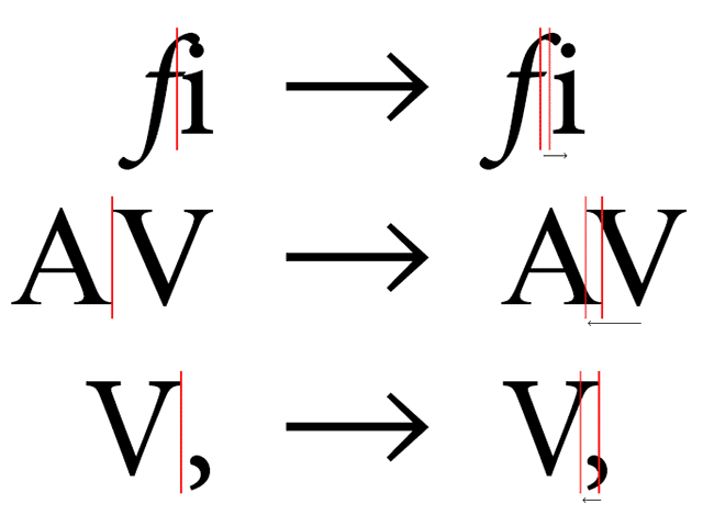
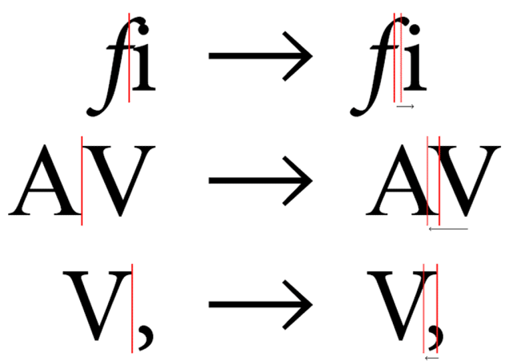
Optical kerning is a newer feature in Adobe apps. If you have a tendency to forget about kerning, be sure to enable Optical kerning, even it means occasionally overriding a font’s built-in kern tables.
Forgetting to check your kerning with Optics on is never a render disaster. And if you don’t like the way Optical looks, you can always change it to Metrics or just kern away.

The default Metric setting remains in place as it’s consistent with other Adobe applications, and appropriate for smaller text sizes. Unfortunately, saving with any text layer set to Metrics may prevent the Kern method preference from sticking (even when last set to Optical), so you have to constantly change the setting each time you open After Effects, and in each version you have installed (eg, CC and CC 2014).
You can fix this by changing the Preference file from “Metrics Auto Kerning” to “Optical Auto Kerning”. To quickly reveal the preference files for After Effects:
… try this:
- Edit > Preferences > General and click Reveal Preferences in Explorer button (Windows)
- After Effects > Preferences > General and click Reveal Preferences in Finder button (Mac OS)
Close After Effects and look for “Adobe After Effects 13.0 Prefs-text.txt” and make the change like this:
- [“Text Style Sheet”] “Auto Kerning Type” = “Optical Auto Kerning”
… Later, it appears there are inconsistent results (even for someone with a good deal of QA experience). Sometimes, just making sure that all text layers are set to Optical kerning when quitting is enough to keep the preference on. Results may vary with versions of OS and After Effects. It’s a bug that’s popped up in the past, but it could also be that some condition is not met to make the preference stick.
By the way, kerning is explained in After Effects Help:
“Metrics kerning uses kern pairs, which are included with most fonts. Kern pairs contain information about the spacing of specific pairs of letters such as LA, To, Tr, Ta, Tu, Te, Ty, Wa, WA, We, Wo, Ya, and Yo. After Effects uses metrics kerning by default so that specific pairs are automatically kerned when you import or type text. Some fonts include robust kern-pair specifications.
For fonts for which metrics kerning provides inadequate results, or for two different typefaces or sizes in a line, you may want to use the optical kerning option. Optical kerning adjusts the spacing between adjacent characters based on their shapes.”

See also Word Spacing from: Creative Graphic Design: Essential Typography by Angie Taylor from Lynda.com.
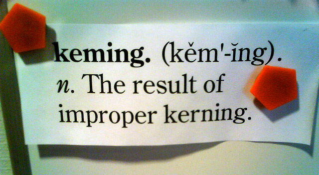
Kerning and tracking issues can cause much debate. For more on the various issues, you might explore these links:


