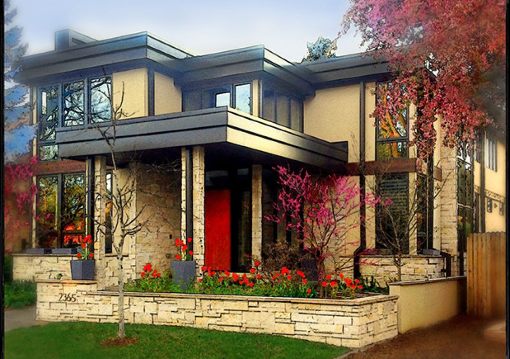
My new scenario: drive up, leave the engine running, hold my iPhone steady, snap and go. Not quite that easy, but almost. The right time of day is a necessity, and experience to select an angle for greatest curb appeal.
Real Estate photography and videography is perennially a very low-pay market. Agents hammering the budget unbelievably and yet there’s fierce competition. Aggression I just can’t handle. By chance, through volunteerism I’ve found a new way to get commissions in this crazy market.
Are you addicted to iPhone apps? Me too! I started fooling around with creative apps while photographing public art installations. I found that spicing up these sometimes not-all-that-arty sculptures in public places can give them a fresh, new interpretation. Based on these experiments I volunteered to photograph house fronts for the local elementary school’s home tour fundraiser. The pictures were to be used as gifts for the generous donors who opened their homes and allowed the public to tramp through. Actually a totally fun project, with the benefit of funding the school PE and art teachers.
Here’s the first base iPhone capture of one of the properties.
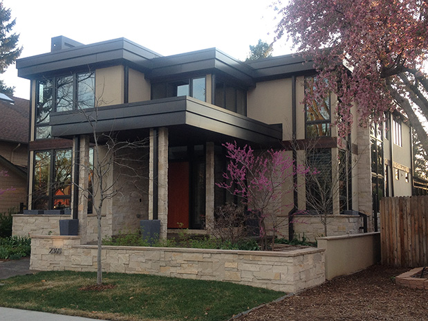
This image needed lots of extra help, because the day was dull. A good flowering tree brought in some color, but the facade was still drab and dark.
Please keep in mind this approach is not Southern Living magazine or Architectural Digest. It’s all about making properties look fun and sexy, regardless of time of day or year in a new way.
Realtors and builders, especially for more expensive properties, are always looking for something extra.
Most houses there are just one or two angles that will adequately show the frontage. This is where your creative eye needs to size up the composition and snap quickly. I rarely make more than two images of a house with my iPhone.
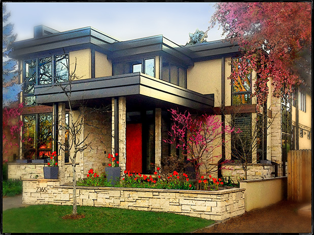
Back to this specific image. It needed contrast and emphasis on red door. Neighbor property had to be removed. An intermediate step revealed the grass needed fixing and the over the top art effect was to be softened. I also cloned in a veritable field of tulips!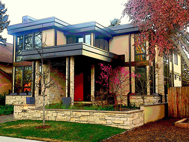
Mid-way in the Interpretive Process

Final Presentation
Postproduction is where you make money. The capture is just a few seconds, but I find I spend hours to create the interpretive pizzazz.
Instructions to experiment with apps
In general I find apps should immediately be used to add contrast, saturation, details and sharpening. I especially like ones that can make an outline of the house structure, and ones that look a little like screen printing. The new “Artist’s Touch” app is great. My standbys are Photo Studio FX iPhone app and Snapseed iPhone app. I work toward a final image that has elements of a watercolor, a drawing or a serigraph. Each one is different.
Remember to layer apps, and functions within an app. Often you’ll get a different result by simply changing the sequence of the apps. I find that sometimes an app will give me a good look in one part of the picture, but not in another. Therefore I save various versions of the image so I can layer and selectively mask in Photoshop.
Once I’ve gone as far as I can in apps, I enter Photoshop. There I fix the keystoning which you are liable to get if you point the iPhone slightly upwards. A necessity for anything architectural. I up rez for size in Bicubic Sharper (not smoother). Many times I make a feeling of romantic Bokeh by fuzzing out corners with a loose lasso and Gaussian Blur. This is also where the layering comes in to make sure the final image does not look like the typical over-pixilated, over manipulated mess we see so often. The final touch is a border from onOne Software for PotoFrame4 utility. They’re the king of edges.
What you want to end up with is an unusual, but believable image that cannot be defined as any one media. An art work interpretation.


Filmtools
Filmmakers go-to destination for pre-production, production & post production equipment!
Shop Now