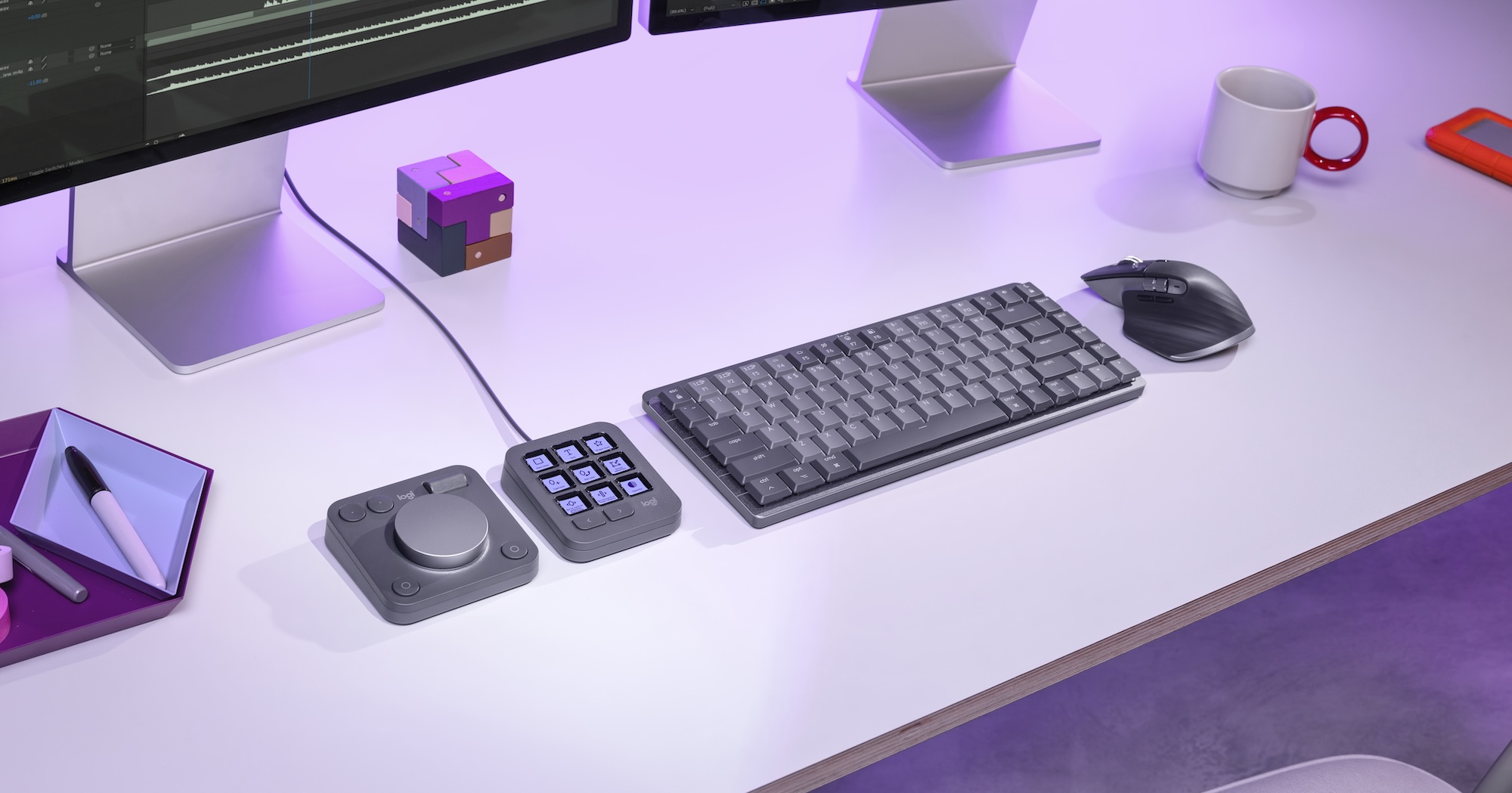
The Logitech MX Creative Console is another entry into the ever-growing list of hardware control surfaces that can be adapted to video editing. While it’s a single purchase, it’s two separate pieces of hardware that work together to create the MX Creative Console. The MX Creative Console is part of the MX Master Series, which also includes Logitech keyboards, mice, and other peripherals.
I have spent a lot of time looking for the perfect editing control surface over the years so when Logitech offered me the chance to review the MX Creative Console I jumped at the chance. When you hear “control surface,” you often think of a color grading control surface or something for audio mixing. But I’ve constantly been searching for a control surface that speeds along video editing.
For years:
Like the CTRL+Console or the Sensel Morph, or the RollerMouse or the Speed Editor or the Loupedeck+ or the Loupedeck CT or the Tourbox or the Craft Keyboard, and the Stream Deck + among others.
I’ll go ahead and say up front that I have yet to find anything I like as much as the Loupedeck CT. This would be the appropriate place to remind readers that Loupedeck was purchased by Logitech a few years ago. I wasn’t sure how I felt about that, but perhaps we’ll see the fruits of that purchase here. I’ll focus more on that later.
The MX Creative Console will retail for $199 and ship in October 2024. That’s a great price.
While you should be able to use the MX Creative Console with almost any application (you can map keyboard shortcuts), at launch, the integration is mainly with Adobe Creative Cloud applications. This particular review will concentrate on the integration with Premiere Pro. Each console purchase comes with a complimentary 3-month Adobe Creative Cloud membership, so that’ll save you a little bit of money. Considering the current cost of the Creative Cloud, which is $60, the MX Creative Console seems pretty affordable for Adobe users.
If I did my rough math right: $60 x 3 = $180 … so $199 – $180 = $19. That makes the MX Creative Console an easy buy for Adobe users (both new and existing). It’s easily worth it and probably the best control surface deal ever.
The hardware
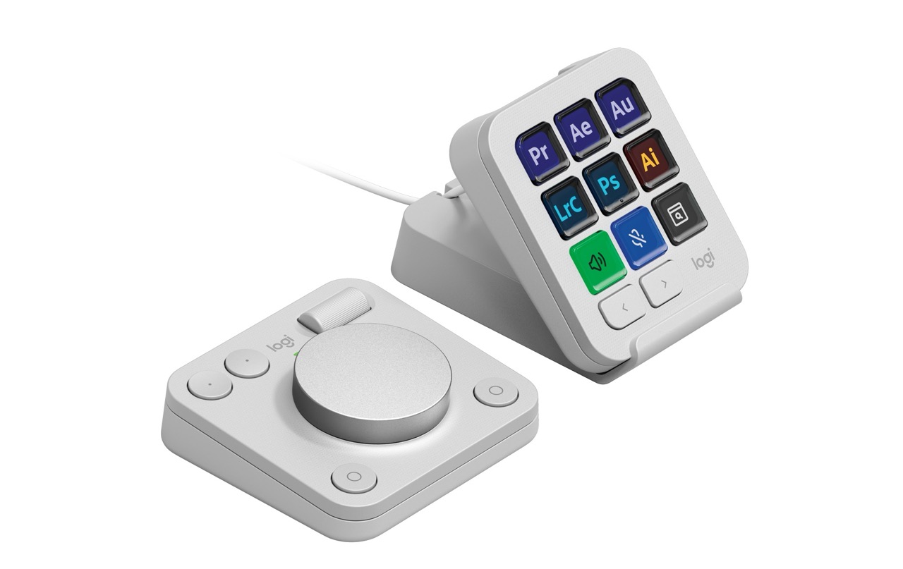
The MX Creative Console is divided into a wired 9-button keypad and a wireless dialpad. Here’s the bullet points on what you get for that price:
MX Creative Keypad
- 9 Customizable full-color LCD keys
- Adjustable brightness levels
- 2 paging buttons to navigate limitless pages of configurations
- Detachable 1.5m USB-C cable
MX Creative Dialpad
- High precision low-carbon aluminum dial with tailored friction bearing
- Advanced roller for fluid navigation
- 4 fully customizable buttons
- Easy-switch to connect up to 3 devices and switch between them
- Connect via Bluetooth Low-Energy or Logi Bolt.
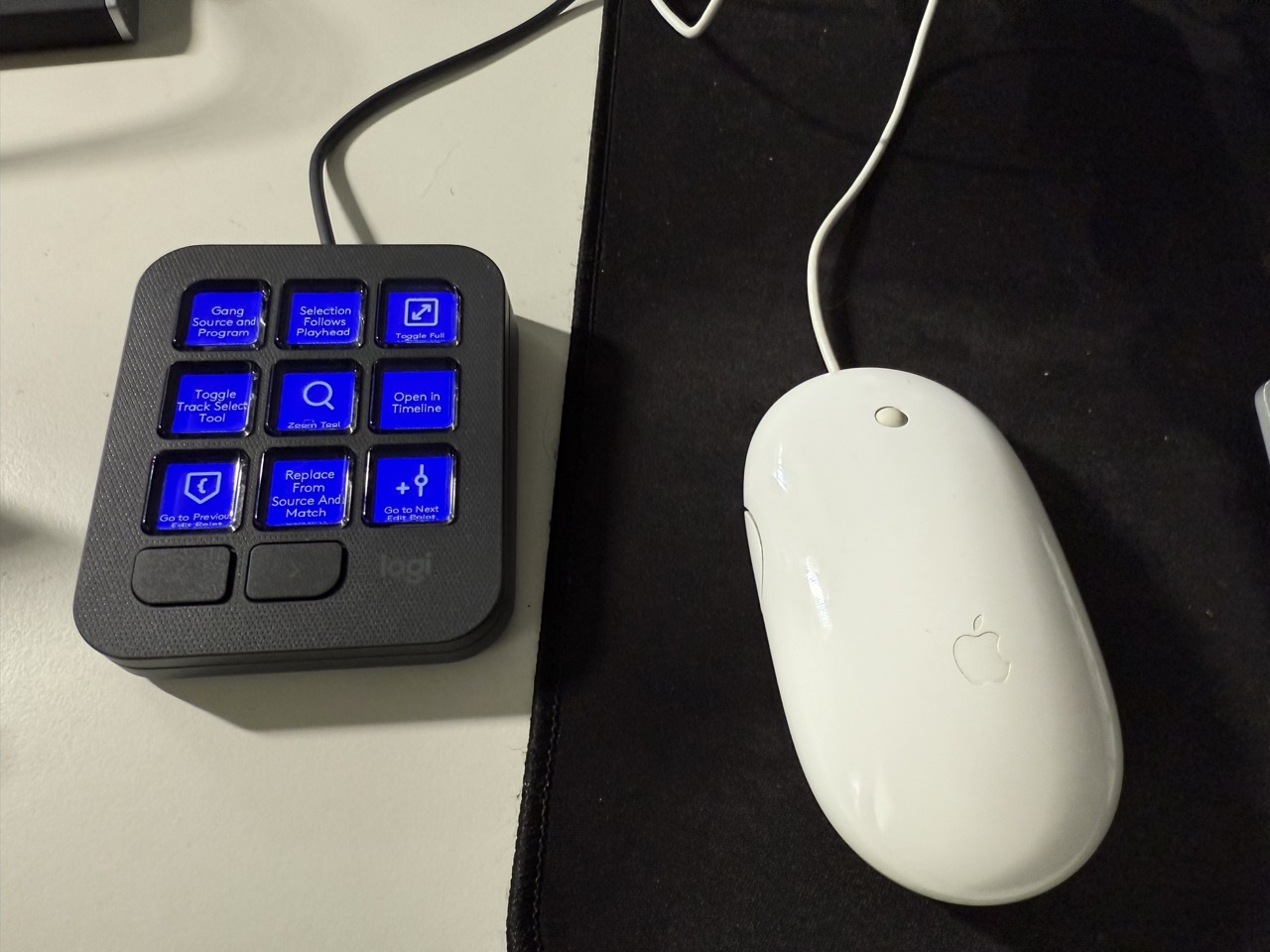
The 9-button dial pad looks an awful lot like a Stream Deck. Each button has an individual LCD display. Two dedicated paging buttons at the bottom will allow you to step through different button configurations for up to 15 pages of actions per application. While it was smart to put the paging buttons into the design, that will enable a lot of mapping. But I don’t know how many folks will step through 15 pages. I think my max might be 3 or 4. I do like those dedicated buttons to step through the different pages as that works better than the Loupedeck’s swipe. Or dedicating a button or two like on a Stream Deck.
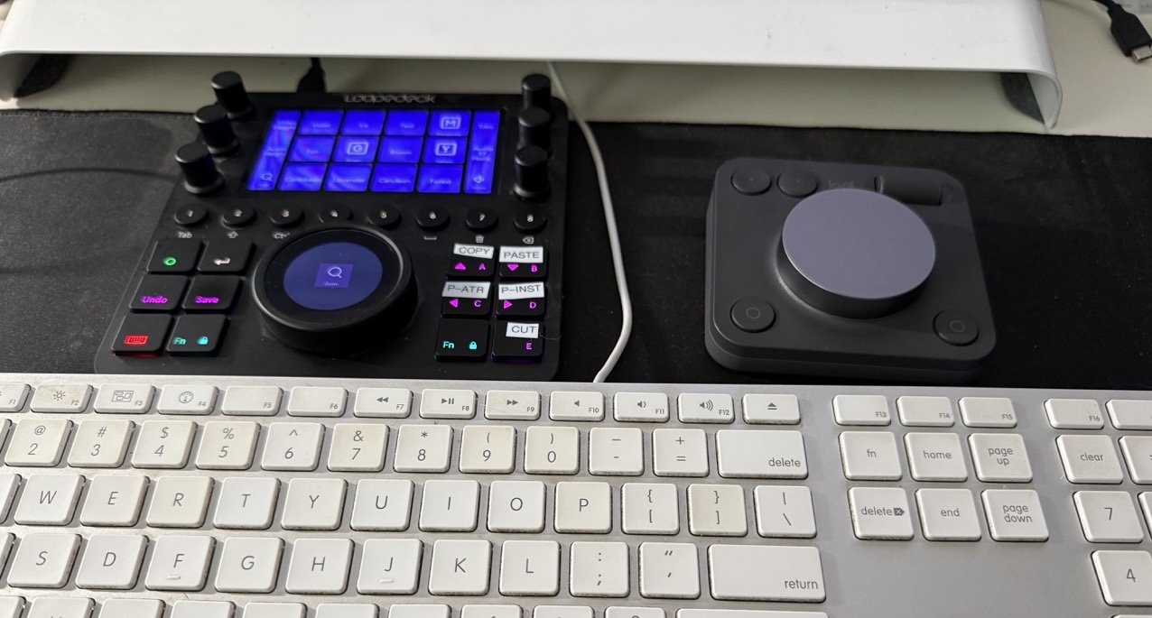
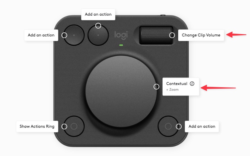
The dial pad includes a large dial in the middle, a roller in the upper right, and a couple of other mappable buttons. Its signature feature is an ‘actions ring’ that gives you a whole host of other dial options when executed from one of the lower buttons. These options are all configurable using the Logi Options+ software.
Construction is mostly plastic with the big knob on the dial pad being aluminum, which does make it a bit more pleasant to touch. The roller in the upper right means there are two twisty things to map. The keypad is wired with a USB-C connection, and I’m guessing that’s because it’s much easier to power little LCD screens through a wired connection than batteries. The dial uses two AAA batteries, and while that may seem unusual in the world of rechargeable hardware, those two batteries are claimed to last 18 months. A switch on the back turns the dial on and off.
The Software
An install of Logi Options+ runs the MX Creative Console. It’s divided into two sections: setting up the dial pad and the keypad separately. The console includes default Premiere, After Effects, and Photoshop profiles, complete with some nice little icons for the keypad functions.
These are the apps with “deep plug-in integration:”
- Adobe Photoshop, Premiere Pro, Lightroom Classic, Illustrator, After Effect, Audition
- Spotify Premium
- Zoom
- Ableton Live
- Philips Hue
- vMix (Win Only)
- Capture One Pro (Mac Only)
- More to come for the launch, keep an eye on the Marketplace.
And the Mac Finder has some too.
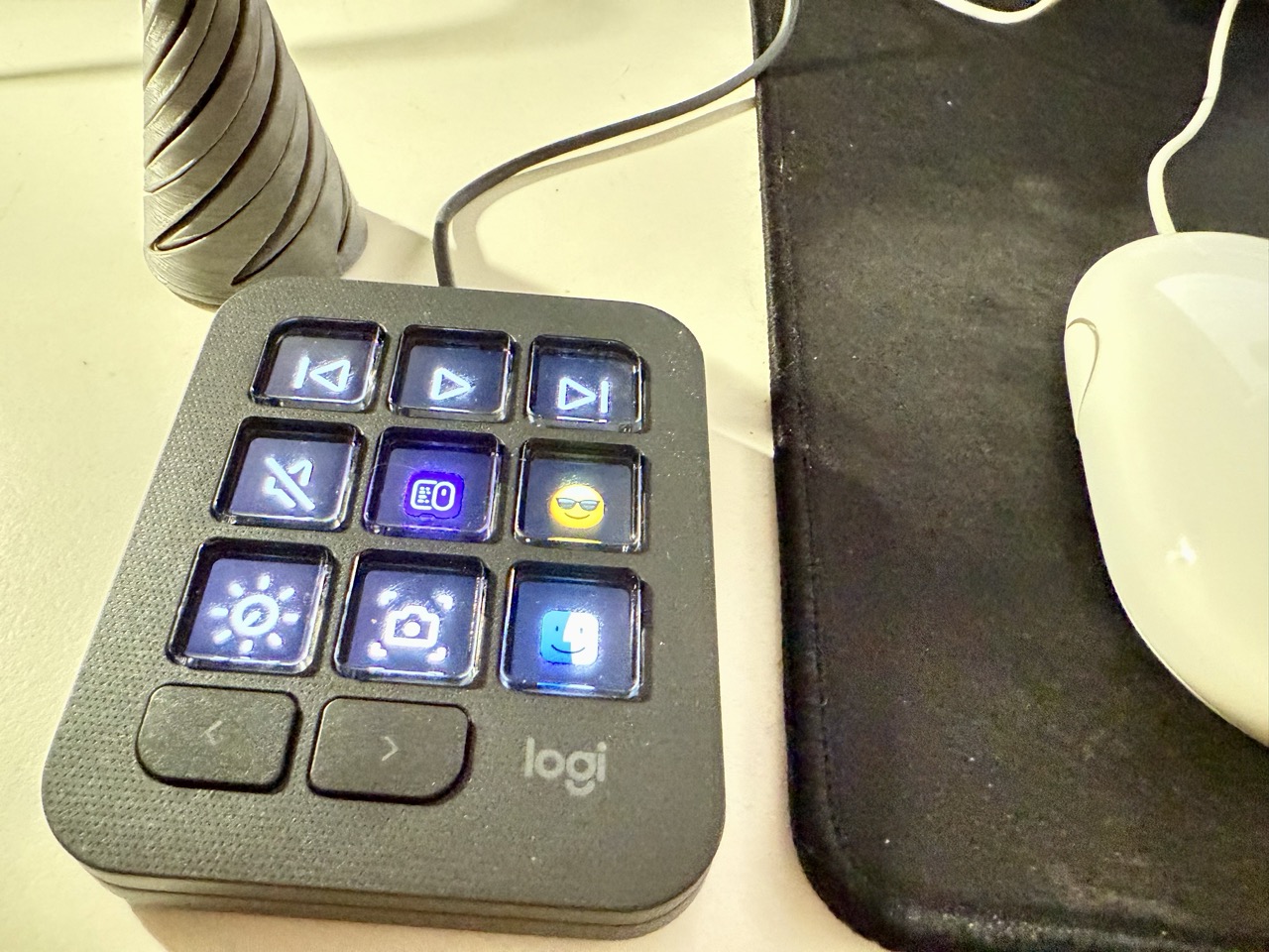
As mentioned, this initial release is focused on Adobe Creative Cloud, so Adobe folks are the target customers. That will change as time goes by and make the MX a much better bang for the buck.
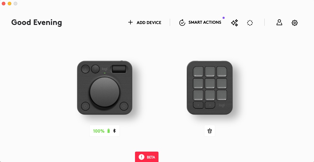
The setup is pretty simple. Whether you’re customizing the keypad or the dial pad, you just step into whichever item you are customizing in the Logi Options+ interface, search for your action, and then drag that onto the corresponding control where you want to map it.
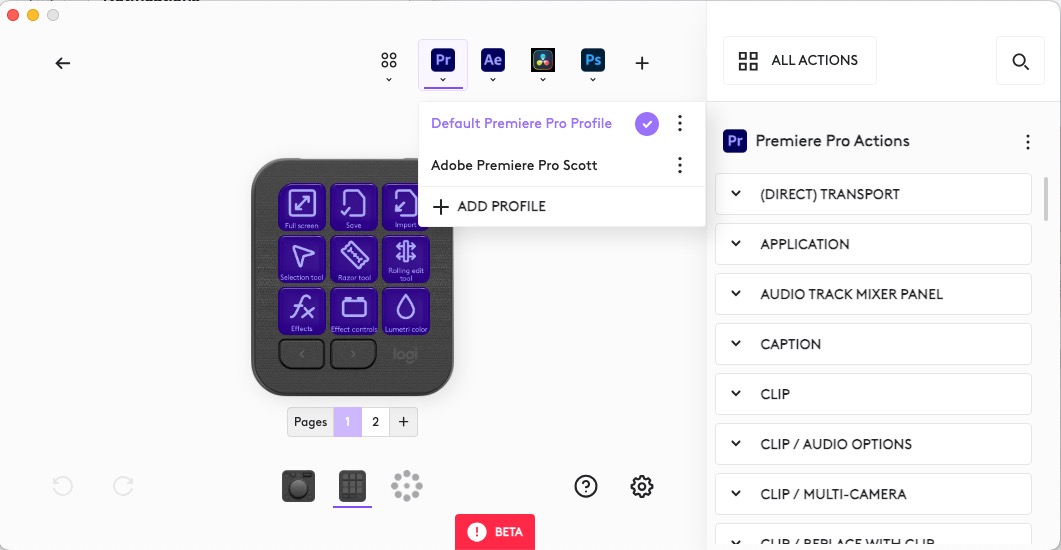
The default keypad buttons for Premiere are okay, better than the default for some control surfaces. I’m not sure an editor needs the Rate stretch tool mapped to a hardware key, but that can be changed.

Below is my current mapping, adapted for a specific Premiere Pro edit I am working on.

The purple icons are default for the Logitech software. Those other cool looking icons? Those are from Sideshow FX and they work perfectly well if you want much prettier icons.
Since this initial release focuses on the Adobe tools (and this review, Premiere Pro) you’ll see some deep integration when you go to remap settings for Premiere. Many different tools and functions within Premiere can be mapped to the MX Creative Console. Remember when I mentioned the Loupedeck acquisition above? That’s where all this comes from.
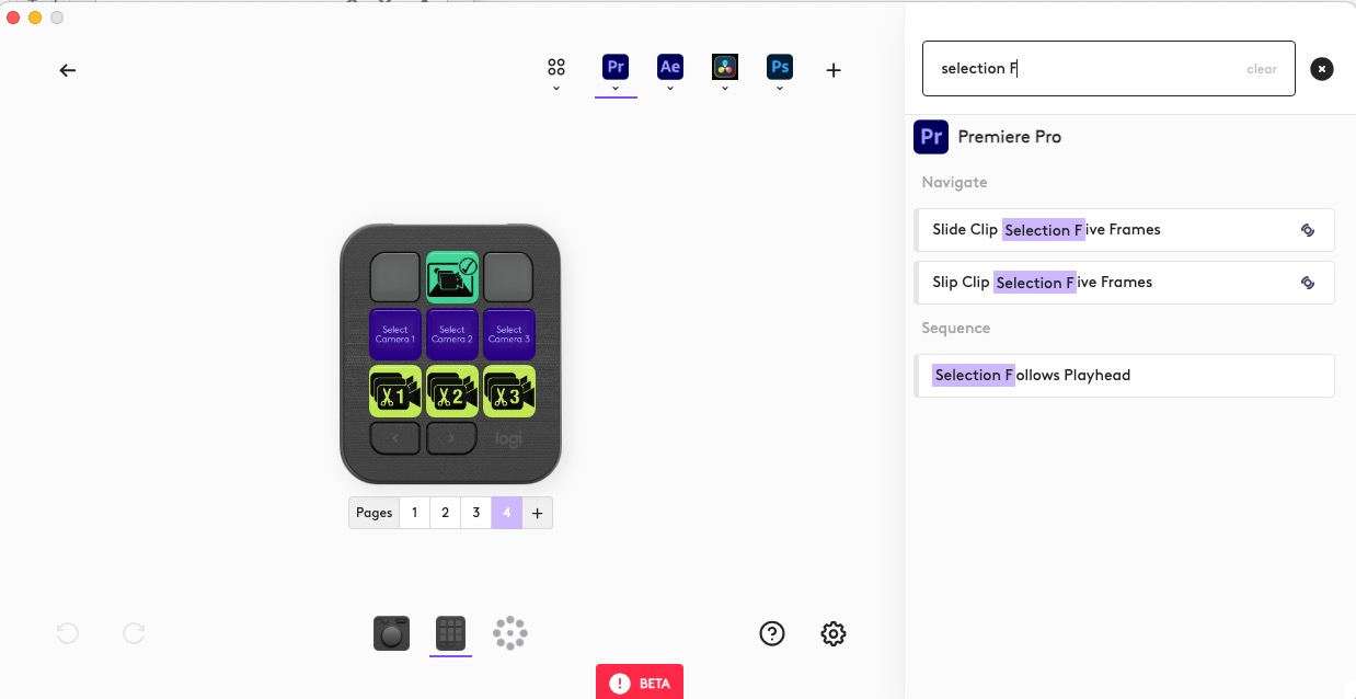
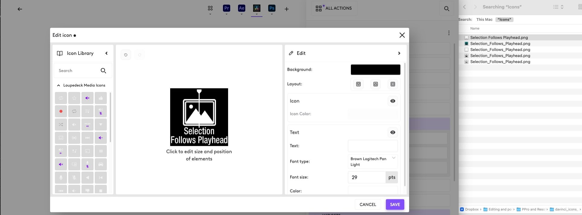
There’s a marketplace where other integrations are available. New plugins should come online as time goes by.

And let me add in one more big miss in both the Logi Options and the Loupedeck software. Why do they not allow easy copy/paste of settings from one page or one profile to the other? That seems like an easy add that could be very useful.
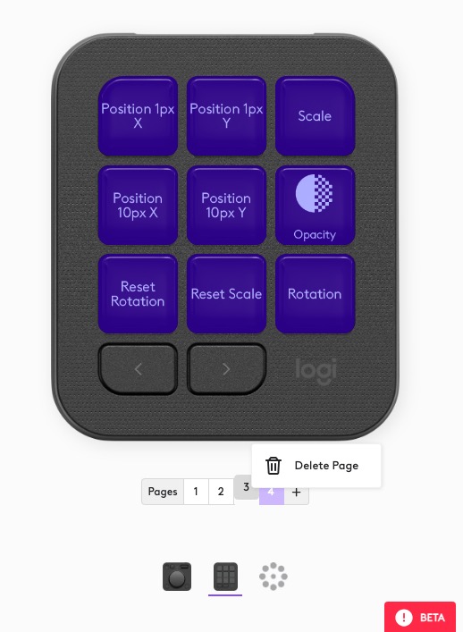
And those non-Adobe video applications?
If you have a lot of custom key mappings and shortcuts for your editing applications, though, you probably want to roll your own settings. And since keyboard shortcuts can be mapped, you can do just that, though it will take some work.

I’ve just gotten started with mapping DaVinci Resolve.
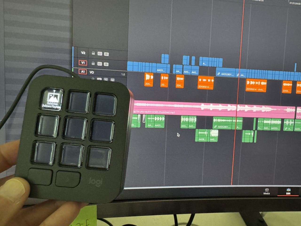
Using the MX Creative Console
I have to say I like being able to split the two modules apart. Most other control surfaces are just one piece of hardware, but the MX Creative Console is a bit of a different idea – the buttons are in one module and the dial is in another. As a lefty, I prefer to keep the keypad near my mouse on the left and the dial pad on the right or at the top of my keyboard. I can then quickly move my hand off the mouse to hit some of the buttons on the keypad while still using the right hand to adjust items on the dial.
The signature feature of the dial is the Actions Ring – which is a combination of software and hardware. When you enable the Actions Ring, you get an on-screen pop-up of 8 things the dial can control. While the default controls in Premiere are for Lumetri Color, everything in the Action Ring is mappable to other settings.
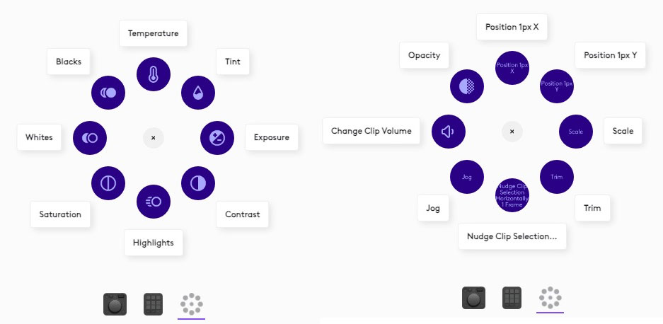
The Action Ring is where the integration with Loupedeck again comes in. The Loupedeck software makes up a lot of the under-the-hood technology of the MX Creative Console. That means many of those settings you enjoy with the Loupedeck, such as scale and position, opacity, and rotation, are available with the dial in the MX Creative Console.
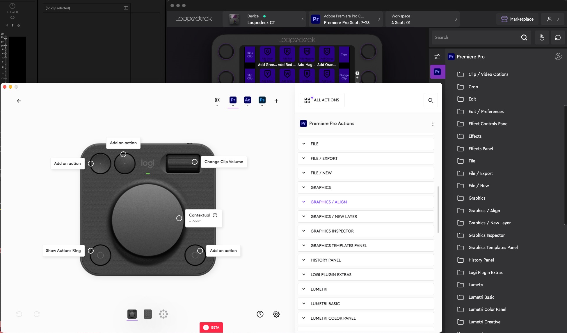
The Actions Ring is a smart implementation of a heads-up display (HUD). I’ve used other hardware control services that attempt a HUD, but the Actions Ring is one of the implementations I’ve seen but it’s far from perfect.

A couple of notes on how the Action Ring HUD could be improved:
You must still grab the mouse to change the Action Ring through the HUD. It’d be a great improvement if you could execute the Action Ring and then spin the dial to choose the new action. That would significantly improve functionality as you wouldn’t have to touch the mouse to change the functionality. It would also greatly speed up use of the dial and Action Ring. Part of the joy of a hardware control surface while editing is not touching the mouse.
Second, with the Action Ring open, it can sometimes be difficult to see the functions. A setting to change the contrast would help. It would be even better if the Action Ring was dynamic, making the appearance more readable depending on the background.
I’m really only speaking of the Premiere settings here, but depending on the function, some functions have tiny type, so it’s hard to read what the function is. If the function would magnify when you mouse over (or better yet get bigger if you could select it with the dial) that would make it easier to see.
One bit of functionality that is worth noting is between the keypad and the dial. If you map dial-based settings to the buttons on the keypad, then a press of that function will highlight that button and turn on the function for the dial. This is very useful and perhaps a better way to use the dial than the Action Ring.
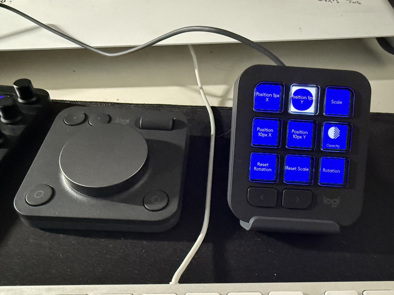
How do you know which functions support the dial? Just look for the little dial icons in the Logi Options+ software.
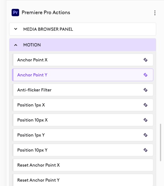
Finally, it’s not immediately apparent, but if you change the dial’s default functionality with the Action Ring, to get the dial back to its default setting, you have to go back into whatever action you changed it to and “step out” with the tiny little arrow. That’s more mousing. There has to be a better way.
Isn’t this just a 2-piece Stream Deck with a dial?
While the MX Creative Console looks a lot like a Stream Deck, it’s unique. The two-piece design is one of a kind as far as adaptable control surfaces go. The only thing I can think of that comes close is the Monogram Creative Console, but the Monogram not two separate pieces. Its modular design is also unique. There’s probably some Kickstarter thing out there but this is real, soon to be shipping hardware.
What the MX has that the Stream Deck doesn’t is the dial pad. Knobs and dials are a game changer in Premiere Pro, so I would take even a single knob over a bunch of buttons any day.
You may be saying, But Scott, Stream Deck has knobs with the Stream Deck +! That is true, but the Stream Deck software has much less functionality, especially in Premiere. I reviewed the Stream Deck + when it came out and didn’t like it as it felt like good hardware in search of better software to make it run. The software may have been updated, but I put it on the shelf shortly after that review and returned to the Loupedeck CT.
Can I still use my Loupedeck hardware with the MX Creative Console?
You can still use Loupedeck hardware with the MX. I have been using a beta to test out the MX and had to install new Loupedeck software to make them compatible. Functionality was pretty much the same, but fresh new icons in the Logi Options + software infiltrated my Loupedeck.
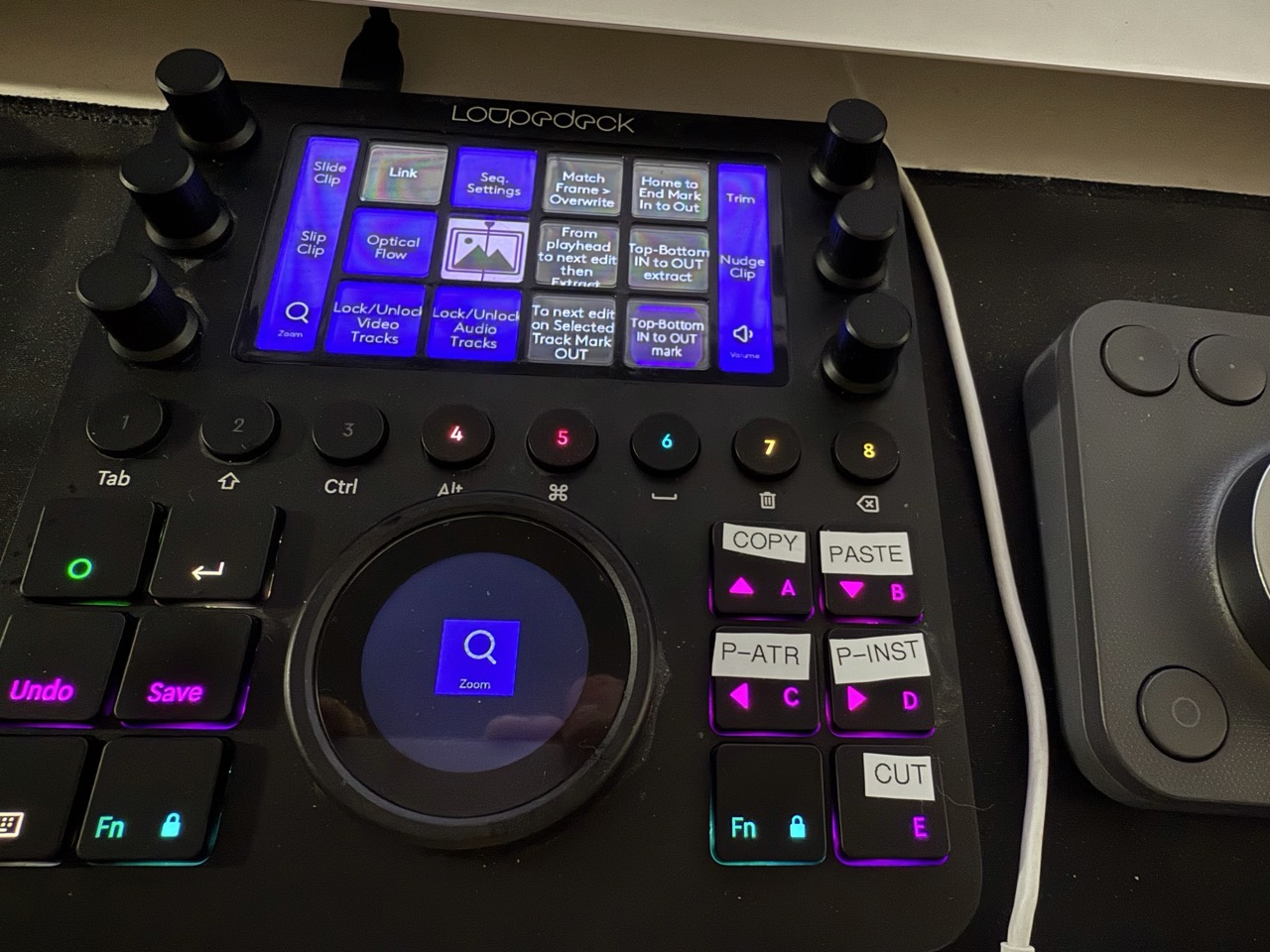
You might think you don’t need both Loupedeck and the MX and that’s 100% true. But if you can have both then why not? They can complement each other. And that is the most difficult part of this review. By having a Loupedeck CT, I still find myself using the Loupedeck way more than the MX. It’s not that the new MX Creative Console isn’t capable of doing pretty much the same stuff as Loupedeck CT, it’s just that the hardware designs are very different. The Loupedeck puts way more front and center. But at the same time, it costs a lot more as well.
A perfect setup might be the MX Creative Console and the $269 Loupedeck Live. That would let you add the six Loupedeck Live dials and really get the best out of a hardware control surface with Adobe Premiere Pro.
Despite the fact that they are using the same software, the deep Premiere integration of the Loupedeck is possible with the MX, it takes a lot more fiddling around to make extensive use of the best part of the MX – the dial pad. I wouldn’t replace my Loupdeck CT with the MX Creative Console, but the CT is way more expensive ($559 vs $199), so the MX might be a better choice on a budget.
Wrap-Up
The Logitech MX Creative Console is a nice entry into the ever-growing world of hardware control services we can use during video editing. While half of the MX Creative Console may seem an awful lot like a Stream Deck, the split design does make this a unique entry into the product category. As far as Adobe Premiere Pro and the other Adobe video apps go, that Loupedeck software that runs the thing really means there’s deep integration.
With the 3 free months of the Adobe Creative Cloud, the MX Creative Console is an easy purchase decision for Adobe users. For everyone else? It’s a very useful and nicely affordable piece of hardware. With a bit of work on that Action Ring, this tool will really shine. You can pre-order it here.
Pros
- The 2 piece design brings some fresh thinking to the hardware control surface.
- There’s a lot of functionality in the software as the Loupedeck-software-base goes deep.
- Having both the dial and the roller on the dial pad is a great combo and leaves a lot of potential.
- The price is good. You get a lot for the money.
- Did I mention $60 x 3 = $180 … so $199 – $180 = $19?
Cons
- The Action Ring software needs some work in both how it’s designed and how to execute different functions.
- Deep functionality is currently limited to certain Adobe Creative Cloud apps. If you’re not in that world, the MX Creative Console will take some setup work with those keyboard shortcuts.
- Paging through the keypad, when you get to the end it doesn’t go back to the beginning, you have to hit the buttons to page your way back to the top.
Cautions
- It’s a bit strange for a single hardware product to have both a wired component and a wireless component, but I can see why they did what they did.
- Be aware of the Loupedeck software and what to update if you also use Loupdeck products.
- There’s something called the AI Prompt Builder in the Logi Options software. Uhh why do we need this?
- I found that when I changed the function of the dial then the big dial on my Loupedeck CT also changed to that function, and that made me mad
.
- Use it long enough with Premiere and you’ll want a “knob pad” with multiple knobs, an LCD and different pages. Knobs are so useful in Premiere
.
Filmtools
Filmmakers go-to destination for pre-production, production & post production equipment!
Shop Now


