Recently I was given an opportunity to test out the Look Designer plugin from Colourlab.ai in what is now an apparently ongoing series about film emulation (more to come!). Everyone is after the elusive “film look” these days and programs like Look Designer purport to get you there faster and easier than if you were to try to do it yourself. Right now Colourlab actually has a full-on program called “Colourlab AI” but that is only available for Mac right now, whereas I’m on PC. Look Designer 2 (and Grainlab) are part of Colourlab AI, which is a larger/prettier program, but we are getting a good chunk of that experience here so let’s see how we get on!
Look Designer 2 is a one-node (if you’d like) solution to both emulation and basic grading, so we’ll talk about it in that way here. Obviously you can get super granular with it, we’re in Resolve after all, but for the sake of simplicity we’ll assume you’re just going to do your whole grade in Look Designer.
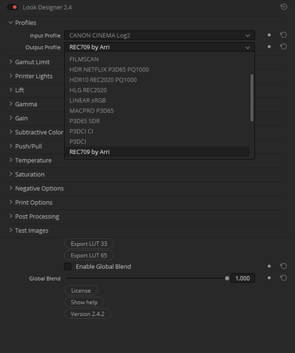
First off, the UI: At the top you’ve got your Input Transform, allowing you to convert whatever footage you’ve got into what will more than likely be REC709. Color management is crucial in this line of work, so it’s nice they take care of that first step for you here, as less-knowledgeable users might not know the proper way of handling their footage through the color pipeline. This section actually has a few extra Input Transforms that Resolve doesn’t have, like Fuji Flog (Resolve, when!?), Protune from GoPros, iPhone formats, and more. If for some reason your camera format isn’t in Look Designer but is in Resolve’s IDT, then just use a Color Space Transform to something Look Designer does have before that node. There goes our one-node discussion I guess.

The output part is similarly simple, allowing for a bunch of REC709 flavors and even most standard Log and Linear versions as well (even including something labeled “HDR for Netflix”). I found that the “REC709 by Arri” and “REC709 by RCM” looked the best on my footage, everything else being equal.
Below that you’ve got RGB Gamut Limits, for tamping down any colors that might be getting away from you. Below that is the Printer Lights function, which is essentially your brightness and base color correction tool and behaves like the Offset function in Resolve. By moving the “All” parameter you brighten and darken the image, and by moving the RGB channels individually you add (or subtract) those colors from the image overall. You’ll want to be judicious with those sliders.
Below Printer Lights we have individual sections for Lift, Gamma, and Gain. You know how those work. Just like the Wheels/Bars in Resolve you’ve got controls for level (“brightness”) as well as RGB sliders to introduce color casts into the various sections of the image.
Below that you’ve Subtractive Color. This is a “CMY” adjustment as opposed to RGB, and it does seem to basically do the same thing as Printer Lights just with the sliders “reversed”. I will say that A/Bing them does lead me to believe something interesting is going on because when the values are more or less matched, colors seemed more natural using the Subtractive Color whereas printer lights seemed to be a bit more heavy-handed. Again, don’t know the science, just what I’m seeing.
I will say that “Subtractive Color” has been kind of a buzzword online recently when it comes to color correction, with the gist being that using it makes your images more “film like” but I’ve yet to see anyone explain it in a comprehensive way. Even Colourlab says on their site: “Discover the world of CMY Subtractive color tools that emulate color processing of real film emulsions. A process that might be challenging to explain but extremely easy to use and enjoy. It will change your beliefs about what color your camera is capable of capturing.” As far as I can tell, subtractive color does what it sounds like and changes colors by removing the other colors, which in our case lowers apparent exposure but also increases saturation. Basically you’ll want to play around with Subtractive Color and the Printer Lights to get a look you like, but I’d love it if a color scientist or someone with the appropriate knowledge could sit down with me and explain Subtractive Color Mixing both from a historical sense (“what are we emulating here?”) and a practical one (“how do you do it and with what tools?”). Just in case any of you reading are that person.
Under that mystery box we’ve got parameters for Push/Pull, Temperature, and Saturation before we get to the good stuff. You know what those all do.
And now we made it: film emulations! Here we’ve got both Negative and Print stocks, of which there are many, as well as some looks named after musical notes that aren’t strictly based on any given film stock but are just expressions of a general “film look”. There’s tons of those in here. In any case, it’s important to emulate both the Negative and the Print stock of your choice because that’s where the magic happens. The “look” of a film doesn’t just come from one or the other, and that’s also why I get kind of frustrated when people talk about film emulation because usually it’s just the Print stock they’re targeting, usually Kodak 2383. I’ve seen more 2383 LUTs and Powergrades than I can count and they all look different. Emulating just a Print Stock will (in theory, basically) give you the contrast and saturation you’re looking for, but not “the look”. Nowadays everything seems to be 5219/2383 anyway but still, the point stands. That’s mostly due to a lack of choice than anything.
In terms of choices, we’ve got Negative Stock, Negative Stock GEN2, Major, and Minor. The Negative Stocks are the “named” ones (Kodak Vision3 5219 or Fuji Eterna 8583, for instance) and then the Major and Minor options are those aforementioned “expressive” looks. Personally I’ve found that I like the Kodak 5274 and Fuji Eterna 400T options under the “Negative GEN2” dropdown, at least as a starting point, but a lot of times different scenes call for different treatments. The Major and Minor options are really cool and I’m going to assume they match what each note is classically supposed to evoke in a listener, but in any case they’re a lot of fun to poke around in.
For Print Stock, I like the Fuji 3510 Contrast option coupled with really any of the available print stocks. Eterna 3510 can look a little green (which is cool but not for everything), but the Fuji CI 8503 offering looks a lot more neutral, and then you’ve got a variety of 2383 stocks to choose from that all have their own personality and look great. 2383 Classic is probably my “first-reach” option there. Among the Negative and Print options are sliders for Negative Intensity, and Contrast & Print Intensity respectively. These affect how contrasty and saturated your image is, essentially.
Below those you’ve got an option for Post Processing (right now just ENR aka Bleach Bypass) and then below that you’ve got some nice tools in the form of test images! The Saturation and Lightness ramps, as well as the Tonemap, might not be terribly useful for you but the “Ed Lachman Zones” (false color) is great to have! Resolve only just recently added a False Color OFX and it’s not really my favorite implementation of the tool so it’s nice to have here in a way that’s both highly legible and very informative.
So, how do we use all these tools together? The easy answer is “however you’d like” but I won’t do that to you. Here’s how I go about grading an image:
First thing’s first, set your Input Transform. For me that’s usually Canon Cinema Log2. For my Output Profile, as I mentioned, “REC709 by Arri” seems to render the most pleasing image so I go with that. From there I’ll skip down to the film emulation and pick my proverbial poison for the clip at hand, usually bouncing between a few to see what looks best. Then, once I have that figured out, I’ll jump back up to Printer Lights to set the exposure and back down to the Print Options to dial in my contrast. This is also where you’d be adding in your Subtractive Color adjustments if you wanted, and here is also where you’d maybe start setting your saturation. Barring any Lift/Gamma/Gain adjustments you’re trying to make, you’re basically done! Add an instance of Grainlab after that (a very simple but great looking film grain tool) and you’ve got a solid look in only a few steps. I found that I was able to essentially set a hero look on my favorite frame and then copy/paste that look along the timeline making minor tweaks to exposure along the way. That seemed to kind of be it! Obviously your mileage may vary depending on how elaborate the video you’re editing is, but for single-location stuff like I shot below, it was a piece of cake.
Getting to the examples, I used Look Designer and Grainlab (along with a few extra Resolve OFX) on a trio of Music Videos I shot with Stevie Redstone, the first of which is available now and you can see below, along with some screenshots from the other two which have yet to be released:
I also used Look Designer on some sit-down interviews I shot recently, which aren’t available to watch but the screenshots of which you can see here:
As you can see, you can get some really great options out of Look Designer. I basically just picked some stocks and I was done. You can go moody, light, stylized, more reserved, there’s a lot of options and tools to play with and you can even export a LUT of your favorite look to use in another NLE or in-camera if you’d like! It really can come together when you use Resolves other powerful tools in conjunction with Look Designer to really dial in the look you want (windows, vs-curves, etc. The usual.)
Obviously, as with any of these programs that are intended to emulate a specific film stock or combo of stocks, I can’t really test that. Not easily, at least. But what I can say is that Look Designer is a fantastic, lightweight program that allows you to dial in a look specific to your tastes that objectively gives great results. I say lightweight because I’m getting full 4K playback with no hang ups, and that’s a treat. Adding Grainlab does slow me down a bit, pulling me down to 16fps from 24, but as I’ve mentioned before my computer is getting pretty long in the tooth so that’s potentially not an issue for newer systems.
At $490 for a Perpetual license or $250/year the plugin is not cheap, but it is a great look generator and if that’s what you’re after, Look Designer can deliver it. They do have a free trial option (as part of the full “Colourlab.ai” Program, which again is Mac-only), so my suggestion would be to download that, give it a test drive, and see how it fits in your workflow. In my experience here it’s been a fast and easy way to get a lot of varying filmic looks that clients have been stoked on, and that’s really all we can ask for, right?


