Introduction
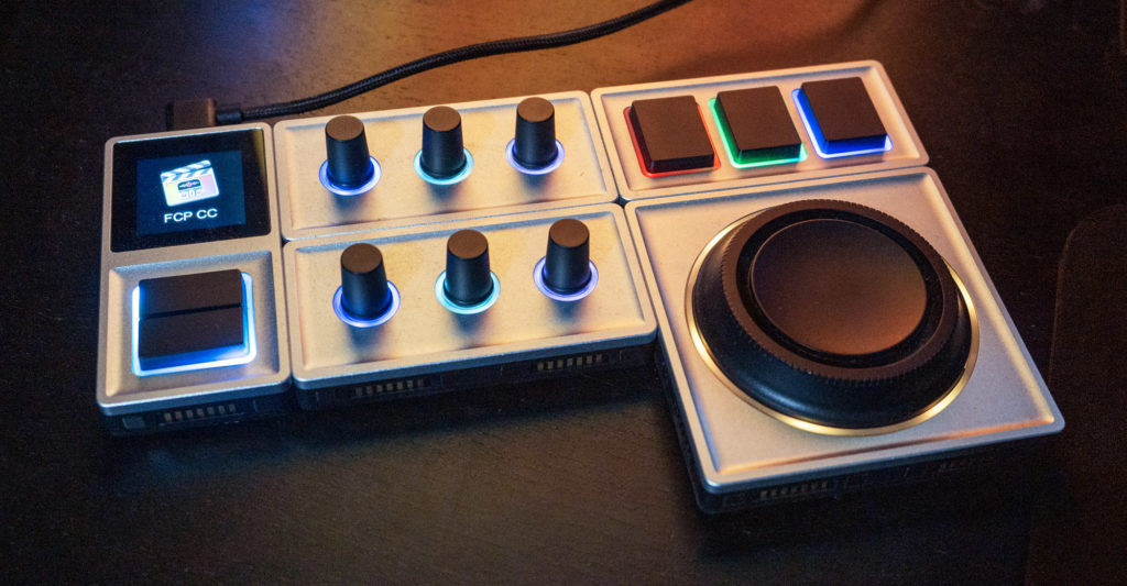
In a field of control surfaces to suit all kinds of different needs, the Monogram Creative Console stands apart as the only one you can physically rearrange to fit into your specific workspace. Other surfaces also have screens, buttons, dials and sliders you can link to your apps, but only the Monogram allows you to build a custom solution, then rearrange it to suit your changing needs. Not a gimmick, this is a uniquely powerful feature, and as someone who mixes up my setup frequently, I really appreciate it.
So how does this magnetic system work?
The Hardware
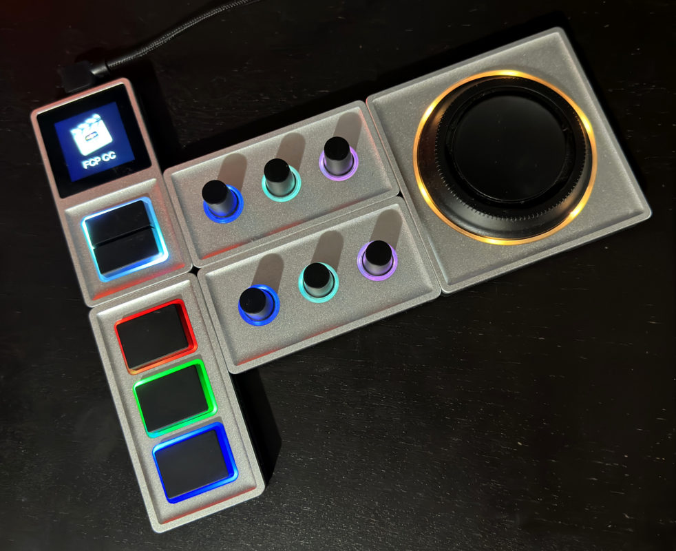
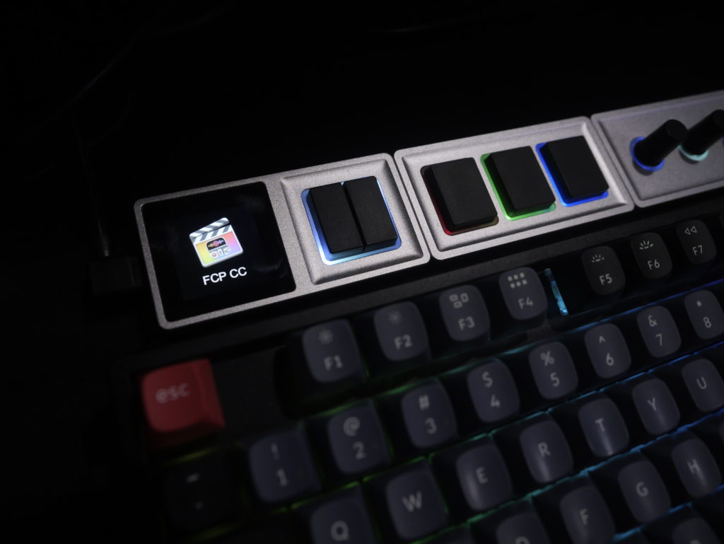
The Monogram Core element has a tiny screen, two buttons, and a USB-C port for connecting to your computer. While this is not a wireless device, all the other modules connect magnetically to one of the sides of the core, or to another module in the chain. Each of these components has magnets on all sides, but small pins sticking out on just one side, and those pins must connect to another part of the console. If the pins meet empty space, that component won’t light up, and won’t work.
Each module is quite different, but some are more useful than others.
- The Dial module includes three endless rotary encoders, and they feel solid, with a smooth, low-friction turning action and a firmer click in. Turning and pushing in can be hooked up to different functions, and you can also turn each dial while pushed in, if desired. This is not something you can easily emulate with a keyboard, and as you can permanently link these dials to sliders or pucks in your software, it does open up whole new workflows.
- The Orbiter looks like a jog/shuttle, but it’s not quite. The outer ring does rotate, but it’s free spinning like a traditional jog, and there’s no sprung component like a traditional shuttle. The center part of the orbiter is like a large, flat joystick that can be gently pushed in any direction, and this is quite useful for adjusting pucks on color wheels.
- The Essential Keys module is less exciting — your keyboard already has keys — but still useful. Each of the three keys here can be set to a custom color to help you remember that button’s function, and you can attach different commands to tapping or to holding each key.
- Finally, the Slider module is one I don’t have here, but it includes three sliders with fixed, absolute ranges. Compared to the endless dials, this has strengths and weaknesses, but I suspect most people will prefer the relative change of a dial to the quick, absolute change of a slider.
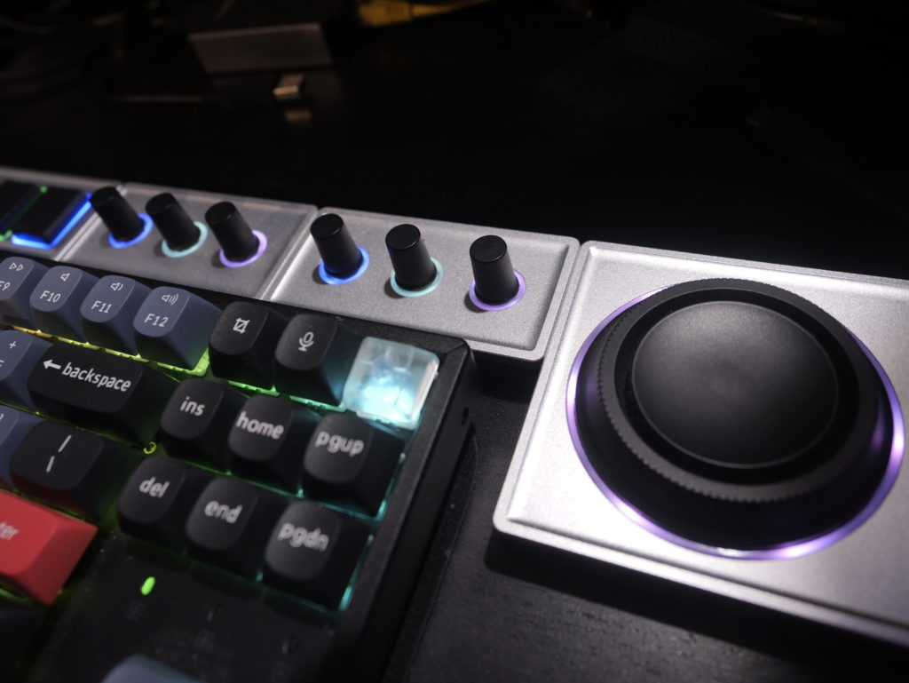
Most users should start with one of the bundles, including the core and at least a couple of other modules, and the Photo Console is probably a good option. It includes one essential keys module, two dial modules and an orbiter, and that’s the setup I’ve been using for color correction, photo culling and processing, and more. There’s also an Audio Console which has one essential keys module, one dial module and a slider module (though I’d miss the orbiter and the missing dials) and a Video Console with two essential keys, three dials and three orbiters (perhaps a little big and certainly pretty expensive). Wherever you start, you can add additional modules if you like — this is a system that can grow over time.
But hardware is only one part of the story, and you need software to connect it to your apps.
The Software
With the hardware connected, you’ll want to download Monogram Creator (for Mac or Windows) to set it up. You can see the core and all the connected modules, rotate the setup by 90°, and switch between as many different profiles as you wish, at the top of the screen. Each profile makes the console behave differently, and you’ll want to set up one or more profiles for each app you want to use. For example, in video editing apps, you might want one profile for general editing, one for audio, and another for color correction. In a photography app like Adobe Lightroom or Capture One (both supported) you might want profiles for culling and color correction.
Outside of creative apps, it’s also possible to use a Monogram Console for more pedestrian purposes like controlling the volume, or switching between Icon/List/Column view in the Finder, or just for scrolling. Profiles will switch automatically as you switch between apps, but if you want to use multiple profiles within a single app, it’s a good idea to use at least one of the buttons on the core module to switch profiles. If there’s no profile created for a particular app, it’ll fall back to the Universal profile — a good place to put generic window management, brightness and volume controls.
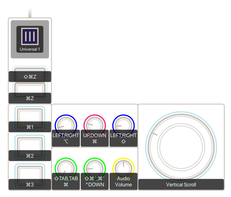
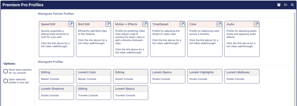
To get started with either Final Cut Pro or Premiere, just hit the plus button in the top right to create a new profile, then pick the app you want to work with. You’ll be offered a selection of profiles to match your specific console, which is a great way to start, and the Profile Exchange has a collection of user-submitted profiles if you’d like to stand on the shoulders of others. However, the flexibility of the system means that many profiles are built for a system other than the one you own, and you’ll need to edit them heavily.
Within a profile, you’ll set up each key, dial, slider or other control by clicking on it in the visual UI, and then assigning an action by choosing a preset, or customizing each individual action (press, hold, turn, etc.) for that control. A custom action can be a keypress, a modifier, a MIDI signal, a joystick movement, or even a sequence of these events, and this is powerful. Being able to input a sequence of keys (or other events) will open up new ways of working, because you can now perform functions that used to take several steps in a single keystroke.
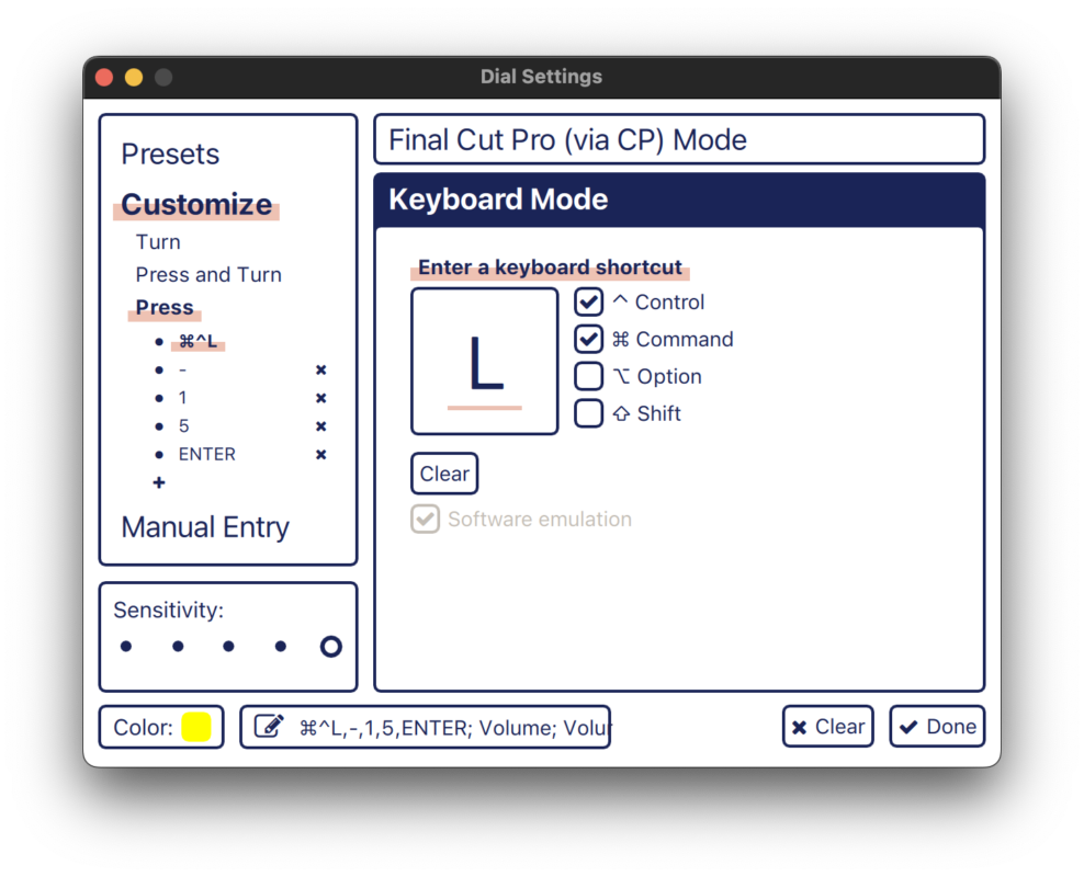
One nice example starts with a range selected on a timeline clip in FCP. If you now change the volume (with ⌃- or ⌃+ , by dragging the volume line in the timeline) you’ll add four keyframes and adjust the audio level within that range. That’s fine, but if you often want to reduce volume by, say, -15dB, you can record a sequence of keys to do exactly that, each time: ⌃⌘L, -, 1, 5, Enter. Software-only macro tools like Keyboard Maestro can do this too, but it’s great to have it built in here.
Each control can be assigned a color from a preset list, and though this is helpful, the color choices are quite limited, and there are no greys. When you’re done editing a control, be sure to press Done in the corner, because any key or modifier presses here easily can be recorded, and can mess up your recorded keystrokes. There is no Cancel option, and Clear will wipe out your work, so be careful.
While it’s pretty straightforward to assign a keyboard shortcut or a modifier key to one of the buttons, you’ll definitely want deeper integration to make best use of the dials and the orbiter. Integration with an app gives you another option for each control, with app-specific functions you can directly address, with no shortcut keys required. If you’re a Mac user running Final Cut Pro, you’ll definitely want to download CommandPost, to enable some of its more complex features. Adobe apps are well supported out of the box, but Avid Media Composer and DaVinci Resolve aren’t directly supported. That doesn’t mean you can’t use the Monogram with them, it’s just that you can’t do everything you might want to.
For example, I could assign ⌘= to a clockwise turn on a dial, and ⌘- to a counter-clockwise turn on that same dial, to give me a pretty usable “zoom” dial in most apps. But in some apps, those shortcuts depend on context — the last pane you clicked in, or even where the pointer is currently placed. With a deeper connection to the software, you can link directly to Final Cut Pro’s “timeline zoom” function, or to Adobe Lightroom’s Exposure slider, no matter where your mouse is. These commands are the real gold for a device like this, and it’s worth looking deeper at the workflows they enable.
Editing workflows
In FCP, I’ve got a basic “editing” setup which controls most of the transform properties, adjusts clip volume, gives a few options for fancy playback operations, sets markers, and controls the timeline. These augment rather than replace the keyboard and mouse, but if I didn’t have an extended keyboard with plenty of spare F-keys, I’d be setting up Trim Start and Trim End on the keys module.
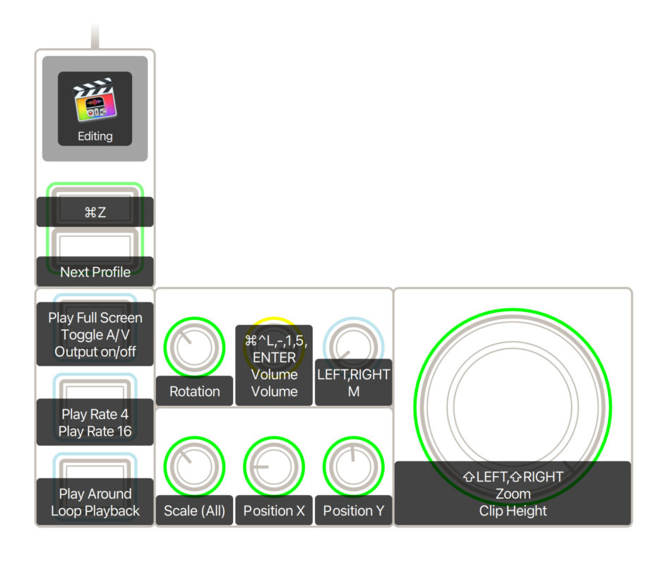
The more transformative setup is for color correction, because the Monogram Console can simplify this process. For me, this part of the job typically involves moving from clip to clip, perhaps apply an auto-fix, apply or paste color correction from a previous clip in the timeline, and then adjust several sliders and controls on each shot. Rather than moving my mouse all over the place, I can keep my hands on the Console and do almost all of that. It’s much faster and more consistent, and makes correction a pleasure.
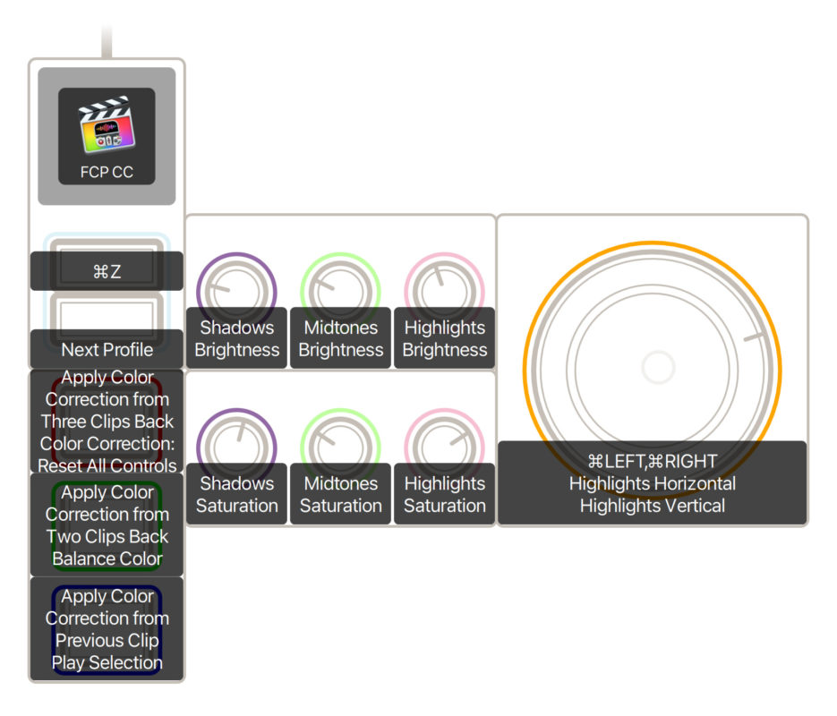
In Premiere, you’ll first need to enable the Monogram by adding it under the Control Surface tab in Preferences, but from there you can assign a huge array of functions anywhere you like. Lumetri Color is easy to control, and you’ll find a built-in preset as well as third-party options to get started; as in FCP, color correction becomes a breeze. For editing, the default preset is a decent starting point, but I suspect you’ll want to customize your own setup.
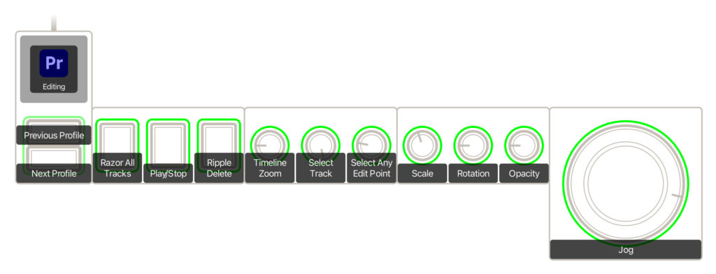
After Effects also has a preset profile to control basic motion properties, and if you adjust these frequently, it’s a big time saver.
Photography workflows
Lightroom Classic is well supported here, and a Monogram Console can absolutely speed up the most important steps in post-shoot photo processing. Culling (where good shots are rated and bad shots thrown away) is already pretty well accelerated if you know the keyboard shortcuts, but there’s a Library preset profile here that’s still helpful. There’s also a Crop profile which makes good use of the dials if you can get used to cropping with dials rather than a mouse, but it’s the Develop module controls found in the Basic I and Basic II profiles that are the real stars here.
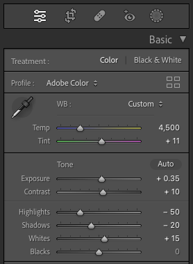
Once you’ve tried using six or more simultaneous dials to control your favorite sliders, moving a mouse between them feels like a massive backwards step. Still, you’ll probably want to customize, because everyone has their own preferred workflow, and the presets probably don’t include all the features you like.
I’m not a Capture One user, but there’s a profile here for you, and while I’ll likely forever be a keyboard and tablet addict in Photoshop, there’s an add-on tool for Monogram Console available too.
Other apps and workflows
For me, the killer feature of the Monogram Console is the ability to use dials to control multiple different settings at once, and I need deeper integration with apps to make that work. If that integration isn’t present, the best way forward is likely to assign custom keyboard shortcuts to Monogram dials and buttons. For any setting that can be directly controlled by the keyboard, which usually includes zooming and scrolling, this can work well enough. It’s a shame that there’s no native support for DaVinci Resolve or Avid Media Composer. Without that support, you could be happy using custom key commands for editing, though color correction will remain out of reach.
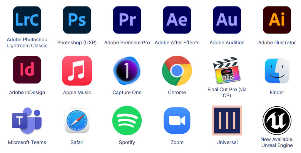
For live streaming, you could certainly use a device like this as a way to switch between angles without looking away from the camera (like a Streamdeck) and it would be handy in a Zoom or Teams call too. I’ve even used a Universal profile’s arrow keys to move around a Pages document.
Still, without deeper access — which app makers would need to provide — you’re not going to be able to use a Monogram Consoler for color correction with Affinity Photo, Pixelmator Pro, Photos or any other unsupported photography apps. That’s not Monogram’s fault, but it’s an issue.
Conclusion
While I really do like the Monogram Creative Console, it does have limitations. If you do color correction in Final Cut Pro, Premiere, or Lightroom Classic, this device will massively speed you up, and I’d definitely recommend it. For editors who miss a classic jog/shuttle, this certainly scratches the same itch, and can help you navigate a timeline more efficiently. But the unique selling points of these devices are the dials and the orbiters, and deep integration with the apps you use is crucial. If you were going to buy one of these just for the buttons, I’d look more closely at customizing your existing keyboard first, and then possibly to a more button-focused device.
Final verdict, then: is it worth it? A Monogram Console isn’t cheap, but if it can transform your workflow, it’s definitely worthwhile. I’d go for the Studio bundle unless you know that three orbiters and extra dials will be well used.
Check it out here: monogramcc.com
Filmtools
Filmmakers go-to destination for pre-production, production & post production equipment!
Shop Now