There are two “film looks”.
There’s what I believe to be the original intent of the phrase, and then there’s photochemical film emulation.
Originally we could only shoot film. There was no “film look” because it was all film. Then, relatively recently, we got various forms of digital video. These days it’s less of a concern, but initially digital looked horrendous in comparison to what you saw in theaters. We wanted our hard work in the indie and student market to look more like the theatrical offerings we were watching, so we did all kinds of things to try to bump up the production value but only a few of them were camera-side as there wasn’t much you could do camera-side, and post was even more limited. Sure we wanted to shoot film, but not because it “looked like film” necessarily, but more so because it was the highest quality option available; digital had no Dynamic Range, neon colors, and was very low resolution. The “Film Look” or a “Cinematic” look, then, was in the product not the medium.
Once improvements to sensors and post-production tools came around, the usage of those terms flipped and now people are literally attempting to emulate film, going so far as to introduce what were formerly negative elements of shooting film like dirt, halation, fogging, heavy grain, weave, etc. because a well shot image on celluloid can look indistinguishable from a well shot image on digital and the only way to suggest otherwise is to introduce aberrations inherent in that medium. There isn’t even one “film look” to begin with anyway!
Emulating specific film stocks can be fun, I’ve reviewed tools that do that before, but the audience isn’t necessarily going to notice and all stocks can behave differently under different conditions. What I think most people really want, even without emulating film, is the color response of film, and that’s where subtractive color models come in.
Put simply, we want our saturated colors to be darker than the way a “saturation knob” tends to do its job, where those colors actually get brighter, giving you more of a neon/flourescent digital look as opposed to a filmic look (by either of my definitions).
I believe there’s a way to both simulate the final image that photochemical film can produce and keep the higher fidelity image that digital gives you without getting too in the weeds, and that’s with Pixel Tool’s new hueShift DCTL for Resolve Studio.
hueShift is a simple set of sliders that allow you to adjust the Hue, Saturation, and Density of any color. By using hueShift in lieu of your saturation knobs or curves, you’re easily able to maintain “filmic” colors while also handling a lot of your primary adjustments all in one node. Methods like HSV and HSL nodes in the tree for subtractive color have come before, obviously, but hueShift is different in that it not only allows for a different color science than is already available in Resolve but also in achieving smoother results that don’t break apart when pushed to the limit. From creator Jason Bowdach:
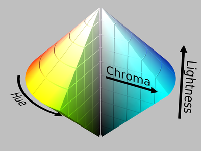
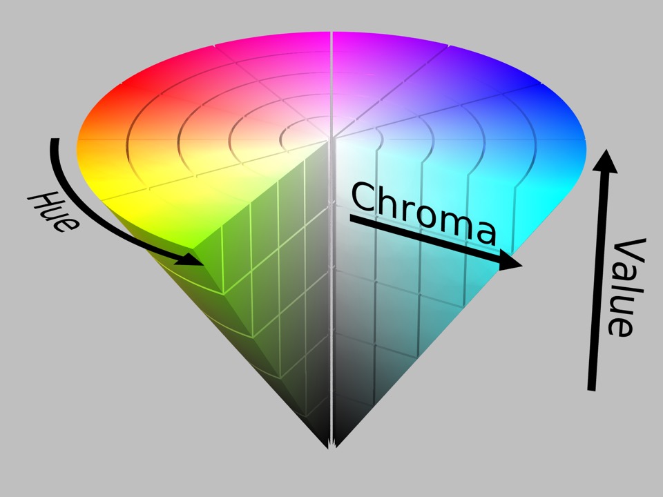
HSL/HSV color models are cylindrical (not cube-like), and although they work well, they can sometimes lead to image distortion and deterioration when pushed too far. To ensure a clean and visually smooth adjustment, we decided to use a spherical color model that gives similar results and is easier to convert to and from. We also wanted to differentiate it from the built-in tools and other plug-ins on the market (which tend to use HSL / HSV).
HSL Visualized in 3D (“Pinecone”) – Notice how the saturation gets increased until the middle, then decreases until the top where it’s 0 (pure white). Saturation is not linearly related to luma\lightness in this color model.
HSV Visualized in 3D (“Cone”) – Notice how the saturation continues to increase until the top of the cone.
The big sliders in the plugin, at least for me, are the Reds, Blues, and Skin Tones. Digital cameras never seem to handle Reds correctly, and obviously Skin is the most important “color” in your image. For instance, the original Alexas tends to render bright reds as magenta and this tool fixes that instantaneously (they solved that with the Alexa 35, though). Look at any movie shot on film and you’ll see reds are deep, dark, and lucious. Skin can look great on digital but it can sometimes look kinda flat and a bit over exposed, but with a touch of density they’re looking fantastic. Blues I just like to adjust to taste, honestly.
After all the H/S/D sliders there are little “solo” checkboxes which allow you to see not only what part of the image each slider is affecting visually but also makes it easy to see what you’re doing on your vectorscope when making adjustments. Oftentimes what I’ll do is make my initial adjustments and then go and solo each color to see what part of the image they’re affecting and make changes from there with that information, often unifying certain colors or desaturating others to clean up shadows, for instance. Or, in regards to the shadows, you can tint them any which way using the same method if that’s interesting to you.
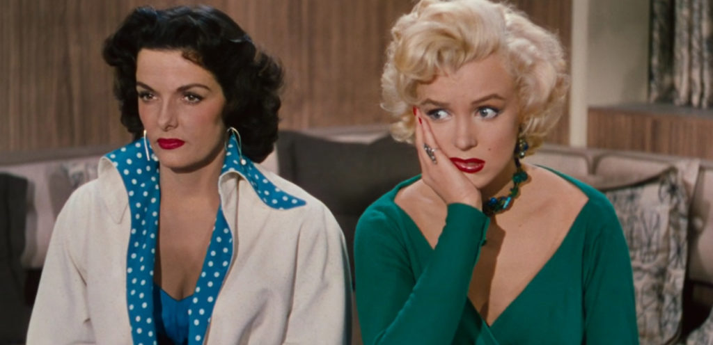
Movies, whether shot on film or colored to look that way, are dark. It’s not that they’re under-exposed, it’s that the colors are denser than digital tends to give you straight out of camera. Their exposure values are lower but their saturation stays relatively high. I was watching Gentlemen Prefer Blondes recently and was pretty taken aback by how gorgeous the Reds were and immediately ran over to my computer to see if I could replicate that look using hueShift on some material I’ve been working on for a music video and I’m happy to say I could. Also I’m aware that may be one of the nerdiest sentences I’ve ever typed. But just look at those red tones!
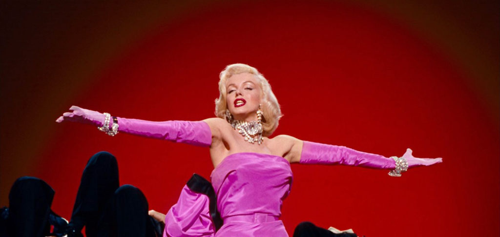
This method also somewhat replicates what used to be a somewhat specific process of selective silver retention processing, which has a few different names like ENR, CCE, and Bleach Bypassing. I also rewatched A Series of Unfortunate Events and went down a rabbit hole of education in relation to Emmanuel Lubezki, ASC AMC’s process as it pertained to that film which actually dovetailed nicely with this article.
Snicket was shot on film (Specifically Vision2 500T 5218) and used Deluxe’s Adjustable Color Contrast processing in the development to shape the look of the dailies in a way that today would seem trivial. He previously used Deluxe’s CCE process on Sleepy Hollow to desaturate the image a bit in the same way that Saving Private Ryan had that “look” to it that we all know, but Deluxe’s system was more granular and let them selectively choose which colors to desaturate and which to keep (Beverly Wood did that job, and you can actually hear a great interview with her on one of the earliest episodes of Team Deakins). By doing this their dailies would look as close to the final image as possible, because they were actually going to use the DI process we all know and love by way of EFilm.
“What I’ve found with the digital process is that if the lighting is bad, you can’t fix it, but if the lighting is good, you can enhance it and work with it. Part of this involves cutting the light, and what I like about the DI process is that if the light is coming from the right angle, the texture is right and the contrast is close to what you want, you can just use Power Windows to darken certain areas of the frame, areas that might otherwise demand a lot of time [to finesse] on set — you might have to properly cut the light with dozens of flags while the entire production waits.” -Lubezki
What that means is they did the whole Silver Retention process for the dailies photochemically and did the grade digitally, but even so that was more for speed of production and less “dialing in the look” in post and actually was the first time he had ever geled his lights in an effort to ensure he actually did get the look he wanted on set:
“I did this in part because I wanted the dailies to look exactly the way I wanted the picture to look after the DI was finished. Specifically, I wanted the faces to look exactly the way I wanted them to look in the end.” […]
“During the tests we also debated using ACE or CCE, but a week before we started shooting, I decided to go with ACE, in part because I’d done CCE before and didn’t like the amount of contrast the actors’ faces picked up. It was too harsh, and this movie didn’t call for that. However, the move to ACE did require the repainting of some major sets, because they looked totally wrong. ”
Because of the special process, Lubezki says, he “had to use a little more fill to see in the shadows, which was unusual for me, because I prefer not to use any fill at all.” In addition to the ACE-treated dailies, he sometimes requested an untreated second print. “I knew our final look would be somewhere between normal and our ACE look, so we also had to know what ‘normal’ looked like,” he explains. “The difference was quite striking: the ACE print’s colors are so saturated and the blacks look so rich [that] after you get used to it, it becomes hard to go back to normal.”
This was just a treat to read about (again that all comes from the ASC article about Snicket) because it just shows that we’re not “cheating” by using these tools (this works with any camera!) and it’s not getting away from the “good old days” or whatever, as even the best among us would have and did similarly back in the day, both in regards to leaning on the grade to speed up the production process for certain applications and relying on the grade to give us our final look while still keeping everything “film-like”. Lubezki even oversampled his film! People talk about larger sensors or higher K-counts being overkill all the time, but they do have their purpose! From the article:
Given the production’s commitment to a DI, Lubezki decided to employ another tactic that would help him render the sharpest and fullest image possible: shooting with Panaflex Platinums in full-aperture 4-perf Super 35mm, with the plan to later extract and reduce from the 0.980″x0.735″ image area to achieve a final 1.85:1 composition. This process, known as “Super 1.85,” would give his original image area an increase of about 30 percent over the 0.825″x0.446″ standard projection aperture. Like many cinematographers, Lubezki has frequently used Super 35 in this manner for increased resolution while shooting TV commercials, because working without any need for prints or soundtrack space makes it an ideal choice. “I think you can really feel the difference in the increased negative size,” says Lubezki, who also shot The Cat in the Hat and The Assassination of Richard Nixon in Super 1.85.
During the 1980s, a number of filmmakers experimented with shooting in Super 1.85 for reduction prints on theatrical films, but the required optical-printing step negated any gain of using the larger negative and resulted in an edgy image quality that actually enhanced apparent grain (though it did result in improved 70mm prints). Today, however, the advent of the DI has given this use of Super 35 a new life.
I’m getting slightly off topic here, but I just wanted to highlight how in 2004, Chivo was doing what we can now do in a few wiggles of our pointer finger. How lucky are we! After 20 years we’re still basically doing the same thing the top of the class were aiming for in 2004 but with far fewer headaches and “what-ifs”. I find that incredibly freeing. Technology changes, techniques don’t necessarily. He also talks about wishing he could have shot at T2.8 for the depth of field, but that’s a whole other article. Let’s just all agree that’s as wide open as we probably need to go, aye?
In any case, I was just excited to see that sometimes a simple process is all you need. If you’ve got great costumes, great production design, and great actors, your image might only need a bit of hueShift to bring it all home (and probably some power windows). This DCTL may be the only color product I’ve reviewed that I’d say is a “must have” just based on the fact that I’ve used so many HSL/HSV workarounds and never been overly thrilled with the results, and oftentimes that involves juggling a few nodes and changing opacities of each or what have you, whereas hueShift is far more granular and simpler to use. I’ve used it in everything I’ve shot the past few months and probably will use it in everything going forward. It’s become as essential to me as the exposure wheel. I’ve been able to fully color correct, ostensibly, an entire timeline of clips in one node each using this tool. With hueShift I’m able to set my base look, unify the color pallete where necessary and give the image some contrast all in one easy panel. It’s even keyframeable! You could go bouncing through all the versus curves, the color warper, and whatnot (albeit with slightly different results) or you could just do it all in one thing that offers better results, at least by my eye. Easy choice.
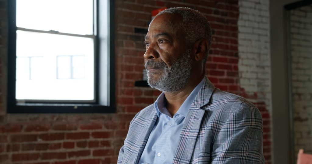
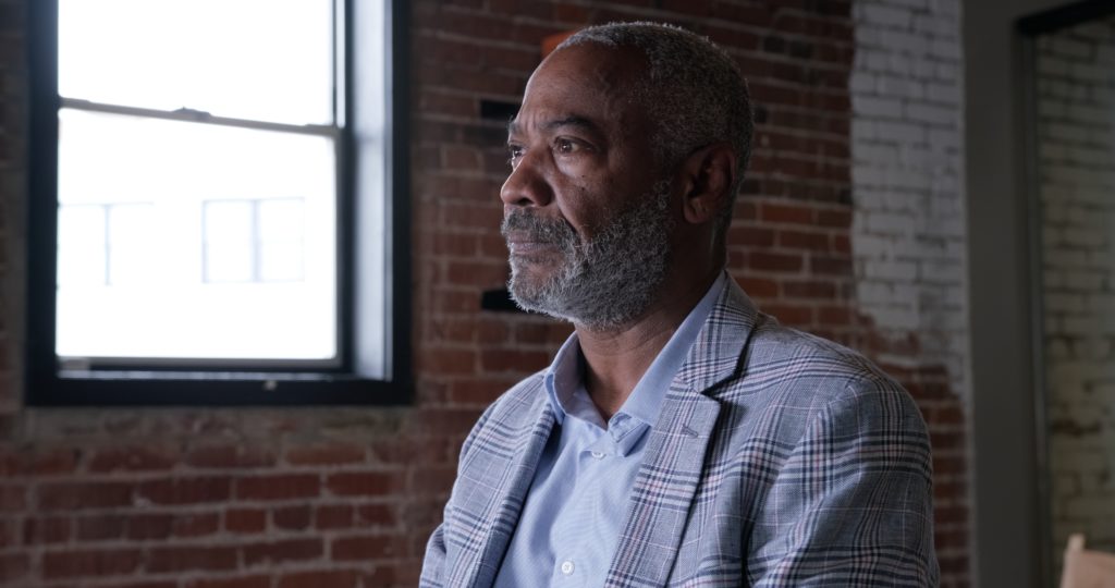
Another thing hueShift has been instrumental in helping me with, that I didn’t necessarily expect, is camera matching. I just got a C70 recently so this isn’t as much of an issue now, but for the longest time I was doing two-camera interview shoots with my C500mkII and my X-T3. The Fujifilm puts out an incredible image but the colors SOOC are obviously different than the C500, even when matching white balance and everything, and getting them as close as possible took a non-trivial amount of work. It wasn’t hard per se, just time consuming depending on the circumstances, and I had to build a couple LUTs to use as a base grade to save me a lot of that time (use can save hueShift adjustments when exporting a LUT out of Resolve, by the way). I’ve got 3 projects in the pipeline shot with the C500/X-T3 combo that I’m much happier with now that I’ve got hueShift handling the bulk of the matching and grading. Below you can see how I achieved this, with the only additional correction being a slight adjustment to the overall tint (just adjusting the WB/Tint to warmer/greener didn’t get me anywhere close). In the actual video I did spend a bit more time to get it exact, but as an example for this article only using the one tool, you can see that in about 30 seconds or so I got damn close in a single node:

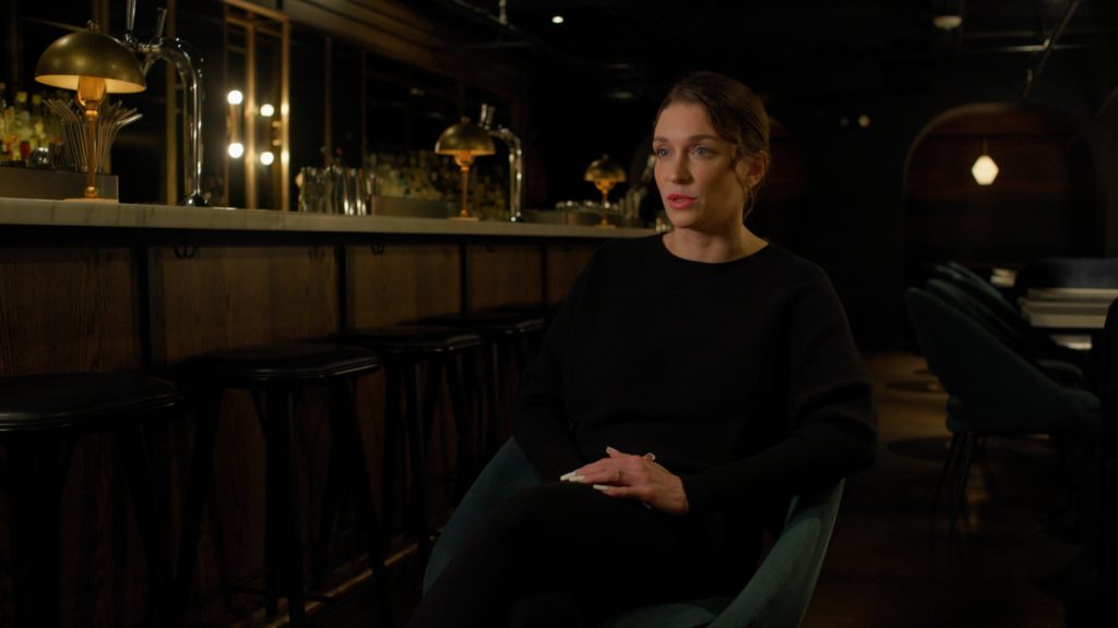
As another set of examples, here you can see how I used hueShift to give some color contrast between the subject and background, dial in the skintones (contrast feels more natural), and fix the lipstick on the subject (a result of an in-camera adjustment I made, which in hindsight was a whoopsie):
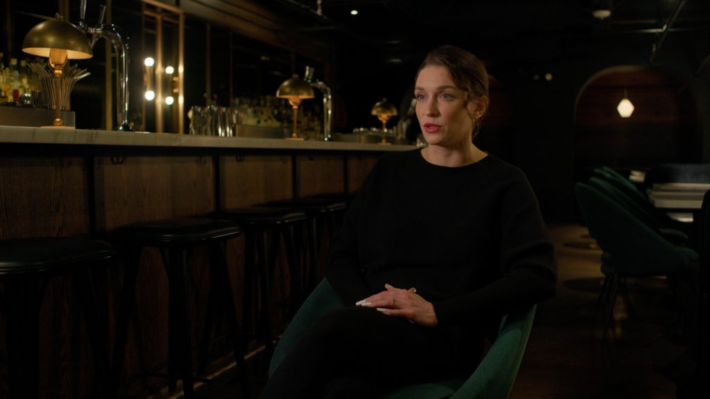
Now those previous clips are shot on a C500 in controlled lighting, what if I was outside just shooting from the hip on an 8bit camera (C100mkII running OWLCOLOR) shooting 709 already?
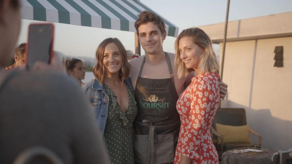
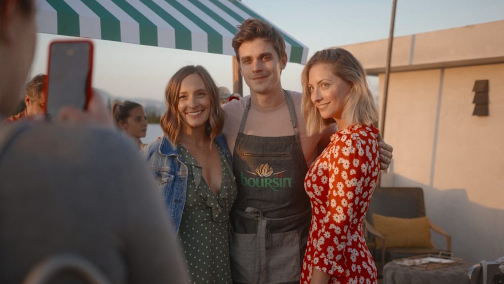
These might all seem kind of subtle but that’s almost the point. They look more natural than if I were to just crank the saturation slider. Specifically in the example above, doing so throws the entire image into neon territory, everything kind of gets brighter, and especially the woman’s dress becomes borderline reflective, see?
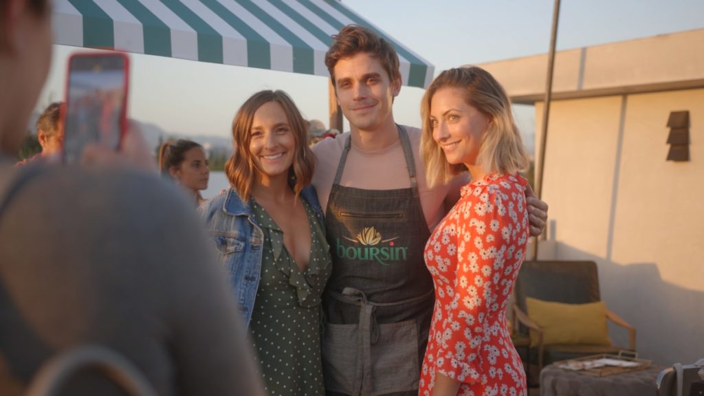
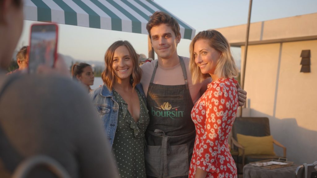
The HDR knob does give us better results than the Primaries Saturation parameter but still, it doesn’t look as good or as natural as the results using hueShift. Note the shadows are overly vibrant in the “traditional” examples.
Here’s another example for you where the subject’s skin looks much more rich and true to life, and we’re able to do the same to her jean jacket with the added benefit of the sky getting a nice little density boost. The sunlight is also able to be managed in a warm but soft way:
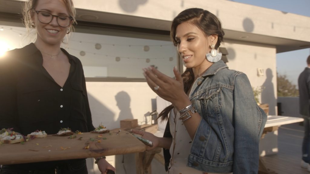
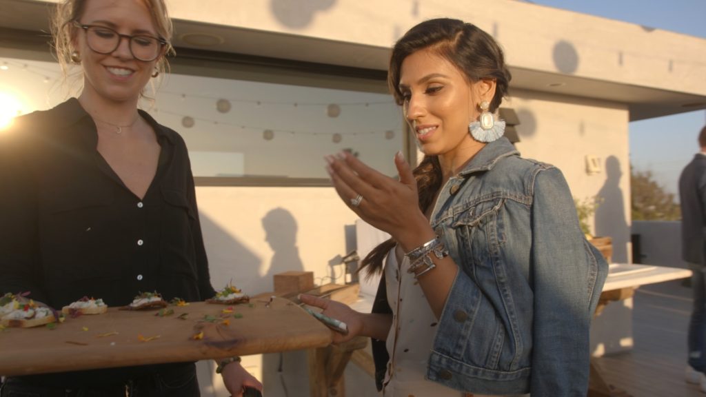
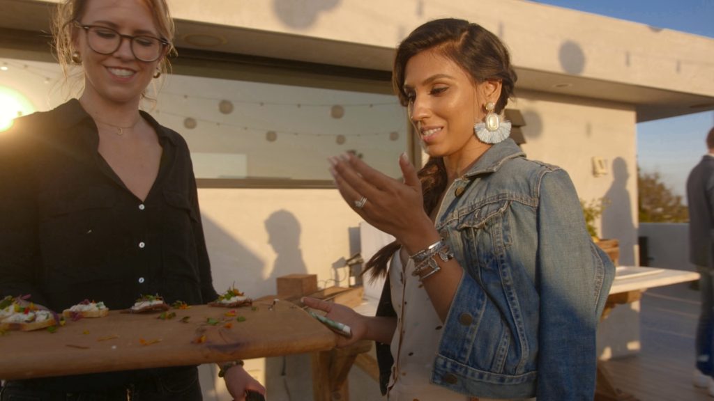
Again, you might think these are subtle but I promise you, the amount of control you have makes it so your adjustments come out feeling natural. Almost every parameter of those images has been adjusted to some degree but even if you were to just use the main sat knob in hueShift, again, it still does that adjustment in a more film-like manner than the traditional tools, and with the rest of the sliders you have a ton of control over those results. Especially with skin, you’re able to kind of adjust the fill/key contrast as a side-effect of using the skin density slider which is really nice. At least for me.
Give it a test run (there’s a free demo) and see if you don’t find it removing a few nodes from your tree immediately. Like I said, I can basically do all my work with a few windows, an exposure knob, and an instance of hueShift or two and I bet you can too. Right now my default tree is DWG CST > Balance > Base Exposure* > 3 Parallel Windows of various types and 1 parallel “look” node > hueShift > Grain (when applicable) > 709 CST. In the Balance node I’ll do any contrast/light/shadow adjustments and any more “global” color stuff, let the color node handle semi-global stuff, and then let hueShift handle the rest. Again this is just my preset node tree as it stands right now, but that thing changes every week haha.
Some Facts About the Plug-In
- hueShift utilizes a cylindrical color model not available within Resolve to adjust hues in a perceptually smooth manner when compared to native hue v and color warper.
- Specialized “Skin tone” vector was designed to make the regular task of adjusting skin easier, sometimes eliminating the “between red / yellow vector” game many have to play.
- Works with most workflows including color managed RCM, ACES, and Rec709.
- The additive / subtractive saturation slider allows for fine control over exactly what “type” of saturation is applied with highlight exclusion controlling “where” the saturation is applied.
- Design heavily inspired by Filmlight Baselight Hue tools
*I’m actually using Pixel Tools’ Exposure DCTL in this node, but use HDR Exp almost interchangeably and in any further nodes like vignettes that use “exposure” shifts.

Filmtools
Filmmakers go-to destination for pre-production, production & post production equipment!
Shop Now