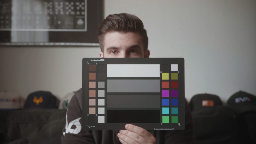
I was recently sent the i1 Filmmaker Kit and Colorchecker Video from X-Rite to review, and since the process is pretty simple I figured it’d be a good excuse to talk a bit about the color workflow and the importance of getting it right. For the record I already own the Colorchecker Classic.
When money is on the line it’s imperative that your image is accurate from start to finish. What you shot on set needs to be exactly what they see in post, and the output needs to be adjusted for the type of display it’s intended for. You need to have a known point of reference throughout your imaging pipeline to be absolutely sure the product you deliver is exactly as intended. Luckily, it’s not a difficult process.
When I first learned to shoot on film way back in 2008, it was drilled into me that we had to shoot a grey card at the head of every roll and with each scene/setup change. 18% Grey has a known reflectance point and the lab can use that reference point to adjust things when they develop the film to correct for mistakes in exposure and color. By holding a 18% grey reference card in the scene’s main lighting (very important), you show the lab a known point for which to make look “correct”. Without being given any notes, a lab will do their best to make sure the grey is correct in both exposure and color, theoretically making everything else in the scene look correct. For instance, if you shot outside on Tungsten stock but didn’t throw an 85 filter on your lens, the lab can see that the grey card is super blue and correct for that. Apparently that’s what Deakins tends to do.

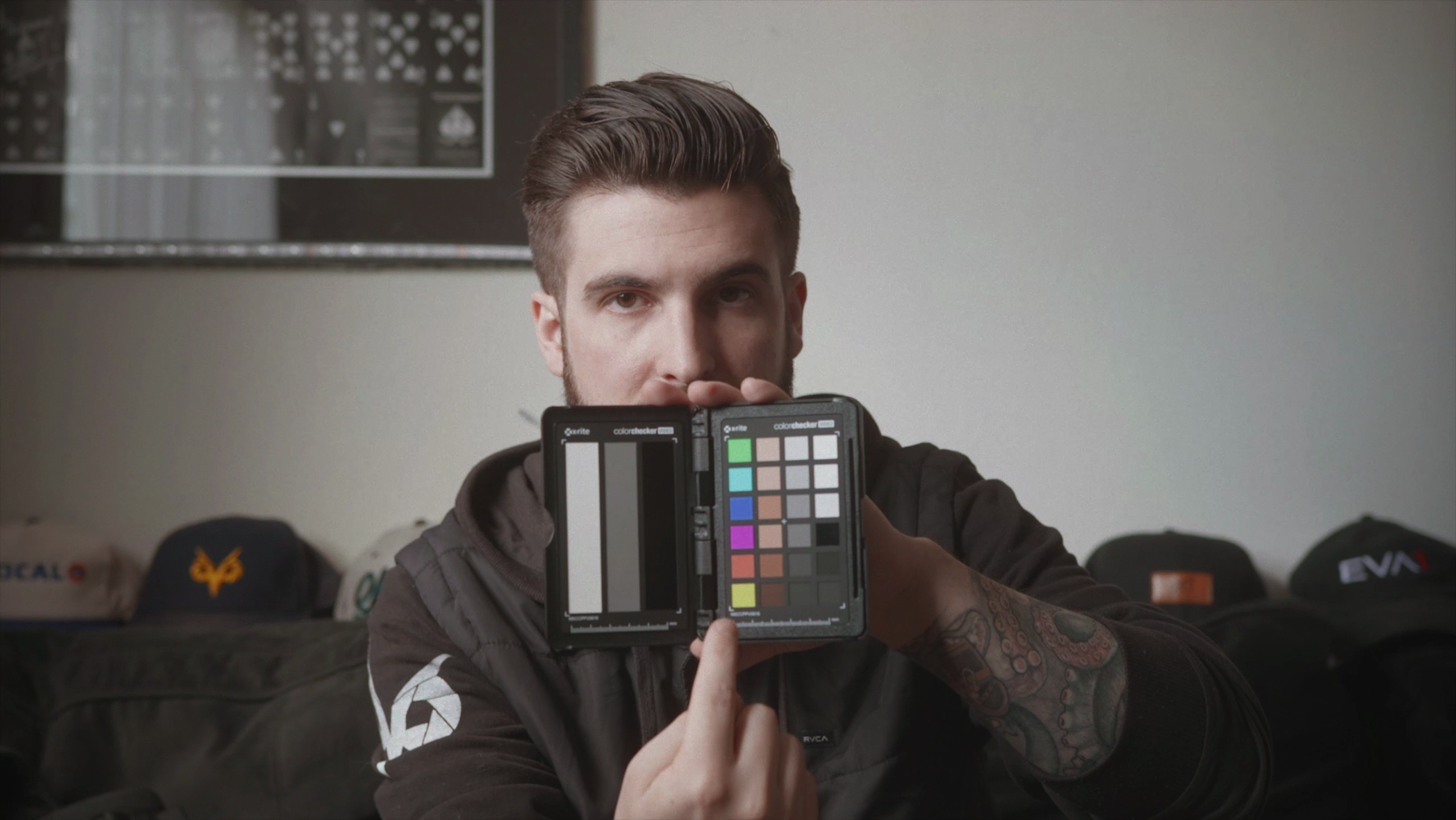
The Colorchecker Video is basically an advanced gray card, in that it gives you known reference points to utilize in the processing of your footage. On one side, a calibrated white card for you to white balance with on-set, and on the other side a series of columns showing the chromatic colors as you see on your vectorscope (six saturated, six desaturated), a set of skin-tone swatches, gray levels (white, 40IRE gray, deep gray and high gloss black), linear grayscale, and two sets of illumination check chips, black and white, at diagonal corners from each other to better assist in determining even illumination. DaVinci can use these types of charts to automatically correct footage, or you can do so yourself rather simply by adjusting your image so the chromatic targets line up with the targets on your vector scope. From there just make sure your white, grey, and black points are set to where they should be and you’re golden. The Colorchecker Passport Video is essentially the same thing, except in a smaller clamshell package and without the column of desaturated targets.
Shooting film is not unlike shooting to a compressed format, in that you don’t have raw metadata to edit and your look is largely baked-in with only some flexibility in post. Even when shooting raw it’s important to initially get it right in camera so you’re recording the most optimal image possible. Remember, your camera is just a data collection device; each camera has an “optimum” setting for recording the cleanest most neutral image possible. For this reason it’s still important to shoot a reference chart, for exposure and color balance.
Using a calibrated white card as a white balance point, such as the one in the Colorchecker Passport or on the back of the Colorchecker Video, guarantees your camera is recording that baked-in image properly. Drastic WB changes in post rarely come out looking the way you want, and your goal with digital is to shoot the most accurate image possible. White balancing with someone’s t-shirt, for instance, is a bad idea as you don’t know if that white is neutral white; if that thing’s got even a tinge of red in it your whole image is going cold. If you don’t have a true white card, a grey card will do just fine as it’s a neutral gray. After white balancing, you’ll want to shoot the color chart on the other side of the Colorchecker Video (or the one in the Colorchecker Passport) for reference later in Post.
The color chart is vital to making sure your colors are being represented accurately in general, but on multi-cam shoots it really comes into play. Even if you’ve got identical cameras, it’s possible (however unlikely) that the footage coming out of one is slightly different than the other. If you’re using two different camera models it’s guaranteed. By shooting a color chart you give yourself a known reference point with which to neutralize and match your images. Programs like DaVinci Resolve have native support for Colorchecker charts, which allow you to define the chart in the frame and automatically set your intended gamma and color space, as well as evening out your image.
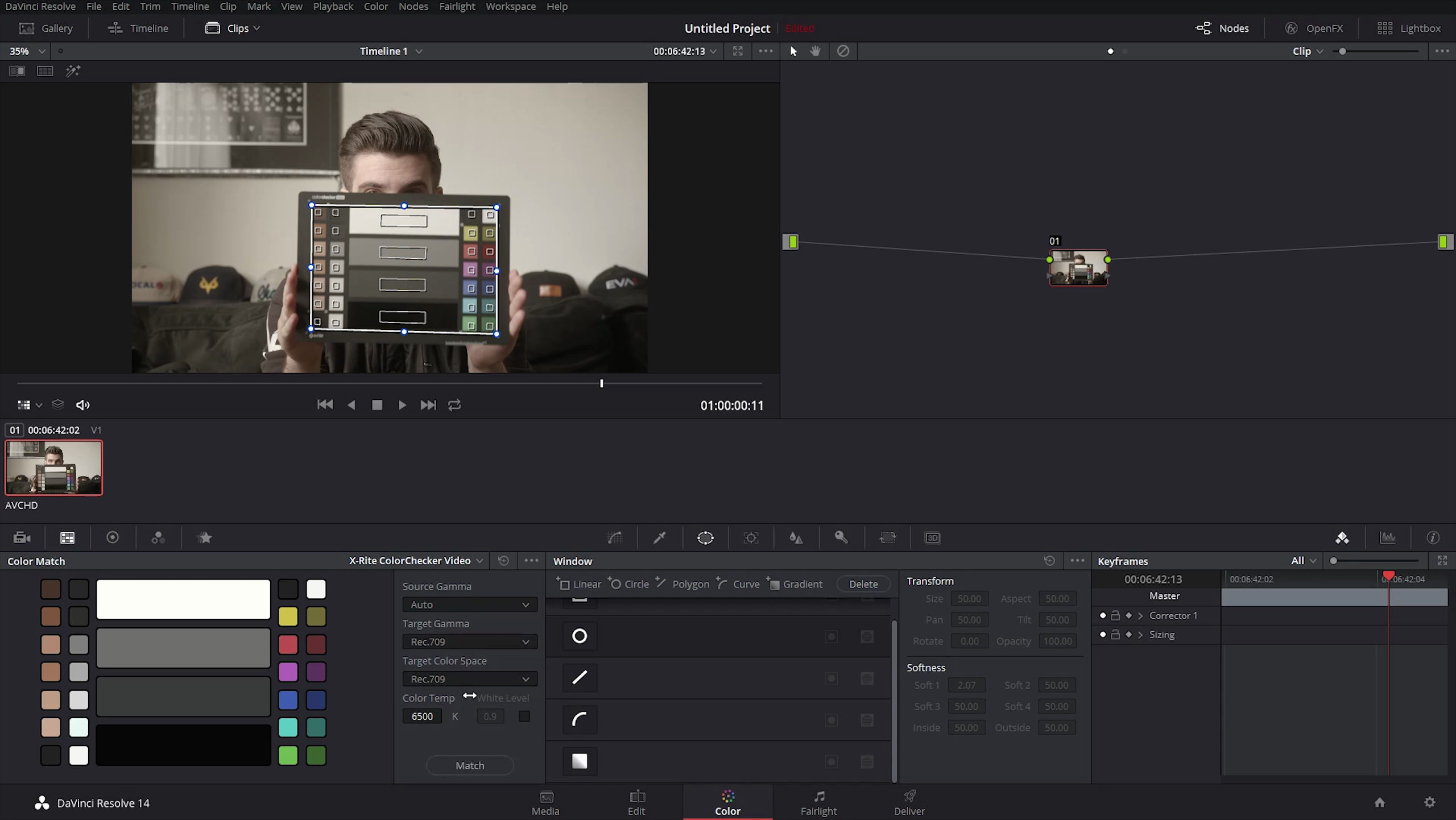
If you’d rather edit in a program that doesn’t support any color charts for automatic correction, you can do the match in DaVinci and export the resulting LUT and loading it into your NLE. I’ve done that plenty of times with Premiere, as it only takes a few seconds. Since DaVinci is free it’s totally worth the download and it’s easier to work with than you think.
Even though you’ve white balanced properly and shot a few seconds of footage with your Colorchecker of choice for every new setup, you can’t yet be sure your final film will be seen as you intended. The reason for that is monitor calibration.
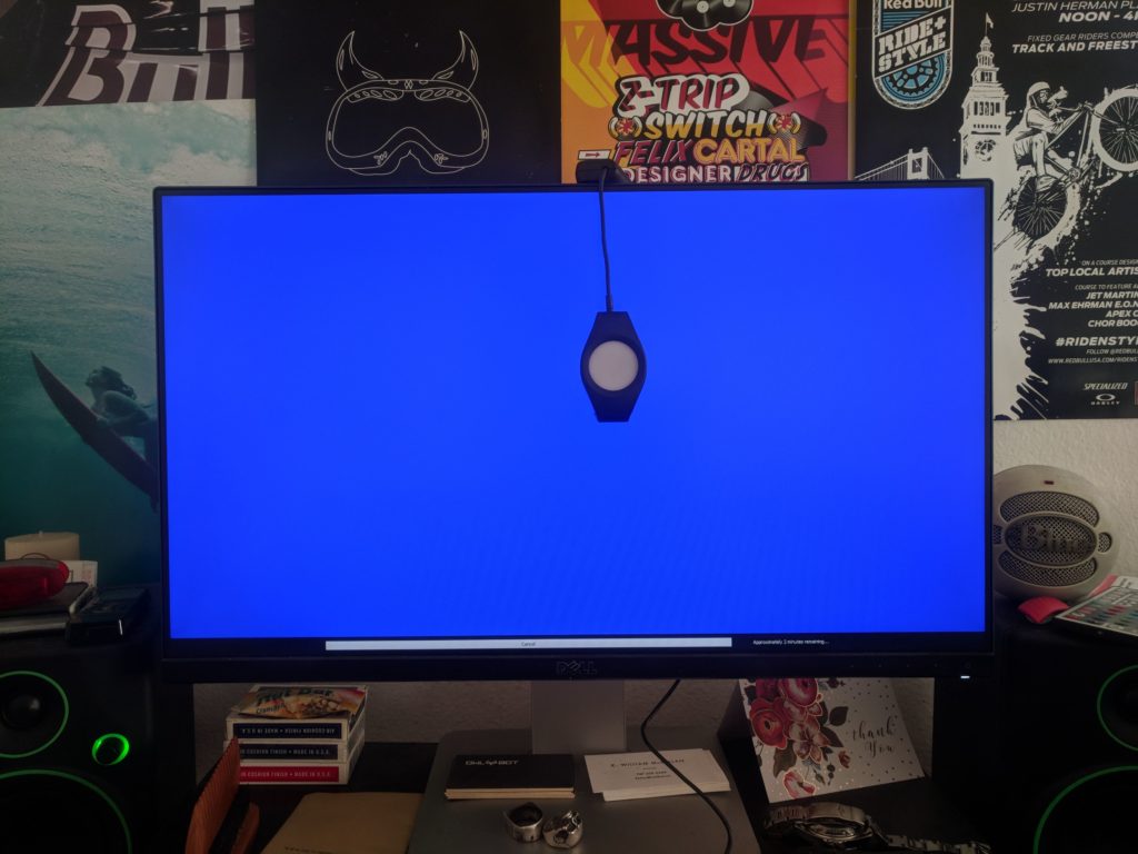
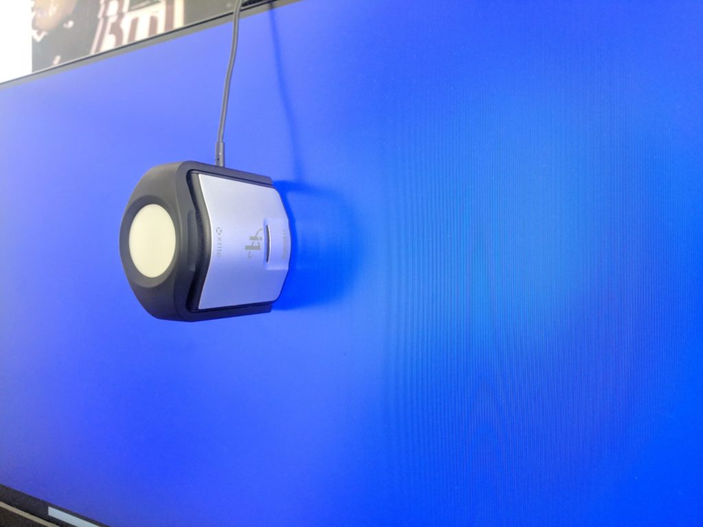
Every display is calibrated differently. Some have a wider gamut than others, some have been around for a long time and have deteriorated, some are just poorly made. While you may have one that’s pretty accurate (my Dell Ultrasharp comes factory calibrated, for instance) it may still be off by a bit, and will definitely drift over time. My secondary monitor is a Samsung television from 2007, and it’s way off. To rectify this situation there are monitor calibration devices (colorimeters) like the i1 Display Pro unit included in the i1 Filmmaker Kit.
Prior to getting the Ultrasharp, the Samsung was my main display and some random Best Buy TV was my secondary. Neither were close to accurate and the Samsung was so far gone, the colorimeter from an arachnid-based competitor to X-Rite barely even came close to fixing it. Once I got the Ultrasharp, the Samsung went to my secondary and I just lived with the fact that it’d never be truly correct. I was interested to see how the i1 Display would rate the Dell and how close it would be able to get the Samsung to it.
Installing the software was simple enough. After a quick restart I booted up the program and took a look. It’s all pretty self-explanatory: you click “calibrate” and select which monitor you want to work on, set what color temp and gamma you want, and let the device do its thing. With my Dell, the “automatic” checkbox worked a treat and the device calibrated everything without my input. As a testament to Dell, the software only made a very slight adjustment from wherever it was sitting straight out of the box, changing almost nothing aside from the gamma. My Samsung, on the other hand, was the recipient of a miracle. It took me a couple of tries but I was able to sort of “zero out” the TV’s settings in the menu to be as neutral as possible allowing the program to do most of the work. It wasn’t automatic, I had to adjust the color balance and brightness on the TV a bit, but it was still pretty quick. Suddenly, my Samsung looks pretty close to the good reference, my Ultrasharp. I cannot overstate how impressed I am by this. I had written that monitor off as un-calibratable for years and here we are. Granted I only tried a few options before I stopped caring, but still. Well done X-Rite.
By making sure you’ve got the correct White Balance in-camera, are shooting a color chart for post, and have calibrated your monitor, you can rest easy knowing that your resulting image will look exactly as it is supposed to when it reaches the viewer. Each step is as important as the other, as leaving one out makes the workflow much less accurate if not meaningless. For instance, if you shoot the color chart and let DaVinci do the corrections for you it may be technically correct but since you can’t perceive what that actually is, all you’re doing is adjusting your image for your specific display and not the viewer’s. For me, prior to using a color-accurate monitor, it was skin tones and underexposure that were always off. I’d do all my color work and without fail, watching it on a laptop or a phone I would see my skin tones going super red and everything was a stop too dark. In the DI everything looked fine, but in reality my monitor was red-deficient (so to speak) and I had to crank them way up just to have them register on my monitor as normal, resulting in sunburnt actors when viewed on anyone else’s displays.
With that in mind I would argue that the i1 Display is the most important thing in the Filmmaker Kit, but the Colorchecker Passport Video is a huge addition as it’s got the white target, the color chart, the white/grey/black card and it all fits in a standard AC pouch without fear of damaging it. The clamshell also makes it easier to avoid touching the swatches, which are relatively sensitive to oils and the like. Like with cameras, the best reference chart is the one you have with you, and there’s no reason to not take the Colorchecker Passport on every shoot. If you’ve got the room, packing in a full-sized Colorchecker Video would make white balancing and your post work a bit easier as the larger size makes it easier to fill your frame. When editing the video below I was shocked at the difference between the CLog footage straight from the camera and the colorbalanced image using the Colorchecker. Trust me when I say you don’t realize how off you are until you see it.

Filmtools
Filmmakers go-to destination for pre-production, production & post production equipment!
Shop Now