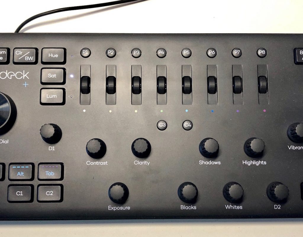
Loupedeck+ is an Indiegogo-funded, button-filled, knob-twisting, plastic-constructed, USB-connecting hardware console that was originally marketed as a photo editing console. It was developed with Adobe Lightroom Classic in mind but as the years have moved on the Loupedeck has now become a photo and VIDEO editing console! How did it achieve this magic when one look at the thing screams Lightroom? Through the magic of software. With software, you can adapt anything to anything.
Loupedeck joins a crowded field of hardware products that are designed to make life easier for many given computing tasks. We’ve reviewed many of these products on the Editblog. The Sensel Morph adapts to many different things. The Logitech Craft keyboard can work with anything really. Ripples, Waves, Elements and MC Colors can help with color grading.
How does Loupedeck fit into this crowded field? In its own way. Since we’re focused on video post-production here at the Editblog then we will focus on the recently added Adobe Premiere Pro integration. That is what prompted me to reach out to Loupedeck’s creators for a review unit.
Trying to fit a square peg into a squircle hole
Take a look at the surface of the currently shipping $249 Loupedeck+.
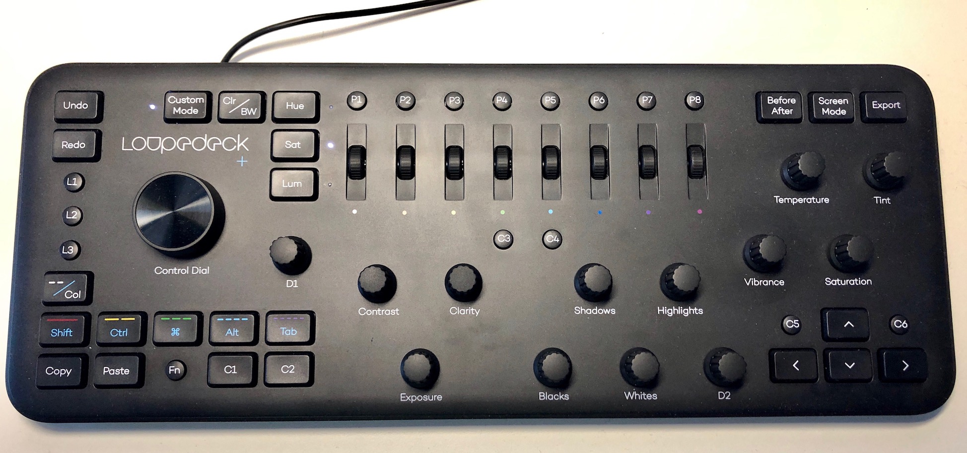
The Loupedeck+ is the second generation of the hardware and while you can currently buy the original Loupedeck it’s the + that added video functionality. Here’s the bullet-point list from the Loupedeck video editing capabilities webpage:
- Faster and more intuitive video editing and color correction. All basic tools for color grading are simply labeled on the console
- Total flexibility with Premiere Pro CC, allowing editors to make their own configurations to fit their workflow
- Ability to export/import editors’ personal Loupedeck configuration setups and easily transfer them to another computer
- Lumetri Color workspace compatibility for color grading
- Ability to toggle between your favorite LUTs, serving as a significant time saver
- Flexible timeline navigation, content trimming, and clip adjustment
- Option to customize console buttons to preferred Adobe Premiere shortcut demands or use preinstalled functions
All the above is true. Rather than beat around the bush on the pluses and minuses of the Loupedeck with Adobe Premiere Pro I’ll get right to the biggest point: you have to spend a lot of time memorizing the settings, looking at the documentation and just learning how you can really use the Loupedeck with PPro. That’s the short of it. There are so many buttons and knobs (most with multiple functions) that it’s going to take time to really dig deep into all that the Loupedeck can do with Premiere. And since this was designed as a photo editing device you can see the developers trying to take that peg and put it into a hole that it wasn’t really designed to fit in. That doesn’t mean it won’t work as you can often get a differently sized peg shoved into a wrong sized hole. It’s just not very elegant.
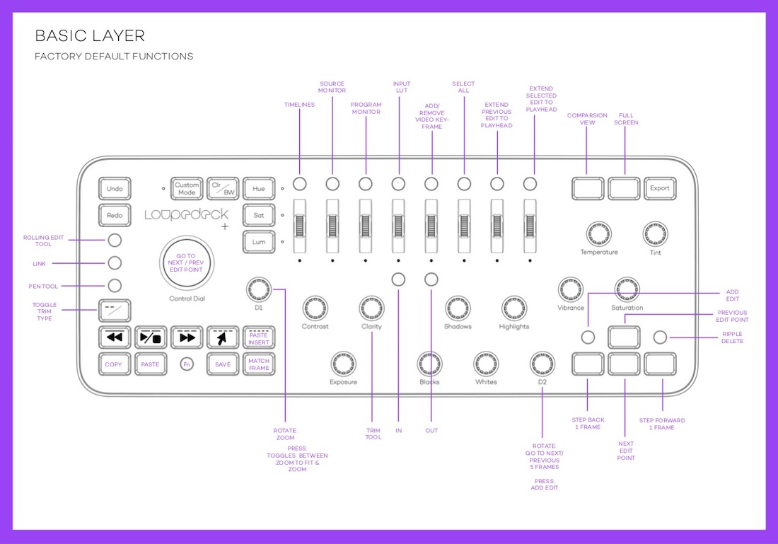
If you attempted to use the Loupedeck without any reading of the manual the basic layer (meaning the default function of the keys without any modifiers) keys would do mostly what they are labeled as. Since Lumetri seems to adhere closely to the Lightroom paradigm most of the dials have a 1:1 relationship. For that, it’s really fast and very nice to work with. If most of your Lumetri work is concentrated in the Basic Correction and Creative tabs of the Lumetri panel you’ll really like the Loupedeck.
For a good example of how a user will have to study the functions of Loupedeck lets look at how it works with Color Wheels.
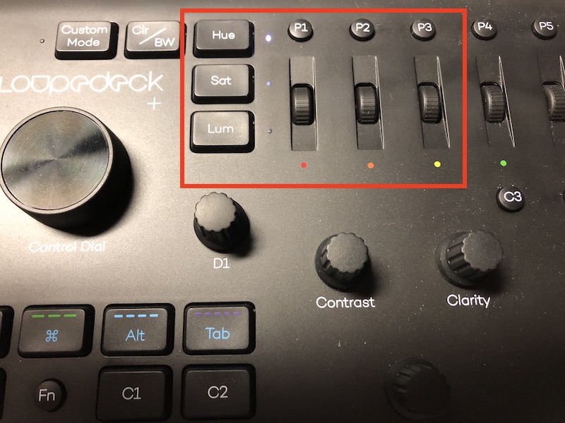
Here is how that is explained in the manual:

These scrolls aren’t near as intuitive as trackballs to control color wheels. In fact, it’s downright clunky but the developers do get an E for effort. The Loupedeck has the controls so why not try and adapt Lumetri where you can.
Holding down the Fn (Function) key you can get another level of functionality out of the device. There are four different levels making for hundreds of combinations but more on that later.
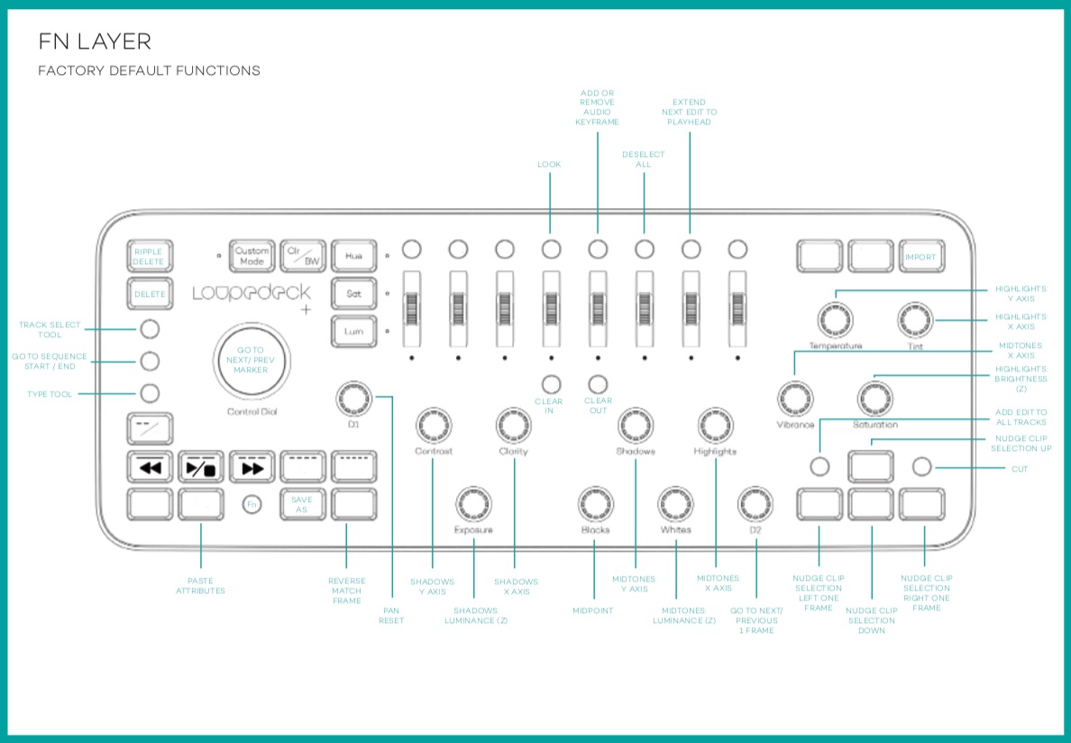
Looking at the FN layer you can see many of the dials are also used to control the Color Wheels. Exposure controls SHADOWS: LUMINANCE (Z) which is the Shadows slider and Whites controls the MIDTONES: LUMINANCE (Z) which is the Midtones slider. Know what the Blacks knob controls that is right between the Exposure and Whites knob? The Vignette midpoint. Why not put all the Color Wheels sliders right together? And strangely enough, there is no default knob to control the Vignette amount.
To make things more confusing, in the FN layer both the Highlights and Vibrance knobs control the same thing: MIDTONES X AXIS. I can’t figure that one out.
So that’s two places to control Color Wheels. Not a bad thing but not something you’d ever really just discover by farting around with the thing. Compare using knobs, dials and buttons to control Color Wheels to the three trackballs in a Tangent devivce and you can see … peg – hole.
Another example of somewhat confusing mappings for video is the ability to change PPro track heights, something that is very nice to do via a dial.
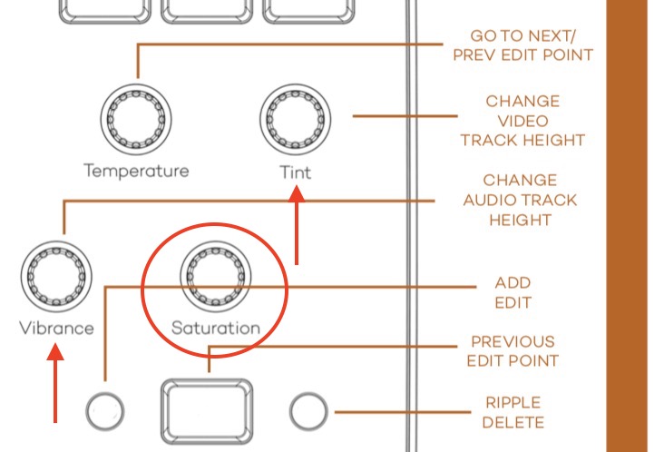
In CUSTOM MODE the change audio track height (Vibrance knob) and change video track height (tint knob) knobs aren’t placed together. Why not? Sitting next to the Vibrance knob is an unused Saturation knob. That seems like the obvious choice.
To note something they got right the D1 knob zooms the timeline in and out when working in the timeline.
Thankfully the controls in the Loupedeck can be customized in settings.
The controls for the Loupedeck+ run deep.
The software is very customizable. Very.
Much of the conversation above sounds like I’m being quite negative about the Loupedeck Adobe Premiere Pro integration. I’m not meaning to be as it’s a cool piece of hardware, you just have to take time to learn the complexities. Talking about the complexity of the Loupedeck is a direct result of the controller software.
There are 4 “layers” to the software that allows for hundreds of controls.
- BASIC LAYER
- FN LAYER
- CUSTOM MODE LAYER
- CUSTOM MODE WITH FN LAYER
This is the description of these four different modes right from the manual:
Loupedeck+ also has a “Custom Mode” which can be activated by pressing the “Custom Mode” button (LED will be lit when Custom Mode is activated). This will open all the dials for extra customization as a third layer. When “Custom Mode” is enabled by pressing FN, you will have an alternative “Custom Mode” with FN, which makes four different layers of possibilities to master Premiere Pro!
Whew.
I could put up a screenshot of each of these layers (I’ve got two of them above already) and how the default controls work in Adobe Premiere Pro but if you’re seriously considering the purchase of a Loupedeck for use with Premiere then I would highly, highly encourage you to give the Loupedeck Adobe Premiere Pro CC user guide a review (pdf link). In fact don’t just review it, study it. Dig into it. Of course, it’s no fun to RTFM but you really should know what you’re getting yourself into if you’re going to spend $250 on a Loupedeck. In fact, download the Loupedeck software, install it and give that a look too. You’ll get a good idea of the depth.
Also from the Loupedeck manual:
By starting to use Loupedeck+ in steps you will experience a fast and more efficient learning curve!
Boy howdy are they ever right. These controls run deep.
Hundreds, perhaps thousands of possible options arise when it comes to customization. Is that good or bad?
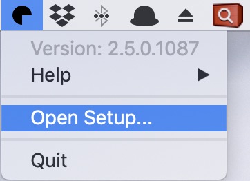
This little pie shape lives in your menubar and is where you access the Loupedeck settings.
It’s once you dig in you’ll see how deep the settings go. Different controls are grouped into different sets. Click on one and you’ll access controls for all of those in the set.
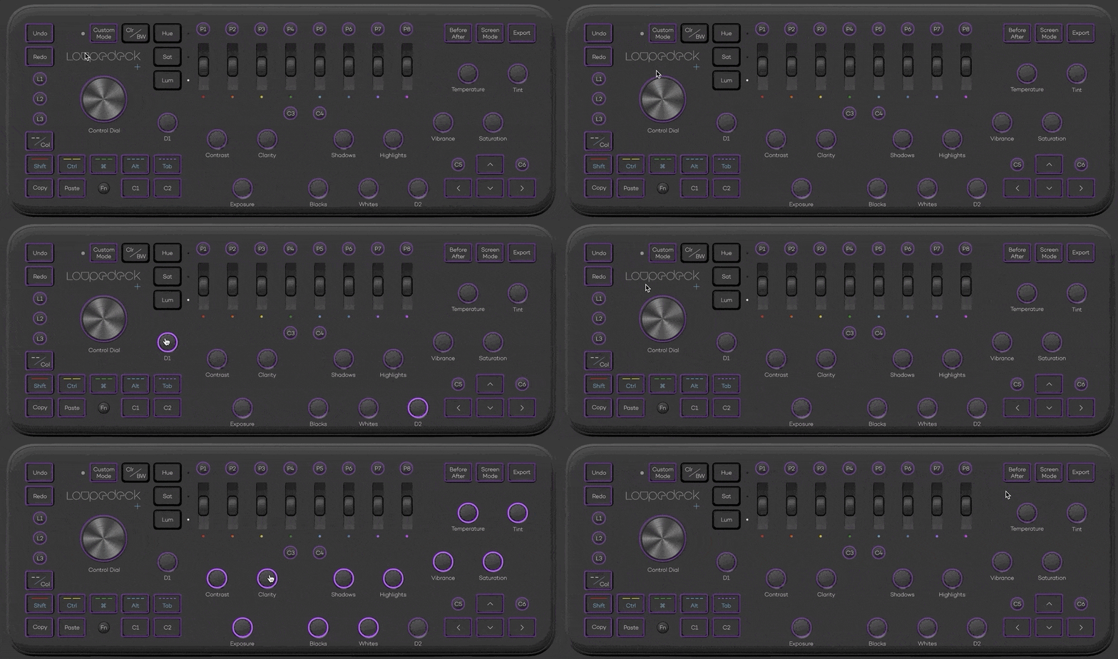
Once you click on a button and want to change it you’ll have to dig into those custom controls. That’s where things go … deep. There are a lot of options.
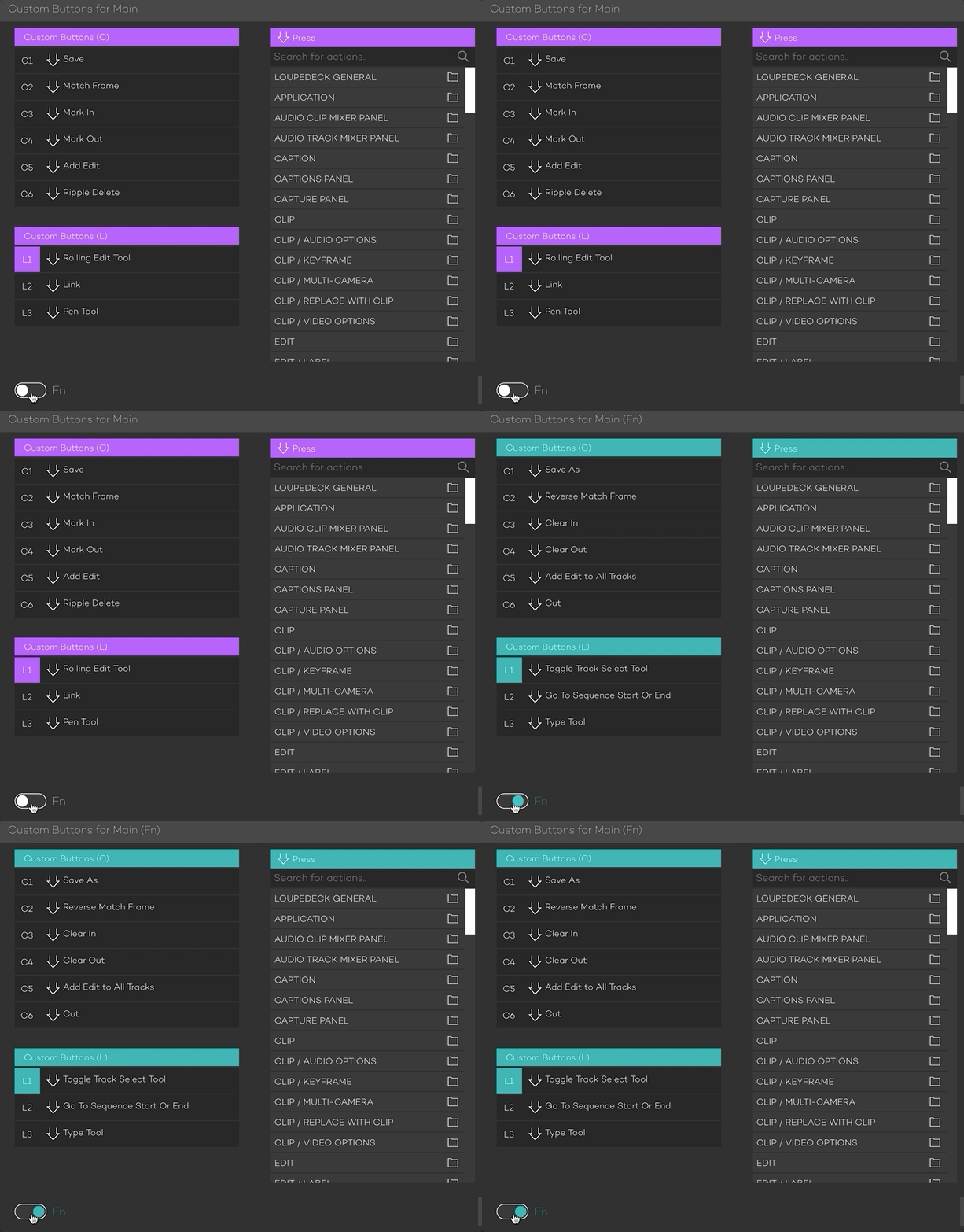
In the above image, you can see the interface for customizing the C buttons and the L buttons as well as the basic function and then the secondary Function level of those buttons. They don’t have a third and fourth level of functionality via the Custom Mode.
Under the Press column on the right, you’ll see many, many functions of Adobe Premiere Pro. Everything from keypresses to keyframing to different panels to tools to markers to … well … what seems to be most everything Premiere will do. That’s what makes the Loupedeck such a deep tool. Most everything is mappable to the many, many keys. Think about how much stuff PPro can do. That’s a lot of customization.
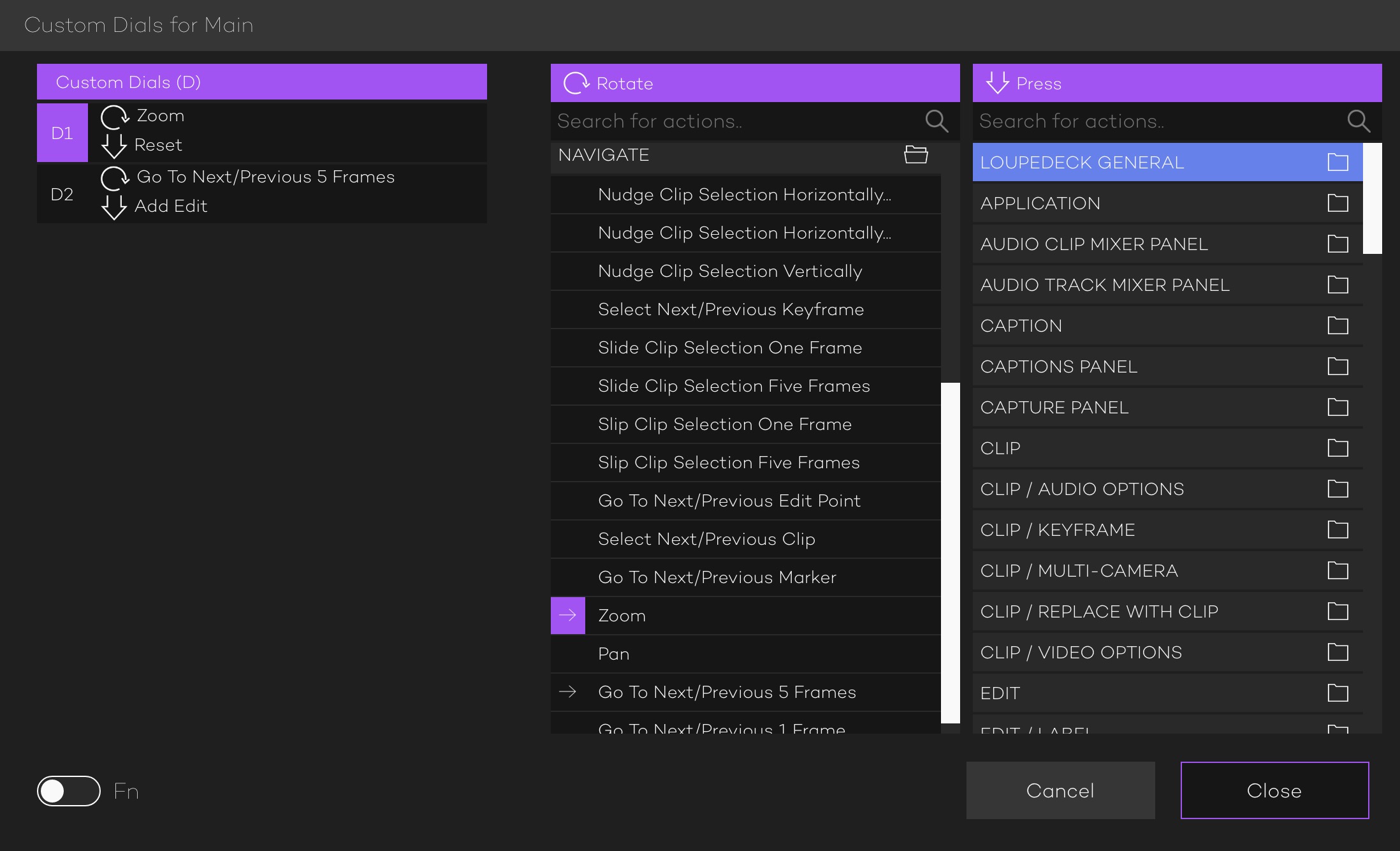
In this next image above you can see the controls for the D dials. It’s set to do what I think is one of the best things a hardware dial can do outside of Lumetri color work: zoom the timeline in and out and maybe other zooming things around the interface. You can tell it will do this but looking under the Rotate column and seeing the purple right arrow highlight by the Zoom command, under the NAVIGATE category. The unhighlighted arrow by the Go To Next/Previous 5 Frames is for the D2 knob.
Where these settings once again get tricky is when you look at the Press for the D1 knob as all the knobs can be pressed which in the Lumetri color controls resets them to zero, as expected.
When I press the D1 knob in the timeline the timeline zooms out with Premiere’s Zoom to Sequence behavior. This is great and what I would want. But searching under the Press column on the right I can’t find where that Reset press is mapped.
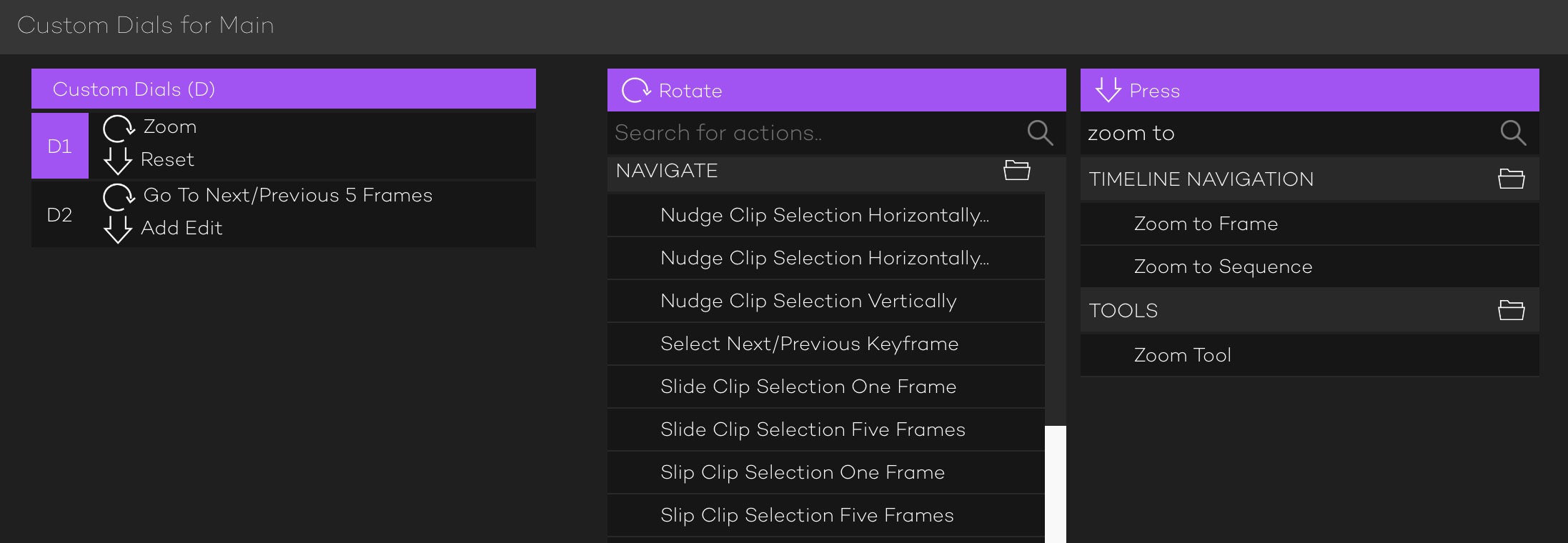
Looking at the image above there is no arrow indicating the press is mapped to Zoom to Sequence. Nor can I find an arrow for a Reset. In fact scrolling around the hundreds of different options in the settings, I couldn’t find anything in that D1 Press column that has an arrow next to it.
It does what I’d want it to do so I guess that’s okay.
But that’s what I mean about the level of depth for the controls of the Loupedeck+. There are so many commands that can be mapped to so many buttons that are non-standard for video editing that the results can be overwhelming. Is this a bad thing that makes the Loupedeck/Adobe Premiere Pro marriage bad? Not at all. You just need to be aware of what you’re getting into if you’re going to spend the money.
The controls run deep.
Also, use Lightroom? Get out your checkbook.
Talk about the Loupedeck in a video editing vacuum negates one of its most important functions: working with Adobe Lightroom Classic. If you’re also a photographer in the Lightroom universe then suddenly the Loupedeck becomes a lot more usable. While you’re grabbing that PDF manual of the PPro integration get the main Lightroom manual as well. Like Premiere, there are tons of controls for Lightroom and the only way to really get to know it outside of hands-on time with the hardware is to study that manual.
I first tried using the Loupedeck with Adobe Premiere Pro but was quickly overwhelmed by how much it could do. After taking a step back I spent a lot of time with it in Lightroom Classic and was able to develop a feel for the Loupedeck and how many controls it has. While I was nowhere near having all the Lightroom controls memorized that second time I tried to use the Loupedeck with Premiere it was a lot more successful as I knew my way around it much better. I would open the PPro PDF manual on my iPad (or my second editing display) and leave it up while I worked. This helped to find the controls and keep them in my head.
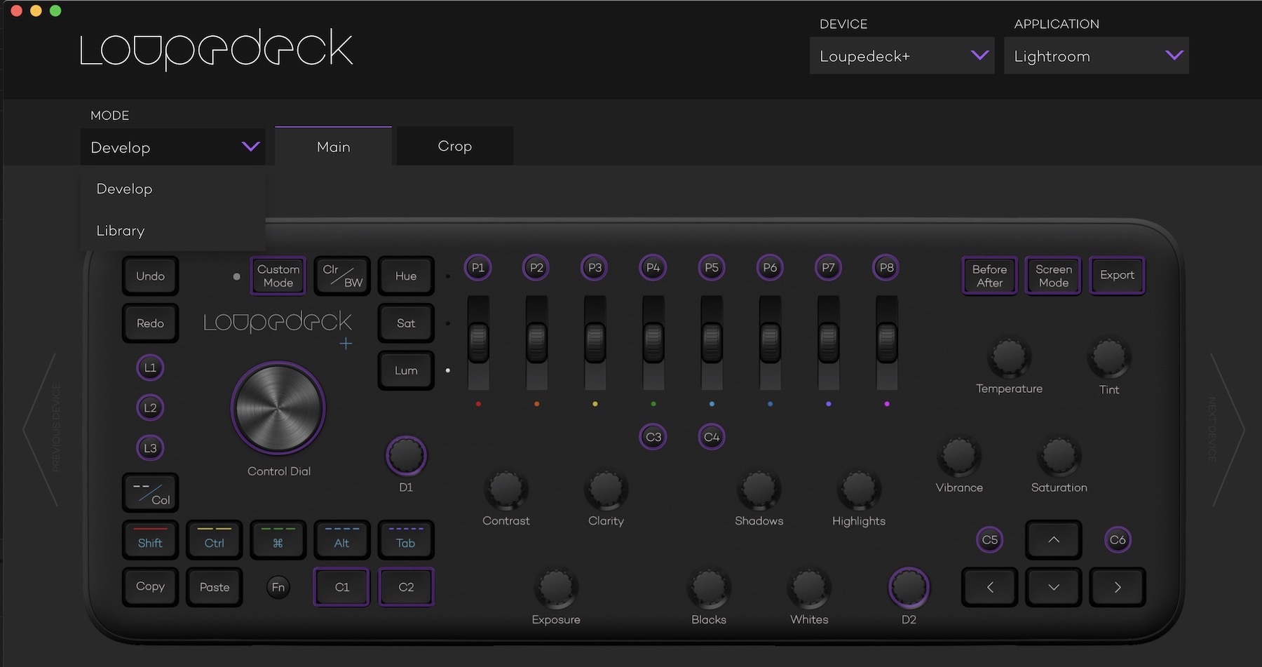
While I’ve by no means memorized all the PPro controls and totally mastered the Loupedeck with Adobe Premiere Pro it’s much more useful now than the first attempt to use it with Premiere. Because … the controls run deep.
More software can be used with the Loupedeck and I’m guessing more to come.
It’s not only Lightroom and Premiere that gets the Loupedeck love.
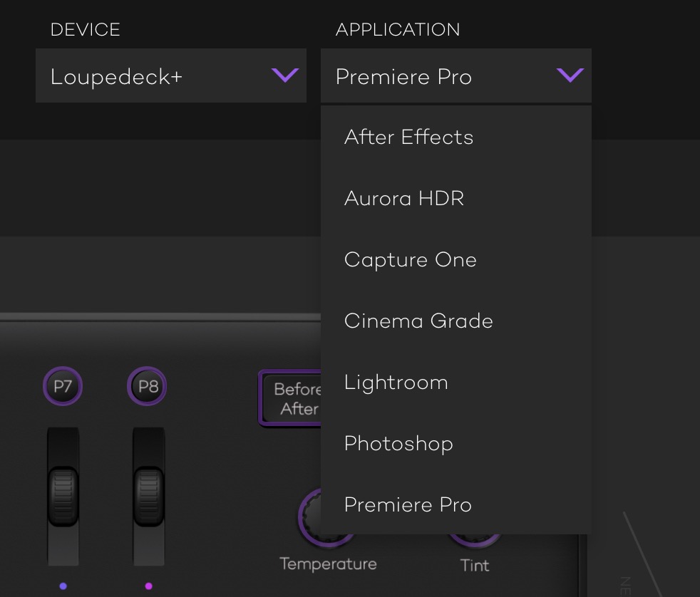
While obviously geared toward image applications the editing integration in Adobe Premiere Pro beyond Lumetri shows the developers can and will adapt the Loupedeck to a lot of different things.
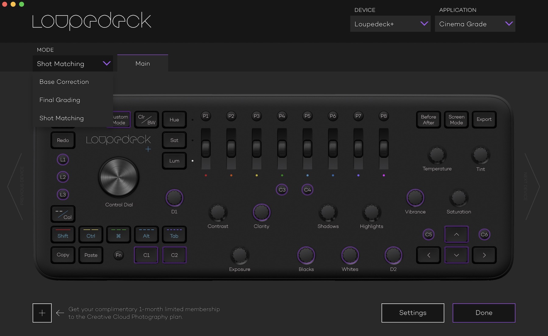 While Cinema Grade is more of a mouse-based color grading tool you can see how the Loupedeck integration only uses some of the controls (Read my Cinema Grade review here). Since Cinema Grade has different “rooms” they can each have their own controls which are seen in the MODE pop-up.
These controls run deep.
Buying advice for the end Adobe Premiere Pro user
I’ll repeat what I said above. Download the Loupedeck Premiere PDF manual and study it. Study it well. Think about what all the developers are trying to fit in when they are adopting this piece of photography hardware to a video world.
Download and install the Loupedeck software. That will give you a level of detail a bit beyond what the printed manual will show.
Selling advice for Loupedeck developers
Several years ago I did a review of the Contour Rollermouse. It was a very different and quite expensive piece of hardware to replace your mouse. Contour Design still offers a 30-day trial money back guarantee for the Rollermouse as well as some other products. I thought this was a great thing so one could take the hardware for a spin without risk.
When asking video editors to use a product that wasn’t really designed for video editing for video editing, no risk is a big plus. Loupedeck doesn’t have anything similar to Contour Design’s 30-day trial and looking at their sales and refund page this might not be easy since they are located in the EU. But if possible I would encourage Loupedeck to come up with some kind of trial for video customers. I doubt this is possible for a variety of reasons but it’s worth a thought.
Right at this moment I am more excited about editing than I have possibly ever been in my life! Can't wait to test out my new Loupedeck. Thanks @loupedeck pic.twitter.com/ydtMYbAV7R
— Fallon Photography (@fallonphotog) January 8, 2019
This tweet above is the proper enthusiasm a photographer and Lightroom Classic user should feel when unboxing the Loupedeck+. Video editors might want to have a bit more skepticism.
Wrap-up
I guess if you really wanted to learn the Loupedeck as deep as possible you could create some small adhesive labels to place above some of the knobs and buttons. At the very least I’d print out the 4 different mappings and have them ready to reference.
I love using Loupedeck with Premiere. I just had to ignore all of the absurd editing functions, reprogram nearly all the color correction controls, re-label over half of the buttons & knobs, and tape over the dead controls that Premiere doesn’t support. Yup! It’s just that easy! pic.twitter.com/ITS2tYwAoH
— Taz Goldstein (@TazGoldstein) May 3, 2019
I wish that the software customization was a bit more intuitive where clicking on a control would let the user change the function more in context of the button as opposed to these long vertical menus that have folders full of commands. You could spend hours clicking around in them to discover what all the different possible options are. While the software is very powerful the user interaction with it needs some refinement.
This all comes back to how much time the user might be willing to dig into the Loupedeck and learn what it will do. The more you’re willing to study the more you’ll get out of it. Just looking at the Premiere PDF documentation there are nine pages of button explanations at the end.
But since this is an Adobe Premiere Pro based review I’ll close with this: The Loupedeck+’s integration with the Lumetri Color panel is easy to understand, fun to use and will definitely speed up your color work if you’re a big user of the Basic Correction tab. For everything else in PPro, the Loupedeck might speed up your work if you’re willing to really study the thing. I think most editors won’t be willing to put in that much time and effort when you’ve got the keyboard right in front of you.
I rarely call out another review of the same product in one of my reviews but I am compelled to in this case because of a line in Videomaker’s Loupedeck review. They say this: “You could use the Loupedeck + instead of a keyboard and potentially edit faster with more precision.” That is wrong on so many levels. No editor of any advanced skill level would ever replace the keyboard entirely with a Loupedeck for video editing as it certainly would not be more precise. It can supplement the keyboard in a nice way, just not replace it. But I guess if you want another opinion of the Loupedeck you can read that review too.
Pros:
Knobs on the Loupedeck that match many of the sliders in the Lumetri Color panel.
The developers have worked hard to make it work with Premiere as well as other applications.
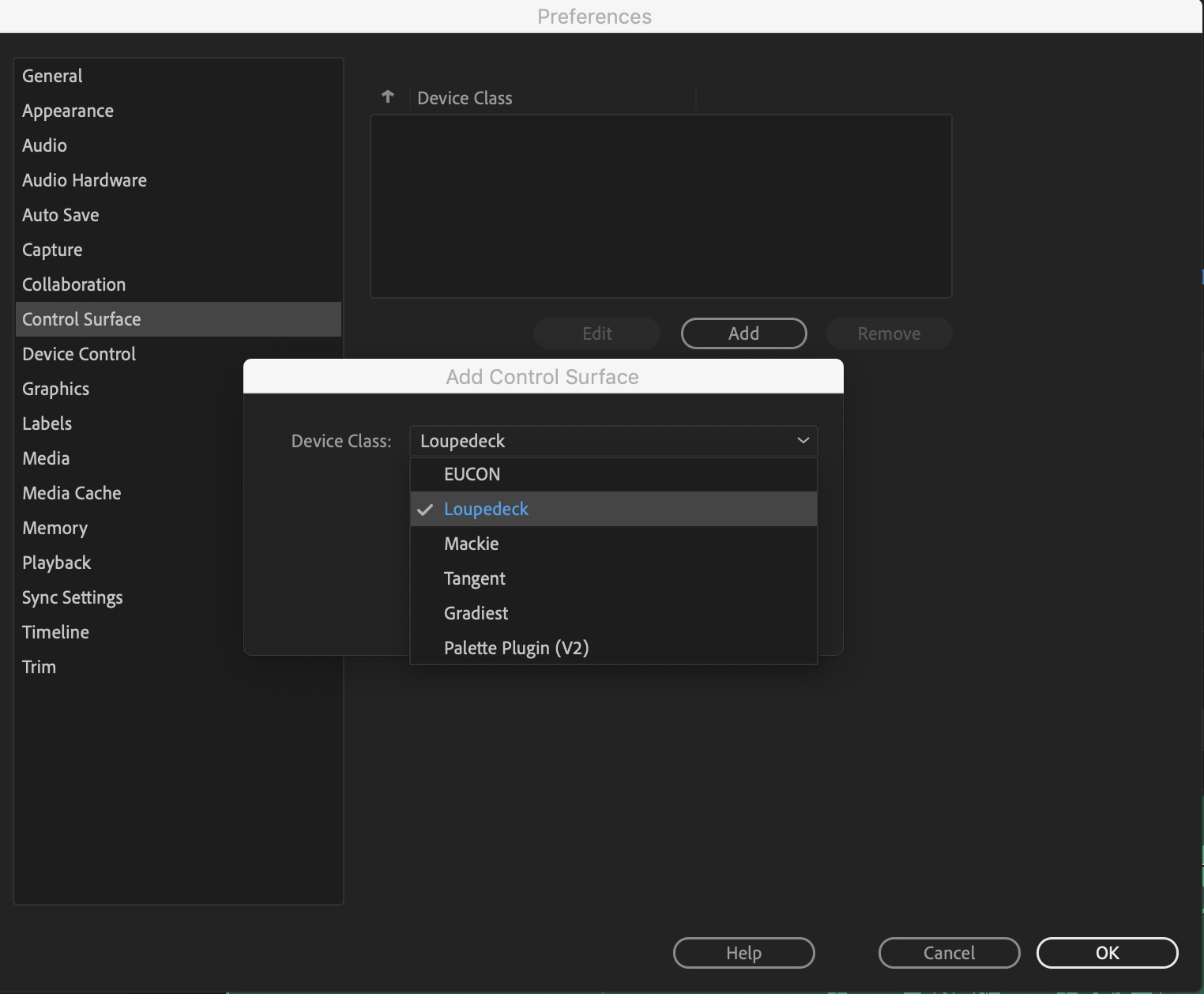
The hooks into Adobe Premiere Pro via the Control Surface preference make the controls very responsive.
Editors who also use Lightroom will get twice as much (if not way more) out of the Loupedeck as will Premiere only users.
Cons:
Some of the default control placements don’t make a lot of sense. For example, in CUSTOM MODE LAYER the SLIP clip selection five frames and the SLIDE clip selection five frames should be on adjacent knobs since they are complementary trim functions.
Can a piece of hardware try to do too much?
Cautions:
You should probably start with the Default keyboard shortcuts in Adobe Premiere Pro to get the most out of the Loupedeck because if you’ve mapped some of the functions away from the default keys some of those functions might not work right.
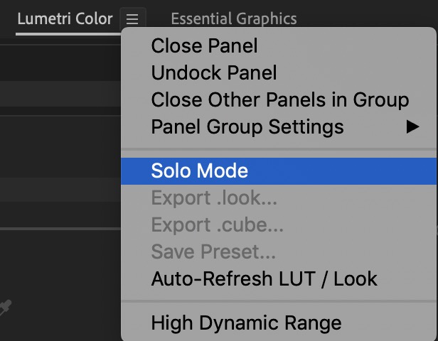
The Loupedeck can’t open tabs in the Lumetri panel so uncheck the Solo Mode so you can open multiple tabs that the Loupedeck uses.
It’s a valiant attempt to control the Lumetri Color Wheels with knobs and dials but it’s no replacement for trackballs on a traditional color grading control surface. But editors who spend a lot more time in the Basic Correction, Creative and Curves tabs of the Lumetri Color panel (and not the Color Wheels) might get better use overall out of the Loupedeck than something like a more traditional Tangent panel.
Did I mention the Loupedeck+’s controls run deep?
SYSTEM REQUIREMENTS
Adobe Lightroom 6, Adobe Lightroom Classic CC 7.4 or later, Adobe Photoshop CC, Skylum Aurora HDR, Beta integration with Capture One.
Adobe Premiere Pro CC
Adobe After Effects CC
Windows® 10, Windows® 8.1, Windows® 7 Mac® OS 10.12 or later version.
Internet connection needed for Loupedeck ™ software download.
USB 2.0 A
39,5 x 15 x 4 cm; 0,67kg
Okay, one more … I found this video review on YouTube and since I spent so much time on the depth of the controls and only casually mentioned the Lumetri integration I feel like I need to reinforce how nice that integration is. While I don’t agree with everything there’s some good info in here about using the Loupedeck with what it does best: running the Lumetri panel.
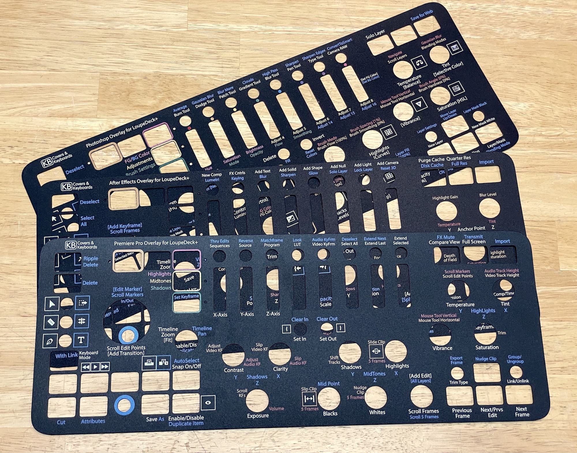
UPDATE 11/18/2020: You can now buy custom cut overlays for Premiere, After Effects and Photoshop that makes the Loupedeck + much, much more usable for video editing.
Filmtools
Filmmakers go-to destination for pre-production, production & post production equipment!
Shop Now