At 12 years old I knew I wanted to look through cameras for a living. Thanks to Youtube, I’ve been able to take a look back at what I was picking up on as a very, very young DP. It surprises me that I saw so much so early.
When asked their inspiration for becoming cinematographers a lot of people my age will run off a list of classic movies: 2001: A Space Odyssey, The Grapes of Wrath, Lawrence of Arabia, Ben Hur. My motivation came strictly out of television. Two shows—a science fiction show for children and an existential series for adults that explored the nature of the individual in modern society—were my dual inspirations.
I’m speaking, of course, of Space: 1999 and The Prisoner.
First, though, let’s look at the baseline of television quality circa 1977. Here’s a clip from a very popular series at the time, The Rockford Files.
https://www.youtube.com/watch?v=lIlW9jlElg8
This is what television looked like in the 1970s. It wasn’t high art, not at all. The series started off looking a lot rougher than this; by this time in its run it is a bit more polished. The scene starts out simply…
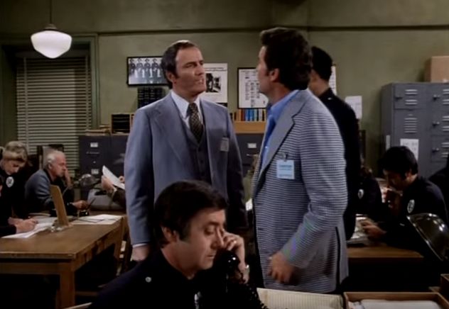
…and continues simply.
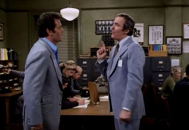
This is what is known in the industry as a “50/50” shot. We’re at 90 degrees to the characters and they are facing each other. It’s not terribly inspiring stuff. This is also known as a “master” shot as it covers the entire action as a standby in case the closeups don’t work. Speaking of closeups…
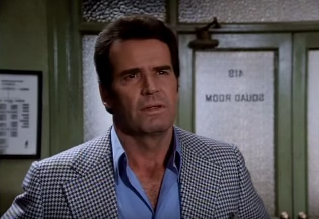

Riveting stuff. If it weren’t for the performances this would be pretty dull. The scene bounces between these, the master…
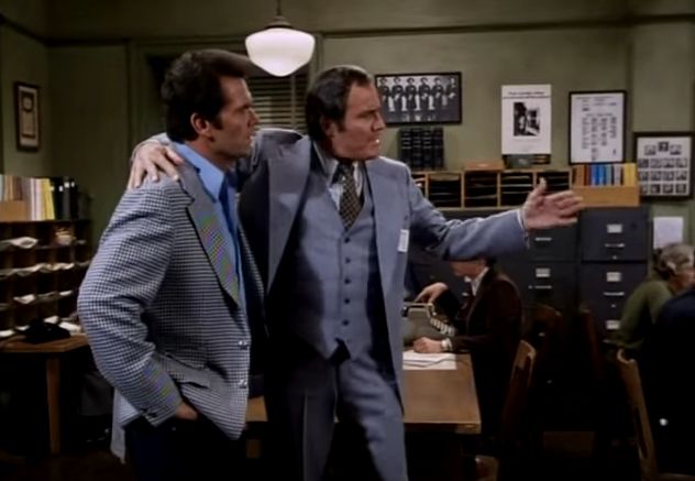
…and one other shot.
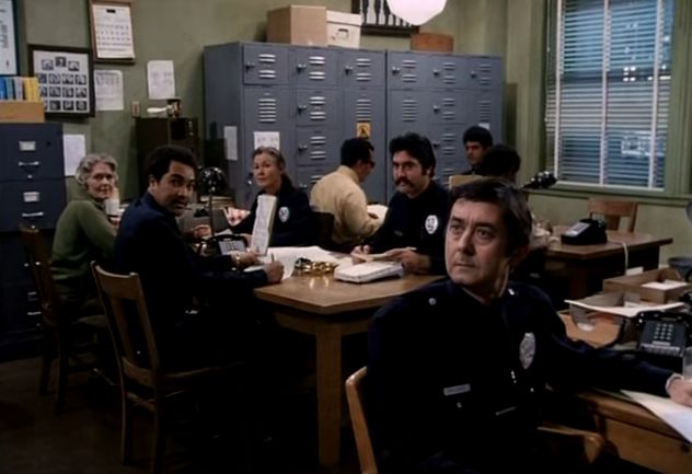
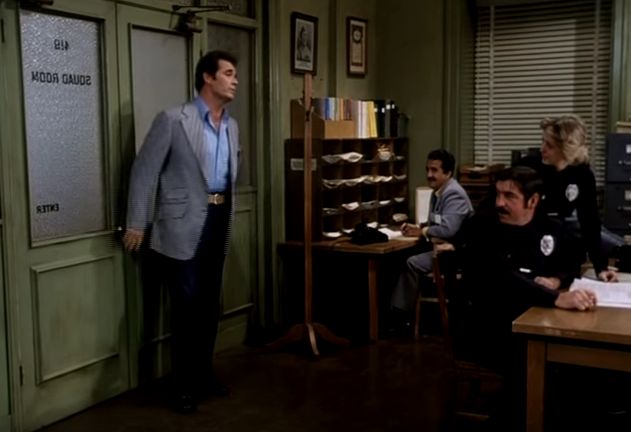
Then Rockford leaves.
One of my last jobs as a camera assistant was on “B” camera for a one hour episodic show that shot a 48-minute episode every five days. The DP ran a very pleasant and fun set, and I really enjoyed my time on that show, but we weren’t creating high art. She made her name in the factory era of television production, and it was interesting to see the techniques behind this kind of work. In her case, she had a formula: 40fc key, 20fc fill and 50fc backlight, with a fresnel aimed at the talent from any direction they looked for a significant amount of time.
Her job was to make the trains run on time, and she did. (One day we finished in ten hours, which is nuts for a TV show.) TV in the 1970s and 80s had a certain look, and that look said “We’re cranking this out as fast as we can.” I came in on the tail end of that era (I worked on her show in the early 90s) and it was interesting to see how this style came about.
When I stumbled across Space: 1999 at 12 years of age, I was awestruck. It was a science fiction show, so as a 12-year-old boy I was immediately hooked, but the blocking, editing and camera moves were beyond anything I’d seen before. The first two minutes of this episode should give us a place to start the discussion. I suspect you’ll notice the stylistic differences immediately, in spite of the fact that this was on TV during the exact same period as The Rockford Files. (You can stop at the opening titles.)
https://youtu.be/8Gpoc4NTWuI?list=PLP094AJQsW6dqRuXjwVbRL-7FOKp2F3Ic
It’s cheesy, sure, but for me it’s crazy cheesy nostalgia. More than that, though, it’s interesting to see what I was responding to. I think it’s clear from the first shot that there’s something different going on.
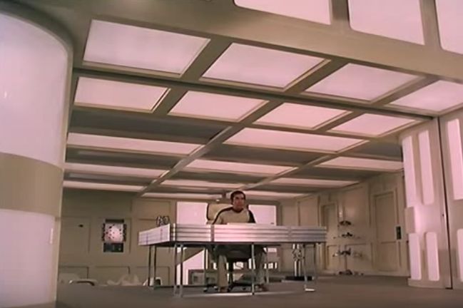
Trust me, you didn’t see a lot of shots like that on TV in the late 1970s. Even as a kid I knew something was up. Whereas U.S. TV was strictly factory driven, there was something very different going on in shows from the U.K. (where this was made). This depth and forced perspective was completely unlike anything I saw on U.S. television at the time.
This is what I think I see in this image:
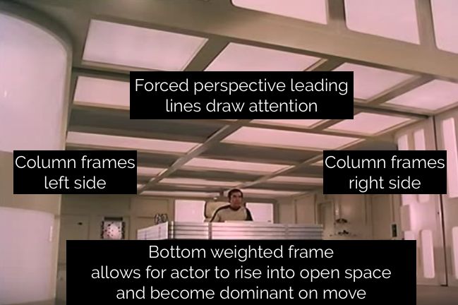
Your results may vary, but I see the actor framed left and right by strong vertical elements, with a leading lines on the ceiling converging just behind him. The lines converging to the left of the actor draw my eye through him, which is much more interesting than if they ended directly behind him.
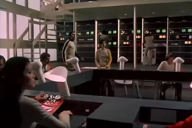
Once again, lots of depth and perspective here. I love that there’s a foreground, a midground and a background. I also like that this single shot takes one character all the way from one side of the set to another.
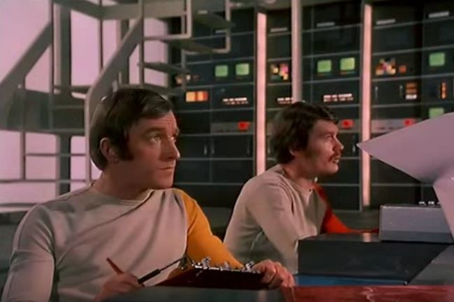
What I think I see:
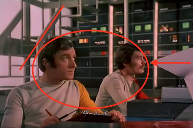
That staircase works really well as a framing element, as we’ll see in further shots. Here it frames the left side of shot, with the lamp framing the right, and together they direct our attention back to these two characters. The wide-ish lens adds a bit of depth to this shot. (The 1970s saw a lot of wide angle lens compositions. I miss those.)
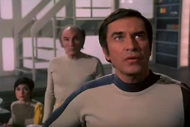
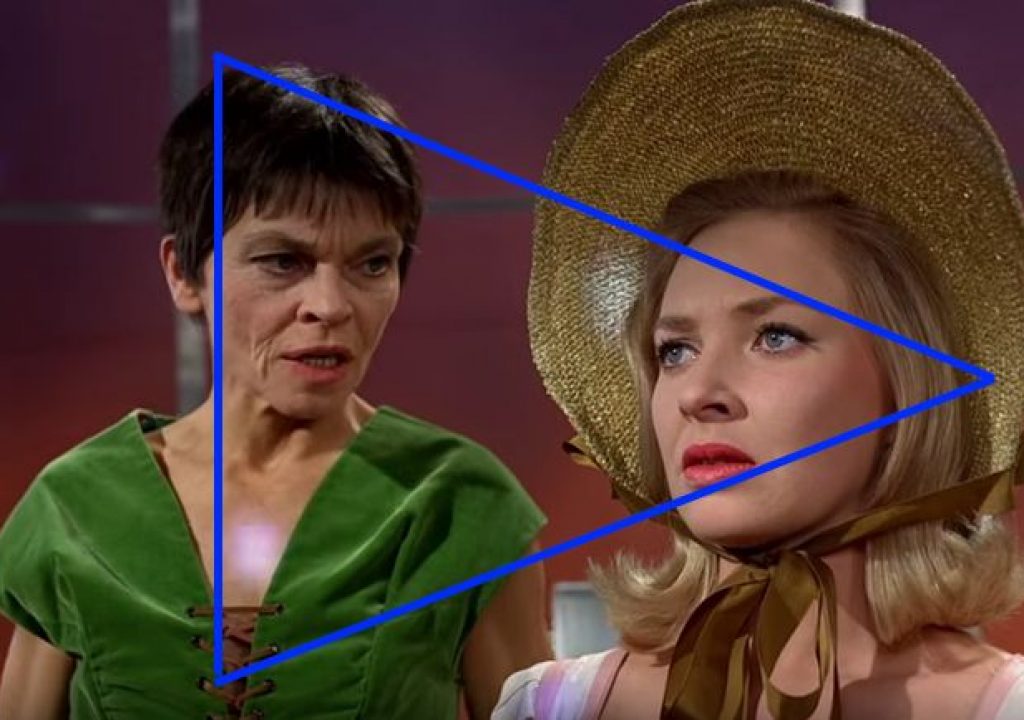
What I think I see:
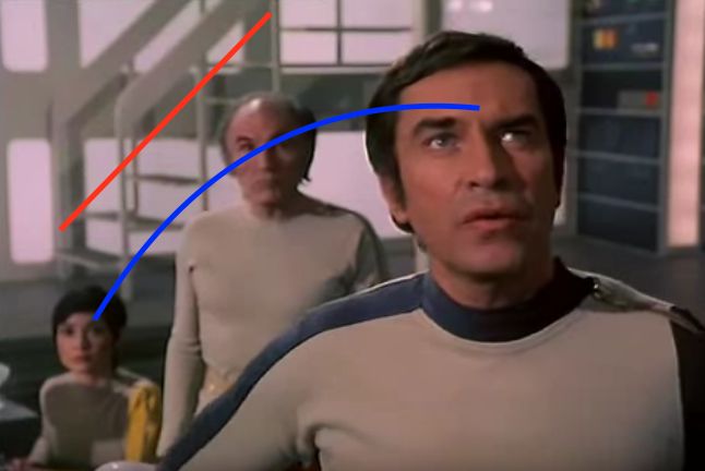
The three heads form a triangle of sorts. Triangles are one of the stronger compositional shapes (along with circles and S-curves). Note how all three heads are different sizes, giving us different depth cues. My eye bounces between the woman at the back and the man in the foreground, following a line drawn through all three heads. The staircase in the background helps as well, lending weight to that invisible line by following it for a bit.
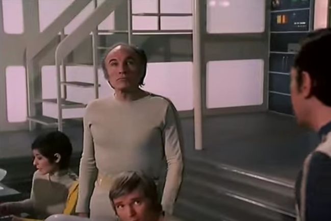
I loved rack focus shots as a kid. It’s a very 70s thing, but I literally sat up close to the TV and watched for them. Focus racks are a great way to communicate depth in a 2D medium.
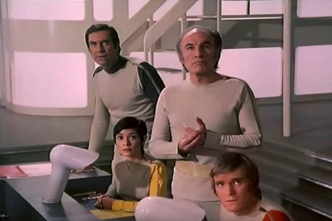
This is a continuation of the previous shot, although with cutaways it may not immediately appear to be. What’s interesting is that this is a master shot of sorts, but… the previous wide shot could have been a master as well, and in U.S. television it might have been. It would have been boring to play the scene through entirely in that one shot, but it would have worked. This combination of master shots is much more graphically interesting and well thought out.
This shot…
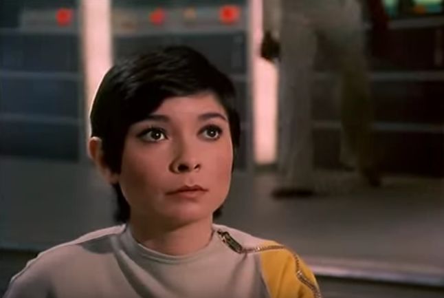
…tilts up and transitions into this shot:
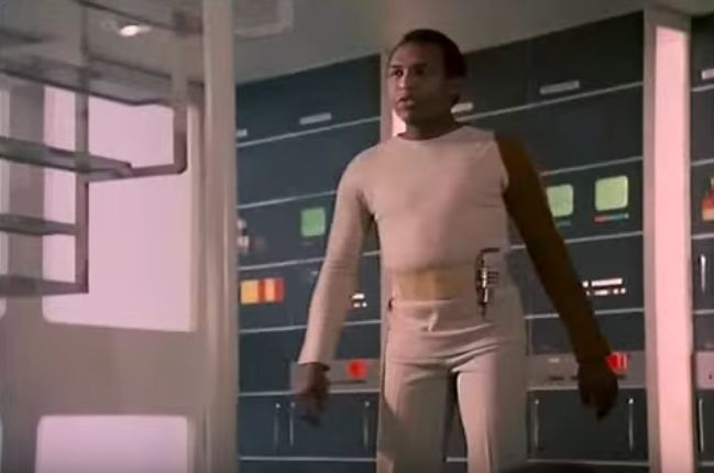
There’s no reason this shot couldn’t have stayed on this guy the entire time… but isn’t it more interesting to start on someone in the foreground and transition to another character as they move into the frame?
I loved this kind of blocking. Transitions from foreground to background and background to foreground excited me for reasons I can’t fathom. I must have been a weird kid—yes, I was definitely a weird kid—but I lived for these kinds of shots. They were much more interesting to me than standard master/closeup/closeup coverage.
The next shot…
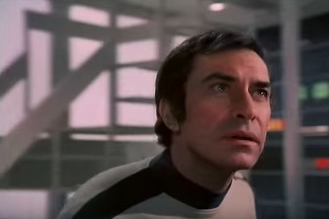
…is another transition, but in reverse:
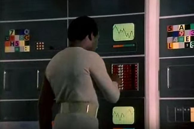
U.S. television was very formulaic in its coverage. It was designed such that any shot could be cut into any other shot at any time. Master, closeup, closeup, repeat. These two shots, covering three different people, can’t cut together in any way other than the way they did. One carries the story so far, and the next carries it a bit further. Sure, the editor could have cut out to a wide shot, but they didn’t. This is a way of executing coverage that I’d never seen before, but it was quite common in British TV series of the time.
Here’s a pan, zoom and rack focus:
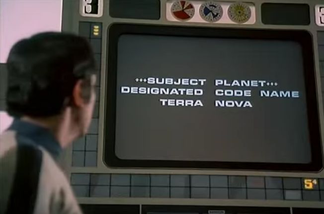
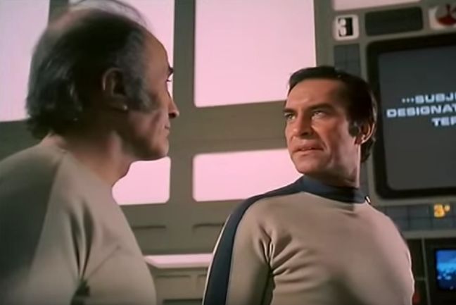
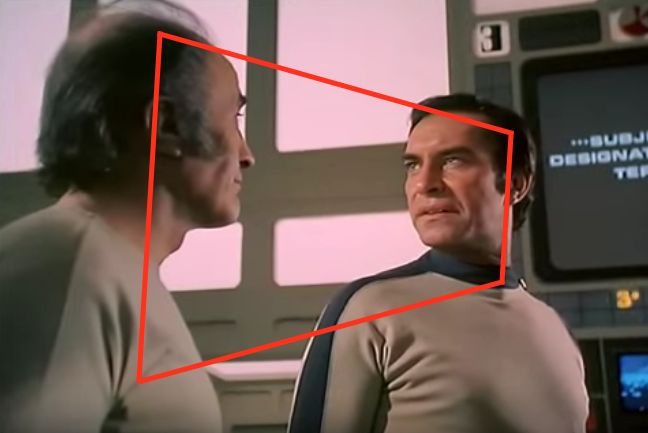
This kind of low angle shot was unthinkable for U.S. television shows. Nearly everything was shot at eye level, or maybe at waist level at a distance. This kind of graphically-designed shot was found only in British TV.
The camera could have panned back to the right to continue the scene, but instead the director opted for a wide shot. And, instead of simply punching out wide, he used action to start us outside of the shot and then pull us in:
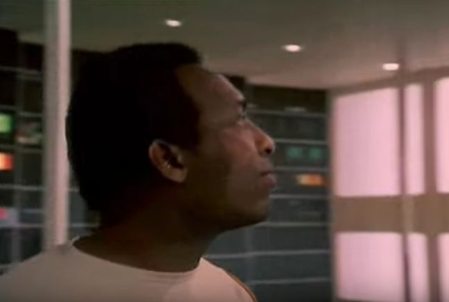
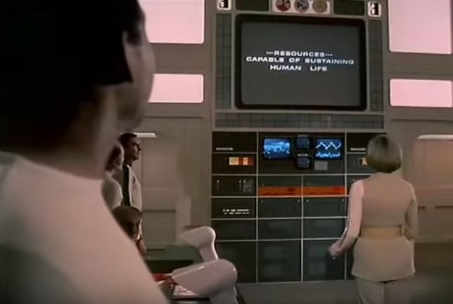
Once again, note the depth of the shot. This isn’t flat “50/50” work, or a director simplifying coverage just to make their day and crank another TV show out of the factory. This took some planning. These shots don’t cut together arbitrarily, they’re shot to work together in a specific way.
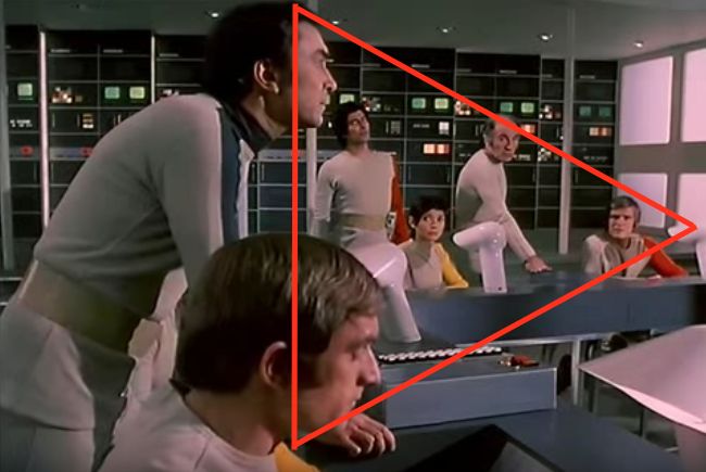
Here’s another triangle composition…
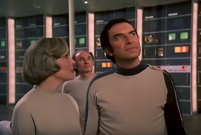
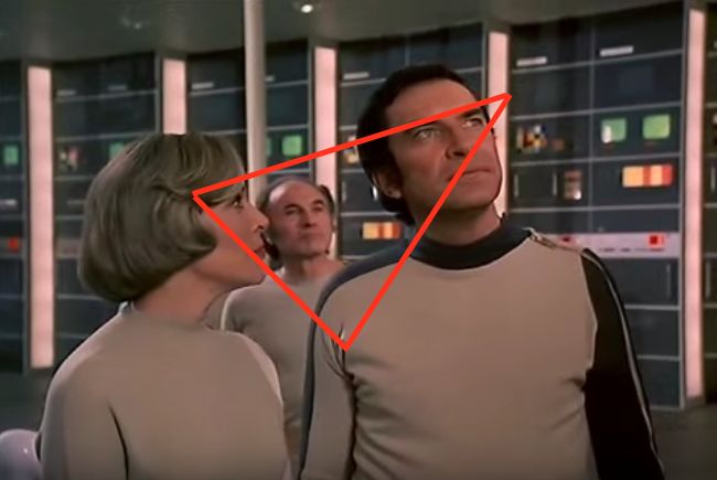
…and yet another.
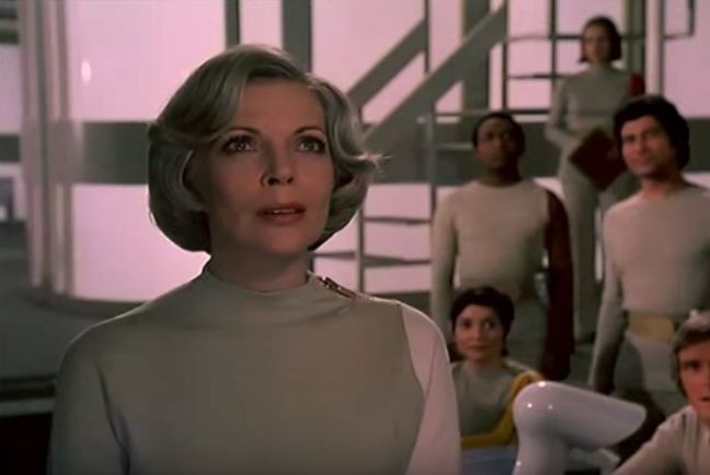
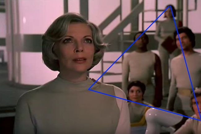
The shape itself is interesting, but it also leads the eye directly to the actress.
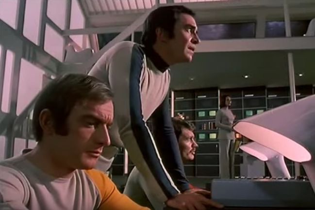
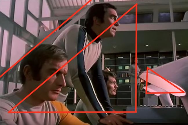
Once again we see triangle between the gentleman in yellow, the gentleman in blue and the lamp, with at least three layers of depth: foreground, midground (man with the mustache), and background (woman and computer wall). The two lamps line up wonderfully.
This style of strong, forced perspective composition isn’t seen much anymore. I miss it.

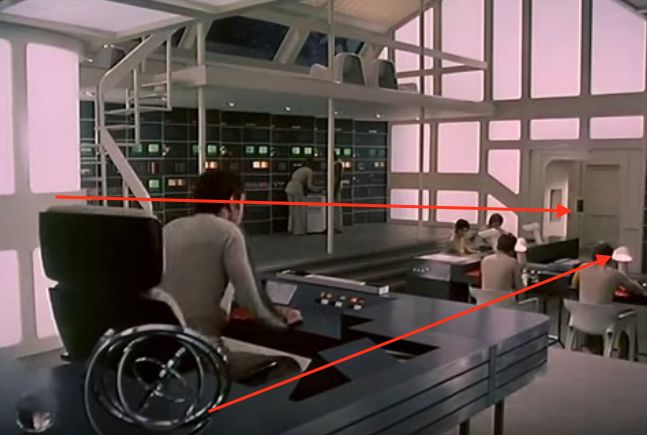
This is almost a throwaway shot to get us out of the scene, but once again notice the depth: we have an object in the extreme foreground, a middle ground at the front of the desk, and a background. The lines of the desk and the perspective of the lens drive the eye through each layer.
This is basically a show for kids, but look at all the planning that went into this one two minute opening sequence! Compare that to where we started…


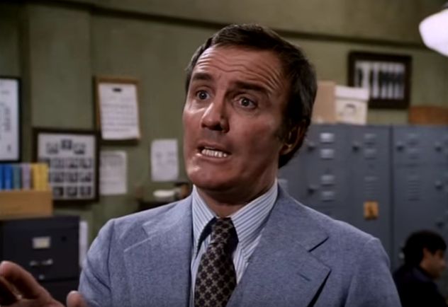
…and the difference becomes obvious. Do you see any compelling shapes here? How deep does this shot feel? The compositions feel very thin and basic to me. It’s competent work, but no more.
The scene from The Rockford Files is as long as the scene from Space: 1999, but Space: 1999 has more complex blocking, more camera movement, several rack focus shots, more complex compositions (as opposed to The Rockford Files frames, which are basically center-punched), and shots that were crafted specifically to work one way within a sequence. I’d like to think that when I noticed this stuff at the age of 12 I was a bit smarter than average, but in retrospect it was all pretty obvious.
Then I graduated to The Prisoner. If you’ve never heard of this show you’ll have no idea what’s going on in this scene, but let’s look at a short-but-simple scene anyway and then break it down. You can stop when No. 6 walks down the stairs.
https://www.youtube.com/watch?v=XZsxO2ptm8I&t=21m32s
The man in black is known only as No. 6. We never learn his real name. He’s trapped in a place called The Village, and he doesn’t know where it is or why he’s there. What he does know is that he’s a former spy, and whoever runs this place wants information that only he possesses. Each episode is a new mind game where No. 2—the ruler of The Village who changes from episode to episode—gets their chance to try to crack No. 6.
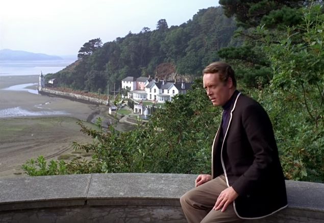
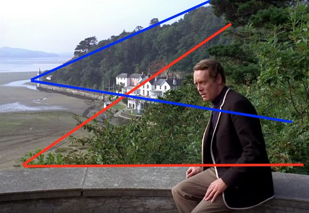
Once again, lots of depth: foreground, midground, background. The curving cement circle is very pleasing, as are the lines of the hills, leaves and river that all guide us towards No. 6. We don’t need much help in focusing on him, though, as he’s the darkest part of the frame and an interesting contrast to the white village in the distance. (This contrast is likely intentional. No. 6 is an outcast, by his own design.)
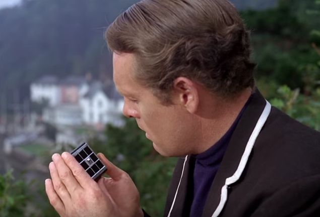
This shot takes us close, as No. 6 seeks contact with the outside world…
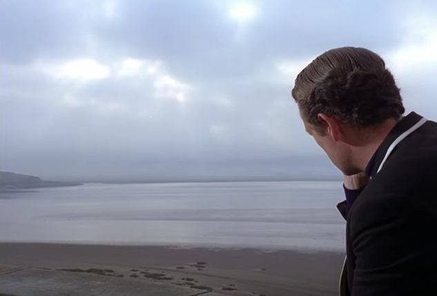
…and gazes out at it, knowing that—for now—he can’t reach it.
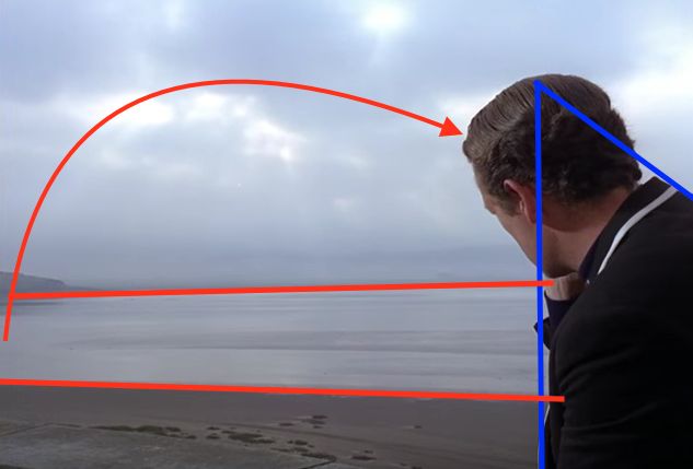
My eye travels around this frame as if it were a painting, starting at No.6’s head and dark coat and moving left along the water between the sand and the horizon, then moving right across the clouds and back to No. 6 again.
Then he’s caught by No. 2 (the villain—maybe), who walks through a 180 degree pan to reach him (although we only see the last 90 degrees in the shot). Even though there’s a camera shadow within the move, it’s a wonderful way to define the space in which the scene plays. This becomes important in a moment.
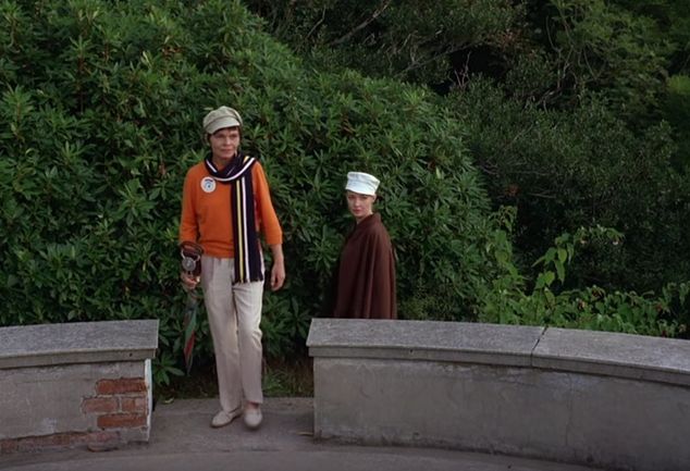
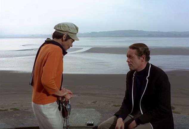
A 50/50 shot, but with a difference. This isn’t a slam job meant to make the day go faster, but a careful composition that shows the relationship between the characters. No. 2 sits for a bit, but she’s generally standing while No. 6 sits. This is an intentional change in their power relationship.
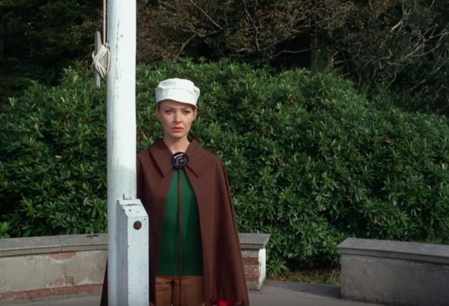
This is No. 6’s watcher. It’s her job to report on his actions. She’s a bit conflicted about her role in all this, which is why she’s hiding behind the flagpole.
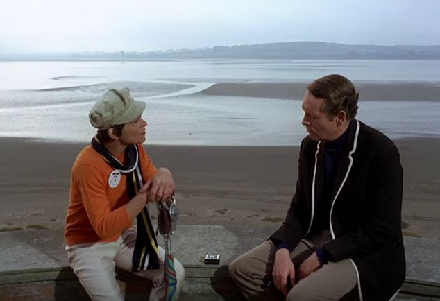
No. 2 and No. 6 converse as equals… but only for a short time. Note the amount of headroom, and how it works perfectly within this frame. The areas of background contrast (the hill in the background and the sandbar) pull the eye toward No. 6, who always gets the upper hand.
Notice, also, that this shot plays out without closeups. None are needed: the performances hold up perfectly well in this wide shot, and it emphasizes their relationship better than individual singles could.
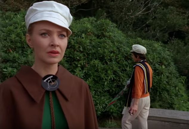
Once again, there’s a tremendous amount of depth to this shot thanks to a nice wide angle lens (I’d guess a 24 or 25mm). No. 2 turns…
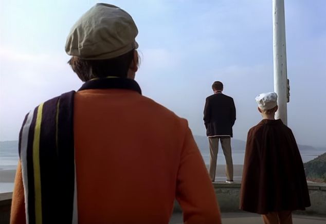
…and we have an instant power shift. Notice the triangle composition drawn between all three heads, and the fact that all three figures form triangles on their own.
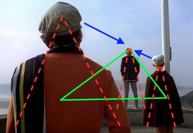
No. 2 is still dominant, as she’s the largest thing in the frame, but No. 6’s stark contrast against the sky, and the fact that we see his full figure as opposed to only part of the others, makes him the focal point of the composition.
Now it’s between No. 6 and his observer, and she can’t hide anymore.
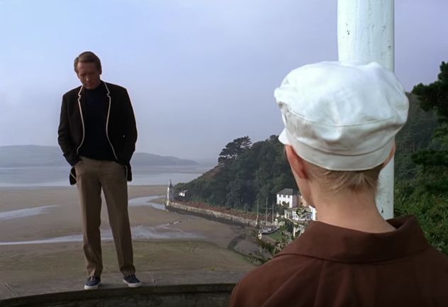
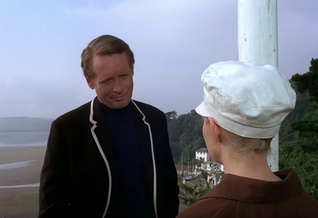
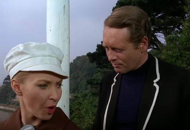
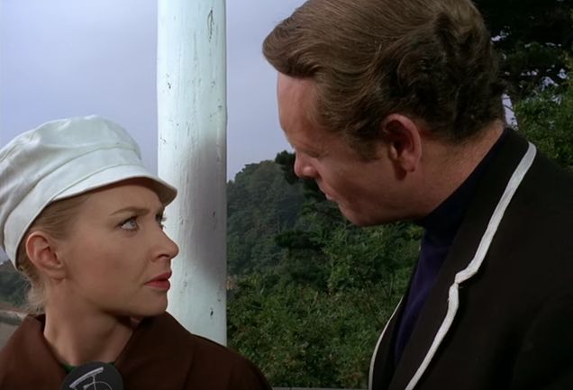
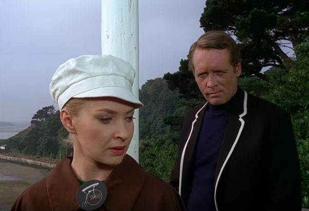
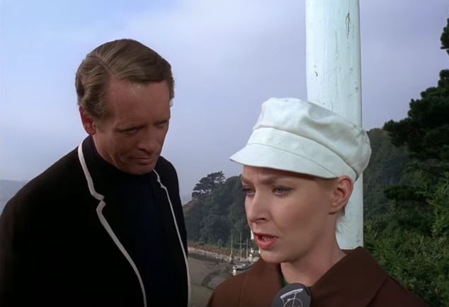
In a way, she’s surrounded… by one person: No. 6. This is a wonderful way to not only express their relationship but to keep the scene moving within one shot while never letting it drag. It also shows that compositions in moving images occur across both space and time: No. 6 doesn’t surround his watcher in one frame, but he does so over the course of one shot—as you can see in the stills above.
For your viewing pleasure I pulled some random shots out of the rest of this episode. In the two images below, notice how how the foreground and background are separated not just by light and dark but through the use of curved shapes that frame No. 6. Notice also that traditional notions of “head room” do not apply here:
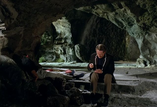
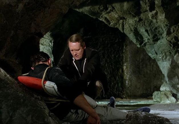
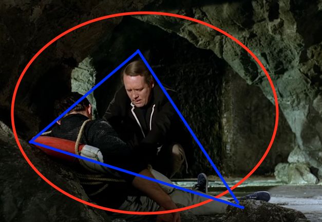
The next shot shows lots of depth: foreground, midground and background. The walls of the cave frame the gentleman in the midground, making him the focus of the shot: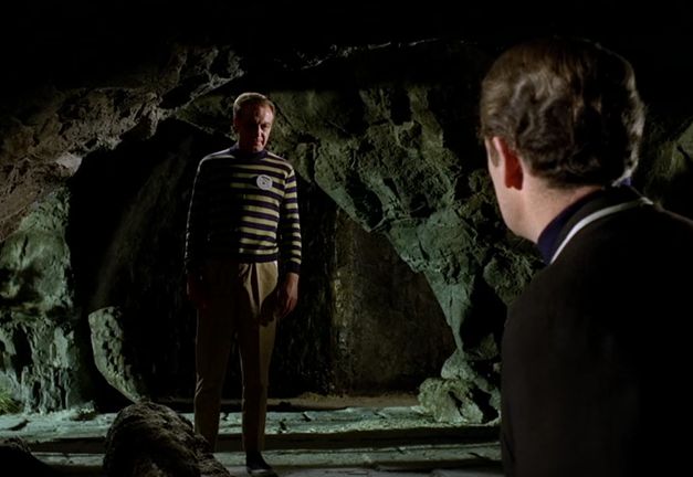
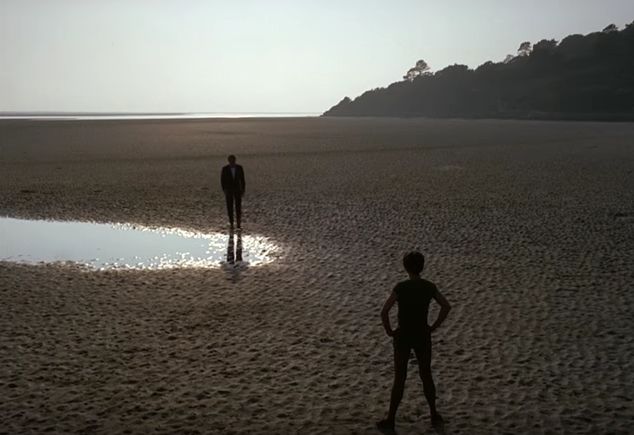
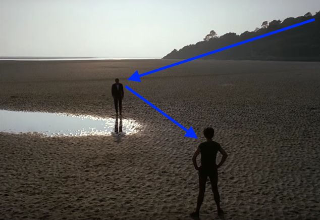
Next we have a marvelous use of silhouette, showing two figures who are diametrically opposed to one another:
Here’s another short clip from the same episode. No. 6 stands trial in a very unusual way, and is confronted by a “character witness”: an old friend and fellow spy whose mind has been destroyed by The Village.
https://www.youtube.com/watch?v=-DCUnGkF9fQ
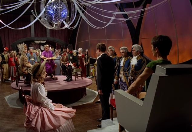
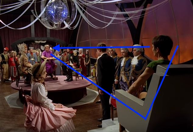
Note the crazy amount of depth in this scene, starting from the background character in purple, to the disco ball overhead, down to No. 6 and his observer, and finally to No. 2 in her chair. This is a very carefully composed shot.
No. 2 starts out as a background figure…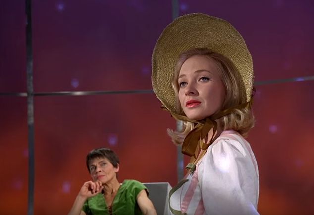
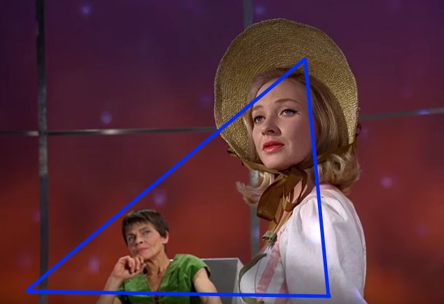
…but soon steps forward to assert dominance. What I love about this shot is that, when the watcher rises to protest, the camera barely moves when No. 2 steps forward. It’s a very powerful thing for a character to move within a frame and land in the perfect spot: in a way, the camera is “too cool to move” and the character clearly wields power if there’s a spot in the frame that’s clearly meant for her.
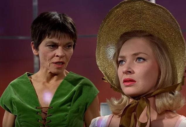

Below: lots of depth. Are you seeing a trend here?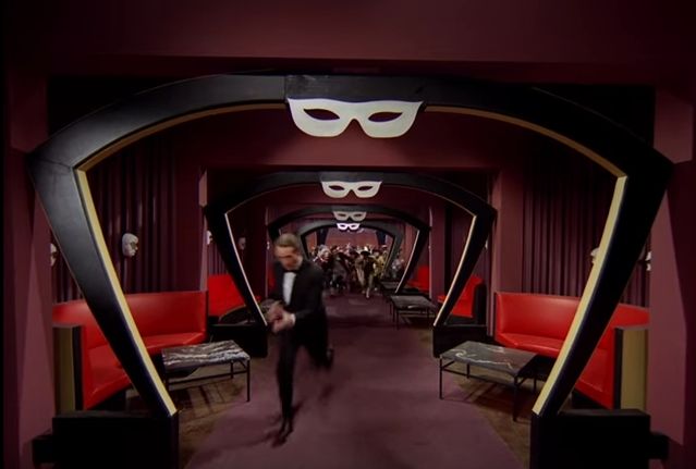
Low angles, wide angles… are you seeing a trend here?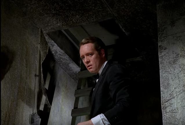
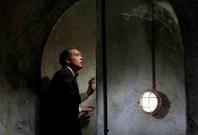
Below: shooting past a foreground object. Another trend?
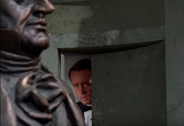
And, once again, let’s compare this to the baseline:


This is why I’m a cinematographer today. I noticed these differences at a young age and decided I wanted to make more interesting images than the ones I saw on U.S. TV. It’s really that simple.
The trick with these compositions is that they’re not always constructed consciously. Often they are, but other times it’s enough to know the mood and theme of a piece and simply “feel” the shapes and movement within compositions. Often I’ll move my eye around the frame, noting where it starts, where it travels, and where it ends up. If it starts in the wrong place, doesn’t traverse the entire frame, and doesn’t end up where I want it to, I’ll adjust the frame until it does.
I spent my teen years with an 8mm movie camera trying to replicate the characteristics of the shots I’ve shown here. I’m still trying to do exactly that with modern tools and lighting. And I still love it.

Filmtools
Filmmakers go-to destination for pre-production, production & post production equipment!
Shop Now