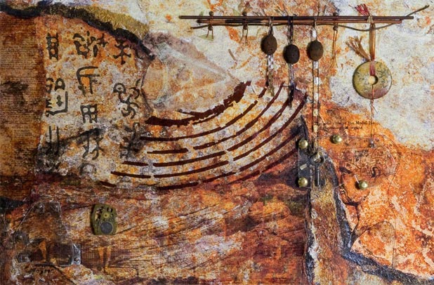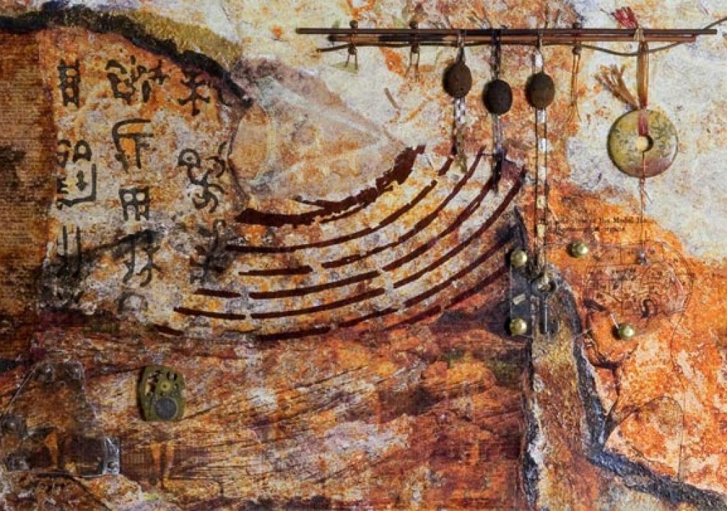
It's been awhile since I walked through the creation of one of art pieces that started life as a photograph, so I thought I'd pick one of my favorites: Seeking to Understand. Although it was created a couple of years ago just after I moved to New Mexcio, the process is similar to that of many of my current works.
Rock, Paper, Scissors Fingers
Many of my pieces start as photographs of rock textures taken during hikes (or other more urban excursions). As it takes a bit of time to sort through selects and color correct them to taste, I tend to create a series based on a particular excursion. As was the case with Avian Aspirations, the seed photo for this work came from a rather un-exotic locale: a landscaping rock outside a place we liked to stay at in Palm Desert, California. This was back when a Canon 10D was my primary camera, and pixels were precious, so I tried to compose and frame the shot as close as I could to “final” as I could, taking color, line, and balance into account:
I then worked on the image to bring out its latent colors and boost its contrast. As this photo would eventually be printed over collage papers rather than photographic paper, I over-amped the saturation and contrast in anticipation of a less-than-perfect print:
The next step involved printing a faint version of this image on a 13×19″ sheet of heavyweight fine art paper (Hawk Mountain Kestrel; I buy slightly flawed proofing sheets for this type of work to save cost). This piece was printed on an old 13″ Epson 2200 Photo printer, rather than my fancier 24″ HP Z3100. In many ways, the considerably less sophisticated manual-feed 2200 is a better printer for mixed media work than my big automated-everything Z3100: Unlike the Z3100, the 2200 does not care what color the paper is, whether or not there is a wide enough white band around the edges to auto-detect them, or if the sheet is a bit bumpy. Most important of all, Epson printers generally can take twice the paper thickness as the equivalent HP printer (1.5 mm compared to 0.8 mm).
This faint version of the photo acted as a “paint by numbers” template for creating a torn-paper collage that matches the lines, shapes, and flow of the original image:
In general, I like to vary the color, texture, and reflectivity of the papers in the underlying collage to help “facet” the resulting surface. In addition to using commercially available collage papers (including those with natural and metallic inclusions, a large silkscreen of a fingerprint, and petroglyph symbols used here), I sometimes custom-print my own papers to better relate to the intended subject of the piece.
I like using text and technical illustrations in my work, careful to choose books that are now in the public domain as my sources to scan. For this piece that focused on knowledge systems (either proven or just conjectured), I scanned an example of the “Model Head” from an old book on phrenology as well as an appendix on “Arbitrary Signs in Writing and Printing” – focusing on the astronomical and astrological – from a late-19th-century Webster's dictionary:
Both were printed on metallic-painted mulberry paper using our laser printer. Metallic paper was chosen to draw attention to the text: It yields a glossier surface and reflects the light much more strongly than the matte papers used throughout the rest of the collage. The toner fusing process allows me to print text on surfaces that would otherwise repel ink, and black toner is lightfast. After printing, I coated these sheets with Golden Digital Ground for Non Porous surfaces to make sure they could later receive an inkjet print on top.
The image along the bottom is photo I took at Red Rocks in Nevada composited with the classic Eadweard Muybridge walk cycle of a man:
Muybridge used sequenced multi-camera photographic rigs to determine how the muscles and bones of both people and animals worked as they performed a variety of movements. These individual photos could then be strung back together as a sequence to replay the original motion – an early predecessor to “bullet time” cinematography as seen in The Matrix among other films. He is sort of a patron saint to motion graphics artists (my day job), and I like to use his now-public-domain images as a recurring theme in my work. Dover Press has published two comprehensive volumes of his work (The Human Figure in Motion and Animals in Motion), which serve as excellent references.
From Collage to Assemblage
The collage papers were glued over the faint print, using a roller and brayer with a lot of pressure to keep flat. The entire result was then coated lightly with Golden Digital Ground to help the papers better take the ink. I then printed the color-corrected photo on top of the collage, careful to align the paper during loading so that the final print matches my original template.
To be honest, the moment the print comes out is usually a let down: I have a mental image of what I think it's going to look like, and it often looks different as the ink overlays on the various papers in ways I didn't fully anticipate. (The fact that I don't have a photo of the work at this point is a clue of how I initially felt!) But when one is painting outside the lines, you have to learn to let go of your preconceived notions and go with the flow. To aid that process, I often set the print aside for a period of time to forget what I thought I was going to get. I then revisit it later to see it for what it actually is, and get inspiration from that.
After sealing the printed surface with a UV-protective varnish, the final step is then adding assemblage materials on top of the print:
The lighter areas along the top right presented a natural void to add the main physical element: In this case, a bundle of sticks acting as a beam to hang other elements from. The pattern in the fingerprint silkscreen paper contained a natural swoop that leads the viewer up to the center of the sticks; that's where I placed a trio of lava beads. The eye then moves to the right and back down to the hero “wheel” stone (another oblique knowledge reference), and continues down to the Model Head. Although it is hard to tell in this photo, the head is underneath a piece of translucent mica floated off the surface of the print using stone chip beads. Behind the mica, the head is staring at a key dangled tantalizingly in front of it, again for its symbolism.
I tend to like to have my main focal area balanced off with a smaller area roughly in the opposite corner of the work. In this case, in the lower left I bring attention to the now-obscured Muybridge men by floating another piece of mica over one frame, and replacing his head in another with the internals of a watch (representing the mechanical age – another period of learning).
Onward
Although this piece was framed under glass, I've sinced moved toward mounting pieces onto boards, and then floating the exposed boards either freely or inside a frame to better let the viewer examine the texture and assemblage elements:
I'm now trying to find ways to coax my HP Z3100 printer to allow me to run collages through it so I can create larger works. This includes experimenting with different base sheets and adhesives. If I make any breakthroughs (or break the printer in the process), I'll let you know.
Our photographs and artwork, as well as content contained in our books, videos, blogs, and articles for other sites are all copyright Crish Design, except where otherwise attributed. Other examples of my mixed media work may be found on my artist web site.

