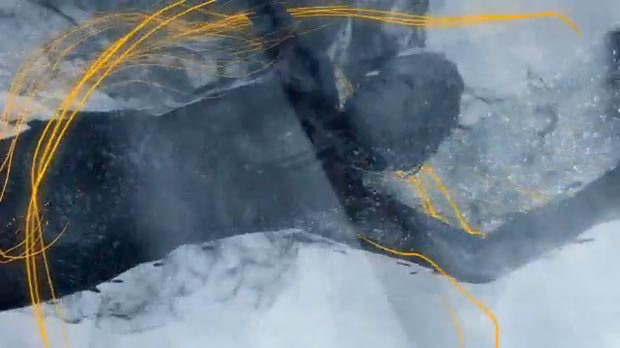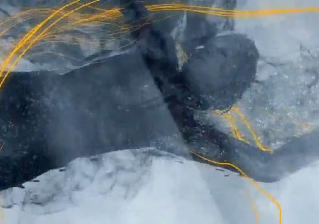

Silhouettes…ink splashes…particle streams that follow movement…all very pretty; all arguably done to death by now. Thus my pleasant surprise to see a commercial (for a knee replacement, of all things!) that pulled these design ideas to together in a very fresh, understated yet lovely fashion. If anyone knows who did this (or how), please share. In the meantime, here’s the spot:


