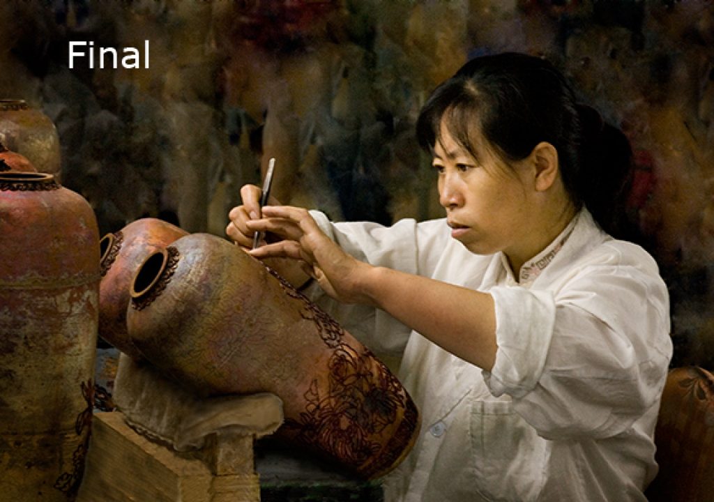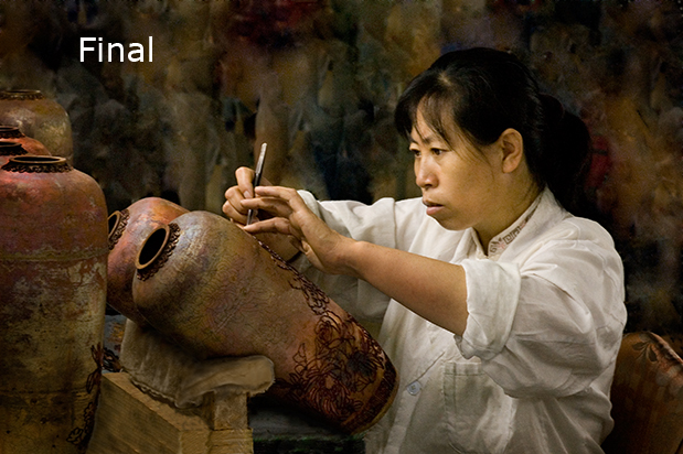
How often have been on vacation and seen a great picture story evolving in front of you, but you couldn’t get the right angle, there was stuff in the way or you didn’t have time to grab a series? That’s just what happened to my good friend and professional photographer Fabian Krajmalnik while touring a famous cloisonne factory in Beijing, China. He saw immediately the potential for a timeless image of the ancient craft.
In his mind’s eye he looked past the hundreds of people crowding the workshops, the clutter of the artists’ materials and the dim, off-color fluorescent lighting. The tours moved quickly and everyone wanted to be very close to make snap shots. Coming toward this artisan’s station, he noticed how her face and hands were illuminated at an oblique angle, and knew he had a winning image if only he could shoot quickly enough.
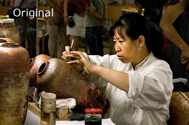
Fabian laughs that he had time for only one shot! He set his Nikon D-70 on Program (also known derisively as “P for Professional”) at 1600 ISO equivalent and fluorescent white balance. This setting yielded only a 1/30th of a second at F8 exposure on a 28-70 2.8 ED-1F AFS Nikor lens. A moment later the artisan’s concentrated expression was gone as she turned to answer a visitor’s question.
Back home Fabian came to me to metamorphose the tourist snap into his original vision, namely the classic portrait style for which he is known. My first glance told me he indeed had diamond in the rough, with wonderful composition, great directional lighting and an intrinsically interesting story to tell. All the building blocks of good light, composition and expression were there; my task was to remove the many unwanted elements, enhance the lighting and totally recreate the background.
In fact, so many things needed to be altered or enhanced, it was hard to know where to start. And of course Fabian wanted to helicopter over my shoulder. Talk about pressure! No one single retouching requirement was all that unusual. Just tenacity to keep going until every detail was perfected. My method calls for zooming in for very closeup precision and zooming back out frequently to full image to reassess to total effect. Many Photoshop enhancers would start with color correction, but in this case I created a new background first and the final color tweaking last. Without a great background the image would never work well visually, and it would be impossible to judge artistically what further steps to take. I drew many dozens of irregular patches with the Patch Tool, alternated with the Healing Brush in replace mode, semi hard, to refine the edges right around the person. My process does not create artifacts or noise. The soft, mottled result echoes the multi-hued texture of the raw metal cloisonne vases in progress on the workbench.
Here’s the step-by-step process I followed:
- almost total recreation of the background to remove the tourists
- neutralization of the color, gross correction in levels
- removal of foreground clutter and recreation of the missing details
- improvement and recreation of detailed textures
- narrowing and refining the lighting emphasis for meaning and impact
- enhancement of the individual’s face and clothing
- fine adjustment in Hue/Saturation/Luminance on selected areas
- sharpening of figure and vase for 3-dimensional quality, softening of background + vignette
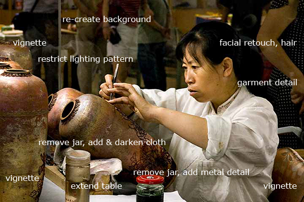
Cropping off the unattractive and distracting jars in the foreground was impossible for the composition; they had to be cloned out and details recreated. We joked that I put off working on this most difficult part. I used a medium-hard Healing Brush in replace mode and then marqueed and duplicated elements of the metal design detail on layers. Blending was seamlessly accomplished with layer masks. Everything on layers!
Once I removed the taller jar, the frayed white fold of cloth supporting the vase was a huge visual distraction. At very high magnification I marqueed and duplicated both the small shred of white and also the wood table top. I darkened the cloth and turned it brown. Extension of the elements with the Healing Brush in replace mode filled the compositional void at the bottom of the image. Then I went for the dark, blurred and aged look.
Lighting was enhanced to lead the viewer’s eye softly into the composition, tell the story of the environment and then fasten upon the rapt expression of the artist and her extraordinarily graceful hands. Shine on all the vases had to be knocked down in different intensities.
The image was sharpened for output combining elements of the portrait and scenic sharpening algorithms I have personally developed to work with my Epson printers. Edges were vignetted in with lasso, feather and levels to echo the ancient subject. Duration of the project was more than four hours, without a break, all at one sitting. My personal success team includes huge memory for speed, the 30 inch flat screen, using key strokes rather than mouse movements, and the indispensable Wacom tablet.
The result: a visual history of dedication to age-old art.
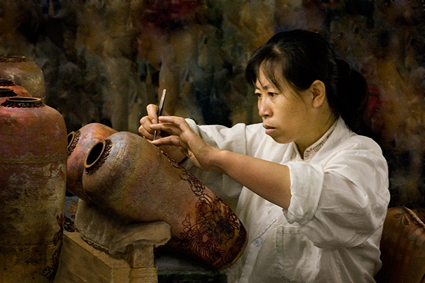
Our collaborative effort won big. Fabian netted a merit at PPA competition. I won a double merit from PPA for the “pixel surgery”, as well as the first place retouching award from O’Reilly Media’s Photoshop Cookbook competition. To me the profound story of the image is the winner.

Filmtools
Filmmakers go-to destination for pre-production, production & post production equipment!
Shop Now