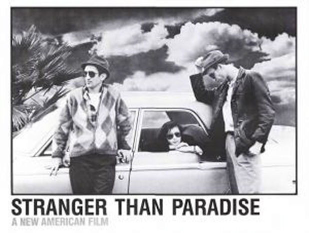
Karl hit the jackpot when he found this 29 year old B/W art movie on Netflix. Unequivocably our 4-thumbs-up rating! Stranger than Paradise is loosely billed as a comedy, and many critics note that there is virtually no plot, no action. To our minds, it’s highly charged in character, plot development and technical/art usage far ahead of its time.
I’d rather call the movie a noir-comedy. We were on the edge of our seats with both the predictable idiocies and the unexpected reversals. Sometimes it’s almost slapstick, but in slow motion, slowed down to a freeze-frame feeling – and no hitting. Yes, the action is minimalist, reminiscent of Samuel Beckett’s play Waiting for Godot in which nothing happens to the two characters, and Godot never shows up.
The snap shot structure is what bears on my comparison to contemporary Fusion work. At first the hard-cuts are annoyingly choppy and disconnected, because each scene is completely segmented from the next with a cut to black. Many scenes have no dialogue; some last only a few seconds. But within just a few minutes you see both visually and in meaning, how the scenes are like a series of stills linked together. Think in the tradition of art photographers Robert Frank, Robert Adams, Frank diLappa and Lewis Baltz. Minmal to the point of empty, yet screaming volumes. Thus my “snapshot” label I invented for the style.
I loved the frozen scene when the three protagonists (we see only 10 other people in the entire film) drive to the waterfront over Lake Erie. It’s a total white-out of snow and fog; nothing is visible, just their silhouettes against a blank. Just like their hipster, loafer, empty lives. But the implication is not noir; change and yearning is hidden in the fog. And the photographic precision could have come from the camera of Henri Cartier-Bresson. The scene demonstrates the use of “decisive moment” style, when the decisive happening is internalized, not an action. Indellible marks.
Syncopation of speed in this film is a forerunner to current Fusion shorts, with the virtually still shots interspersed with movement. Everything was filmed on actual location in actual weather in NYC, Cleveland and Melbourne, Florida, mush like the current approach of photojournalist event photographers. It could have been shot on a Canon 5D Mark II with just a few lenses, guerrilla style, with little use of typical dolly, boom and lift effects. The super-grainy B/W film makes you think of surveillance footage, as though you are cutting open and dissecting lives.
I especially like that music appears only for a purpose; the sound track is just what actually happens, completely motivated – and sometimes that means nothing. This factor alone makes for extraordinary impact. Note also the flatness of the lighting, particularly in the interior scenes. The greyness of tone (low contrast, little black and little white), is the totally perfect artistic palette to represent the story and characters. At one point Willy says, “No matter where you go, it all looks alike.”
But this is no dull, depressing film. The existential ennui countered by comedic elements is so real, so ingrained in human psyche. No, I’m not going to tell the story; it’s both nothing and everything. Get this film today, or 10 years from now. It will equally good then, as today, as in 1984.
Stranger than Paradise, written and directed by Jim Jarmusch (his 3rd film), starring John Lurie, Richard Edson and Eszter Balint, produced by Sara Driver. Released in 1984 by Samuel Goldwyn Company. 89 minutes, budget reported as $90 – $100K, with a reported gross revenue of almost $2.5 million.
Winner of awards at Cannes, Sundance, Junpo, Locarno, NFP, NSCF, Rotterdam, Satellite, and continued comment and blogging over the years. Roger Ebert: “…a treasure from one end to the other.”
Film Trailer link: http://www.youtube.com/watch?v=ToCSOp7FGT0
Netflix title link: www.netflix.com/Movie/Stranger-than-Paradise/70075715

Filmtools
Filmmakers go-to destination for pre-production, production & post production equipment!
Shop Now


