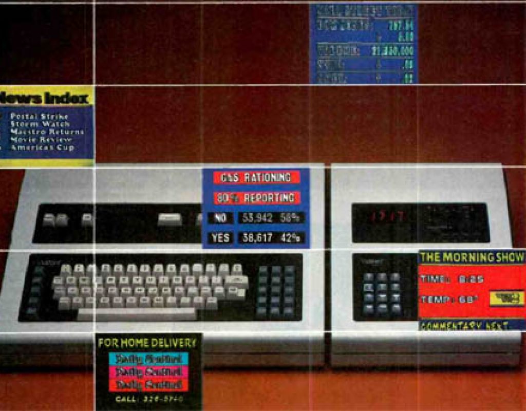
There is very little we do with a television today that does not require some amount of reading from the screen. We take for granted being able to easily read material as it pops up as a show’s title or credits, a lower third name identifying the person speaking, text running in motion across the screen with sports scores or late breaking news or the progress of a scoring drive to a football game. Even being able to follow along with the program without the sound if you engage the closed caption function.
In the beginning, both films and television shows were viewed with very little on the screen outside the images a camera was able to capture. Something as simple as displaying a show’s title required planning and specialized work by several people called graphics artists in a department known as the graphics department. Going all the way back to silent film, the cards which spelled out the words the silent film stars mouthing were well planned.
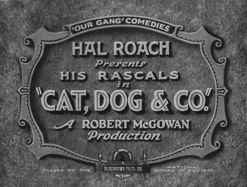
Narrative film, whether for television or motion picture, still takes a lot of time to make titles and credits that are easy to read and still have the look that integrates them into the photographic style established for the overall project. Film, now electronically based, is influenced by the way television graphics are created as opposed to the early days when television graphics borrowed from and emulated film styles.
But it did take a while. The equipment did not come easily. Television since World War II went more than two decades before the hardware (and the software) was created to make electronic lettering approach typographical quality – easy to create and equally easy to read in those days before high definition. Any discussion of television graphics prior to 1970 must include a discussion of how engineers were able to combine two video sources together to form a composite picture.
Before the invention of videotape, television was predominately live which meant everything connected with a show was happening as the general public was seeing it. Naturally, that also included the titles, artwork that might be included as part of the program or story and the end credits. Exceptions were for filmed programs that were edited like motion pictures and able to take the time to build their titles and credits using film techniques. Later, advertising agencies would pay to have animated openings made that would feature their product and allow the director to roll in a film threaded up on a nearby telecine chain (projection island).
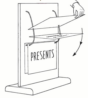
Early television broadcasts, more often than not, added motion to their titles or credits from something as simple as art cards being allowed to fall one at a time (“What’s My Line?” closing credits), a paper roll unwinding in front of the lens (“What’s My Line?” main titles) or a setup using miniature models (“Texaco Star Theater”) or live models (“Queen for a Day”) placed somewhere nearby. These setups would be out of the way of the studio audience’s view in normal use. A television camera would dolly off to the side or off stage and, as a floor assistant executed whatever movement was to take place, shoot the main titles or end credits. Many of these were crude and appear off angle, sometimes running outside the frame or out of sync with the narration.
In the late forties and through the fifties, television technical directors experimented with superimposing titles over the live scene. They would carefully split the dissolve bar (or “T” bar) on early video switchers so pictures from two different sources could be combined on one picture.
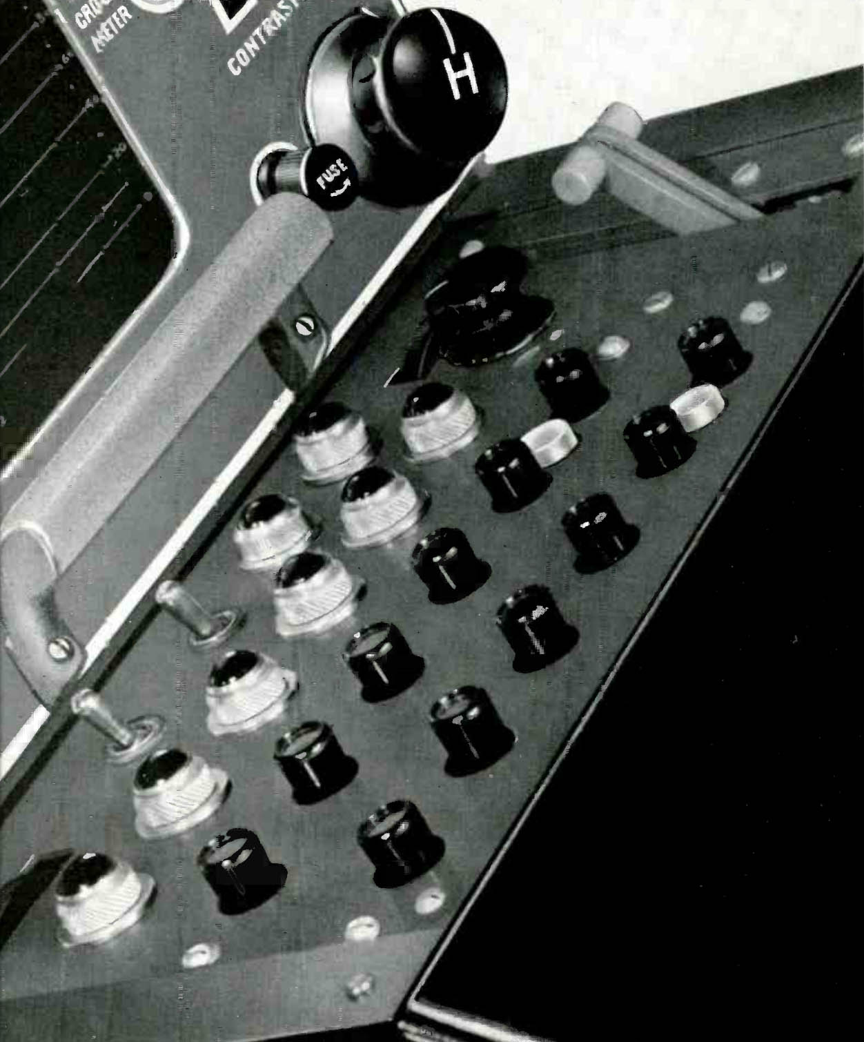
While the purpose was achieved and the viewer was able to see both the graphic message and the picture that was behind it, the video level of the two sources could only total 100%. Otherwise, the switcher would be transmitting up to 200% video (something engineers were wary of). Care had to be taken in these early tools not to overdrive either signal.
As a result, the live camera usually dropped in brightness level while the art card showed through but was translucent. It took some ingenuity and creativity to make it work. The Fred Waring Show was an example of using an additive mix to its best advantage by building lighting effects into the show open.
Sometimes, the producers didn’t even try to hide the problem. They just embraced it as they did in the initial “What’s My Line?” program when they used the reverse – black letters with a white background.
Anyway you look at it, adjusting the video was still a flawed system. But after a few years, Radio Corporation America (RCA) engineers learned how to refine and advance the process and replace the super imposed video with a new process called the “key.” It was an improvement in the video switching equipment that allowed for the possibilities technical directors were looking for.
“Keying” refers to electronically cutting into the video and replacing it with video from another source. The “Key” can be generated from an art card (usually a black piece of cardboard with white letters hot pressed onto it under pressure and heated to fuse them together). The key allows a solid image to be seen over the underlying video without the background image bleeding through and becoming translucent or allowing changes in the brightness of the background. This would be an internal or normal key. By loading the complete title with a clean video image of the background onto a separate set of crosspoints (called a Mix/Effects bank), the key could be faded on (and off) by setting the switcher to dissolve from the camera to the M/E bank (and then back again).
On November 3, 2014, Bobby Ellerbee did a look back on his Eyes of a Generation website ending up with the breakthrough we’ll get into later in this article – the Vidifont character generator from CBS Laboratories. However, in the example below, Maureen Carney provides an early example of creativity going on in the local stations in addition the experimentation at the networks making good use of the key function..
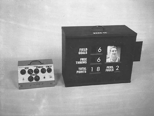
The previously described setups were referred to as self-key, normal key or internal key. They all used material that was covering up the hole in the video to be the same material cutting the hole.
Several other iterations of the key became available about the same time as the electronics were all related. It could also describe a luminance key, but the blacks had to be adjusted and set up properly (below zero volts) ahead of time. Later on, when color became available, the hole could be filled with an electronically generated color source and became known as a matte key. And of course chroma key. Developed by Frank Gaskins, NBC Burbank’s technical operation supervisor and Milt Altman of the NBC graphics art department, it freed every weather person out there from drawing pictures on maps.
External key, usually available on the same switcher, allowed a third video source to cut the hole in the frame to place information. By adding an external source (normally a white on black drawing, shape or high contrast film), unique effects could be created.
Classic uses of the external key were revealed to the public on the Ernie Kovacs shows (covered in a previous article). Kovacs was one of the first creators to adopt the possibilities of video electronics to his brand of comedy. He used the medium to provide a style that was unique to television and not just a copy of a radio show or movies. Many of his tricks were accomplished through the use of external and luminance keys to pull off the “magic” he used on his shows.

But keying only provided an improvement in the signal. Expensive cameras that were expensive to operate were still required just to shoot art cards and graphics rather than following the action on the set. A live camera was still needed to capture the graphics whether in the studio, on a football field or at a political convention.
The political year was the problem for Rudi Bass, Director of Graphics Arts for CBS News. His desire was to be able to randomly access almost 4000 graphics for each of the two 1968 U.S. political conventions. And if someone interviewed a person not in the database, they would have to go without being identified graphically. On the other hand, many of the names would not be used but had to be in standby just in case. Bass writes about the creation of video lettering in the 1971 edition of The Journal of Typography.
Several companies were building graphics generators hoping the television creative community would embrace them. More would follow. Entertainment shows could continue budgeting a camera and a cameraman to shoot art card graphics. However, in news with its inherent time constraints, they were being used grudgingly.
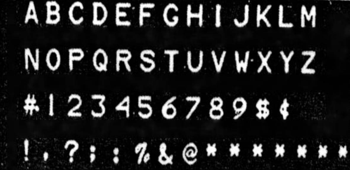
Just being able to type information on the screen was not enough. Frankly, it needed to look like what the public was used to – professional typesetting they could find in movies, newspapers and magazines and every sign imaginable from billboards to street signs. Even the previously established television art cards had it. It was a step down. Generating it electronically limited television to looking like a computer screen. It just wasn’t natural.
The inability to change font styles generated characters that all seemed to be the same. Changing their size was complicated. The other thing was they all occupied the same width. Whether the letter was an “I” or a “W”, the space allotted to it was exactly the same width. On a credit sequence, it was not possible to create titles that were justified. “Justification” was a typesetting procedure. The old way, with the hot press titles, could do it but it ate up a lot of time and resources.
For example, if you had a lower third name that read “Vice President” (14 spaces) on one line and the name “Spiro T Agnew” (13 spaces) on the next line, you ended up with an extra blank space. If a period was added to the “T” it would use the same space as the “W” and really emphasize the problem.
CBS’s Bass approached Stanley Baron, an engineer at CBS Laboratories, the research arm of CBS. Baron explained the companies building character generators at that time all had “characters based on metric structures and none of them approached the quality of typeset graphics.”
The graphics units being manufactured and sold did not possess the unique abilities Bass and Baron wanted to design into their new character generator. CBS and NBC were among the early users. Major stories, such as the Apollo Eleven moonshot that landed two humans on the moon, used these graphics because they were able to easily type them in and have a graphic ready to go in minutes and not wait for a graphic artist.
Baron went about solving the problem and coming up with solutions. Finally, in the late sixties, based on the research he had done, CBS Labs gave the go ahead to build a feasibility prototype. In his paper, “Inventing the Vidifont: the first electronics graphics machine used in television production,” Baron explains how they solved the problems. In 1967, the prototype was demonstrated to visitors to the Labs. They were positive about it in their comments and believed a market existed. Would this make art cards a thing of the past?
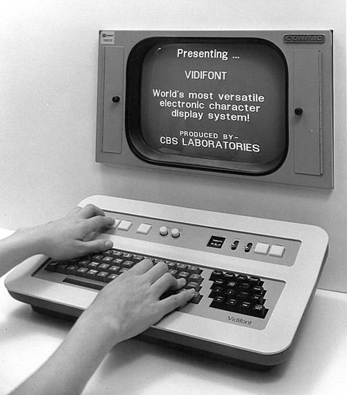
However, Baron adds, “CBS management in New York was not convinced… a market existed for such a device and a request for funding development of a production model was rejected.”
He goes on to add, “Representatives of Visual Electronics showed interest in the Vidifont system… In response to Visual’s request, in October, 1968, I drafted a specification for a graphics generator based on the feasibility prototype.” The two companies entered into a partnership to take it to market. “Visual asked me to suggest a name,” Baron says, “The name I had been using for the feasibility prototype was “Vidifont,” an abbreviation of ‘video font generator,’ and that was adopted.”
CBS, Inc. changed the business model for the Laboratories and rights to the products produced by the Labs were sold to other companies. Eventually,CBS Laboratories ceased operations.
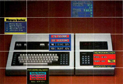
Vidifont was finally unveiled at the National Association of Broadcasters convention in 1971. It permitted production of messages from just a name in the lower third of the screen to long crawls for credits or story exposition. The operator could bring up various fonts in different sizes and mix them on screen. “Broadcasting” magazine on April 12, 1971 explained, “The system provides proportional character spacing, as well as character display color control on a word by word basis.”
The reaction of the attendees was very positive and created a lot of traffic for the booth. The Vidifont quickly established a market for electronic graphics generators that could do more than just put block letters on the screen. John Christopher Burns Design provides a collection of Vidifont promotional images showing what quality of typography owners could expect.
Systems Resources Corporation (SRC) had supplied a message storage device in 1969 to integrate into Vidifont’s off-line capabilities of composing and editing of displays off-line. The staff at CBS Labs shared SRC’s vision of Vidifont’s future, such as RAM storage of fonts, and how that would require further development of peripheral devices.
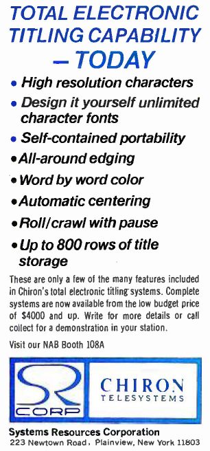
Since its creation in 1966, SRC had developed several innovative digital technology-based products. They entered the electronic text field providing airport flight schedule (arrivals and departures) displays in early 1970. In 1971, they added the Chiron and entered the broadcast market with a competing character generator with the Vidifont. SRC (Chiron’s) unit controlled the edging of the displayed characters in a manner that took background variables into account. Baron states in his article, “Over the next few years, Chyron came to dominate the market for electronic graphic generators” (When they brought out the new “II” unit, the spelling of the name was changed to ‘Chyron’)
Somewhere between March of 1973 and May of 1976, Thomson-CSF took over responsibilities for Vidifont. They made further upgrades but then BTS Television Systems took it over somewhere around July of 1993.
In 1986, Baron was invited to speak as the inventor of the first video graphics device at the International Conference on the History of Television. Originally, he was scheduled for 20 minutes at nine am. The session finally broke for lunch at just passed noon!
Baron’s article adds, “In 1992, The National Academy of Television Arts and Sciences recognized the Vidifont with an EMMY award to CBS.”
In the years leading up to HDTV systems, computers began taking over all aspects of television production. The most obvious was graphics. Years before we had HD all that was needed to design and present high quality graphics was nothing more than a home computer with the correct software and maybe some hardware cards to help it along. But for those graphics to look really good professionals inevitably turned to the high end machines that made their graphics look great and made their jobs easier.

Filmtools
Filmmakers go-to destination for pre-production, production & post production equipment!
Shop Now