If you remember back to the good old days of Final Cut Pro there was once the rumor of Final Cut Extreme that was to be this super-NLE with everything all in one package. I’ve actually heard through the grapevine this was indeed in development but was killed to make FCPX. This new update to Premiere Pro isn’t that super-NLE just yet (but it might be all that FC Extreme was going to be) but it takes one step closer with one of the biggest feature additions to ever come to PPro: Lumetri Color
Check this half hour video from Adobe for a real deep dive into this stuff and other features I didn’t cover here.
Lumetri Color correction tools
We’ve been seeing some of the SpeedGrade acquisition creep into Premiere for a few versions now and this release is the biggest marriage of the two technologies yet.

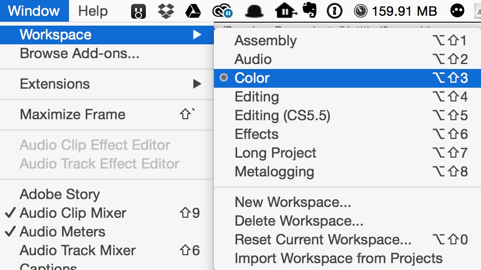
The old Color Correction workspace has been renamed Color and when you open this workspace a Lumetri Color panel populates the right side of the interface. If you ever wished PPro had a better 3-way color corrector you’ve gotten your wish, and then some.
That’s a whole lot of new, and very powerful, color correction options.
This new Lumetri Color panel is divided into different color grading tools. They’ll mostly all be familiar to anyone whole has taken a trip through SpeedGrade. Or Resolve.
Lumetri Color begins with Basic Correction at the top.
A massive list of installed LUTs should cover most any digital cinema camera you want to throw at it.
Basic image sliders for a nice batch of color tools are at your disposal.
If those controls look a little bit like Adobe Lightroom, that’s no coincidence.
Creative brings a big pop-up of premade looks, many resembling film stocks. There’s an option to Browse right from that menu so expect others that you’ll be able to load in. I’ll bet someone somewhere will even make a set to sell at some point in the future.
Adjustments brings up another batch of sliders you might remember from Lightroom. Both the Sharpen and Vibrance sliders will be welcome.
The Curves option is very full featured. The RGB Curves will probably replace the RGB Curves effect for most editors.
The hue saturation circle is a new addition and that includes easy to add control points by clicking the dots at the bottom. A control + click will remove them.
And there they are, the 3-way color correction we’ve been waiting for in Adobe Premiere Pro. Full sliders to adjust as well as color wheels. Double click on a color wheel to reset the control point.
The Effects parameter is limited to a Vignette at this point. Maybe we’ll see Lightroom’s grain added at some point.
Lumetri Scopes
We wouldn’t want all these new color tools in PPro and have to rely on the old, not very good, PPro scopes. The new Lumetri Scopes panel is realtime and can be tailored to your liking. There’s four options and you can show as many or as few at you please.
These look much more streamlined and usable than:
I don’t know many folks who ever really like the old PPro video scopes.
This new color overhaul is big. It’s big because it has a lot of powerful tools that look as if they can make some really pretty images but it’s also big because it is empowering the editor with new, creative tools. You would think that with SpeedGrade’s ease of Direct Link you really wouldn’t need these tools built into PPro but what I think Adobe has done is listened to the whiny editor who doesn’t want to change interfaces and learn a brand new tool to do color work. Maybe next we’ll see a Secondaries option. What I wonder is how many people this will keep out of Speedgrade who would have made the trip in otherwise. I know for what color work that I do the majority of it will be able to be accomplished with Lumetri Color right in PPro.
Another subtle change that makes the Lumetri Color feel integrated with the app is the Options tool (Window > Options). I always thought Options was just one more window that only served the purpose of changing workspaces but Adobe is now showing it docked across the top of your interface.
You can remove and rearrange what Workspaces appear in the Options bar. That’s much faster access to the workspaces but it still feels like you give up too much screen real estate on something like a laptop. I do like that your custom workspaces will show up.
Morph Cut
Remember that Adobe MAX 2014 sneak preview called #GapStop that made jump cuts in interview seamless? That tech makes an appearance as Morph Cut. Throw it onto a jump cut, probably reduce the size from the default down to a few frames, let it analyze and then render. Your jump cut may be gone.
First the effect has to analyze the transition.
It might fail if it doesn’t feel you have made the transition long enough for a proper morph cut.
Here’s a couple of examples where I tried the Morph Cut. It worked very well on the most simple jump cuts so I tried to choose two here that had a bit of complexity to them. Obviously huge head movements and hands flying through the frame aren’t good candidate for a Morph Cut but these worked pretty good.
I chose this one because there was a blink right around the jump cut. It worked much better than I thought as it looks like a double blink.
In this one the subject’s head moves just a bit. Notice that the morph on the steam in the background is noticeable.
But that was easily fixed with a matte over the background. The average viewer won’t ever see the Morph Cut here.
New audio channel mapping matrix
If you’ve ever ventured into the Modify > Audio Channels dialog box you were presented with this (at least if you have a clip with 4 mono audio channels):
This Audio Channels matrix has been updated to make it easier to understand and assign those channels to available tracks in a clip.
This does make it easier so see and assign those source channels. Remember this is assigning channels to tracks in a source clip, not tracks in the timeline. Maybe it’s just me but it still seems more confusing than it has to be.
Hide items in a bin
Here’s an interesting one that I don’t know if I’d see myself ever really using. I’d be curious as to the genesis of this feature addition. When you right+click an item in a bin you have an option near the top to Hide. That means there’s also a new view column called Hide that will place a check by any hidden items.
This just hides those items from view. Check View Hidden and back they come. I don’t really see any indicator or anything to tell me I’ve got hidden items in a bin so I’d be afraid that I would forget I hid something.
Make Subsequence
You can now make a subclip from a sequence. Or as Adobe likes to call it, Make Subsequence.
Trim and Nudge commands in Timeline can use the same keyboard shortcut in context
This is one of those small but huge tweaks that are fabulous for the hardcore storytelling editor. Previously you had to map trimming with the keyboard (moving the edit point) and nudging a clip (moving it in the timeline) to two separate keys even thought you’d never use both commands at the some time. Now you can map them the same meaning that’s one less shortcut you’ll have to memorize.
If you’re coming over from Avid Media Composer and use the Avid keyboard mappings you’ll be especially happy with this little change. The way Premiere’s keyboard shortcuts work in general are that the same key might be able to do different things depending on what panel is in focus. But then you’ll encounter this old trimming behavior and not understand why. Little changes like this are welcome.
Appearance tweaks
The last interface update to PPro did away with the bright gold highlighting and gave us blue. There were a few editors out there didn’t like the blue (you can’t every please everyone) and now there’s a few new options in the appearance tab of the preferences to subtly change the intensity of the blue.
While the overall interface can still go darker and lighter it’s the highlight colors that can now be individually tweaked. Small yes but a way to tailor the interface to your liking a little bit more than before.
A little change to the Track Selection tools is small but makes it easier to identify which tool you want to select, or is selected.
There’s going to be more feature tweaks and updates to discover as there always is when we get a big update. A few that I noticed from Adobe’s notes that I haven’t had time to try:
Too many windows docked into one panel? Instead of the super tiny little scroll bar to scroll the window tabs there’s not a pop-out menu on the right of the panel to show you there are multiple things docked in the panel and get access to those windows.
If there aren’t too many windows open then the pop-out on the right goes away.
A number of camera original formats that have source settings previously had to be accessed and adjusted by a pop-up box containing the format’s controls. Now those controls can be adjusted in the Effect Controls tab. Those formats include RED, Arri, CinemaDNG, DPX and Sony F65.
Clips with alpha channels can be preserved via a new Preserve Alpha checkbox when using the Consolidate and Transcode function. If you’re transcode to format doesn’t support alpha channels then the original clip in that original format will be copied.
I didn’t see a mention of the Consolidate and Transcode function performing better overall but here’s hoping.
There’s an interesting new option in the Create Multi-Camera Source Sequence dialog box to use a Camera Label or Camera Angle metadata tag to better organize camera angles that have stopped and started during recording. “Video clips with matching metadata are placed in their own track sequentially according to timecode.”
I’ll have to play around with this one to really understand but it could be a huge time and sanity saver for multicam reality shows. This new option is only available when syncing angles and audio by timecode but I could see this expanded in the future to include all methods of syncing. I love the idea that I could apply camera label metadata of my choosing and have PPro place that in a more organized way when syncing by audio.


