Are you wondering if Adobe is going to update the Creative Cloud video tools for IBC 2018? Well, wonder no more (and tune in for a live Q and A with Adobe today at 9 am PST). The answer is yes and Adobe Premiere Pro, as usual, is at the front of the release. The entire Fall 2018 update to the Creative Cloud pro video tools adds quite a few interesting things.
https://youtu.be/wgcn1qi2p_s
I’m always one to key in on the smaller, less flashy features that tend to benefit craft editors the most and that’s what I’ll concentrate mainly on here.
Advanced Curve Grading in Lumetri
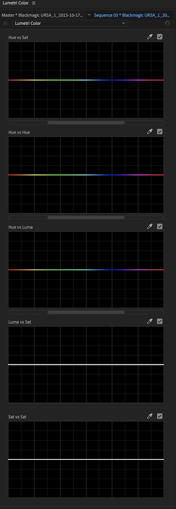 The biggest noticeable change for those digging around the new PPro will be the new Hue Saturation Curves that populate the Lumetri panel. There are all of the hue saturation curves that you might expect or might have seen in other color grading applications. Hue vs Sat(uration) and Hue vs Hue are the two you’ll probably use most often but Hue vs Luma, Luma vs Sat and Sat vs Sat are also available.
These curves are great additions for a couple of reasons. First is that they are quite useful and a full set of hue saturation curves are great for quick color grading. Second is that most of PPro’s competitors have their own full set of curves and this has been notably lacking in the Lumetri color Engine of Adobe Premiere.
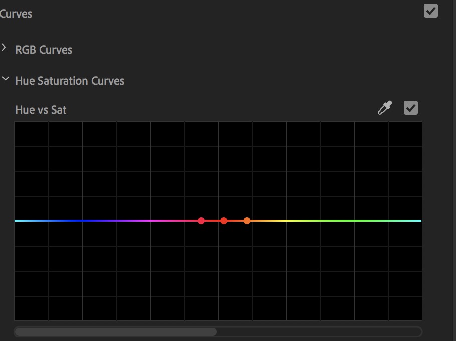
Adobe has put their own spin on the operation of these curves. First, you’ll notice a slider bar underneath each of the curves. This is nice so when you select a color range via the eyedropper that would typically wrap around from one side of the curve graph to the other you can move the entire display.
It’s an interesting world we are living in right now. Adobe is continuing to move Premiere more into DaVinci Resolve territory with more and more added to Lumetri with each update. Blackmagic continues to move Resolve more into Premiere territory with more editorial feature added with each update. No one NLE is overwhelmingly better than another but REsolve still has the upper hand in color grading. Premiere still has the upper hand in creative editorial. But they are getting closer with each update.
The question IMHO comes down to conforming between the edit and the grade. Is it worth lesser editorial tools and no conform pain to do the creative edit in Resolve? Or do you forgo more advanced grading tools to keep the edit in Premiere and do the color grade with Lumetri? This is, of course, a personal decision that depends on many factors including time, budget, the complexity of edit, source elements and skill of the conformist and colorist. There is no easy answer.
But about those new Lumetri curves. Don’t like it when your control points for a curve wrap around the edges of the graph?
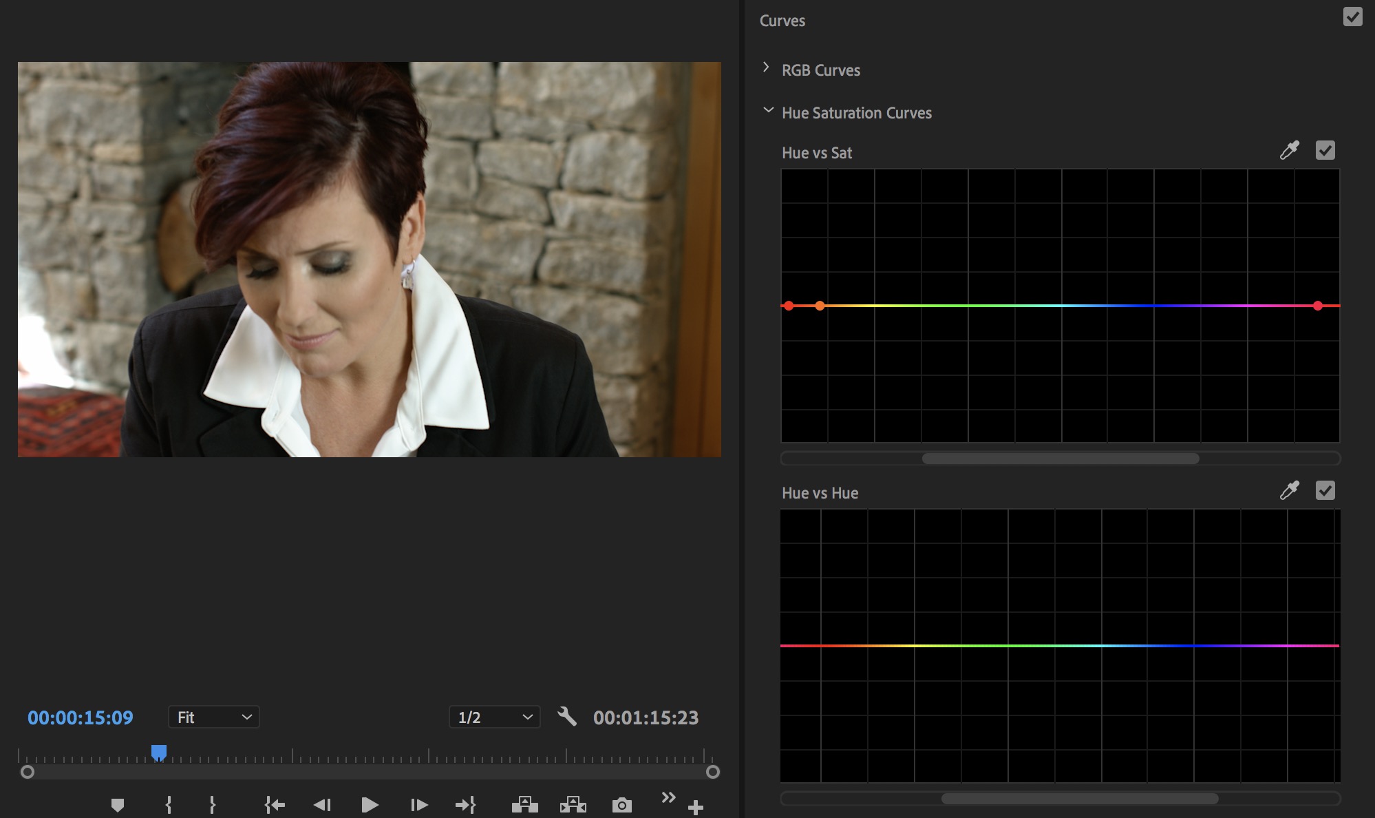 Just move the slider over and you can re-center that color range instead of having the control points wrapped to both sides. Simple but nice.
The other unique thing you will notice is that when adding control points and moving those control points on any of the curves Lumetri will display a vertical line that gives you an indication of what’s going to happen in the image as you drag the control points.
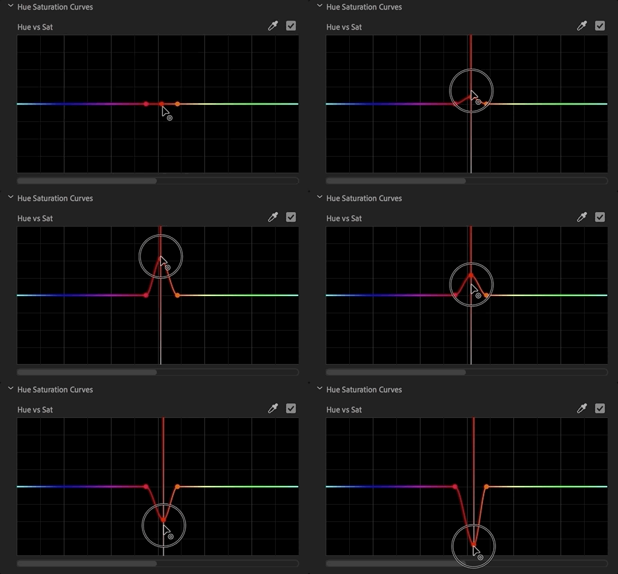
Depending on what curve you are adjusting you will see different colored guides in those vertical lines on the graphs.
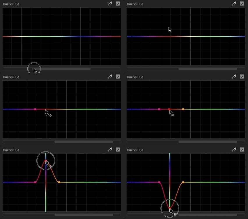
That will come in handy on some parameters more than others but like the graph sliders so control points don’t wrap around from one side of the graph to the other these vertical guides are a nice touch. Holding shift will constrain the dragging of the control point to the vertical line. Like the old Hue Saturation Curves circle, a double click removes all points and CMD/CTRL (Mac/PC) removes only one.
Speaking of the old the old Hue Saturation Curves circle … it is gone. Good riddance.
Better Lumetri Management
While it has always been possible to apply multiple Lumetri instances to a clip for more advanced color grading that was previously a more cumbersome process as you had to apply the effect from the Effects pallet each time.
The Fall 2018 release of PPro adds a new pop-up at the top of the Lumetri panel to add and manage multiple instances of the Lumetri effect right from the panel.
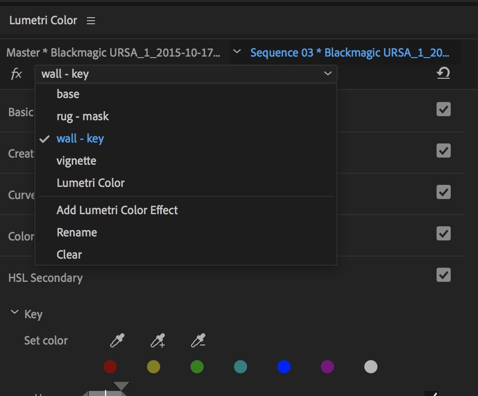
You can add them, clear them and rename them without ever leaving the Lumetri Color panel. Any new instances of the effect that are applied in the Lumetri panel show up under the Effect Controls panel as an applied effect. That is where you can adjust the order in which they are applied.
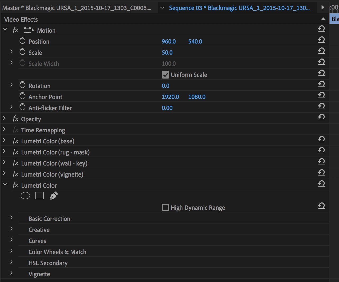 Looking through the keyboard shortcuts I don’t see any new shortcuts that will let you move through the different grades via the keyboard. Hopefully, that will come in future versions because if you are using a control surface like a Tangent Ripple that could make for some Nice and efficient grading.
https://youtu.be/F7bXmq7_umA
Better Reduce Noise and a new Reduce Reverb via Essential Sound
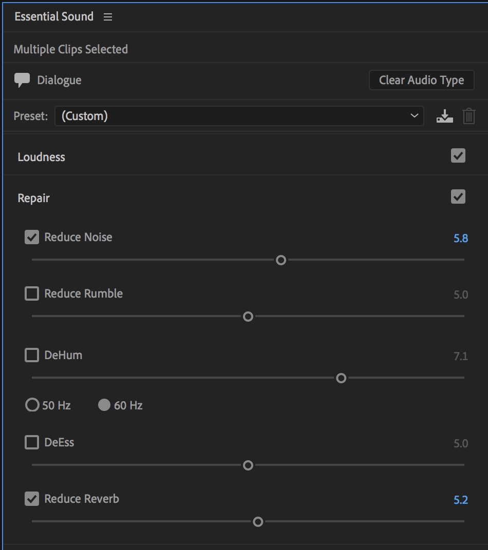
Anyone who ever tried to use the Reduce Noise slider under the Essential Sound panel probably knows it was relatively useless. Being an adaptive noise reduction filter the effect had to “listen” before applying noise reduction. This usually resulted in hearing the noise before it was filtered out.
 This new Reduce Noise is far superior to the old … at least on the noisy clip I tested it on.
The clip below is an iPhone recording in my office with hard drives going, a fan and a rather loud air conditioner. The first few seconds are silent before I talk so you can hear the noise in the room. Notice how you hear that noise before it is filtered out by the old Adaptive Noise Reduction.
Audio PlayerHere is that same clip on the timeline run through the new Essential Sound Reduce Noise.
Audio PlayerThat works a lot better. No giant sucking sound as the noise gets processed and then removed.
I’m glad we’re seeing functionality continue to be added to the various Premiere panels, especially Essential Sound as we all know that audio is often shortchanged or even neglected in the post-production process. Adding parameters that actually work means people will, gasp, use it!
https://youtu.be/FbMrZn_NX_4
Display Color Management
A new Enable Display Color Management preference (off by default) will attempt to more properly map the image on wide color gamut displays like an iMac Pro.
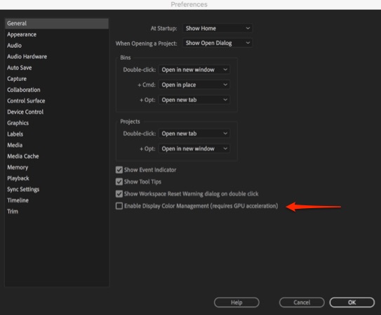
This should allow Premiere to properly jive with the display profile in your computer’s settings. It applies only to the connected computer displays, not third-party hardware, and is for display only, not export of media. We’ll have to play around with this setting I think to get the full story. It’s not full on color management like what is built into Resolve but perhaps it can help with the dreaded Quicktime gamma shift.
Label color visibility on timeline clips
This seems so small but it’s actually huge for editors. If you use clip labeling to organize and visually make your timeline a much more managed place you might have noticed that when you selected clips in the timeline the video clips all went to a state of selected color and not the label color.
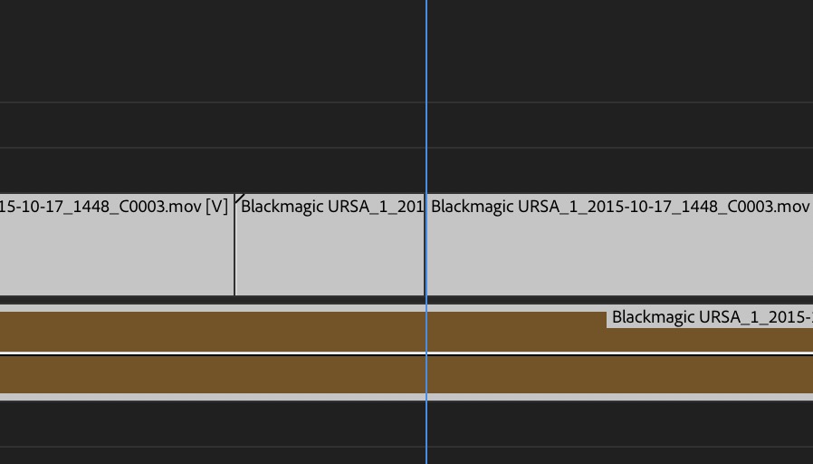
I see that highlight but no label color.
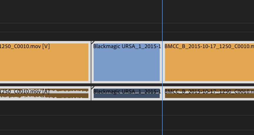
I now see label color.
Video clips now have the same highlight design as audio clips so we can see the label color when they are selected.
You might notice more overall readability of clips in icon view in a bin. It looks like readability got some overall love.
Vector Motion controls in the Effects Controls Panel
The introduction of the new Type tool several versions ago and the Essential Graphics Panel basically introduced continually rasterized options for the new type tool. Those controls have now been exposed in the ECP with a new Vector Motion option.
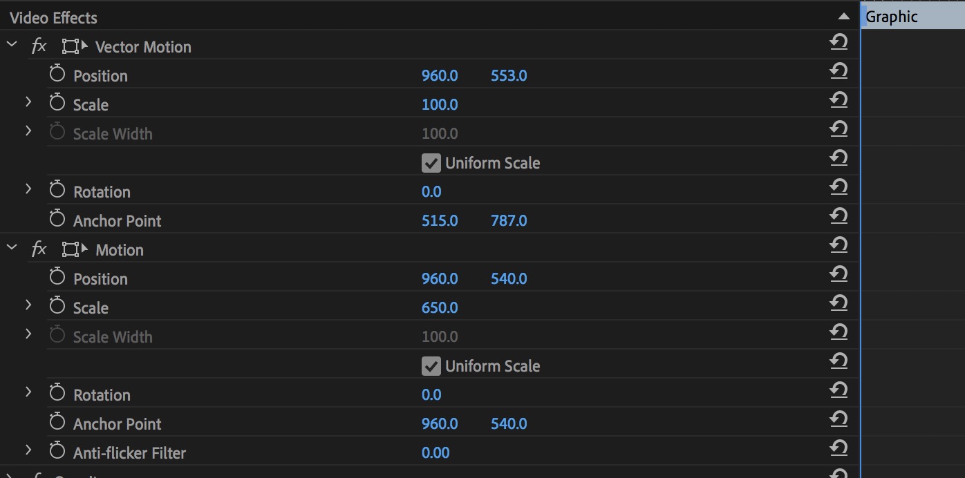
When working with the new type tool you always wanted to scale and move via the Essential Graphics Panel to keep type looking crisp. Now we have the option to use them in the Effect Controls panel.

Unfortunately, this doesn’t mean we can now bring in Adobe Illustrator or other vector graphic files and keep them rasterized but maybe in the future.
A few more notable things straight from Adobe
Those above items are some of the new and notable things that I was able to “kick the tires” on before this new release drops sometime in the fall. There’s a lot of other things that are less useful for me in my day-to-day editing but are worth noting for this release.
Performance and format support
Hardware-based encoding and decoding for H.264 and HEVC
offer better performance and faster rendering. Improved image processing provides more responsive playback, rendering, and Lumetri Color performance.
New native format support now includes ARRI Alexa LF (Large Format), Sony Venice v2, and the HEIF (HEIC) capture format used by iPhone 8 and iPhone X. Improved visibility for QuickTime 32 files makes it easier to identify legacy media in your projects.
End-to-end VR 180
I don’t do any of this work so PPro’s team will spell this one out.
As with existing support for 360 content, you can view 180 media on-screen as flat equirectangular images, mouse around rectilinear VR view (also on screen), or using VR headsets with the Adobe Immersive Environment.
Spatial Markers: Review immersive media more efficiently in the Adobe Immersive Environment. Place spatial markers on your media while in your headset so you can easily find those areas when you return to the desktop Timeline.
Theatre Mode gives you a new portable reference monitor within the Adobe Immersive Environment: a virtual screening room for collaborating with your director or producer, whether for 2D or immersive content or a combination of both
Motion Graphics workflows
Motion Graphics templates continue to get a lot of work. The cool thing for the Fall 2018 release is data-driven infographics which means this: Drag and drop spreadsheet files onto Motion Graphics templates to generate visual representations of your information. Even better: updates to the spreadsheet are reflected automatically in the graphic.
https://youtu.be/UAxIrdUdU1s
https://youtu.be/8UN04DcEYp4
Better After Effects Collaborative workflows with Motion Graphics templates
I like the AE to PPro integration with Motion Graphics Templates and these are getting better. Easier to create with more control options inside of Premiere this workflow continue to evolve.
Simplified authoring: Designed to streamline editorial in Premiere Pro, After Effects artists can now hand off uncluttered Motion Graphics templates with editable parameters organized into groups with custom headings and twirl-downs for showing (or hiding) each set of controls. Your editors will love you.
Font controls: Unlock font settings and enable editors to change typefaces without having to ask you to resubmit the template. Like everything else in Motion Graphics templates, you decide which elements can be customized and which should not.
Responsive Design—Time: Preserve the integrity of keyframes within flexible, stretchable After Effects compositions to protect designated regions, such as intros or outros.
And that’s it for this look at the Fall 2018 Adobe Premiere Pro release. All of the Creative Cloud apps are getting updated so check out PVC, the Adobe Blog or anywhere around the internet for the updates to the rest of the CC suite. I don’t have any idea when it will ship but be careful upgrading when it does.
Oh … I didn’t mention Project Rush. So … Project Rush.

Filmtools
Filmmakers go-to destination for pre-production, production & post production equipment!
Shop Now