It’s mid-June 2015 and the Adobe Creative Cloud update that was promised before NAB has shipped. While most all of the CC apps were updated we’re only going to look at Adobe Premiere Pro CC 2015. We had the NAB-preview and there’s been a lot written on the new Lumetri color correction tools and the apps in general so I wanted to talk about a few things that I came across while using the update for a full work day.
It’s mid-June 2015 and the Adobe Creative Cloud update that was promised before NAB has shipped. While most all of the CC apps were updated we’re only going to look at Adobe Premiere Pro CC 2015. We had the NAB-preview and there’s been a lot written on the new Lumetri color correction tools and the apps in general so I wanted to talk about a few things that I came across while using the update for a full work day.

There’s this beautiful new splash screen to take you into PPro 2015.
What I noticed was there are quite a few small features (like some other PPro updates that have come down the tubes) that are in this 2015 update that don’t make the headlines. They are little interface tweaks or feature additions that might make the creative offline editors very happy but wouldn’t necessarily sell a lot of licenses or make very good demos. But they are very important so there they are, IMHO.
But first be aware when you install and sync your settings
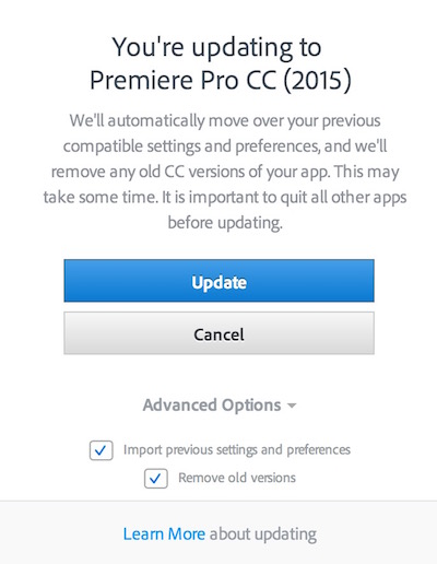
If you haven’t already installed the update be aware that the default will overwrite the 2014 update unless you choose the Advanced Options.

There you’ll be able to keep CREATIVE CLOUD 2014 and/or CS6 if you uncheck Remove old versions.
Then you’ll have lots of Premiere’s installed!
And if you want to change the icons to keep them straight in our dock grab some custom made icons here.
I had trouble making the Sync Settings feature work via Creative Cloud to get my keyboard shortcuts, workspaces and preferences across to the new version. Seems this might be a known issue though it did work for some folks.
@editblog If you used Migrate Prefs on install you should get kb shortcuts and prefs. We had a late breaking issue with sync settings…
— Adobe Premiere Pro (@AdobePremiere) June 16, 2015
— Adobe Premiere Pro (@AdobePremiere) June 16, 2015
If you need manually move your keyboard settings or saved metadata column layout and such just follow the path:
/Users/USERNAME/Documents/Adobe/Premiere Pro/9.0/Profile-CreativeCloud-/Mac
I found these are in my Documents folder, not the Library
Note that if your preferences don’t sync then some settings might revert back to their original state like the much hated Automatic peak file generation under the Audio preference. Go back and turn that thing off before importing media. And of course default means the Media Cache Files will go back to your startup disk. We are ready for an overhaul of media cache creation in the next Premiere update Adobe engineers.
There are a few undocumented things
UPDATE 6/18/15: Here’s one that was mentioned in an Adobe blog before NAB but I just discovered/remembered today: Selection Follows Playhead
If you look under the Sequence menu in the new PPro 2015 update you’ll see a new option called Selection Follows Playhead. with that checked clips in the timeline that land under the playhead will automatically be selected instead of having to click them. Why is this new and important? With the new Lumetri color tools you don’t want to have to manually stop and click a new clip as you go through grading your shots. A bonus by-product is that if you only have effects on clips and no Lumetri color you can still make use of Selection Follows Playhead to automatically open up the Effect Controls to adjust those parameters.
UPDATE 6/17/15:This is a nice one thanks to reader David Sikes in the comments below. Check the keyboard shortcuts for a new Bypass Lumetri Color Effects button and map that to your keyboard for easy toggle between your grade and the original footage.
This is kind of a necessity when doing a lot of color grading so it’s a nice addition. I tried it out and it appears to only work when you have the Lumetri Color controls open during grading. But you can always toggle the grade off at any point by going to the Effect Controls.
There’s a new preference under General for Show Event Indicator.
This update add a new (and brightly colored) message that will pop-up at the bottom right should PPro encounter a problem.
From what I can tell unchecking Show Event Indicator will suppress those pop-ups. I’m guessing those issues would still be logged in the Events window.
I noticed a couple of new cursors that appear when you’re over a panel area that would allow you to drag a panel to dock elsewhere.
This single square cursor appears when you can drag a single panel tab and move it around to dock elsewhere.
This double square cursor means you’re grabbing an entire panel with multiple tabs/windows to dock elsewhere.
Trimming gets some feature love
There’s a number of small enhancements focused around trimming in the 2015 release. These are small but important things that hardcore craft editors will appreciate. These are things that aren’t big and flashy but are important none-the-less.
- Trim and Nudge can use the same keyboard shortcut
YES! Pardon my excitement as this is my favorite thing about this new update. If you’ve build your PPro keyboard out of a Media Composer base you probably realized that mapping the m,./ keys to make them like Avid (which can perform double duty in Media Composer) could not do the same in PPro, until now. Before nudging a clip as in moving clips left and right in the timeline and trimming an edit as in moving the edit point left and right had to use separate keyboard mappings. Now that can be the same which makes sense as it would be impossible to use those two command together.
- A composite view is shown in the 2-up display in the Program Monitor when drag-trimming an edit point in the timeline
This one threw me for a loop as I couldn’t really see much difference in the two-up trim view between the old and the new. Then it hit me that “composite” view might mean if you are doing some composting and needing to trim the edit under the composite. That’s the key as PPro will now show you the composite image (as in whatever is in the layers above your trim) in the two-up trim viewer as you make the trim. Say you have a lower third above your clips you’ll see that lower third as you trim.
- A Revert Trim Session button can be added to the Program Monitor to enable an edit point to be returned to its original position before Trim Mode was entered
This one puzzled me a bit as there isn’t any explanation in the help documents. It’s an innocuous looking arrow button that has been added in the Button Editor on the Program monitor.
Add it to your transport control buttons and it becomes active when using the Trim Edit function and opening the Trim view in the Program monitor. You seem to be able to trim until your hearts content and then if you don’t like what you did hit the Revert Trim Session button before exiting the trim mode and all those trims will revert back to their state when you entered the trim. If that sounds like an Undo function it kind of is but it’s like multiple undos in one. If you watch the History panel you’ll see it jump back multiple levels at once when using the Revert Trim Session.
You can even add more trims to your selection while in the trim mode and the Revert Trim Session will revert those too.
And it’s nice to see this new Revert Trim Session as a keyboard shortcut so you don’t have to see those cluttering transport control buttons just to use it.
@editblog Undoes all trims from the time you entered trim mode. ^Al
— Adobe Premiere Pro (@AdobePremiere) June 16, 2015
- In loop playback Trim mode in the program monitor, the I and O buttons can be used to adjust the position of the edit point on the fly
Once again a new feature that will please Media Composer editors. Trimming on the fly is not possible. When in trim mode hit the space bar to play around the edit (which honors the Preroll and Postroll settings from your Playback preference) and when you hit I or O on-the-fly as you audition the trim the edit will jump to that point. It’s a great way to trim an edit to where it just feels right all without stopping playback or touching the mouse.
New in @adobepremiere 2015 on-the-fly trimming and a live playhead while playing around a trim
A video posted by @editblog on
But there’s an even better by product of this new feature: when you hit the space bar to audition the trim the playhead will actually move in the timeline as playback happens. In older versions the playhead would not move. This is important to be able to see exactly where the playhead is when you want to trim on the fly. And it just feels right to see it move whenever you media is playing back. I hope hope that this active playhead can be expanded to actually move when you’re just JKL playing a trim as well. Avid can do that.
And lots of other new things
- 4-point editing has been improved by enabling Ignore Source Out
This option has been in the interface before 2015 but I’m guessing it wasn’t ever highlighted as an option to use. I opened the old version and it’s there but I couldn’t make it light up as an option to use, it was always grayed out. But I couldn’t make it see the Ignore Source In Point in the older version either so go figure.
Here’s a 4-point edit (as in IN and OUT set in both the Source and Program) with all the options to select/
Here’s a 4-point edit in PPro 2014. Options grayed out and I have no idea why.
- Clip Markers are still displayed in the timeline for tracks set to minimum height
This was a bug more than a feature IMHO. If you had clip markers applied you had to have track heights at least one tick above their smallest setting. Now you can have a completely minimized track height for all tracks and still see markers. The way it should be.
- Subsequences can be created from parts of a sequence
Check your Sequence menu and there is now an option to Make Subsequence near the bottom. This is like a subclip for a sequence and something Media Compose editors will welcome as it’s a nice little thing to have when making string-outs or selects reels.
It’s very important to note that making a subsequence respects which tracks are targeted when you make it. So if you have your track targeting turned off for music on A5 your subsequence won’t have any music in it. This is a good thing as you can selectively make subsequences with or without certain elements. Subsequences get an Sub_01 Sub_02 etc added to the original sequence name. And if you make a Subsequence from a Multicamera Source Sequence that you have opened in timeline it does not make a new multicam sequence, just a regular sequence. Not a big deal but good to know.
- The transition UI has been restored in the Effects Control Panel
For some reason this transition control was removed a version or two ago but now it’s back. While you can still manipulate transitions right in the timeline the Effect Controls provides a more detailed way to interact with a transition.
It’s nice to have an alignment pop-up for Start, Center and End on but but it’d be nice to be able to type in a custom alignment as well, like Start 9 frames before the cut. If you have really good eyes you can even see a preview of the transition by checking Show Actual Source and hitting the little play arrow.
- Up and down cursor arrows can be used to adjust numerical parameters
This is very nice for more precise control over click and dragging. Clicking and dragging is often not nice for precise control. And modifiers makes this new function even more useful:
-
UP/DOWN arrow moves the parameter in ONE number increments. 10.0 – 11.0
-
SHIFT + UP/DOWN moves the parameter by TEN. 10.0 – 20.0
-
COMMAND + U/DOWN moves the parameter by a TENTH for even finer control. 10.0 – 10.1
-
ProRes media performance has been improved by up to 2x on Mac
That is welcome. I’m not sure how to really test that other than by just feel but any media performance improvement is great!
I’m sure there’s more to discover in this Adobe Premiere Pro CC 2015 release. If you have any favorites please leave them in the comments below.
Many folks on twitter have been busy updating their products and commeting on this release. Here’s a few that I found useful:
favorite new addition to @AdobePremiere CC 2015 is a color picker when creating a new Color Matte pic.twitter.com/lSuN18CTi5
— danny princz (@rendernyc) June 16, 2015
@MaciekKaliski Workspaces do not translate forward because of the new layouts in CC2015 – sorry if this is an inconvenience. ^meagan
— Adobe Premiere Pro (@AdobePremiere) June 16, 2015
The very valuable direct download links for Adobe CC 2015 Release http://t.co/PiY2FlGGYC #Adobe
— Jeff Greenberg (@filmgeek) June 16, 2015
We’re ready for Creative Cloud 2015! Read our blog post to learn about Red Giant & CC 2015: http://t.co/ECcb2q8Pl9 pic.twitter.com/ZzQTROFV35
— Red Giant (@RedGiantNews) June 16, 2015
Sapphire 8.11 is fully compatible with CC 2015. V8 customers can download it for free here – http://t.co/LU04pa13bm https://t.co/ly3dacmSZa
— GenArts, Inc. (@GenArtsInc) June 16, 2015
BEFORE YOU UPGRADE TO AE CC 2015. There is a bug with AE CC 2015 that affects our plug-ins, so. make sure you… http://t.co/tH2K5klSno
— RE: Vision Effects (@REVisionFX) June 16, 2015


