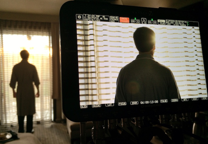
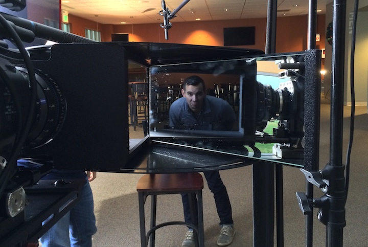
On a recent visit to Sony Studios I saw a 4K monitor for the first time. For the first time ever I thought to myself, “I hope they hold this shot long enough for me to see everything in it!”
I’ve seen 4K demos projected on 25′ screens, and the footage comes across just as a movie would: there’s nothing inherent in the presentation that makes me say “Wow, that’s an amazingly detailed image!” When the same image is displayed on a 60″ monitor, however, the effect is jaw-dropping. The amount of detail crammed into such a small space is almost too much for the brain to process. Indeed, a Sony rep told me that 4K sports panning shots have to be very slow not because of technological issues but because the human brain can’t process the new image information fast enough.
Adam Wilt and I have a Canon C500 camera on loan from Canon and I want to shoot something with it that really shows off what 4K can do on a 60″ display. My impression is that 4K is all about textures and fine detail, so when a friend mentioned a cypress grove on the coast near San Francisco I realized that this was the perfect place to capture the kind of textures I want.
I shot these stills during a recent location scout using my Nikon D7000 stills camera. I processed them in Adobe Lightroom.
When I saw that 4K monitor image I was overwhelmed by how much there was to see in one frame. My eye literally didn’t know what to look at next, and I realized this was a problem: viewers could find such complexity confusing and exhausting unless they were told where and when to look. As a cinematographer I specialize in directing attention to particular spots within the frame but 4K is different as it offers the opportunity to be “epic.”
Epic, to me, is Lawrence of Arabia:
“Epic” is framing a wide shot to be a wide shot, taking advantage of resolution and composition to create an image that works perfectly in that particular high-resolution medium. Your eye is guided through the frame as if it were looking at a painting, and there’s plenty to look at.
Indeed, painters have some very sophisticated tricks for guiding the eye that they’ve been using for centuries. A single painting has to engage a viewer for a period of time without letting their gaze slip away, such that the viewer scans the picture several times in a proscribed fashion and sees something new every time. Painters know not only how to direct interest but how to guide the wandering eye around the frame and then back to the center of interest, never letting our attention leave the frame.
That’s what I want to do with this little 4K Canon shoot: I want to shoot a miniature epic.
When I took my location scout photos I sought compositions that were interesting enough to view for long periods of time. I looked for textures and patterns that would read particularly well in a high resolution image. When I looked at compositions I forced my eye to move in circles around the frame, and if they wanted to drift out of the frame then I worked to include something that would block that movement. I sought frames that gave my eye a reason to move back and forth across the image instead of looking only at one defined spot. I tried to think “epic.”
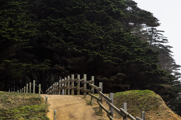
I like this image because the curve of the path reflects the curve of the trees on the right side of frame. My eye goes up the path, into the texture of the trees, down the curve of the branches on the right side of frame and back to the path. There’s lots of texture for the eye to feast on.
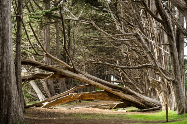
I shot this fallen tree from several different angles. My eye travels down its trunk to the trees on the right, where it then moves up their trunks and is directed to the left side of the frame by their branches. My eye then it travels down the length of the fallen tree again and lands in the center of the image. The dark ground at the bottom serves as an accent and keeps my eye focused on the center and sides of the frame.
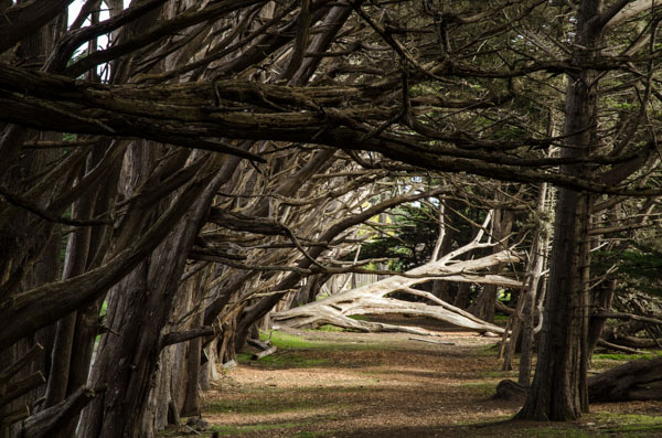
This image works in a similar manner: I start by looking at the bright fallen tree but then my eye moves up the tree on the right. The horizontal branches block my eye from leaving the frame and guide it back across to the left side of frame where it follows the curve of the branches down and back to the fallen tree.

In this image my eye starts on the path and follows the lower branches across the bottom of the frame. I then follow the upper branch across the top to the trees on the right, and then back down to the bottom branch and across to the path again.
In each of these cases I’ve created a path for the eye to move through the frame that both guides its course and prevents it from drifting out of the borders of the image. This is less of a problem with TV and projected images as they are most often surrounded by some sort of black border that keeps our attention focused on the picture, but it’s still good practice to create compositions that instruct the viewer where to look and in what order. It’s quite pleasant to view images that are constructed that way and it reduces the strain of trying to take in a very complex image in a very short period of time.
The addition of vignettes in color grades is one method of keeping the viewer focused on the center of an image without letting their attention drift out the sides. This image on its own is very pretty:
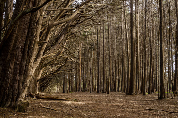
While the ground is interesting I find it distractingly bright and textured in the foreground, and my attention is drawn to it as my eye moves around the frame. It’s hard to keep my attention within the frame because there’s really nothing there that prevents my eye from escaping out the bottom.
Here’s the same image with a vignette. I went a little overboard just to make a point:
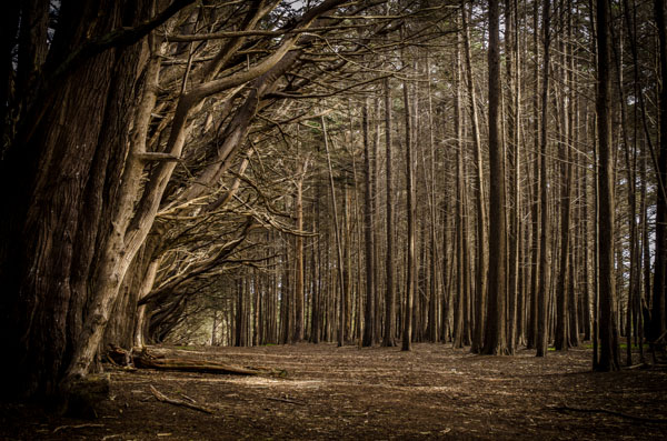
Corners can lead the eye out of the picture, as can flatly lit ground at the bottom of the frame, so by darkening these elements I can keep the viewer’s eye locked within the frame. When I look at this image by gaze moves around the frame in a circular motion that feels comfortable. The non-vignetted version is a little more stressful to look at as it’s easier for my eye to dart around the frame in no particular pattern, which can be confusing and tiring.
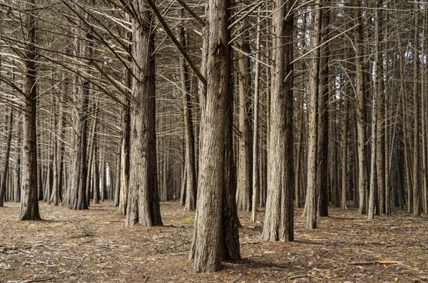
I really like this image. The triangular arrangement of the trees guides my eye across the bottom of the frame and up into the verticals of the tree trunks, where the branches then guide me across the top of the frame, down the trunks and across the bottom of the frame again. The bottom of the frame feels a little weak, though, so I’m going to darken the ground a touch:
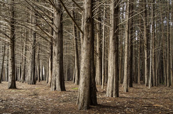
The change is subtle but it does help to keep my eye moving across the bottom of the frame instead of stalling at the bottom edge of the picture.
I know there will still be directors who want to keep the camera moving, or have only one object in focus at a time, and those techniques are valid storytelling tools for a lot of projects. 4K TV, though, is going to open a world to us that we haven’t enjoyed since the days of 65mm filmmaking. It would be a shame not to take advantage of it.
Images like these on a 4K display are, in my opinion better than 3D: partially because we don’t have to wear glasses to enjoy it, but also because everyone can see 4K but not everyone can see 3D.
Here’s one last image:
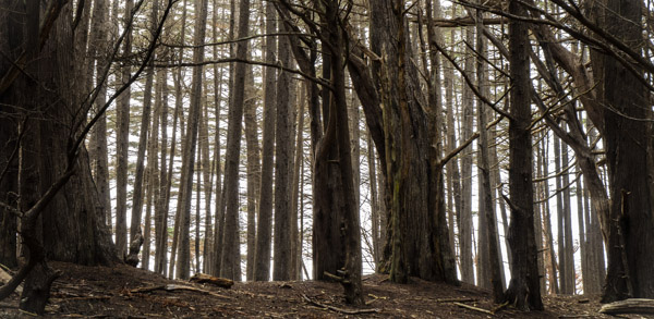
I cropped this a bit as I love wider-than-normal images. I like how my eye is hemmed in by the ground at the bottom of the frame and the horizontal branches along the top. The sides of the image are framed by large dark tree trunks while the lighter, thinner trunks in the background offer a lot of eye-pleasing detail and a sense of depth that separates them from the foreground. This is the kind of image that will sell 4K images, and I hope to capture many of these this weekend with a Canon C500, in glorious 4K resolution.
02/15/2013
Art Adams
Director of Photography
www.artadamsdp.com
Twitter: @artadams

Filmtools
Filmmakers go-to destination for pre-production, production & post production equipment!
Shop Now