For a couple of weeks I’ve been researching the mystery of Sony S-Log, and log curves in general, trying to determine what they are, what they do, and whether they are a good thing or not. After interviewing three different people (George Palmer of HDPix, Michael Bravin of BandPro and especially Steve Shaw of Digital Praxis) I finally had a sartori. I get it now. It’s really cool. And it’s surprisingly simple.
USE THE APPROPRIATE AMOUNT OF FORCE
I’ve written before about how advanced gamma curves of any sort are intended to fit up to 12+ stops into the five stop bucket specified in the Rec 709 HD standard. While the other curves built into the F35 and F23 are basically what-you-see-is-what-you-get curves, S-Log is the only one that’s not. At first I had a hard time getting my head around the math of how S-Log is storing bits until Steve Shaw helped me see that it’s all about working with Mother Nature.
An image sensor sees light one way: linearly. It simply counts photons. A 14-bit sensor, with 16,384 steps per channel, will distribute brightness this way:
16,384: totally saturated sensor (maximum white)
8,192-16,383: First stop down from maximum white
4,096-8,191: Second stop down from maximum white
2,048-4,095: Third stop down from maximum white
1,024-2,047: Fourth stop down from maximum white
512-1,023: Fifth stop down from maximum white
256-511: Sixth stop down from maximum white
128-255: Seventh stop down from maximum white
64-127: Eighth stop down from maximum white
32-63: Ninth stop down from maximum white
16-31: Tenth stop down from maximum white
8-15: Eleventh stop down from maximum white
4-7: Twelfth stop down from maximum white
2-6: Thirteenth stop down from maximum white
1-2: Fourteenth stop down from maximum white
As you can see, the first four stops of dynamic range get an enormous number of storage bits–and that’s just about when we hit middle gray. This is the origin of the “expose to the right” school of thought for “raw” cameras: if you expose to the right of the histogram you are cramming as much information as possible into those upper few stops that contain the most steps of brightness. As we get toward the bottom of the dynamic range there are fewer steps to record each change in brightness, and we’re also a lot closer to the noise floor.
The solution to this strange state of affairs continues on page two…
THE WASTE OF COUNTING BITS
Linear gamma images, in their raw form, are unwatchable: most of the image will appear very dark because the vast majority of luminance values in an average scene are going to fall into one quarter of the bits. Out of 16,384 steps per channel, flesh tone is probably going to fall around 2048 or so, which is pretty far down. Cameras apply what Sony calls a “coarse” gamma correction of .45 to this linear image in order to brighten up the shadows and mid-tones and make it viewable on any Rec 709-compliant TV monitor.
Side note: CRT monitors have a natural gamma response of 2.2, which is the inverse of .45. It was long ago decided that cameras would encode linear images with a .45 gamma curve so that the pictures would appear normal on CRTs. LCD monitors do not have this natural 2.2 gamma response so they are designed to artificially mimic it in order to stay compliant with existing standards.
The problem is that linear gamma is somewhat the opposite of logarithmic gamma, which is how our eyes see. Without getting into hardcore math, this is how logarithmic gamma works:
Imagine one lit candle in a dark room. If we light fifteen additional candles, one at a time, the sequence of total candles lit looks like this:
1 2 3 4 5 6 7 8 9 10 11 12 13 14 15 16
By the time the sixteenth candle is lit you might assume that the room would appear to our eyes to be sixteen times as bright as it did with one candle lit. But because we see in logarithmic values, the room actually only seems four times as bright as it did when the first candle was lit.
A logarithmic change means that the apparent change in brightness between one candle and two is the same to our eyes as between two candles and four. Adding four more candles, for a total of eight, looks like the same brightness increase as increasing the number of lit candles to sixteen.
The top line is the number of candles, and the bottom line shows the perceptual steps where our eyes see the SAME apparent increase in brightness:
1 2 3 4 5 6 7 8 9 10 11 12 13 14 15 16
1 2 4 8 16
And there’s the difference between linear and log gamma:
The sensor (linear gamma) counts ALL the candles, even though our eyes gradually stop seeing small increases in brightness due to the lighting of individual candles because each additional candle is perceptually too small to count.
Our eyes (log gamma) look at brightness in terms of how bright the first step is (adding a second lit candle to the first) and how much change needs to occur to see that step again (adding four candles to four, adding eight candles to eight, etc.).
Here’s another way to look at this scenario. In order for the eye to start at one brightness level and then see four additional steps of equal brightness:
1+1+1+1+1
We need to light the following numbers of candles:
1 2 4 8 16
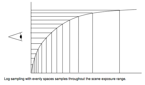
It’s important to notice that the logarithmic steps get bigger as the room appears brighter, because that’s how we perceive reality. Our eyes are very good at detecting small steps in dark and mid-tones but the brightness steps get much bigger when we look at bright objects. This is the opposite of how a sensor sees, because linear gamma allocates the most, and smallest, steps to highlights and the least, and biggest, steps to mid-tones and shadows.
On to the main course on page three…
THE MAGIC OF S-LOG REVEALED
Here, in all its glory, is how S-Log works:
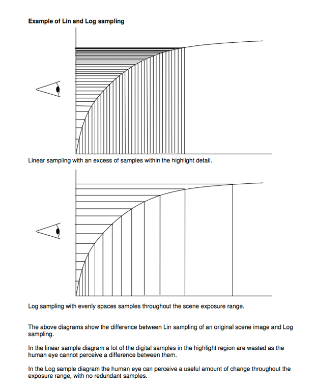
The gamma curves that we’ll look at on the next page are based on the bottom graph, and it’s useful to notice a couple of things about it.
The steeper the curve the finer the brightness steps, and the flatter the curve the bigger the steps. The steepest part of the curve is between 0% and 70% on a waveform monitor, which is where the most perceptual steps of brightness are; after 70% the curve becomes very flat and is meant to hold highlight values whose steps can be wider because, while our eyes appreciate seeing highlight detail, we aren’t very good at perceiving fine luminance steps in it.
Brightness data is stored in 10-bit steps, or 1024 values for each channel. The internal code values for different shades of brightness, and their equivalents on a waveform monitor, look like this:
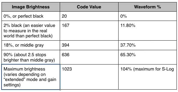
It’s handy to note that, if you move the decimal point of the code values one step to the left, they are very close to their equivalent waveform value. For example, middle gray’s code of 394 becomes 39.4, which is very close to a waveform value of 37.7%.
One of my first questions to all the people interviewed for this article was: “With only 370+ steps from black to gray, and another 250+ or so from middle gray to white, and with another nearly 400 steps dedicated to highlights, are there enough steps to prevent banding when they are expanded and manipulated in post?” The answer, universally, was “Yes: you’ve been watching this for years. This is based on the Cineon spec for digitizing film, and you’ve been fine with it so far.”
There are three reasons why this curve won’t play well on a regular Rec 709 display:
(1) S-Log lifts the blacks considerably, which tends to desaturate the colors
(2) The brightest highlights are heavily compressed
(3) It’s a high dynamic range image whose gamma is not Rec 709 compliant, which desaturates and flattens the image
There’s much talk about using LUT’s and such for viewing an S-Log-encoded image correctly during grading, but that’s not really correct or necessary. Unless your footage is destined for another kind of media, like film, imposing a LUT isn’t necessary.
For TV deliverables you can get an idea of what’s happening on set by configuring one of the F35’s monitor ports to overlay Rec 709 gamma on top of the S-Log image. It’s not going to be a perfect rendition but it’ll give you an idea of what’s going on. When configured this way the F35 output will display a curvy Greek “gamma” symbol in the corner, along with the numbers “709”, to remind you that Rec 709 is being applied to that output. (Your DIT can watch the uncorrected S-Log signal on another monitor.)
While you might be tempted to paint this image to make it prettier you shouldn’t touch the paintbox at all. Painting a Rec 709 rendering of an S-Log image will result in a reshoot, and while the rest of the crew will thank you for another day’s work, you won’t be there.
Another viewing option is to use one of the Sony BVM-L LCD displays, which offer a built-in S-Log-to-Rec 709 decoding function.
To sum up, S-Log very efficiently puts 12 stops of dynamic range into a five stop bucket by remapping brightness data in a way that makes sense to our eyes, and then throws away the data between the perceptual steps that our eyes can’t see. It’s a very good form of visually lossless compression.
S-Log isn’t the end of your options, as I’ll prove on page four…
THINK OUTSIDE THE CURVE
There are other options to S-Log, and a trip to the Digital Praxis web site (http://digitalpraxis.net/sonycurves.htm) will present you with several families of curves that might work better for your particular situation or style of working. The first three sets, the “fixed”, “variable”, and “Cineon” curves are designed for post processing, although the “fixed” and “variable” curves are viewable on set without any major corrections.
Before we start, here’s what you should know about looking at these curves:
(1) The steep vertical part of the curve is where the finest tonal steps are stored, in the shadows and mid-tones up through middle gray.
(2) The flattest part of the curve is where the largest steps between brightness values are stored. The flatter the curve, the bigger the steps between luminance values.
(3) The gray horizontal line is 0% black, and although the curves technically start below black (don’t ask!) we’re only concerned with 0% black and above.
(4) Each vertical square is 10 IRE units.
(5) The horizontal measurement across the bottom is “scene brightness,” Sony’s method of describing how bright a highlight each curve can hold. A Kodak telecine gray card contains a patch of 90% white, so you can think of brighter percentages as being multiples of that white. Or, think of it in terms of how bright a highlight Rec 709 can hold at 100% (typically 2-2.5 stops over 18% gray), and each doubling of that percentage means you can hold another stop of highlight. (450% = 2 1/4 stops brighter than 100%, because the steps are 100% -> 200% ->400% plus 1/4 of the way to 800%.)
(6) Most of the curves split at middle gray (42%) to store increasingly extreme brightness values.
(7) Where to set “white”: Typically black and middle gray stay in roughly the same portion of the IRE scale, with white and super white being the moving targets. My rule of thumb, currently untested but theoretically valid, is that your brightest “textured white” should be placed where the curve goes through a 45 degree angle into the highlights. Beyond that the steps between values increase dramatically, and that’s suitable for highlight rendition but not for holding detail in anything truly important. (Textured white is an Ansel Adams reference to the brightest white value in a print where one can still see detail.) Highlights are effectively gone when they flatten out and show no more steps of brightness. The farther up the flat part of the curve the highlights go the fewer steps will be employed to store them, so try not to push any but the brightest highlights to that edge.
Even though these are log curves they don’t have to follow a strict log format. The distance separating the steps can be tweaked by the designer of the curve to allow for different circumstances, or to emphasize capture of different portions of the brightness scale. That’s why Digital Praxis can offer three sets of log curves to suit three different styles of shooting, as well as one WYSIWYG set. The idea behind the curves is the same: record only the changes the eye can see and ignore the changes that the eye can’t detect.
The following picture is such a great explanation of how to interpret gamma curves that I’m going to post it again:
The bottom part of the scale shows how bright something is, while the vertical part of the scale shows where that brightness value is translated to waveform % values.
The following curves can be acquired here. Each curve is presented using linear data. The graphs show how log sampling stores smaller steps in the shadows and mid-tones and stores wider steps in the highlights. Each family has curves of increasing highlight compression, usually numbered 1-5.
The first are the “fixed” curves:
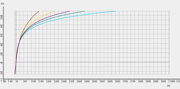
Although these curves are logarithmic, there are adjustments made to points on the curve so that values are stored slightly differently depending on where they fall. In this case the fixed curves “lock” middle gray at about 42% and “lock” black at 0%. Increasing curve strengths strengths (there are 5, from 1 to 5) lift the shadows and compress the highlights toward middle gray. These are good curves if you want to set a T-stop for mid-tones and then choose to expand or contract the contrast range to adjust for contrast changes while keeping mid-tones roughly the same.
The next set of curves, the “variable” curves, work a bit differently:
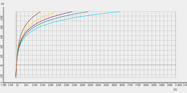
These curves lock black at 0% and increasingly compress highlights beyond middle gray. If we count four squares up the graph from the gray baseline (the curves actually start below 0%, with the dark gray horizontal line at 0%) we’ll see that the curves really take off and flatten to varying degrees starting around 40%. Each vertical square is ten IRE units, so four squares is roughly 42%. These curves will protect mid-tones below middle gray but compress highlights above middle gray to varying degrees. Where the fixed curves aim for preserving middle gray, these curves simply aim at reigning in highlights and will probably require opening up the T-stop as you increase curve strengths (1-5)
The next set of curves, called the “Cineon” curves, are based on how the Cineon file format stores film negative values:
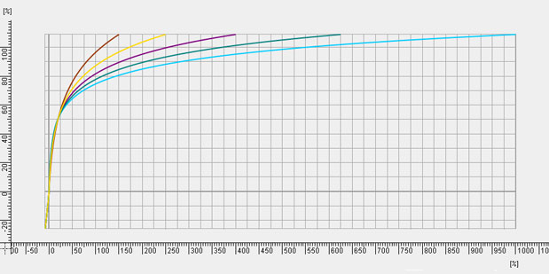
These curves capture the most latitude the camera can offer but are unwatchable on set without a compensating LUT and must be graded in post.
The Megagamma curves, however, are designed to be “What You See Is What You Get” curves:
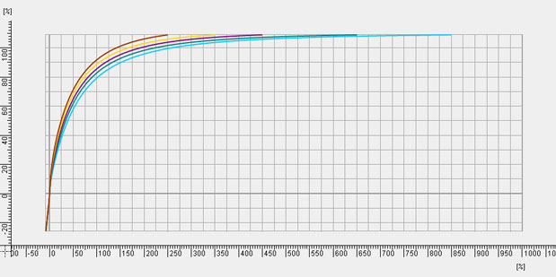
These curves place textured white higher on the IRE scale, keeping shadows, mid-tones and textured whites well within the range of comfortable viewing on a Rec 709 monitor. The highlights flatten out higher and flatter on the curve, so the price for Rec 709-accurate mid-tones are highlights that are sampled with less frequency than any of the other curves we’ve looked at so far. If you like what you see on the set monitor then you won’t have to do any further tweaking in post.
For comparison, here’s what Sony gives you in the camera:
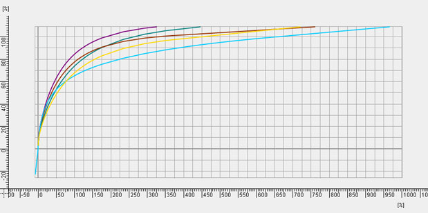
Purple = Hypergamma 3 (max. 109%)
Green = Hypergamma 4 (max. 109%)
Brown = Hypergamma 1 (max. 100%)
Yellow = Hypergamma 2 (max. 100%)
Blue = S-Log (max. 104% in extended dynamic range mode)
And this graph of Rec 709 shows you what you’ve been dealing with for all these years:
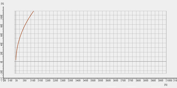
It’s pretty startling to see what we’ve had to put up with for so long, isn’t it?
On to the last page, where we touch briefly on color correction and gamut…
POST: NOW WHAT?
Post color correction couldn’t be easier. Sony lifts the blacks up a bit in S-Log it will be necessary to bring them down to a normal crisp level. (This is not necessary when using Digital Praxis curves as their bases are locked at 0%.) After that it’s just a matter of setting gamma and gain such that you like what you see, and then proceed to perform any other corrections you like. The only time a LUT is necessary is if you are grading for a deliverable that is in a format other than HD, such as a film out.
I had an interesting discussion with Steve Shaw about the choice of color gamut to use in S-Log, or with any form of Log curve. There are several built-in gamut choices in the Sony F35 and F23, but the most useful ones are probably the F900R, which is a very pleasant rendition of Rec 709, and S-Gamut, which captures every color the camera can see, and which Sony says is very close to the color gamut that the human eye can see. When I saw these choices it occurred to me that if I was shooting for both a film out and for broadcast I’d probably want to shoot in S-Gamut and monitor in Rec 709, because that way I’d capture all the colors available to the camera while still being able to view a reasonable image on a Rec 709 compatible display. Steve says that, in situations where you are going for a film out, capturing more information is always better than capturing less, so why not shoot S-Gamut for a film out and then shrink the color space to Rec 709 for broadcast? But he also says that the perceptual differences between Rec 709 and S-Gamut are minimal–because we see colors logarithmically. The farther out from the center of the CIE chart we look the bigger the steps between colors have to be before we see any difference.
A very helpful guide to colorimetry can be found at the International Cinematographers Guild web site.
Thanks to Steve Shaw, George Palmer, Michael Bravin and Dhanendra Patel for their very generous help and feedback over the course of writing this article. Any errors should be attributed solely to the author.

Filmtools
Filmmakers go-to destination for pre-production, production & post production equipment!
Shop Now
