Many years ago I wrote about the simplest interview lighting setup ever. Here’s my modern take on that same setup.
The TL;DR version is: I still use it. I don’t shoot a lot of small-scale talking-head interviews anymore. While I still shoot interviews the scale tends to be bigger—I often have a larger crew and multiple cameras rolling. Generally, though, I use variations on this theme.
There are many ways to light faces, but the harder the light source the more one has to study those faces as shadows are incredibly important to making a person look their best. When lighting someone I’ve never met before, I play it safe as repeat business depends on making people look better than they expect. (Everyone hates how they look, so it’s important to make them look better than they actually do, and by a wide margin.)
That’s why I still use this setup. It’s not 100% perfect for everyone, but it achieves 90% of perfection for nearly any face. That’s good enough.
THE STRATEGY
Big soft sources that are slightly above and close to the subject, work wonders for everyone. I learned this while working for a prolific corporate video client. They often scheduled 5-20 interviews in a day. My crew consisted of myself and a sound person, and the lighting package consisted of a four-light ARRI kit. The grip package was four folding white/black bounce cards and four C-stands. The only way to survive was to keep things simple.
Around the same time I shot a project for ABC (“I Survived a Disaster 3”). I had to shoot 24 interviews in a hotel suite in one day and make each look different.
It’s more important to light the people well than to light the background. The background, though, is what makes locations look different. I formulated a system where I could light anyone well in a hurry, and then focus on lighting the background to complete the look. You can read my original article here.
I’ve been working part-time as a trainer for the ARRI Academy since February 2018., and they asked if I could shoot some student testimonials to promote the Academy. In return for answering questions on camera, I decided to teach the students my one-size-fits-all interview lighting setup. Here’s what it looks like.
HOW IT’S DONE
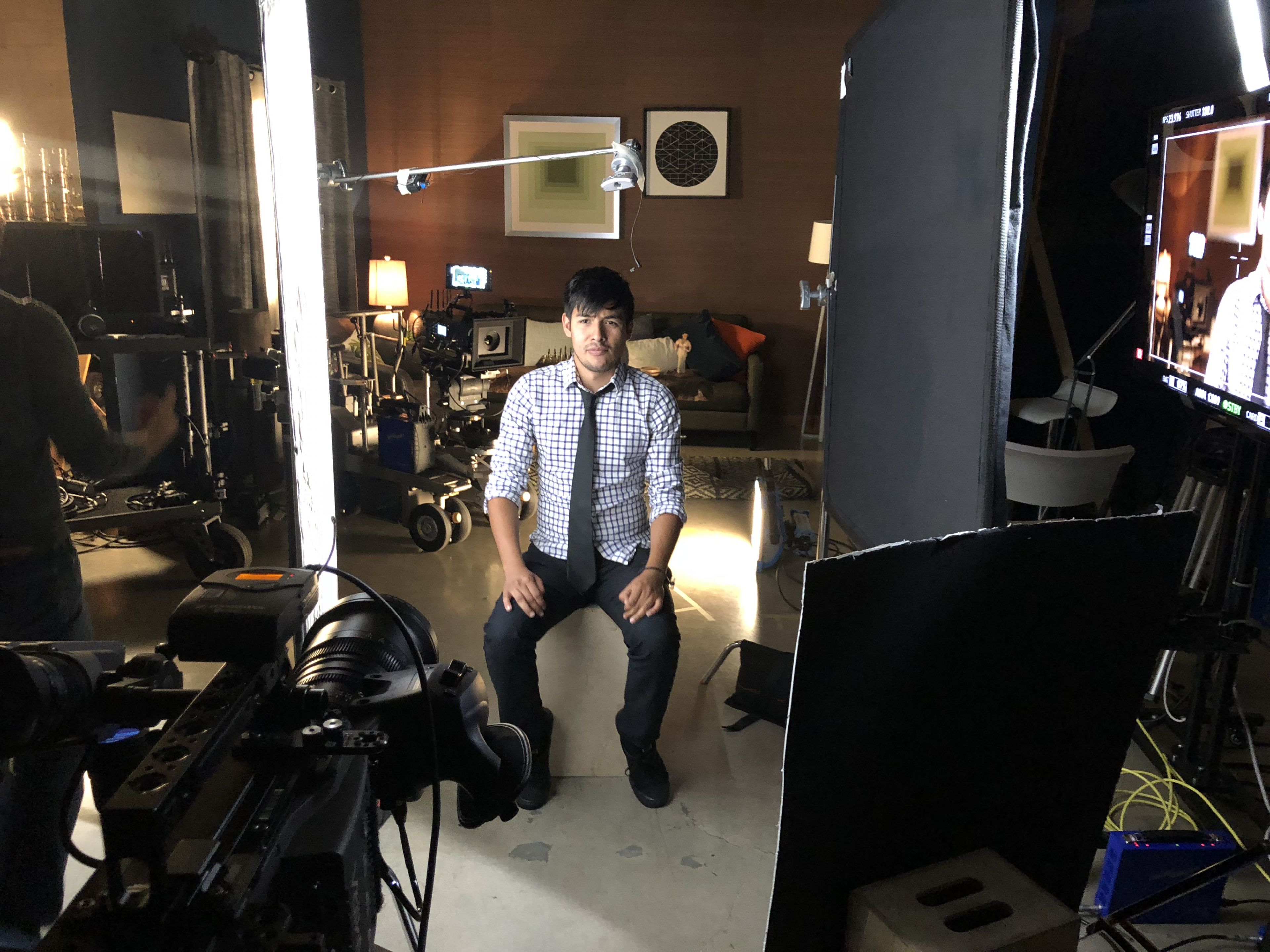
That’s camera assistant Leo Rodriguez. To the left is a 4’x4′ bounce card. To the right is a 4’x4′ floppy flag. On the right, near the camera, is a passive fill card. (“Passive fill” means the card is reflecting ambient light. “Active fill” means the card is lit by an extra lamp.) The light that’s illuminating the 4’x4′ bounce is at the top right corner of the picture, behind the floppy flag so it doesn’t strike Leo directly.
As we were in a hurry, co-trainer Nico Fournier laid an S30 Skypanel on the floor to light the background.
Here’s a diagram from my original article that explains what’s going on. It’s flipped left-to-right compared to Leo’s setup, but you’ll get the idea.

It’s a simple concept. Light a face with a hard source demands precision. Shadows reveal imperfections, so placement of those shadows is critical. Soft shadows require less precision.
We can place this soft source using hard light principles. Traditional portraiture lighting places the nose shadow on the “smile line.” This is an invisible line that connects the corner of the nose with the corner of the mouth. Raising the bounce card and angling it slightly down casts a soft nose shadow along this line.
Placing the card close to the face is important for several reasons:
- A 4’x4′ source isn’t very soft unless it is close. The farther away it is, the sharper the shadows are. I usually put the rear of the card 2′-3′ from the subject. Closer is better.
- A large, close source creates beautiful specular highlights in skin.
- The part of the face nearest the card receives the most light, so it is the brightest. The shadow side of the face receives less light because it “sees” less of the card. Also, the part of the bounce card closest to the camera is what wraps around, and it is farther away from the face. Flattening the card to the subject and putting it near the camera will still create soft light, but the face won’t show much tonal range. Angling the card, so the rear is close to the subject and the front is farther away, brightens the key side and creates a wider tonal range as the light wraps around to the opposite side.
We can replace the floppy flag with a piece of black/white foam core, black side in, as it’s easier to carry foam core on small shoots. Its role is to reduce ambient light and create contrast. A lot of talking head interviews take place in white rooms, so this is crucial.
Sometimes the 4’x4′ “negative fill” eliminates too much light, but that’s okay. It’s easier to add light than to remove it. When I first developed this technique, I’d tape pieces of typing paper to the flag at head height until the fill level on the face looked correct. Now I use a piece of foam core placed low and near the camera.
Soft light from below fills in the chin shadow. Light from the direction of the camera smooths out skin imperfections. I often see fill cards placed to the side of the subject, opposite the key. To my way of seeing, this is incorrect. That placement “catches” the most light from the key to make it the most efficient bounce source possible, but that’s not the purpose of a fill card. It exists to fill shadows but in a flattering way. Placing that bounce source close to the lens axis achieves this goal, whereas placing it too far to the side lights the face unevenly. The fill-side eye is lost in deep shadow, and the nose protrudes when lit from both sides.
AND… THE RESULT
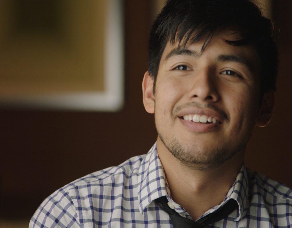
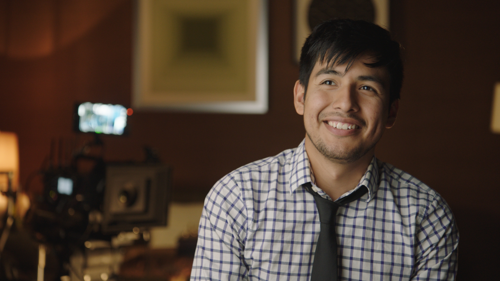
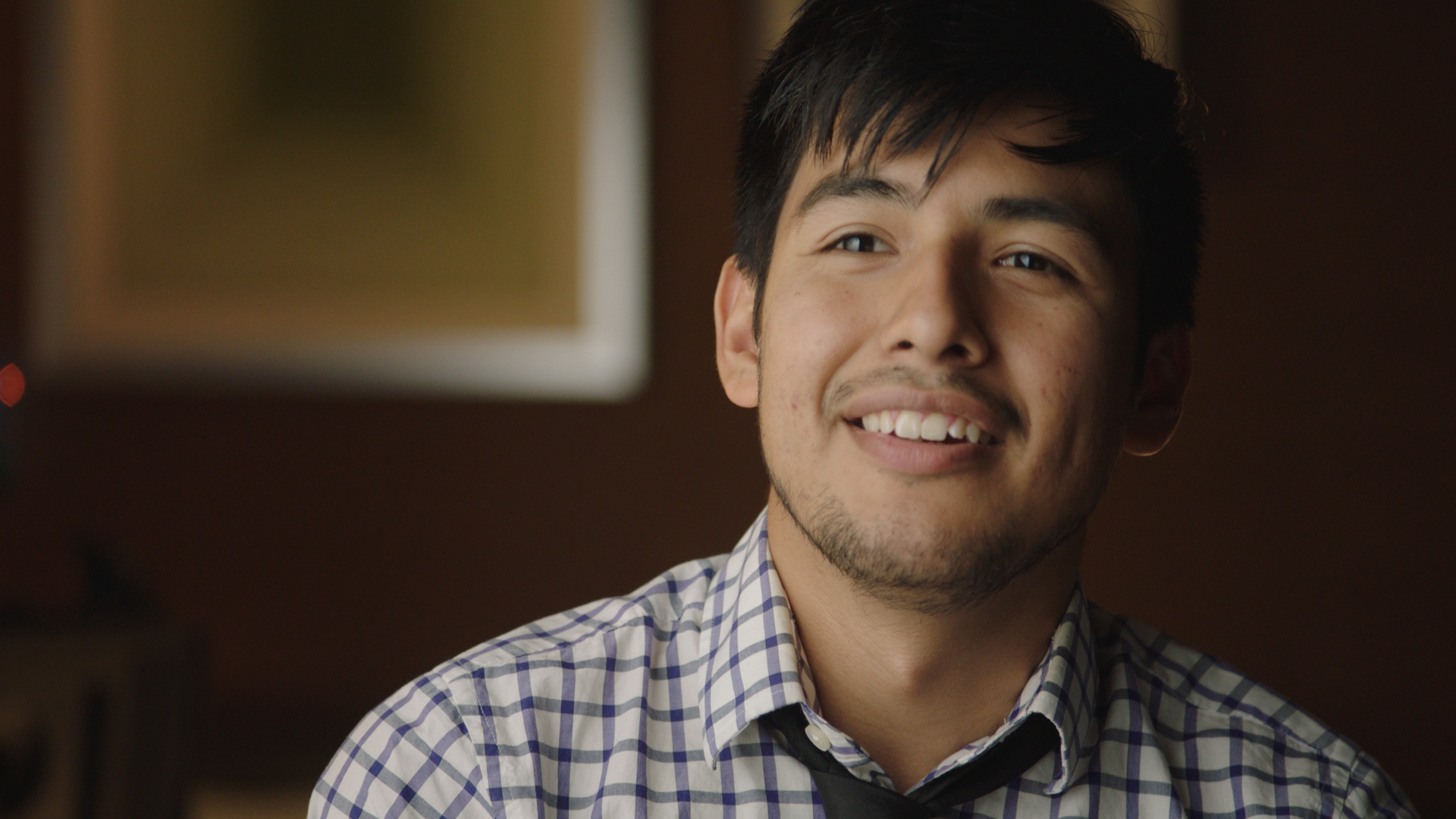
I love how this looks. The left side of Leo’s face is nice and bright, and I see specular highlights in Leo’s cheek, nose, and forehead. The fill side of his face drops off nicely. The nose shadow falls downward, which is in line with traditional portraiture principals. The shadows are open without feeling artificially lit. I could have done a better job with the background but we ran out of time. Still, I think most clients would be okay with this look.
I rarely use back lights on interviews anymore. They aren’t in style, and most of my clients don’t want them. They also tend to be more trouble than they are worth. A hard backlight works well until someone with big ears sits in. A soft cheek scratch looks beautiful until someone with big hair sits in. I’d rather create separation by lighting the background. (A dramatic scene might necessitate a different approach, but for interviews, it’s all about the face—and speed.)
We shot this on an Amira at EI 800 at T2.8 on a Fujinon zoom. I don’t remember the focal lengths, but I’d guess 50-60mm for the wide shot and 75-85mm for the closeup. T2.8 works okay on longer focal lengths, but T2 is better for wider shots or shallower sets. I try to shoot interviews on prime lenses when possible, but that limits options in the edit. A common interview trick is to change the focal length when the interviewer asks a question or the subject flubs their delivery. That makes it easier for the editor to shorten sentences and remove mistakes without cutting away to something else.
This setup has rarely failed me. I love lighting faces, but when I’m working quickly it helps to know that I have a strategy that works well on everyone. Backgrounds are always a challenge, and we are judged on the entire image. Making a person look great in a hurry will keep you on the job, but the combination of a beautiful face and an interesting background will make the phone ring more often.
Disclosure: ARRI pays me to teach ARRI Academy classes, but they didn’t pay me to write this article.
Filmtools
Filmmakers go-to destination for pre-production, production & post production equipment!
Shop Now