I’m not happy with just knowing that colors work together in artistic ways. I want to know why. Here are some thoughts. I’m a strict amateur in the world of color (I’m not a color scientist or an art expert) but I have some thoughts on the matter that I’d like to share, just in case they’re thoughts you haven’t had yet. Awareness is the key to discovery, so keeping some of these thoughts in mind should help me, and perhaps you, to learn how to use color better.
PRIMARY COLORS
 This is the spectral response of the cones in the human eye. “S” relates generally to blue. “M” relates generally to green. “L” relates generally to red.
The additive primary colors are red, blue and green. A primary color is generally defined as a set of colors from which all other colors can be mixed. In this case, each of the additive primary colors corresponds to a peak in the graph above. “Additive color” means that if one starts with black and adds colors together, they will appear brighter than the black background, and if one adds them in equal amounts the result will be white. This is the way light works.
Years ago, while shooting for MTV, a young producer asked me to make the background a more saturated hue. “Add some more lights with deep gels back there,” they told me. “That won’t work,” I said, “because light is additive.”
“Just do it, please! We’re running out of time, I don’t want an argument!” Okay… we added some more lights to the background and put very saturated gels on them, and the background only got brighter. Eventually the producer relented, I pulled most of the lights out, and we used large cutters to remove ambient light from the background, which made the colored lights that remained appear more pure.
That’s the way light works. No matter how heavy the gel, if you add more light, you’re going to end up with a brighter subject.
Subtractive color is different. Where adding the primaries in equal amounts results in white in the additive system, it results in black in the subtractive system. Water color painting is a great example of this: one starts with white, and the application of paint filters part of white’s spectrum and leaves the desired color behind. Adding subtractive color always makes things darker.
The subtractive primary colors are yellow, magenta and cyan. Looking at the curve above, it occurred to me that this can be described as:
Yellow: red + green
Magenta: the complete absence of green
Cyan: blue + green
Magenta can be manufactured in the subtractive color world by mixing red and blue, but in light it can only be created by removing green. When one dials CC to a negative value on a multicolor LED light, for example, all one is doing is turning down the green LED. Minus green gel works the same way: it holds back green and lets the rest of the light through.
It’s interesting that additive color works in the realm of light (projected images, light sources like LEDs and displays, traffic lights, etc.), but it’s not the way we’re meant to see things. In a world before electricity, subtractive color defined how we saw the world. And, in that process, everything revolves around green. This makes sense because it’s the one color we are more sensitive to than any other.
I don’t know if that’s useful, but it’s really interesting.
WHAT IS THE BRIGHTEST COLOR?
Yellow.
Looking at the graph above, it’s pretty easy to see why. The spectral response curves of the L and M cones overlap a LOT. There’s a theory that says that the L cones are simply a mutation of the M cones, which means that the color “red” might be an evolutionary accident, but also explains why they are so similar.
Another aspect of this can be understood by looking at the luma coefficients for Rec 709:
Red = 0.2126
Green = 0.7152
Blue = 0.0722
In other words, the luma channel is comprised of:
Red = 21%
Green = 71%
Blue = 7%
When video is encoded into Y’CbCr for broadcast, the luma channel (Y’) is calculated using these percentages because they match how humans sense brightness.
Note for geeks: “Y” is luminance. “Y'” is gamma corrected luminance. “Cb” says where a color falls on an axis between blue and yellow. “Cr” says where a color falls on an axis between red and green. This is because humans don’t see yellowish blues or blueish yellows, which implies that they are mutually exclusive. The same is true of red and green.

This is very handy for encoding color and luma separately, and allows for chroma subsampling. I’ve been told that Y’CbCr hides chroma subsampling much better than does RGB.
“What does this have to do with yellow?” Sorry, I’m getting to that.
As green and red make up so much of our sense of brightness, it is the brightest color that we can see. If red is 21% of our sense of brightness, and green is 71%, then together they make up 92% of our sense of brightness. It’s hard to beat that in saturated colors.
Blue, on the other hand, is a lowly 7%. A pure blue is never very bright.
WHY DOES THIS MATTER?
It matters because of something that interior designers have known for… well, a long time:
Warm colors advance, cool colors recede
The “Hollywood blockbuster” look is well known and often used, to the point where it’s become cliche. The biggest problem, though, is this:
IT WORKS.
Let’s go back a few hundred or thousand years. The things that differentiate foreground and background are:
Foreground: flesh tone (warm).
Background: sky (cool).
WARM
We see flesh tone amazingly well, because it’s a combination of both red and green—the two colors that contribute the most to our sense of brightness. The first time I worked with an Arri Alexa under low light I kept checking my meter against the monitor, as my meter said faces should have been a lot darker than they were on the monitor. Arri appears to emulate the subtractive color model of film, where the most saturated hues are also the darkest, so they saturate colors heavily until they reach about middle gray in brightness. They don’t look over saturated because they are never bright and saturated at the same time: beyond middle gray, hues only become brighter, not more saturated.
This saturation throws me off, though, because flesh tones feel brighter than I think they should be.
I think this is one of the reasons Sony’s LC709typeA LUT feels underexposed. Years ago Sony asked me to make a presentation at CineGear about the Sony F55 and Cine-EI, and the audience complained that the “normal” exposure felt too dark. By meter and luma waveform, though, it was dead on. My suspicion is that they pulled the saturation down a bit in the mid-tones and that made faces feel a little darker than they were.
As flesh tone consists of the two colors to which we most derive our sense of brightness, it makes sense that a little goes a long way.
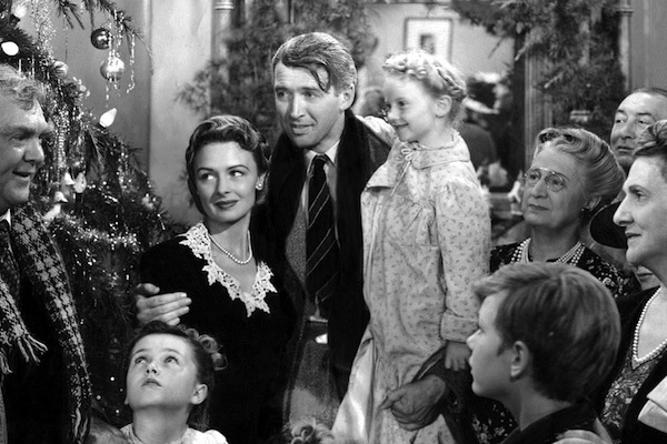
Years ago I worked on a black and white short film on which I was not the DP. The DP exposed the film as if it were color negative, and dailies showed all the flesh tones as a dull gray. That’s when I realized that flesh tones in old black and white movies are always brighter than they would be in color—by at least a stop—because without color information they appear a dull light gray, and need a bit more exposure to pop and appear lifelike.
COOL
Blue sky is consistently bright, so it makes sense that we wouldn’t need to be as sensitive to blue as we are to other colors. There really isn’t anywhere else in nature where we see lots of blue. There are very few blue foods (and the Wagner Color Response report says that the best way to make food look unappetizing is to light it with blue light). The vast amount of blue that we see is in the distance, behind everything else, and it’s really bright.
WARM AND COOL CONTRAST
So: if we’re hunter gatherers, we’re used to seeing flesh tone near us and blue sky farther away. Flesh tone looks bright because it contains the two colors to which we’re most sensitive, and blue—to which we’re the least sensitive—is always in the distance and brighter than anything else in our visual field short of the sun. There’s a saying in interior design circles that “Warm colors advance, cool colors recede,” and in the context of how we evolved as primates this makes perfect sense.
When a colorist warms skin tones and cools everything else, they’re just playing off an innate human response to color to generate a guaranteed visual response that adds to our sense of depth and foreground/background separation.
Also, remember that we don’t see yellowish blues or blueish yellows, so this is a built-in biological contrast effect.
Green, the great brightener
Anyone who has seen a comparison of the Rec 709 (HD) and Rec 2020/2100 (UHD/HDR) color gamuts knows that green benefits more than any other color:
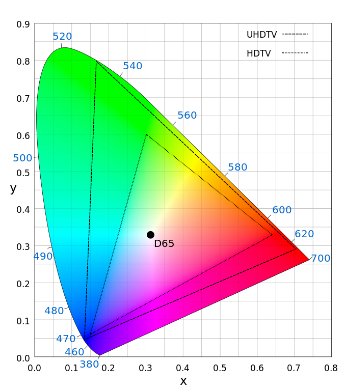 Remember the breakdown above, where green comprises 71% of our sense of brightness? It’s also the most saturated color we can see. I’ve often wondered why.
If you’ve ever shot in a forest, you’ve discovered that they are extremely dark places. The heavier the foliage, the darker they are. There’s a reason that green is such a popular color for plant life: it absorbs blue/ultraviolet and red/infrared, leaving green behind. Leaves are little energy-sucking machines, and they don’t leave cameras and film much to work with.
This is perhaps why we can see green so well: in a dark forest with predators overhead, the ability to see movement among leaves and branches could mean the difference between life and death. According to the book “Vision and Art: The Biology of Seeing” (highly recommended) our ability to see motion is largely based on brightness alone, which may explain why so much of that sense is based on green.
Artistically, green is a complex color to work with. It attracts attention, both with its presence and its absence:
A light that has too much green (and appears yellow on faces) or not enough green (appears magenta or ruddy) is visually disturbing.
It brightens any color with which it is mixed, and many of our favorite hues contain some amount of green. It’s rare to see a pure blue or pure red in the real world: green is often mixed into blues to create a brighter hue that many think of as pure blue, but isn’t; and green is often mixed into reds to create a brighter, slightly orangish red that has more “punch” but still feels red.
Blue, the great desaturator
Once, when shooting the Golden Gate bridge with a Canon camera, I found I could get make the grass green or the bridge the proper hue of orange, but not both at the same time. Canon normally skews reds toward orange, apparently to blend skin blemishes (which are red) into flesh tone, and that threw of the color of the bridge, which is a very orangish red.
Using the one matrix that made the bridge the proper color, though, made the grass in the foreground so intensely green that it distracted from the people in the frame. I realized that the original matrix, that skewed reds toward flesh tone, also pushed green towards blue, desaturating the grass and making people pop out of the frame a bit more.
One matrix made the bridge the bridge the proper color but emphasized the grass at the expense of everything else, as it was the brightest thing in the frame; and the other made the bridge the wrong color but de-emphasized the grass, putting the emphasis back on the people.
This is when I realized that technically correct color is not always perfect color: clearly someone understood that bright greens upstage flesh tone, and they did something about it. My only complaint was that I couldn’t make the bridge the proper hue while desaturating the grass at the same time, at least using the built-in matrices. That would have taken some custom work that I didn’t have time for.
Adding blue to any color reduces its brightness, because blue contributes very little to our sense of brightness. This often reduces that color’s saturation as well.
This is one of the reasons green screen compositing became popular. In any situation where a green screen is being used on set, the green screen will always appear brighter under existing light. (Green = 71% of Rec 709 luma vs. blue = 7%. Pure blue is a very dark color.) Also, any object in front of a green background creates one of the highest contrast scenarios in film making, which is great for generating mattes but tends to stress both cameras and codecs—revealing flaws in both.
Blue and cyan: we love them because we can’t have them
When the Varicam 35 was released I found it visually stunning, especially for day exteriors. For the longest time I could figure out why. Eventually I realized it was because it punches up blue hues in a way that most cameras don’t.
I have a theory that we love cyan because we don’t see it very well. In the diagram at the top of the article we saw that blue and green don’t overlap much at all, so subtractive color cyans—the kind we see in nature—are never very bright. Additive color cyans, though, can be as bright as desired. Some camera manufacturers will add a little green to blue skies to make them pop a bit more (I think of them as “candy-coated skies” because they’re a bit too much for me). In Panasonic’s case, the day exterior footage I saw, shot in some sort of fog, was lit by skylight, and the billowing cyan fog was beautiful.
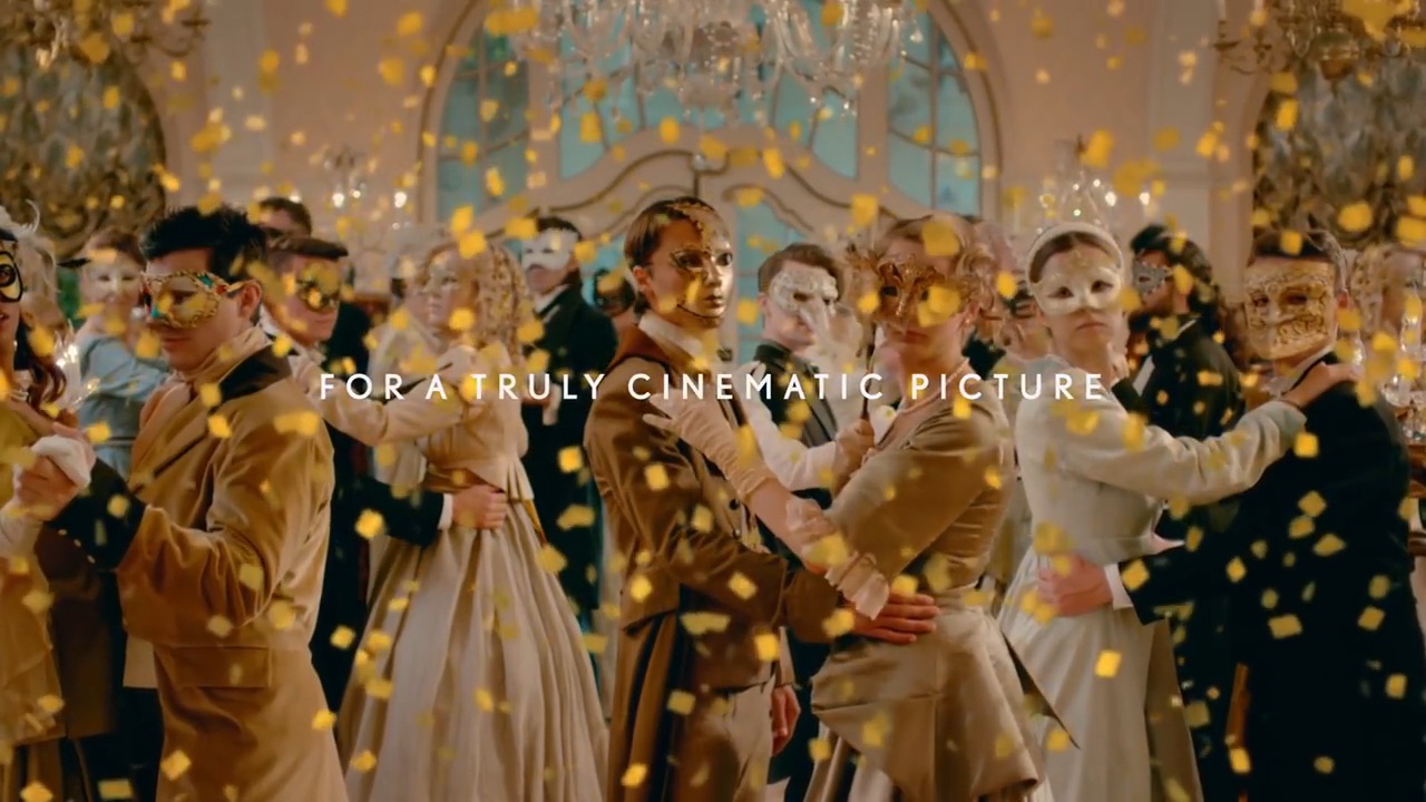
That may have been a grading choice, but if so, the footage gave a lot of leeway for grading. Here’s a Panasonic HDR TV commercial shot on Varicam 35, and most of the blues are actually a bit greenish—but subtly so, without being cartoonish. This spot contains some great examples of the Hollywood blockbuster “Warm colors advance, cool colors recede” look.
https://www.youtube.com/watch?v=SooPRm7VOL8

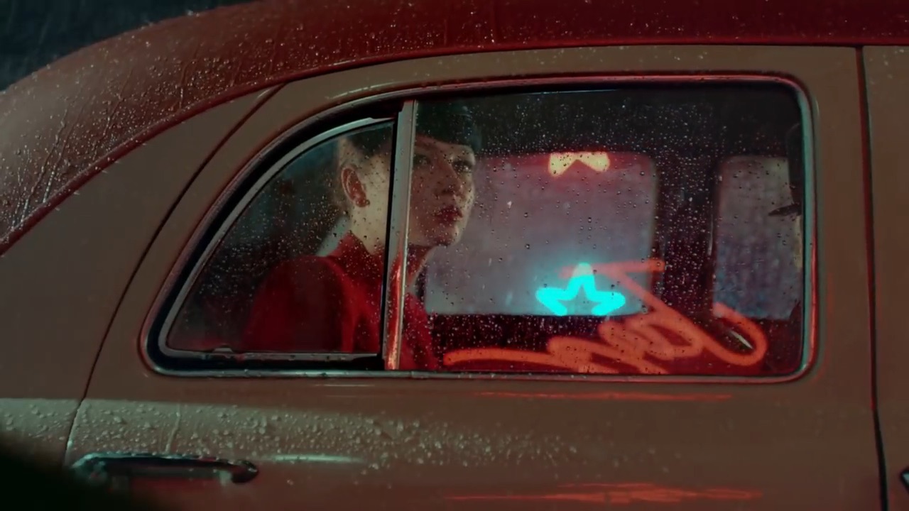


In this next example, the ice that appears later n the piece are mostly greenish blue but also have a bit of red mixed in, to create a very complex hue of blue that I’m not used to seeing… well, anywhere.
https://www.youtube.com/watch?v=LPa0KWVhYJ8

I don’t think that human beings want to see images that are realistic. They’re boring. We want to see reality with a twist. As cinematographers and artists, we make lens choices, lighting choices, exposure choices and color choices that, together, tell a story from a point of view that can’t be found in nature. It’s an interpretation, or even a visual story, and humans love stories.
I started writing this article because it occurred to me that there must be biological reasons for why we like the things we do. Reading a book like Vision and Art prodded me to jot down the thoughts that came into my head, even though I’m not close to finishing the book yet. There are lots of artists who intuitively understand color, but I always want to know the “why” behind artistic choices. That helps me to learn to use these tricks consciously as well as intuitively.
What can I say, I’m an artistic geek.
I hope you found this interesting.

Filmtools
Filmmakers go-to destination for pre-production, production & post production equipment!
Shop Now


