Tweaking footage for your reel is a huge advantage. Here’s how to take your footage to the next level without taking on a second full-time job as a colorist.
I’ve been a fan of Tiffen’s DFX digital filters ever since director/DP Joe Murray showed me that their precursor, Digital Film Tools 55mm and Digital Film Lab, were tools he used when coloring his own professional work. Joe started his career as a colorist, and he has the skill to tweak footage for his reel in the privacy of his own home. Using a combination of After Effects, Apple Color and tools like Tiffen DFX, Joe makes sure that his passion for filmmaking comes through the way he intends it to–every time.
Tiffen partnered with Digital Film Tools and fleshed out the 55mm and Digital Film Lab products with digital versions of Tiffen filters, taking a great effects package and making it even better.
I am not a professional colorist, and I can’t afford to hire one to tweak my reel. Besides, I like to play around and experiment, and while I’m no competition for a professional colorist I’m pretty good when it comes to manipulating my own imagery. The best part of coloring your own footage is that you learn what kinds of shots are problematic, which makes life a lot easier when it comes time for a professional to grade your work. As a camera assistant I was taught to always think about where the footage will go next–in that case it was paramount to make sure that my slates filled the frame and were legible, bright and in focus so the assistant editor could read them!–and this holds true for my work as a DP. If I have some idea what a colorist can, or can’t, do for me, then I’ll be in much better shape on the set when it comes to deciding what I will spend time on and what I won’t. Sometimes it’s a lot cheaper to let something go that you can have a colorist fix later when it’s just them, you and a director in a room instead of an entire crew waiting around for you to set a flag or put a grad in the matte box, and if you can make those calls accurately then you’ll be very popular with your producer.
I love playing with Apple’s Color, but with its steep learning curve and more than a few bugs it’s hard for me to spend the time necessary to learn it really, really well. It’s the most powerful tool out there for the price, but it’s not always the most convenient. I also love Magic Bullet Looks, but while it is a very fast and malleable tool it doesn’t offer the variety of diffusion and softening effects that Tiffen DFX does. So while I prefer Magic Bullet Looks for fast and effective coloring, Tiffen DFX allows me to add diffusion and grads a bit more subtly. That’s where the magic is.
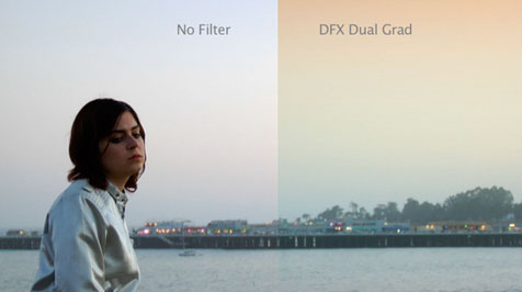
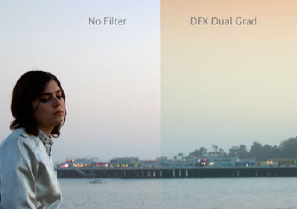
Left: the raw shot. Right: the same image enhanced with a digital grad from Tiffen’s DFX 2 digital filter suite.
Above you’ll see a couple of video clips that I’ve treated with a variety of Tiffen DFX 2 filters. Both clips are from spec projects that were shot on an HVX-200, and while they look pretty nice just the way they are there’s no denying that a little extra tender loving care in post will go a long way. Some of the looks I demonstrate above are pretty severe just to show you what’s possible, but the best touches are frequently the light ones–and while they aren’t obvious manipulations there’s no doubt that they do improve the image beyond what an HVX-200 is capable of. And if you’re shooting with an HVX-200 you probably don’t have the budget to carry a collection of diffusion filters or grads, but for the price of one filter you can (digitally) have them all.
Does digital diffusion have the same effect as on-camera diffusion? No. When you put a glass filter in front of a lens you are manipulating the image at the highest bit depth possible. The image never looks better than it does in the camera’s DSP (digital signal processing unit) where matrix and gamma adjustments are applied to the raw data coming off the sensor. After that the data is squeezed down and output, depending on the camera/recorder combination, in 10-bit color for HD-SDI output or AVC-Intra recording, or 8-bit DVCProHD data or tape. Manipulating 8- or 10-bit compressed footage won’t come close to what you can do in camera by affecting the image at its purest level. But applying diffusion digitally, while not the same as adding it optically, still makes a difference, and Tiffen’s filter profiles seem very true to the originals. The best part is that you can choose to apply the diffusion effect to the overall image or only a specific part.
You can read about the first shot, of the girl on the lounge chair, in this article, and see the end result here. She was lit very simply with available skylight from a large roll-up door that I opened just enough to create the soft-but-contrasty look I was after. The raw images looked pretty good but I’m a stickler for making people look their best and I wanted to find a way to make her flesh tone perfect and silky smooth.
The other shot, the singer in front of the pier, I wrote about in this article. At the time I thought this shot could probably stand on its own if it had to, but in the back of my mind I knew I wanted to to try to do something to make the sky a little more interesting.
The trick to these kinds of effects is that you don’t want to blow out and clip some important detail that you might want to tweak later. It’s also good to realize that you might not be able to push things too far if you are shooting a highly-compressed format like 8-bit DVCProHD, or 10-bit low bit rate XDCAM. This pertains primarily to processes that require a change in gamma, ped or gain–anything that “stretches” out the data that’s already there. The adding of digital diffusion or color grads is less susceptible to banding but still looks better if you don’t have large areas of clipped detail. (Smaller clipped highlights can made a bit prettier by adding the subtle glow of a small amount of white diffusion.)
Let’s go on to page two and talk about Tiffen DFX’s controls…
There aren’t a lot of controls in the typical Tiffen DFX filter, which is fine by me. The filters themselves are specific enough that you don’t need too many controls: the optical properties of each filter type are built in to the filter, so instead of constructing a look you are only finessing the strength, color, or where it’s applied.
I picked the “Glow” filter as a generic example. Here’s the original image:
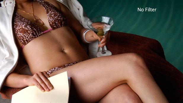
This looks pretty nice, but it could look better. There are some small skin blemishes that could use some cleanup and the skin texture could be smoother. This kind of adjustment isn’t a “make or break” tweak, but it will definitely take this shot to a level beyond what I could capture with an inexpensive camera on a low budget.
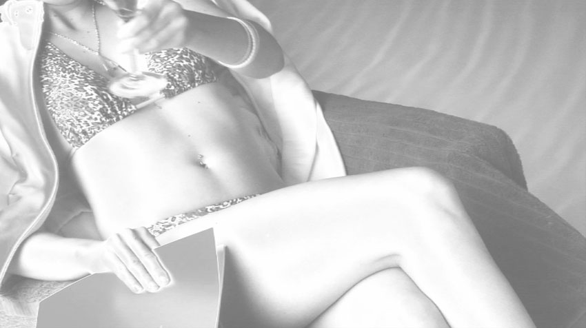
Here’s what happens when I add the “glow” filter without any tweaking:
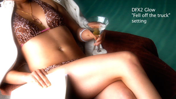
This is a bit heavier than I’m going for, but it gives me a coarse idea of what the filter will do. Let’s do a little tweaking with the filter controls:
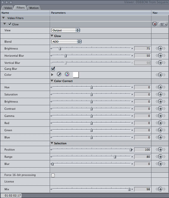
The checkbox next to “Glow” enables or disables the filter’s effect. This is what I like the most about packages like DFX 2 or Magic Bullet Looks: you don’t need to leave Final Cut Pro to do your color grade the way you do in Apple’s Color. Everything is done in the timeline, which (after rendering) allows me to not only immediately see the new look in the context of the edit and the audio, but also allows me to quickly turn the effect off, or adjust it, if it doesn’t work as intended. Shots rarely stand alone and must be viewed, and graded, in context with the shots that occur around them. A professional colorist might be able to grade a completed project in one pass, but I tend to tinker and play with looks and it helps me to do this without leaving FCP.
Filters can be stacked and it’s simple to turn them on and off to see what combinations may work for the scene. Every change results in rendering time before the clip can be seen in motion, but results can be seen in still form immediately.
The “View” option determines what we see while tweaking the filter controls. The three options are “output”, which shows the image with the filter applied; “original”, which shows us the original image, or “selection”, which drops us into a black-and-white mode that helps us isolate specific parts of the image where the filter will be applied. More on this shortly.
“Blend” is a fairly powerful tool. The “add” option simply adds the bright glow effect to the image without much discrimination. This setting would work well if there weren’t many bright highlights in the shot already, as “Glow” would create them. IN this case, as I already have highlights in the image, the alternate option, “screen”, preserves the highlights and offers a higher degree of subtlety. For this image “screen” is the blending mode that we’ll use for the final look.
The “Brightness”, “Horizontal Blur” and “Vertical Blur” sliders that appear beneath the “Blend” pulldown menu only affect the areas to which “Glow” has been applied. That can be the entire image, or it can be portions of the image that we’ll select below. “Gang blur” syncs the horizontal and vertical blur sliders so they travel together, although if you’re going for an anamorphic look you could uncheck that box and increase the amount of horizontal blur without affecting the vertical blur.
“Color” determines what color the “Glow” filter highlights will be. That’s pretty handy. If you want the highlights to glow white, as they would when using white diffusion, then you’d leave this alone. If you wanted the look of a flesh-colored nylon stocking behind the lens you might want to change this. We’ll do that below.
The six options below “Color Correct” apply to the entire image. Sometimes applying a filter overall will dramatically change the image in some way, so this section allows you to do an overall compensation for the filter’s effect. For example, if you wanted to apply “Glow” to the entire image but the blacks became very milky then you’d be able to compensate overall by manipulating “contrast”, “gamma” and “brightness” here.
“Selection” is probably the most useful tool here. “Position” and “range”, however, aren’t the most intuitive labels for these controls, so let me try to explain what they do in better terms:
When using the “position” tool we need to change the “View” pulldown menu at the top to “selection”. DFX shows us this black-and-white image:
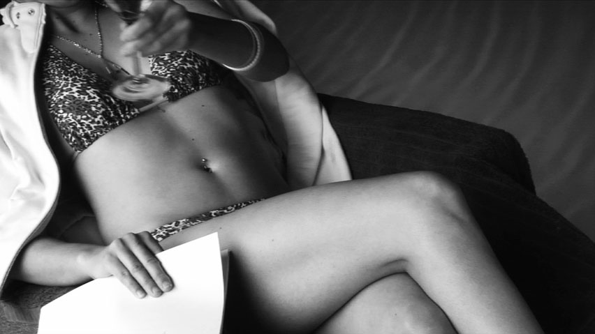
“Position” divides the image into bands of brightness, and by moving the “Position” slider I can select a range of highlights, mid-tones or shadows. The bright areas in the selection preview are what “Glow” will be applied to, while the dark areas will be ignored. Right now “Glow” will be applied to nearly everything in the shot to some degree because there’s very little that’s truly black (“unselected”) in this image. I want to isolate the flesh tone highlights, primarily on the legs, so I’m going to move the “position” slider until those highlights are the brightest things in the image:
You can see that I’ve still got too much of the image selected, but I’ve made the flesh tone highlights on the legs as bright as they can be. I’ve used “position” to determine which slice of luminance values I want to affect the most, and now I’ll slide “range” down to reduce that slice to just what I need:
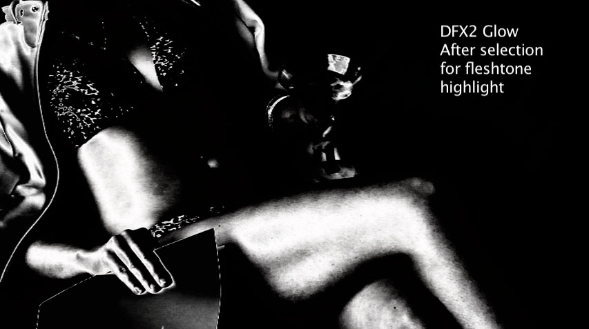
I’ve retained the bright areas of flesh tone as selections while eliminating most of the folder and clothing. The martini glass will still get a little bit of glow but I’m good with that.
Here’s what the controls look like afterward:
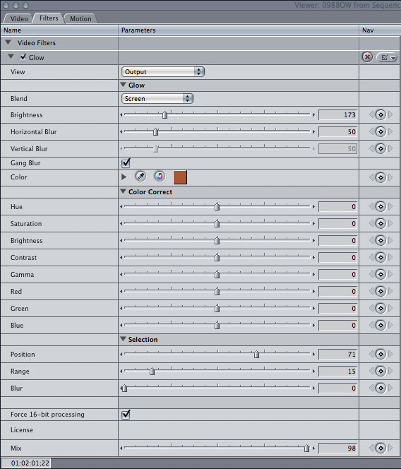
There are a couple of things to notice here:
The color of the glow has changed. I used the eyedropper tool to sample the darker flesh tones and add that color to the filter effect. This gives the flesh tone highlights a bronzed effect.
I’ve changed the “Blend” option to “screen”, so instead of adding glowing highlights to already bright highlights and taking them way past clipping, the glow effect will be blended in a way that preserves the highlights that already exist without blowing them out.
You can see the new “position” and “range” settings. “Position” is set a bit lower than it was initially, and “range” is set dramatically lower in order to isolate a narrow swathe of brightness levels. (It might help to thing of brightness as a pie, with “position” selecting a slice and “range” determining how big that slice is.) I didn’t use the “blur” slider as that feathers the selected area and I wasn’t really interested in doing that. I’m being very specific as to what portions of the image I want to affect.
“Force 16-bit processing” is a neat trick: it takes your footage, which in this case is 8-bit DVCProHD, into a 16-bit color space for manipulation. After the effect has been applied the result is transferred back into 8-bit space on your timeline. This can help smooth over some odd artifacts that can creep in when manipulating 8-bit data, such as banding due to rounding errors. If you have a fast enough machine that the render times don’t become prohibitive, I recommend turning this on.
“Mix” affects the opacity of the effect. In this case I want it full up, so that’s about where it is. Adjusting this slider changes the filter’s transparency, with 0 totally eliminating the effect and 100 being completely opaque.
Here’s the result:
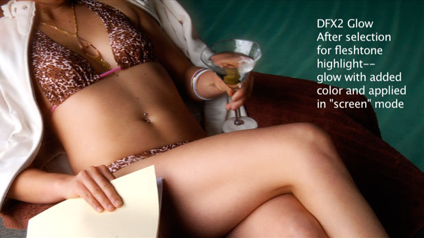
It’s a subtle effect, but then the best ones usually are. I don’t want to telegraph that I used special filtration, I just want the audience to respond to the look. I think you’ll agree that this is a silkier, smoother look than the original. Here’s the difference:
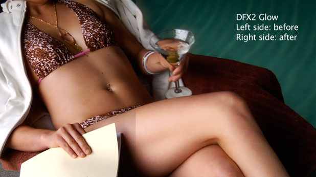
One thing that I’m not showing, due to my making the control panel as big as possible, is that every aspect of this filter can be key framed. Every adjustment can be set to change over the course of the shot. You can’t do that very easily with a glass filter.
Tiffen DFX 2 contains digital versions of popular Tiffen diffusion filters as well as a host of other effects that could prove handy. One of my favorites is “Halo”, which emulates the “diffusion in the telecine path” look. For those of you who weren’t around in the 80’s, putting diffusion in the telecine was quite popular: by putting a diffusion filter in the optical path while scanning color negative film the diffusion effect was reversed, so instead of causing highlights to glow the shadows bled into the highlight areas. It’s a very interesting effect. Give it a try in Photoshop by inverting an image, applying the “diffuse glow” filter, and then inverting it back to normal.
I’ve got the Final Cut Pro DFX plugin, but you can get it in a stand-alone version as well as in plugin form for Photoshop, Photoshop Elements, After Effects, Autodesk Combustion, and several flavors of Avid.
Art Adams is a DP who positively glows about post color correction. His web site is at www.artadams.net.

Filmtools
Filmmakers go-to destination for pre-production, production & post production equipment!
Shop Now