TLCI’s developer says prism cameras and single sensor cameras respond to color in the same way. Thanks to Panasonic, I can show that’s not the case…
I’ve been somewhat critical of the proposed new lighting evaluation standard, TLCI, which attempts to construct a virtual camera model against which new broken-spectra lighting sources can be tested. The idea behind the system is a very good one: give lighting manufacturers a way to virtually evaluate their lights before manufacturing them, which results in better and cheaper LED light sources for the film industry.
This works well in theory but might not in practice, because—according to this document—the TLCI’s camera unified camera profile was developed by testing the spectral response of nine prism cameras. The document does state that single sensor camera data was included, but it doesn’t say where that data came from and nowhere in the document does it say single sensor cameras were tested.
While prism cameras are in widespread use in the broadcast world, the motion picture industry has almost completely switched to single sensor cameras, so lights that may work well on a talk show set might not work so well on a feature film set, simply because of the differences in camera technology.
The principal developer of TLCI, Alan Roberts, told me via relayed email communications, passed through the Cinematography Mailing List, that he believes single sensor cameras see the world in exactly the same way that prism cameras do. He insists that my anecdotal evidence stating otherwise is in error. I haven’t shot with a prism camera in years and I haven’t been highly motivated to hunt one down, so I’ve not been able to definitively illustrate how single sensor cameras handle color differently to prism cameras… until now. More on that shortly.
Pure, saturated hues don’t seem to be a problem for prism cameras. I believe this is because they use dichroic filters to separate red, green and blue wavelengths, and such filters are not difficult to make or fine tune. They are considerably bigger than the filters one finds on single sensor cameras as they can be made big enough to cover the entire sensor, not individual photo sites. The big issue for prism cameras is ensuring that the three sensors are aligned so that the three color signals overlap perfectly at the photo site level.
Single sensor cameras, however, require dye filters that function at the microscopic level. Photo sites are almost impossibly small and yet each one must have a differently-colored filter to the photo sites around it. Dichroic filters aren’t practical at this level, although there are companies working to make them so. For the moment, though, there are a limited number of available dyes that will pass the proper red, green and blue spectra while also adhering to silicon, so naturally their color response will not be as clean as what we see in prism cameras. In particular, red seems to be a serious problem: prism cameras are often able to generate a very pure red, while single sensor cameras often can’t.
In short, prism cameras can be tuned to pass enough red, green and blue to create very saturated primary colors while overlapping just enough to produce very accurate and saturated secondary colors. Single sensor camera color response can not be so finely tuned due to the difficulties in manufacturing such tiny filters from limited materials, so color channels overlap in a slightly less predictable manner—resulting in color shifts and reduced saturation.
Thanks to a highly-esteemed British cinematographer and two recently released Panasonic cameras, I can now show you exactly what I’m talking about.
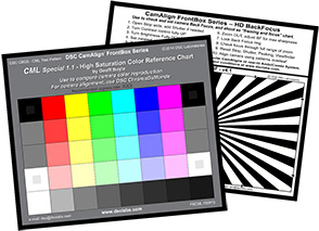
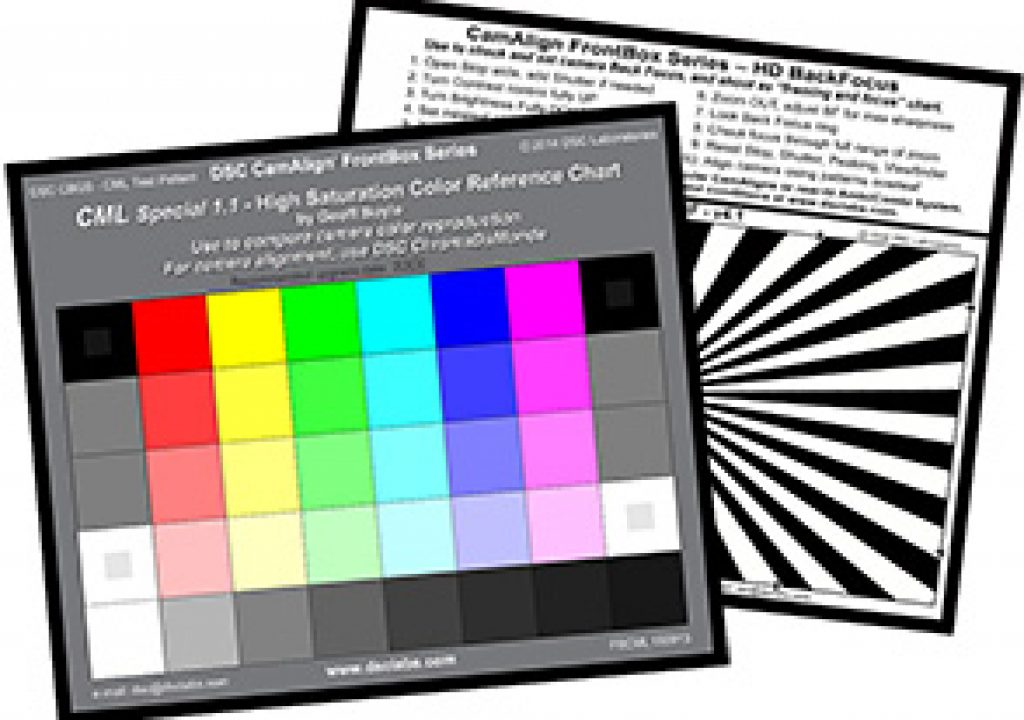
UK-based director of photography Geoff Boyle, FBKS shot a series of camera tests where, among the factors examined, he looked specifically at how cameras handle overexposed saturated colors. Historically this has been a great weakness of video cameras: where film highlights gently desaturate until they reach maximum negative density, clipped video highlights are prone to unpleasant color shifts as the color channels never clip in unison. Geoff approached DSC Labs, maker of the Chroma Du Monde series of test charts and a company for whom I frequently consult, and asked for a custom test chart. Rather than print a chart with calibrated Rec 709 primaries and secondaries, he simply wanted the most saturated colors that DSC Labs could print. And here it is.

The CML High Saturation Color Reference Chart, designed by Geoff Boyle. The top row of colors is 100% saturated, with subsequent rows falling at 75%, 50% and 25% saturation.
Geoff’s chart, the CML High Saturation Color Reference Chart, is pure brilliance. Not only does it show where cameras fail when rolling off highlights, it has an unintended side effect: it exaggerates color contamination between color channels.
If you haven’t seen Geoff’s excellent UWE 2015 Camera Evaluation Series, you really should take a look. He examines a number of contemporary cameras and reveals their strengths and weaknesses through a series of over- and underexposure tests. The results are both fascinating and startling, and reveal many interesting aspects of a camera’s “look” that often aren’t immediately obvious when viewing “real world” images. What intrigued me the most, though, were his tests of the Panasonic Varicam 35 (single sensor) and the Varicam HS (prism with 3 CCDs)—not just because they are Panasonic’s first real foray into the high-end digital cinema world, but because they are a perfect comparison of single sensor color and prism/3 CCD color.
Every company has its own color “brand”. Panasonic ruled the world in the late 1990s/mid 2000s with its unique color science that popped flesh tone beautifully and reproduced secondary colors accurately, at a time when Sony color was considered adequate, semi-accurate and uninspiring. A couple of years ago I shot a series of cooking show-style spots and we used Panasonic HDX900 prism cameras, and the clients commented that the set looked like a watercolor painting. They loved it. (The HDX900’s dynamic range was awful by modern standards, but we shot on a stage so I had a fair amount of lighting control.)
Panasonic would likely still rule the world if they’d been able to make the transition from prism cameras to affordable single sensor cameras more quickly. Now, though, they’ve introduced two new cameras that are meant to compliment each other: a single sensor 4K camera and a 2/3” prism HD camera. Given that Panasonic’s brand revolves around their signature look it’s reasonable to assume that they want these cameras to reproduce color as similarly as possible. By looking at a comparison between the two I think we can assume that they attempted to match their colorimetry as closely as they could within the limitations of single sensor and prism technology.
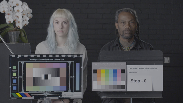
Happily for me, Geoff Boyle tested both of these cameras in exactly the same way, and used his new high color saturation chart as part of the process. Let’s take a look. (Varicam 35, or “Varicam PL” as it is labeled in the test, is the single sensor camera. Varicam HS is the HD version.)

Varicam 35, tungsten light, flat grade.
Varicam HS, tungsten light, flat grade.
Varicam 35, daylight, flat grade.
Varicam HS, daylight, flat grade.
This is most obvious discrepancy between the two cameras is in the red channel. In the half saturation Rec 709 chart (each patch on the Chroma Du Monde is 50% saturated, to be read at x2 gain on a vectorscope, as some colors can’t be printed at full Rec 709 saturation) the two reds appear to be different largely in saturation:
Tungsten light: Varicam 35 (left), Varicam HS (right).
Daylight: Varicam 35 (left), Varicam HS (right).
Geoff Boyle’s high saturation chart tells a much more dramatic story:
Tungsten light: Varicam 35 (left), Varicam HS (right).
Daylight: Varicam 35 (left), Varicam HS (right).
In the high saturation chart, red appears extremely saturated on the HS but orange on the 35. The green value is much higher than it should be, which implies that the red dye filter on the red photo sites is passing a certain amount of green light. Similarly, the green patch on the Varicam 35 has more red in it than the same patch viewed through the HS, so it appears that the green dye on the photo sites in the 35 passes some more red to the green channel than the HS’s prism does.
Color is considerably less saturated in the single sensor camera compared to the prism camera, although the latter’s saturation is a bit strong for my tastes.
Just for fun (yeah, fun! I’m such a geek…) I used a color picker to sample values from the tungsten-lit charts and put them into a table with their RGB values. I wanted to better understand what’s going on in the charts, and converting the colors into numbers and comparing hues side by side seemed the best way. (The target color channels for each box are underlined: for example, if the target is red then the red value is underlined, and if the target is yellow then both red and green are underlined.)
The purity and accuracy of a hue is dependent on the following:
- In the case of primary colors, the primary color channel should show a much higher number than the other channels, and the other color channel values should be roughly balanced.
- In the case of secondary colors, both primary color channels should show a much higher number than the remaining channel, and the two primary channels should be roughly balanced.
In nearly every case the prism camera (Varicam HS) sees more pure hues than the single sensor camera (Varicam 35). There’s more separation between color channels in the HS over the 35, and less cross-color contamination.
The high saturation chart isn’t built to any standard other than to make the most saturated colors that can be printed. It’s rare to find colors this saturated in nature, so the odds that you’ll see reds turning orange on footage shot with the Varicam 35 are probably pretty low. (This tends to be a common issue with single sensor cameras, however; prism cameras are generally much better at generating a pure, cherry red, while some cameras, such as those made by Canon, often render reds as orangeish when using their most common matrices.) When it comes to studying the effectiveness of TLCI, however, it shows very clearly that there are considerable differences between how red, green and blue overlap between these two kinds of cameras.
Adam Wilt provided me with a slide that he obtained from a Panasonic presentation on the Varicam 35:
As you can see in the graph at far left, the prism camera’s red, green and blue channels overlap just enough to reproduce accurate secondary colors without contaminating each other to the point where saturation is dramatically reduced. The typical single sensor camera’s dye filters don’t overlap as cleanly, resulting in cross color contamination, reduced saturation and reduced color accuracy by comparison (middle). This slide shows how Panasonic has reduced this unintended color crossover in their newest single sensor cameras, potentially yielding more pure primary and secondary colors than many single sensor cameras can accurately reproduce.
At this point I’m sure you’re asking yourself one simple question:
What does this mean in the real world?
Years ago I helped design the first broad spectrum multicolor LED light for the motion picture industry, the Kelvin Tile. We used five fairly spiky LEDs in combination with one broad spectrum LED to mimic the effects of black body daylight and tungsten light sources. It wasn’t perfect, but it looked great on a Sony F900, a prism camera that was the gold standard at the time.
What was curious is the Kelvin Tile made flesh tone look more saturated than a tungsten light did. While the Kelvin Tile was not as broad in spectrum, it made real world color appear more saturated. Instead of the broad, rolling spectrum of tungsten light the Kelvin Tile’s spectrum looked like a comb: five sharp points of color plus a broad overall cool base. Those spikes were much more saturated than any part of a standard tungsten light’s spectrum. This turned out to be metameric failure of the best kind, where the lack of spectrum was overcompensated for by punching up the spectrum that was there, with surprisingly positive results.
When we showed the light to Kino Flo, who eventually became a distributor, we were told that they wanted to check the light against a number of other cameras. We had two profiles built in to the Kelvin Tile, one for film and one for video, because the broken spectrum light read differently in each medium and film required a slightly different LED light mixture for neutral “white” light. Kino Flo told us we might need more profiles, possibly one for each HD camera model: “We’re discovering that LED lights look different on just about every camera we test them on.”
A couple of years ago I shot a test for PRG’s Cineo line of remote phosphor lights (now spun off into Cineo Lighting) with an Arri Alexa. One of the lights we tested was the Kelvin Tile. Where it looked great on the Sony F900, it looked absolutely awful on the Alexa. One of the issues with LED lights at the time, in 2006-2007 when we devised the Kelvin Tile, was that there were no LEDs that emitted light into the far red portion of the spectrum, just above the punchy saturated reds that sit at the top of human vision. Single sensor cameras use far red to make flesh tone look healthy, just the way our eyes do, while prism cameras seem to cut red light lower in the spectrum. That low red cut on the F900 made the Kelvin Tile look great because that camera didn’t need far red to reproduce the hint of barely-visible-but-saturated red that makes flesh tone look healthy. The Alexa, on the other hand, really wanted to see some far red—and the lack of it in the Kelvin Tile made people look a little bit dead. (They looked great under both tungsten light and the Cineo HS we were testing.)
But enough about red. Back in my Betacam days I shot a lot of corporate video for a large healthcare provider, and I spent a lot of time in hospitals shooting under fluorescent lights. The old prism cameras didn’t really see their green spike so I was able to mix tungsten light with ambient light and see very little difference between the two. The first time I tried this with a Sony F3 single sensor camera the overheads were so green that I had to add 1/2 plus green gel to all my lights and white balance in order to make the background fluorescents look neutral. The F3 saw that green spike much more dramatically than any prism camera I’d used previously.
So when someone tells me that prism cameras and single sensor cameras see color in exactly the same way I become highly skeptical. Not only do prism and single sensor cameras see the world differently, but there are so many variations in sensor designs that it’s surprising if any two cameras from different manufacturers can be matched. Recently I worked with an out-of-town client who told me they’d shot part of the project with both a Canon C500 and an Arri Alexa side by side, and they wanted to know if I knew of any colorists who could match them. “We’ve tried three or four but they only make the Arri look like the Canon and not the other way around!”
Well… yeah. That’s going to happen. Cameras aren’t generic. They are built with strong, distinctive looks that serve as their “brand”. A fair amount of their look is made in image processing, but at the most basic level color is determined by how the visible spectrum is divided before light strikes the sensor, and how the sensor responds to those wavelengths. These fundamentals determine quite a lot about how a camera sees the world.
I would love for TLCI to work, and I believe it does—for prism cameras. What bothers me is that the TLCI developers don’t explicitly say they’ve tested single sensor cameras—and, in fact, they don’t reveal the brands and models of any of the cameras that they’ve tested. I don’t understand how they could develop a unified virtual camera model when prism cameras and single sensor cameras see the world so very differently.
Until they reveal which cameras were tested to device the TLCI virtual camera model I have no choice but to remain just a little skeptical that TLCI applies to my non-broadcast world.
Disclosure: I have worked as a paid consultant to Sony and DSC Labs. I have worked as an unpaid consultant to Arri and Canon.
Art Adams
Director of Photography
http://www.artadamsdp.com


