Color awareness is a learned skill. All you really need is a car.
The human brain is a funny thing. For the longest time I was aware of color in only the broadest sense. I wasn’t very good at formulating color combinations, or recognizing subtle hues, or evaluating variations in hues. Fortunately I had one key experience that put me on the right path.
I took a beginners class in color at an interior design school, just for fun. In the class they ran a video from the late 1980s starring a designer by the name of Carlton Wagner. He wanted to better understand psychological responses to color, so he conducted an extensive study to determine how western populations respond to color in environments. The results were fascinating:
- Green is a “temporary” color. If you want a place to feel comfortable for a short period of time, paint it a green hue. Great for guest bedrooms. (Not so good for permanent bedrooms.)
- Red rooms cause people to lose track of time. It also stimulates the adrenal gland, so people tend to feel hungrier in these environments. Great color for dining rooms and restaurants.
- Blue is a calming color, but can also make environments feel cold. Good for emergency rooms and other high stress areas.
- Yellow is a great color for transitional spaces. As it is a combination of red and green, the two colors that overlap the most in the human visual system and contribute the most to our perception of brightness, it requires more visual processing power than other hues. The extra stimulation is great for drawing attention to small objects, but also good for keeping people moving as yellow surroundings tend to be overwhelming if viewed for too long.
One of the more interesting things mentioned was the influence of subtle variations of the same color. In a very dated example, he spoke of how he always wore a blueish-red tie on long plane flights because flight attendants in the 1980s were mostly women, and they preferred bluer reds while men preferred greener (yellowish) reds. He felt he received better service this way, although I’m skeptical that this was due to his choice of tie color. Still, it got me looking more closely at colors in general, and I learned some interesting things.
For example, I noticed that almost no two red cars from different manufacturers are the same hue of red. Some are cooler, some are warmer. I noticed that pickup trucks and sports cars aimed primarily at a male audience were a slightly orange red, while red SUVs and station wagons (“family vehicles”) tended to be cooler reds.
 Here are our old friends, green, red and blue. Normally we order them “red, green and blue” but I’ve done something a bit different and sorted them by perceived brightness. If you look at the Rec 709 luma coefficients—something I’m we’ve all done, right?—you’ll see this:
RED: 0.2126
GREEN: 0.7152
BLUE: 0.0722
4:2:2 Rec 709 comes down the pipe as Y’CbCr instead of RGB. Y’ is gamma-corrected luma, while Cb and Cr are color difference signals. (More on that here if you’re interested.) The important thing to remember is that brightness and color are split apart in this scheme, so there has to be some way of figuring out how bright a hue is. That’s done by using the above formula, which boils down to:
21% RED + 71% GREEN + 7% BLUE = LUMA
That’s a long way to go to show you that, assuming that Rec 709 is trying to approximate some aspects of human vision, our sense of brightness comes mostly from green, less from red, and almost not at all from blue. In fact, you can see that in the squares above: all three are pure 8-bit RGB hues, with one color channel set to 255 and the others at 0, but they do not look to be the same brightness.
 Variations on a theme: the middle square is the pure color, while the squares on the left and right have 60 units (8-bit) of another color added to in.
It’s interesting to see how adding green to any color has a huge impact, and this is important to know because green is one of the less pleasing colors on skin tone. On the other hand, mix it into blue and the effect produces what might be considered a “traditional” blue, because it’s the hue that we often see as blue because pure blue is really rare.
Also, the reddish green is really vibrant, and is probably the hue we’d be more likely to see on a city street street than actual pure green.
Red also has a significant impact on hue. It has half the impact on luma that green does, so it has half the effect on hue that the same amount of green would—but it’s still very noticeable. I see this on the bottom row, where the reddish blue is obviously different to pure blue but is noticeably less vibrant than greenish blue.
Blue’s effect on red and green is less still. There’s a hue shift, but it’s not as obvious. This is easy to see along the top row, where 60 more units of blue creates a cool red but 60 more units of green creates orange.
 This shows variations on a theme. The top row is pure red and blue. The second row has some green added to both squares, and the third row has twice as much green added as the second row. What’s interesting to me is that, if I saw the second row on their own, I might say those are “red” and “blue.” They aren’t pure, but they feel brighter than the first row, and for some reason that’s what I expect primary colors to be: bright. They are brighter, but that’s because they have some extra green in them and aren’t pure. This is very common: I almost never see what I would consider “pure” hues in either city or country environments.
The bottom row shows that there’s a much greater impact to red than there is to blue by adding the same amount of green to both patches. The left patch is definitely orange, but the right patch still feels blueish. This is the kind of blue I see most in the world. I almost never see a pure blue, because it’s just not very eye catching.
Several camera manufacturers cheat their blues toward cyan. I have a theory about that.
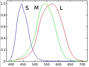
These are the spectral response curves of the cones in the human eye. Notice how red and green overlap a lot, but blue doesn’t overlap much with either. My sense is that the prettiest blues have a lot of green in them not only because they are brighter that way, but also because the eye isn’t tuned to see cyan very well. As a result, when we do see it, it’s really pretty.
Remember above when I noted yellow as a color that makes your brain buzz and keeps you moving? Well, this graph shows why: red and green overlap a lot, and contribute the most to our sense of how bright something is. If any hue is going to fire up a lot of brain cells, it’s yellow.
All this is important to keep in mind because the colors you see in the real world that you think are red, green and blue usually aren’t. They are almost always mixtures.
Okay, that’s enough about how colors influence each other when mixed. Let’s look at some color examples. I found the following stock pictures on a website called Max Pixel:
The car at the top is green with a LOT of blue added, creating a hue near cyan. The VW bus at the bottom is green with a little bit of red mixed in, resulting in a warm green.
The old car above looks to be nearly cyan (blue with a lot of green) but with a hint of red. The car below is similar but with more red than the first, as it’s a duller hue.
The more colors that are mixed together, and in more equal amounts, the less saturated the color. My digital color picker tells me that last car’s hue is mostly blue, but with 2/3s as much green mixed in—so not a perfect cyan, but close. But… it also has half again that much red. Upscale cars tend to be a bit less saturated and their hues will be quite complex mixtures of all three primaries. Carlton Wagner described it this way: “If I’m choosing a color for a lower end car, I might select ‘brown.’ For a higher end car, I’d go with ‘sable.'”
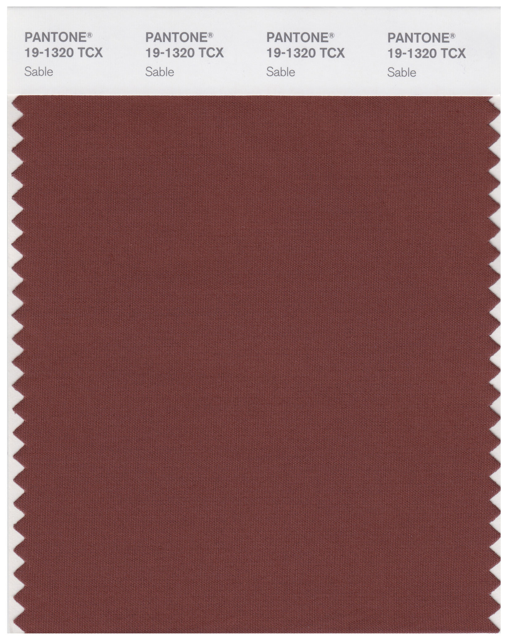
I couldn’t find an example of a regular old brown, as I’m not sure it exists, but here’s Pantone Sable:
 That’s not brown. It’s certainly a sophisticated variation, though: whereas Apple’s color picker says their version of RGB brown is mostly red, with half as much green and half again that much blue, this sable is mostly red but with equal amounts of red and blue. I can see that blue in the Pantone swatch.
The car is a pure RGB red. The wall is blueish red.
Why am I showing you all this? Because you too can develop a strong sense of color, simply by watching what color cars pass you on the freeway. You can also learn color awareness by looking at everyday objects and reminding yourself of this simple rule:
Almost nothing in the real world is pure red, blue or green.
I always say to myself: “This can’t be a pure (color). What other (color) is mixed in?” That focuses my attention, and over time has made me keenly aware of the variety of hues I see in the real world.
Where does this fit into cinematography? Some examples are:
- Sometimes a camera’s white balance can be just a little bit off, which can in turn make the image look… unpleasant. The preset white balance settings in Arri cameras look a bit yellow to my eye, and I’ve learned that yellow usually means an excess of green. Setting CC to -4 or so usually removes that color cast that otherwise makes people look just a little too yellow.
- Cameras will occasionally show a predisposition to popping some colors and not others, which is important to recognize as not everything can be fixed easily in a color grade. It also might affect your camera choice if you know that one camera has a predisposition toward popping important colors in a certain way, or skewing them another. Panasonic Varicams tend to reproduce reds beautifully while making greenish blues pop a it more than usual. The Sony F55 can render blues as almost electric, while F5/FS7 blues will be a bit duller. Arri reds are either pure red or just on the cool side. Canon cameras make very pretty colors, but the only two they seem to reproduce accurately are pure blue and flesh tone—greens tend to be cool, and reds tend to be warm.
- I’ve learned to reject locations that are painted blue but have to be shot as if at sunset, under warm salmon light. Warm light and cool paint don’t mix.
- I’ve become fairly good at choosing gel colors. Years ago I had to shoot a spot with the same background colors used in a stills campaign, but the still photographer was pissed off that he wasn’t hired to shoot the motion job so he wouldn’t tell us what gels he used. I was able to achieve a close match by looking through a gel swatch book at a white piece of paper and matching that to a print reference.
- Color awareness in relation to my tools has also kept me out of trouble. Years ago I shot a project where we had to use specific brand colors as backgrounds for talking head interviews, but we were shooting with a Canon C300 and those cameras tend to reproduce pretty color but not accurate color. None of the brand colors photographed as intended, annoying the client, and I was able to solve the problem by pulling up the website of a seamless paper manufacturer, photographing the samples off a laptop screen with the C300 (after white balancing to a blank MS Word doc), feeding that image to a high quality 17″ on-set monitor, and then comparing that image to the brand colors and choosing the best matches. The rolls of seamless paper that showed up didn’t match the brand colors by eye, but they worked perfectly on camera.
In this article I noted that I recently had to adjust an LED Kino Select to match fluorescent Kino Flos as the Select looked just a little green to my eye. That’s important, because mixing sources together that don’t match perfectly is not something that can be easily fixed in a color grade. A lot of people wouldn’t have noticed. Heck, my gaffer didn’t even notice. But years of staring at car colors on freeways has made me very aware of subtle hue differences simply by knowing that almost no color is a pure primary hue, and then asking myself, “What colors are in that, really?”

Filmtools
Filmmakers go-to destination for pre-production, production & post production equipment!
Shop Now


