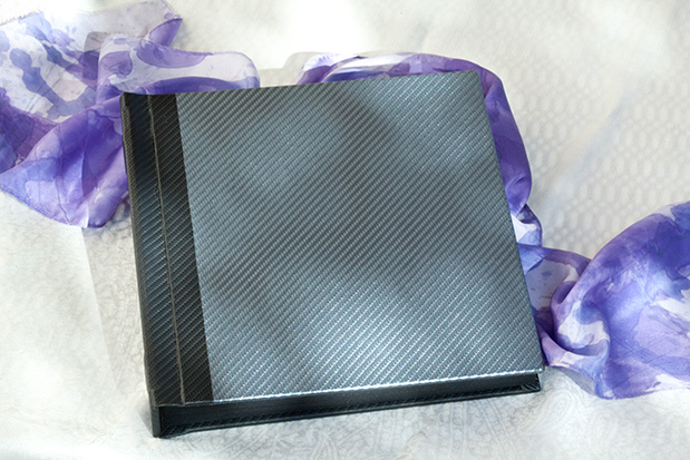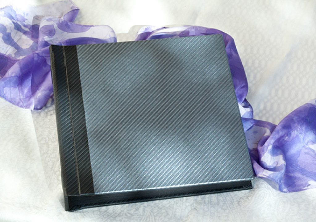
I almost couldn’t believe it! An email in my in-box from a trusted supplier is touting a new product line that flies gracefully out of the past with some new twists. Check out this new line from ImageBooksInc. that could give you a creative edge.
There are so many book designers, book template companies and album and press book providers now, that some have started to go out of business. An over-saturated market perhaps, but as Tony Nunez of ImageBooksInc. (a subsidiary of Excel Picture Frames) says, “There’s now a void in that market. End clients and studios are once again looking for fine matted books.”
The first book I received from ImageBooksInc. is a juicy hybrid that will let you get the best of both worlds – frame a matted style that is very classic and, where appropriate, drop in a panorama that punctuates with collage or single image impact. According to your choice! Now it’s yours, American made.
ImageBooks has jumped into the void to offer 10″x10″ and 12″x12″ flat spine albums (four different page quantities) with hand-cut mats included. This is a no-brainer: a picture frame company naturally has the best mat cutters and can easily design bevel cut mats, both standard openings and potentially to your own specifications.
Why is this ImageBooks line worthy of note?
- Mats are neutral Ph 2-ply mat board, texturized in linen or granular to virtually eliminate fingerprinting and scuffing. The page substrate is 3-ply board. Once assembled this thickness gives a beautiful “hand” to the pages, reminiscent of the most expensive art styled albums from Seldex, Australia – without either the price tag or the wait for delivery. Imagine out how attractive interspersed panos can be.
- The popular architectural-look cover materials can have custom engraving or a picture window. The material is called a “carbon fiber” pattern, very much to my liking, because of the classic neutral colors and the very up to date industrial feeling. Simple, elite, clean, classic – good for weddings, portraits, children, seniors and other events alike.
- The solidness of the spine bespeaks craftsmanship. I was just this week looking over some of our past wedding book samples. Remember when books were 3-4″ thick and weighed a ton? So bulky you had to have a suitcase to carry them around. And because of the weight, spines would inevitably warp and pages would sag, not to mention gouges in the covers if you should be so unlucky to drop one. The ImageBooks line reduces weight and bulk, provides a more affordable option, and yet gives the same classic style.
- More upscale (and easier to assemble) than peel-and-stick albums; sleek, modern shape and performance. A great combination of old and new. A good way to be ahead of the trends.
A thumbnail history of book styles
How is this return to classics begin to happen? Is what’s old new again? Could be! The elite album marketplace of the 70’s was owned by mats, both fixed and slip-in with pages that had evolved to eliminate acetate covering. At that time lacquering the surface was a must; of course contemporary coatings are still a good idea for both photos and inkjet prints.
Soon a wide number of manufacturers sprang up to challenge the lone front runner. Hundreds of mats in all sorts of print size combinations. But in our studio we wanted something more custom yet, and started hand cutting and mounting collaged pages interspersed with the matted ones. I don’t remember seeing anyone else doing this technique at the time, and I was fortunate to win a great many awards from professional associations.
We didn’t know it, but we were working with nascent techniques which eventually split into two paths: the scrapbookers with ephemera, text and embellishments and the montage full page spread studio styles created solely in Photoshop.
The best hand made montages take time, and more importantly taste and deep understanding of the client. Ready-made page templates, which have become the norm, have started to look alike. A lot alike; and in my opinion, templates end up being cookie cutter. I have unfortunately seen so many that just look like high priced comic books. Sometimes every device or kitchy border but the kitchen sink was thrown in, though of course that’s a generalization. No story line, just a sequential patchwork. Quality of individual images dropped.
I applaud the new age of emerging photographers that are taking time to learn their craft and create image after image that stands on its own in technique, composition and content.
The new quality-minded professional deserves new presentations. I’ll definitely be putting ImageBooks in my product line.

