In the “good old days” of post, directors, cinematographers, and clients would all judge final image quality in an online edit or color correction suite using a single, calibrated reference monitor. We’ve moved away from rooms that look like the bridge of the Enterprise into more minimalist set-ups. This is coupled with the current and possibly future work-from-home and general remote post experiences. Without everyone looking at the same reference display, it becomes increasingly difficult to be sure that what everyone sees is actually the proper appearance of the image. For some, clients rarely come into the suite anymore. Instead, they are often making critical judgements based on what they see on their home or work computers and/or devices. And if you’re working in Adobe Premiere Pro there might be the added complexity of the “gamma shift” as it’s often called. This is something I address in a companion article called Understanding Premiere Pro’s Color Management.
The lowest common denominator

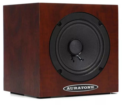
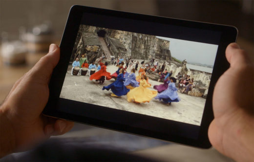
Today, smart phones and tablets have become the video equivalent of that cheap hi-fi set-up. Generally that means Apple iPhones or iPads. In fact, thanks to Apple’s color management, videos played back on iPads and iPhones do approximate the correct look of your master file. As editors or colorists, we often ask clients to evaluate the image on an Apple device, not because they are perfect (they aren’t), but rather because they are the best of the many options out in the consumer space. In effect, checking against an iPhone has become the modern video analog of the Auratone sound cubes.
Apple color management

Apple computers enable the use of different color profiles and the ability to make adjustments according to calibration. If you have a new iMac, then you are generally better off leaving the color profile set to the default iMac setting instead of fiddling with other profiles. New Apple device displays are set to P3 D65 color with a higher brightness capacity (up to 500 nits – more with XDR). You cannot expect them to perfectly reproduce an image that looks 100% like a Rec 709 100 nits TV set. But, they do get close.
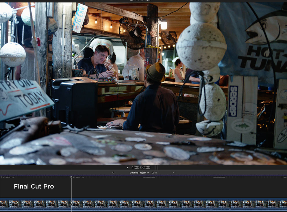
Below you can see the same image in Final Cut Pro, Resolve, and Premiere Pro. Note the subtle differences in each NLE’s viewer image. Screen grab images may be less pronounced than the actual visible differences. You can view the three images side-by-side at this link.

And to make those differences a bit more pronounced, here’s a gif of the same comparison.
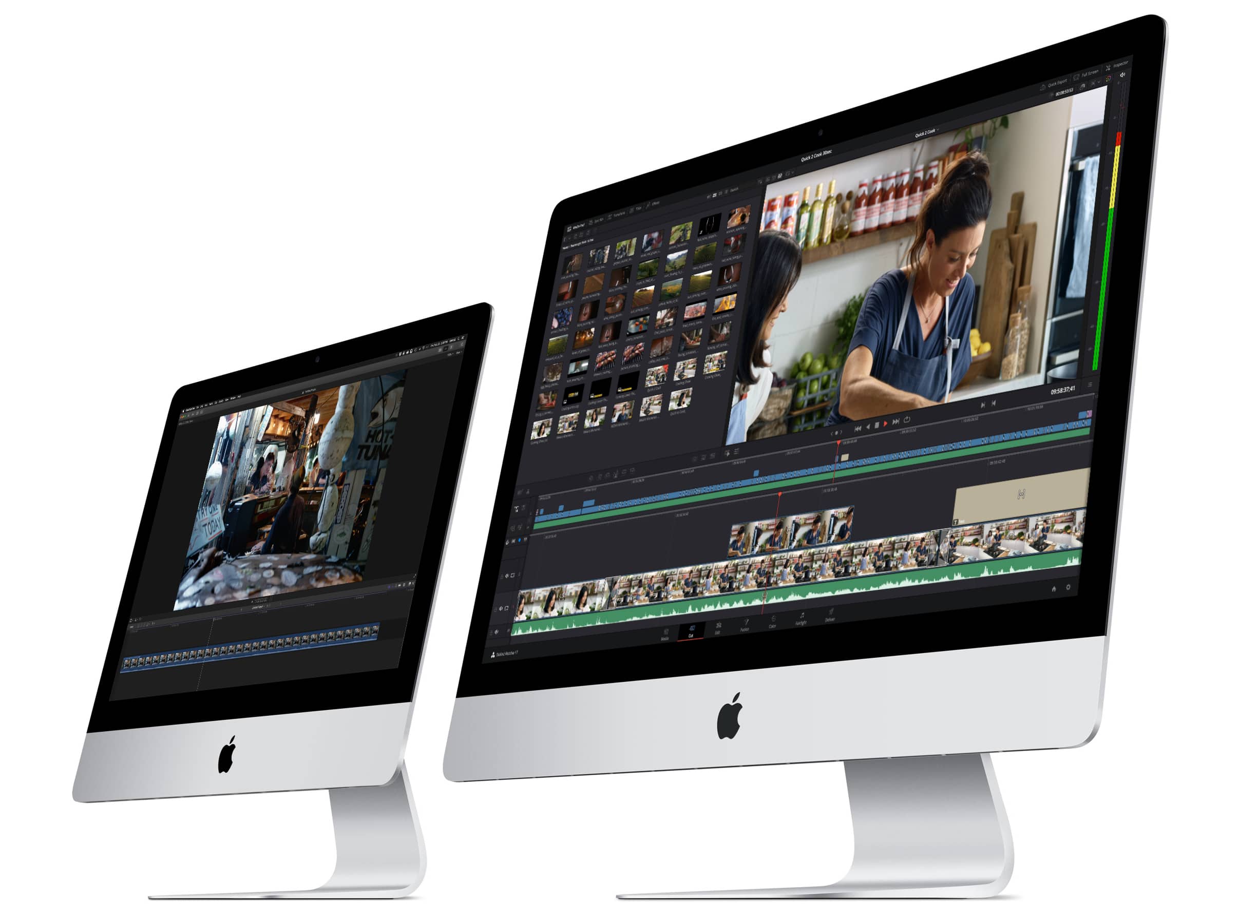
I routinely edit/grade with Media Composer, Premiere Pro, DaVinci Resolve, and Final Cut Pro on iMacs and iMac Pros. Of these four, only Final Cut Pro shows an image in the edit viewer window that is relatively close to the way that image appears on the video output to a monitor. This is thanks to Apple’s color management and the broader Apple hardware/software ecosystem. The viewer image for the other three may look darker, be more saturated, have richer reds, and/or show more contrast.
User control
Once you get past the color profile (Mac only), then most Apple devices offer two or three additional user controls (depending on OS version). Obviously there’s brightness, which can be manual or automatic. When set to automatic, the display will adjust brightness based on the ambient light. Generally auto will be fine, unless you really need to see crucial shadow detail. For example, the pluge portion of a test pattern (darkest gray patches) may not be discernible unless you crank up the brightness or are in a dark room.
The next two are gotchas. Along with the user interface dark mode, Apple introduced Night Shift and True Tone in an effort to reduce eye fatigue after long computer use. These are based on the theory that blue light from computer and device screens is fatiguing, harmful, and/or can impact sleep patterns. Such health concerns, as they relate to computer use, are not universally supported by the medical community.
Nevertheless, they do have a pleasing effect, because these features make the display warmer or cooler based on the time of day or the color temperature of the ambient light in the room.
Typically the display will appear warmer at night or in a dimmer room. If you are working with a lot of white on the screen, such as working with documents, then these modes do feel more comfortable on your eyes (at least for me). However, your brain adjusts to the color temperature shift of the display when using something like True Tone. The screen doesn’t register in your mind as being obviously warm.
If you are doing anything that involves judging color, the LAST thing you want to use is True Tone or Night Shift. This applies to editing, color correction, art, photography, etc. It’s important to note that these settings only affect the way the image is displayed on the screen. They don’t actually change the image itself. Therefore, if you take a screen grab with True Tone or Night Shift set very cool or warm, the screen grab itself will still be neutral.
In my case, I leave these off for all of the computers I use, but I’m OK with leaving them on for my iPhone and iPad. However, this does mean I need to remember to turn the setting off whenever I use the iPhone or iPad to remotely judge videos. And there’s the rub. If you are telling your client to remotely judge a video using an Apple device – and color is part of that evaluation – then it’s imperative that you ask them (and maybe even teach them how) to turn off those settings. Unless they are familiar with the phenomena, the odds are that True Tone and/or Night Shift has been enabled on their device(s) and they’ve never thought twice about it simply because the mind adjusts.
QuickTime
QuickTime Player is the default media player for many professionals and end users, especially those using Macs. The way QuickTime displays a compatible file to the screen is determined by the color profile embedded into the file metadata. If I do a color correction session in Resolve, with the color management set to Rec 709 2.4 gamma (standard TV), then when I render a ProRes file, it will be encoded with a color profile of 1-2-1 (the 2 indicates 2.4 gamma).
If I export that same clip from Final Cut Pro or Premiere Pro (or re-encode the Resolve export through one of those apps) the resulting ProRes now has a profile of 1-1-1. The difference through QuickTime Player is that the Resolve clip will look darker in the shadows than the clip exported from FCP or Premiere Pro. Yet both files are exactly the same. It’s merely how QuickTime player displays it to the screen based on the metadata. If I open both clips in different players, like Switch or VLC, which don’t use this same metadata, then they will both appear the same, without any gamma shift.
Client recommendations
How should one deal with such uncertainties? Obviously, it’s a lot easier to tackle when everyone is in the same room. Unfortunately, that’s a luxury that may become totally obsolete. It already has for many. Fortunately most people aren’t as sensitive to color issues as the typical editor, colorist, or DP. In my experience, people tend to have greater issues with the mix than they do with color purity. But that doesn’t preclude you from politely educating your client and making sure certain best practices are followed.
First, make sure that features like True Tone and Night Shift are disabled, so that a neutral image is being viewed. Second, if you use a review-and-approval service, like frame.io or Vimeo, then you can upload test chart image files (color bars, grayscale, etc). These may be used whenever you need to check the image with your client. Is the grayscale a neutral gray in appearance or is it warmer or cooler? Can you see separation in the darkest and brightest patches of these charts? Or are they all uniformly black or white? Knowing the answers will give you a better idea about what the client is seeing and how to guide them to change or improve their settings for more consistent results.
Finally, if their comments seem to relate to a QuickTime issue, then suggest using a different player, such as Switch (free with watermarks will suffice) or VLC.
The brain, eyes, and glasses
If I’m on a flight in a window seat, then the eye closest to the window is being bombarded with a different color temperature of light than the eye towards the plane’s interior. This can be exacerbated with sunglasses. After extended exposure to such a differential, I can look at something neutral and when I close one eye or the other, I will see the image with a drastically different color temperature for one eye versus the other. This eventually normalizes itself, but it’s an interested situation.
The bottom line of such anecdotes is that people view things differently. The internet dress color question is an example of this. So when a client gives you color feedback that just doesn’t make sense to you, it might just be them and not their display!
(Editors’s note: This article first appeared on Oliver’s own blog Digital Films. We asked to reprint it here as it helps answer a very a common question.)

