In this inaugural post of my new question-and-answer column, I tackle two kickoff queries about video scopes from colleague Scott Simmons, who thoughtfully saved me from having to come up with something on my own. If you have a question about color grading, postproduction workflow, or any interesting intersection of production and post, send it my way at ask@www.provideocoalition.com. I'll answer via this column as time permits.
I find this doesn't come up too terribly much, or perhaps it's just that I don't really make a note of it anymore, but I'm fond of saying you should keep one eye on your scopes, and another eye on your monitor. My short answer would be, if ever the two disagree, go with your monitor.
This, of course, depends on whether or not your display is really trustworthy. If you have a high quality, color-calibrated display such as those made by Sony, Dolby, Flanders Scientific, Penta Studiotechnik, etc., and you've worked with it long enough to be comfortable with how its characteristics line up with other displays seen by your audience (how dark its blackest black is, for instance), then going with the picture you see is a reasonable call. However, if you don't trust your monitor, you'll need to be much more conservative with regards to relying on your scopes. This can be a bummer, creatively.
Getting back to my original point, the overall goal of shot matching is to achieve a convincingly plausible match among the various shots in a scene, and that requires you to evaluate the characteristics of each image, overall. When people watch a clip, they're looking at two things–they're focused on the object of the scene, such as a person talking, and they're also taking in the overall atmosphere of the image, whether it's bluish or orangeish, high contrast or low.
If you work to match the overall character of the image, with a particular focus on the object of the viewer's gaze, the details usually come into line. A good cinematographer working with a well funded art department will light and set up each angle of coverage in such a way as to achieve a reasonable in-camera match, so you should only need to tweak during the grade. However, for a run and gun production, lighting can vary quite widely, and you can find yourself looking at odd combinations of shots cut together.
And this leads to one possible example of when you'll run into potential disagreement between your eye and the scopes; there are a variety of situations where one or two significantly colorful elements in a cutaway shot with unique color or contrast characteristics will alter your perception of the color balance of the shot. The scopes show an atmospheric match, but your eye is revealing a perceived difference that will be apparent to an audience.
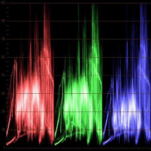
This is a difficult thing to illustrate without having exactly the right set of media, but I’ll try. The following two RGB Parade scope graphs correspond to a pair of clips in a scene that should match. The main difference is that one image has stronger highlights, while the other has more midtone detail. However, the color, based on the two scopes, appears to match reasonably well in terms of the general shape of the graphs, which indicates relative red, green, and blue balance, and the alignment of the tops and bottoms, which indicate white and shadow balance.

Looking at the media side by side, though, shows that the clip on the left appears somewhat warmer then the other (although this effect diminishes with the size of the image and may be difficult to see here).

There are two reasons for this. First, while the parade graph is incredibly useful for image analysis, there can be details hidden in the midtone traces of the graphs that are hard to make out. Second, the over-the-shoulder image has a lot of green grass, and the abundance of green can alter your perception of the color of everything else in the frame. Especially since the green grass on the ground doesn’t have the warmth of the green in the treetops. Should it? That's a whole other question…
In this kind of situation, even though each clip looks fine on its own, and the two scopes show an approximate balance, you’ll probably want to cheat the overall color balance of one of these clips to match the other, and you can only really do this by eye. At the end of the day, viewer perception trumps the scopes; there are many, many color interactions that can cause subtle shifts in the color the audience perceives that has nothing to do with a strict analysis of hue and saturation, and you don’t want to use a video scope analysis as an excuse to convince yourself that two shots match if they really don’t.
Click onward to the second question of the week.
If you're trapped on a desert island and you can only have one scope, the RGB parade is incredibly flexible, and would probably be my choice. However, the Vectorscope would be my second choice if I could have two, because it analyzes color components (hue and saturation) in ways that a waveform doesn't, so that's what I'll focus on in this answer.
The polar representation of the analysis, where each hue is assigned an angle around a “wheel,” makes it very easy to spot the specific distribution of colors in a shot. This is a great indicator of how much color contrast you've got; simply put, a wider distribution of hues provides higher color contrast, while a lower distribution of hues results in lower color contrast (although there are several interplays of hue and saturation that contribute to perceived color contrast in different ways, which I cover in the “Color Correction Handbook,” Peachpit Press).
In the following scene, you can easily see that the blue outside the window is represented by a long arm of the graph that stretches towards the Blue/Cyan targets running around the outer edge of the graph.

Also, the overall orientation of the Vectorscope graph relative the very center (which is usually indicated with crosshairs) lets you quickly see what the atmospheric color temperature is in the scene. I use atmospheric in the creative sense of the word, if the vectorscope leans towards orange, then the scene can be said to be “warm,” if it leans towards blue/cyan, it can be said to be “cool.” These sorts of averages are easy to see in a Vectorscope.
Additionally, the distance of a portion of the Vectorscope graph from the center shows how saturated a particular element is. Most Vectorscopes have a series of 75% targets that serve as rudimentary guidelines for the maximum amount of saturation that's allowable, which is an adequate general guide (as well as a good excuse when you want to justify to a reluctant client why you need to desaturate a distractingly colorful element). In the following example, you can see that the graph is much smaller, hugging the center of the vectorscope much more closely then the previous example.

The angle and reach of the “arms” on the Vectorscope graph that correspond to particular elements of the scene are also really useful when comparing two shots; if the same part of the graph varies from one shot to the next, you know there's a hue or saturation variance, and you can manipulate the color balance until they line up can be a quick technique.
Here’s one last note, which is that I’ve dipped my toes into the software development world with the creation of a new Vectorscope graticule, intended expressly for colorists. A graticule is an overlay of targets and reference lines that help you to interpret what you’re seeing in a video scope. Traditionally, digital HD vectorscopes provide very little in the way of reference features, which has always bugged me. Consequently, I open-sourced a freely available new graticule, seen below, that I think makes it easier to visually analyze what you’re seeing.
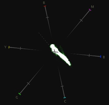
The first developer to incorporate it has been Divergent Media, with their software-based Scopebox (the vectorscope shown in this article is from Scopebox). They also have some other interesting Vectorscope features, and you can download a free evaluation copy to check out.
Special thanks to filmmakers Lauren Wolkstein (Cigarrette Candy), Jake Cashill (Oral Fixation), and Yan Vizenberg (Cargo). These examples also appear in my Color Correction Handbook (Peachpit Press).
Filmtools
Filmmakers go-to destination for pre-production, production & post production equipment!
Shop Now