The first time I used a DSC Chart for color analysis I was completely blown away by the thought and cleverness that went into designing the Chroma Du Monde. Now they’ve done it again, but this time for focus.
As back focus must be set using a lens of short focal length, it can be difficult to find a focus target of appropriate contrast and detail in so wide a shot. The Siemans star has been the back focus aid of choice for decades.
According to Wikipedia, the Siemans star was originally developed to measure the resolution of imaging systems. The points of the star touch only in the center, but most systems fall short of the resolution necessary to see that point so the loss of resolution causes the lines appear to blur together into a circle around the center. The Siemens star is very good at revealing the focus setting at which it is sharpest: just adjust back focus until that blurred circle at the center appears to be the smallest it can be.
As I am occasionally an idiot I neglected to shoot a Siemens star while testing the DSC charts in this article. I’ve acquired a Siemens star graphic from Wikipedia in order to illustrate my points.
Here is a sharp Siemens star:

Notice how the Siemens star appears to have a soft round circle in the center. That shows the limiting resolution of the process I’ve put this image through in order to post it on this page. This is what you’d see when back focusing, although typically that circle would be a bit bigger when viewed through a typical HD camera. The nice thing about a Siemens star is that no matter how big it is in the frame, the goal is always to make that soft center circle as small as possible.
The problem then becomes seeing that point clearly. Sometimes the limiting resolution of a viewfinder can make it difficult to see when that soft circle is smallest in the absence of a large, sharp monitor.
One of my mentors once told me “There are no small mistakes in the camera department,” so I’m always looking for new and improved tools that replace worry with efficiency and certainty. When DSC Labs brought their two newest focus charts to my attention I became very excited indeed.
The first one is called “Fiddleheads.”
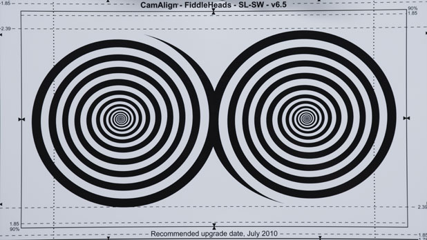
The Fiddlehead chart consists of two sets of spiraling lines whose size and spacing have been painstakingly determined to be optimum for the purpose of setting focus. During my tests I found that the spirals gave me plenty of feedback as to when I’d approached or passed the point of focus, and when the chart was fully in focus the center of the spirals “snapped” into crispness. I have a theory as to why this chart works so well, and while it deals with concepts that have made heads explode in the past I’ll try to simplify as best I can. (Believe me, that’s the only way I can grasp these concepts myself.)
Every camera’s resolution is measured in terms of horizontal and vertical resolution. Here’s how I visualize those working:
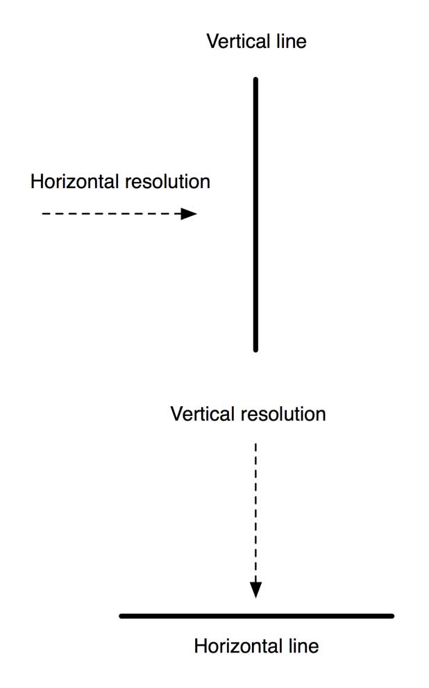
Let’s pretend that horizontal resolution is a ray that “sweeps” through the image horizontally and reports every obstacle it encounters as an element of a picture. From the drawing above we can see that horizontal resolution is going to detect vertical lines most strongly, as vertical lines are perpendicular to the way horizontal resolution “sweeps” across the frame and create the greatest impression.
Vertical resolution works the same way: it is strongest at detecting horizontal lines, because it hits them head on.
(This, by the way, is how vertical and horizontal detail circuits act. Detail circuits enhance resolution by drawing a thin black line along areas of high contrast, and vertical and horizontal detail can be individually adjusted. For example, vertical detail can be increased to emphasize eyes in a wide shot as eyes are primarily horizontal objects.)
The Siemens star works well because it’s quite simple to see the point at which a system’s resolution disappears. The Fiddlehead chart does exactly the opposite. It presents a nice solid high-contrast line against which horizontal and vertical resolution can happily smack their little heads as they sweep across the image. And, instead of trying to set focus based on a chart that shows where resolution disappears, the Fiddlehead chart helps us set focus by showing us the last point at which focus holds. That’s not a subtle difference.
Here’s what the Fiddlehead chart looks like when it snaps into focus:
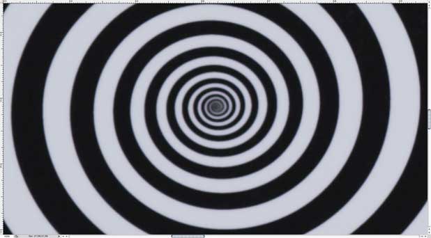
This is a blown-up frame from the movie above.
The Fiddlehead chart doesn’t leave much room for error, which is the point.
This can be important as some cameras “cheat” resolution either by using sensors with lower horizontal resolution or by recording images with decreased horizontal resolution. I don’t have any real examples to show you so I’ve recreated some in Photoshop by adding horizontal blur to still images.
Here’s the pattern you’ll see with low horizontal resolution on a Siemens star:

Notice how what was a circle in the center of the star is now an oval.
Here’s the Fiddlehead chart under the same conditions:
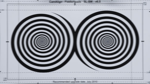
Even if horizontal resolution is cheated in the system it’s still easy to see where vertical resolution is sharpest.
What’s interesting is that I had no difficulty focusing a RED ONE on a Fiddlehead chart on either a high quality large screen display or a small 7″ low quality on-camera monitor. Michael Wiegand, Sales Manager at DSC Labs, recently tested the Fiddlehead chart on a number of diverse cameras and said that he found he had an easier time finding focus on a small, low quality on-camera monitor or viewfinder than he did on a large engineering quality monitor. I chalk this up to the fact that smaller monitors typically employ more sharpening to create a crisp image than larger monitors, and the enhanced sharpening causes the Fiddlehead spiral to snap into focus in a more obvious manner.
DSC also sent me their new CineZone chart:
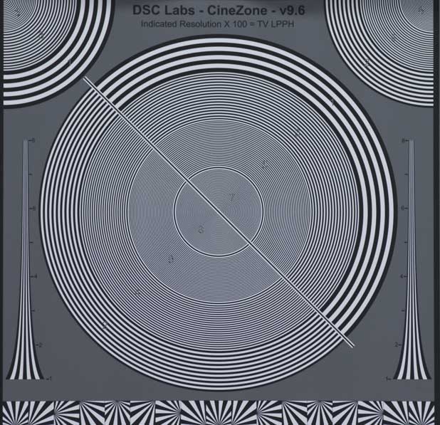
This chart can be used not only as a focusing aid but as a resolution chart. Once again, notice that the lines are not wedges that present flat sides at finite angles, like the Siemens star, but are curving lines that present a solid contiguous target to both horizontal and vertical resolution “sweeps” at every angle possible. That’s a key difference: the Siemens star offers resolution targets at set angles, whereas the CineZone chart offers line targets at EVERY angle that fill in the gaps left by the Siemens star.
Here’s the CineZone chart snapping in and out of focus:
As well as being handy as a focusing aid this chart can also be used as a handy resolution chart. The chart reads in “LPPH,” or “Lines Per Picture Height.” This means that when the chart is framed such that the very top and bottom of the chart touch the top and bottom of the frame, the circle marked “8” indicates 800 lines of resolution from top to bottom of the picture. If you can see the individual lines then your camera is seeing full HD resolution, as 800 lines is the most that a typical 1920×1080 camera system can see according to my friend and video guru Adam Wilt. (This is plenty of resolution for use with the RED ONE, as the RED’s viewing output is 720p.)
The CineZone chart incorporates a number of different resolution tools including trumpets (the long vertical graphics on either side of the chart), miniature Siemens stars across the bottom, and replicas of the central chart in the upper left and right corners to reveal whether the lens used remains sharp in the corners.
The CineZone chart has one more cool feature on the back:
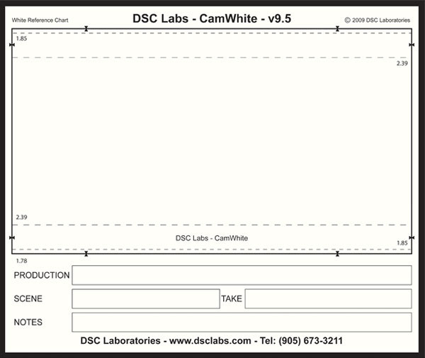
Voila: an instant framing chart that can be written on with dry erase markers. The chart’s white background is intended to be a perfect white balance reference, so as long as you write on it with black ink you can shoot both framing info, shot/scene info and a white balance reference at the same time.
I’ve long advocated the use of a “DP Slate” that contains grading information intended for a colorist, and this chart appears to be perfect for that task: simply write your timing instructions on it and roll on it for a second or two. As long as all the clips reach the colorist it’s quite hard to miss a timing note, especially if the slate is in frame as the camera rolls. That guarantees that the slate will also be the clip’s thumbnail. (This is generally good practice for digital shoots, as the editor’s clip bin will be filled with easy-to-read thumbnail slates. Just make sure the slate fills the frame. The rule of thumb is to hold the slate 1′ from the lens for every 10mm of focal length.)
DSC Labs is allowing me to keep the charts, and I’ll report back over time how well they are working out on my shoots.
And if you were wondering where the “fiddlehead” name came from, a picture is worth a thousand words:

The charts are named after these ferns that grow behind David and Susan Corley’s home in Ontario. (David and Susan are the owners and founders of DSC Labs. I suspect you can figure out where the name of their company comes from.)
Thanks to Adam Wilt and Meets the Eye Studios for their generous help in photographing these charts with a RED ONE.
Art Adams is a DP who is frequently accused of being sharp, although whether that describes his intellect or sarcastic humor depends largely on the situation. His website is at www.artadams.net.

Filmtools
Filmmakers go-to destination for pre-production, production & post production equipment!
Shop Now