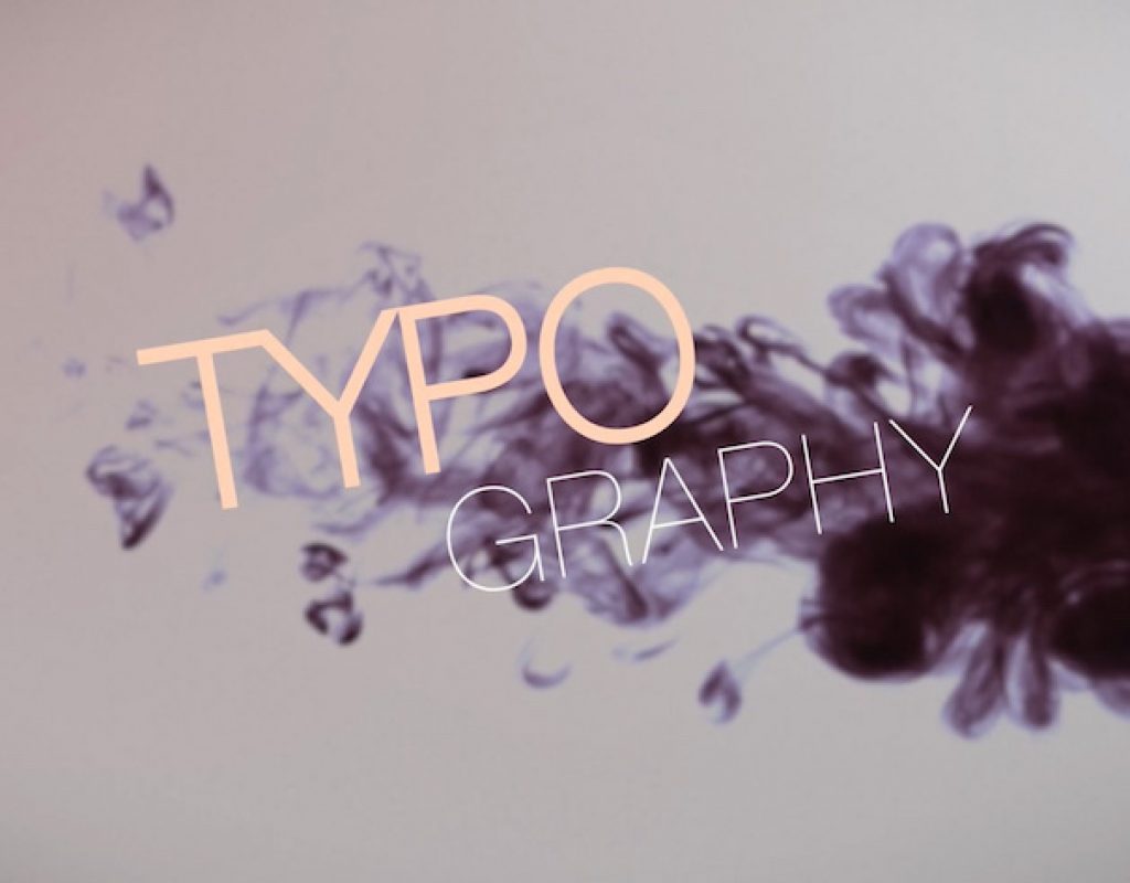
Besides graphics, words and texts are the most decisive elements of motion graphics. Typography is vital! Typefaces have a character and incredible influence. Always be careful with what font you use and how you present it to your audience.
The mission of text
Text should inform and provide your audience with clear messages and instructions. Depending on the kind of motion graphic you are planning to create, text elements can be your most essential objects, or they can have more of a supportive character and describe your other elements. What will be the mission of your text? Will it be informative? Will it alert? Frighten? Amuse? Impress?
Your text is a form of visual communication and the look of your words and texts has to support your overall theme. Never underestimate the impact of typography and try to understand different typefaces’ character.
Type classifications
There are millions of different typefaces and every font has a distinct character. Some are gallant, serious, elegant or classy. Others are dynamic, intrusive or aggressive, Plenty others are cheery, happy, funny and non-serious.
Different typefaces have different shapes, different proportions and different case sensitivities. They can all have a completely different look. There are a lot of different systems that people have used to try and categorize all of these typefaces. Because there are so many of them with similar looks, and plenty of them are exceptional ones, designers have invented remarkably complex classification systems with sub-categories so that every typeface perfectly fits into a group.
The most relevant type classifications are typefaces with serifs, sans serif, script, blackletter, monospaced typefaces, pixel typefaces, decorative typefaces and symbols.
Mixing typefaces
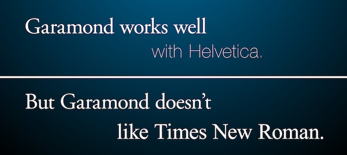
When mixing typefaces, their differences have to be obvious! If there are only slight differences, the mix will be discordant, which will also have an influence on the legibility of your text. Roughly said, a serif and a sans serif in combination always works well. They have a different style and create a good contrast.
The more the style of two typefaces differs from each other, the higher your chances will be that you have found a harmonic mix. As a broad rule I’d say that mixing more than three typefaces is also a mistake and will end up in chaos. Using two typefaces normally is more than enough.
Legibility
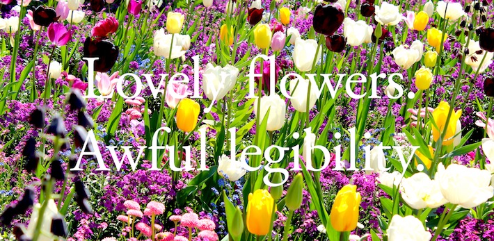
One of the most crucial aspects with typography concerns the ability to achieve a balance between legibility and the (hopefully) extraordinary design of your words. You may have the world’s most beautiful typeface, but your motion graphic will still be a flop if nobody can decode your words.
You also have to consider that your words have to attract attention in order to compete with your other design elements and therefore have to be visually stunning, which might affect legibility negatively. So what we have to balance is good legibility on the one hand and an appealing design on the other hand.
Some factors that have an influence on the legibility of your words are the typeface itself, its size, its position, its tracking (the distance between the letters of a word), the contrast between your text and your background and finally the type of animation you use.
Improve your text
Let’s take a look at some possibilities around how to make simple text more appealing. Especially when you have a complex design with more than just a basic background, it’s imperative that your text elements have the ability to cope with your other design elements, and that they don’t get lost in your composition.
There are hundreds of ways to make text more prominent. From simple design adjustments to complex effects. Your imagination is the only limit. But be careful! Depending on what you want to tell, you shouldn’t exaggerate the usage of effects. Less is more!
Effects are tools to generate eyecatchers. So mixing up as much effects as possible has to be the best way to create the perfect eyecatcher, isn’t it? Nope! It is much more important for every effect you use to serve a special purpose. And that purpose primarily is to underline your overall message and only secondarily to create an eyecatcher.
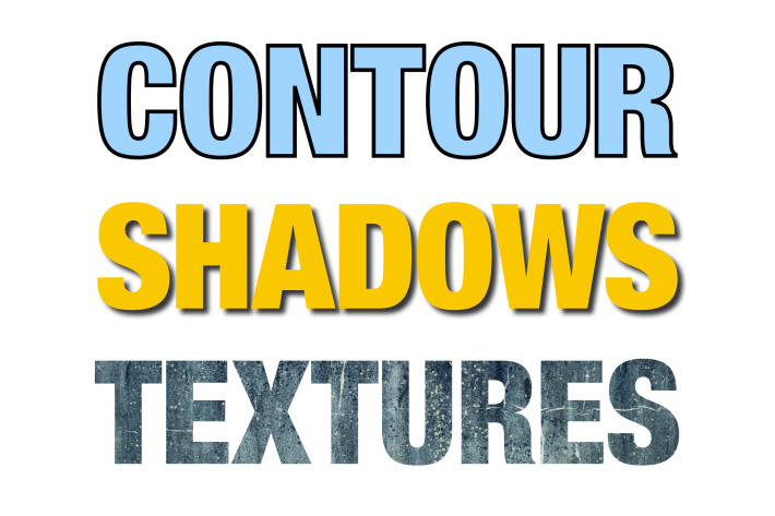
These techniques are some simple, yet effective examples: Distortions, contours, beveled edges, 3D text, gradients, shadows, textures, etc.
Animating text
With animations we can support the eye-catching character of text. However, intrusive and confusing animations can also make your design descend into chaos. Just as the different typefaces have different characters and different meanings, animations can also have a meaning and an impact on the audience. This meaning should always support the character of your typeface and the overall theme of your design.
In motion graphics you have the powerful ability to show several elements in a sequence. With animations you can guide the eyes of your audience in exciting new ways. Normally they would read from left to right. With successively appearing text objects you can adjust that reading direction to your needs and thus create whole new reading experiences.
Because motion graphics are time-based, you can also have an influence on the reading speed of your audience. You want to establish a feeling of high speed? Why not show several elements in a small amount of time so that your audience really has to be quick to catch up with everything? Of course you shouldn’t do this with information that needs to be recognized by everyone, but in some cases this might be an awesome stylistic device.

Try to understand the meaning and effect of motion to achieve the most expressive designs. Animating the upscaling of a text for example gives the viewer the impression as if the text is coming closer. It gets bigger and bigger as if it’s going to pop out of the screen at any moment. Such a text animation can have a threatening and offensive character, and is absolutely an eyecatcher.
When it comes to animating text, I’d suggest to never animate every text object the same way. Always use some variations and make changes to avoid being too monotonous. When animating an important title in a complex way, I like to use simple fading animations for all the other objects and texts, so that the main title is highlighted better.
You also need to decide if you want to animate your whole text as one object or if you animate its several letters individually. The latter can create a unique character of fragmentation and chaos. Just make sure you don’t sink into total chaos when animating every individual letter.
Conclusion
As you have seen, there are many different aspects that need to be considered when it comes to typography and animating text. We’ve barely scratched the surface here. As a broad rule keep in mind that every decision you make during your design process, should always help to tell the message of your motion graphic. This applies especially to the typeface you decide to use, its look and feel and of course its animation.
To learn more about Typography, Graphic- & Motion Design, you can preorder the free eBook, “Motion Graphics Design Academy”.
Filmtools
Filmmakers go-to destination for pre-production, production & post production equipment!
Shop Now