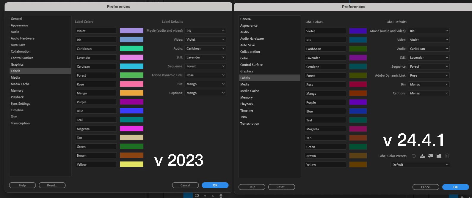
There’s been a lot of discussion around the May 2024 update (24.4) to Adobe Premiere Pro in regard to some visual and behavioral changes in the interface. To say some people don’t like when their interface changes would be an understatement, as this change has left some Premiere users rather hot under the collar despite functionality being pretty much the same as it was before. This update has brought new clip label colors as the default color scheme as well as redesigned FX clip badges. While the change of label colors might be immediately noticeable upon updating, the FX badges are something many editors might not even use or know about … until it changes.
An Adobe Premiere Pro Public Service Announcement
It’s worth noting that all of these changes have been part of the Adobe Premiere Pro Beta for some time, but I realize not all editors use the beta or even know it exists and can be installed alongside the shipping version.
With that, here’s a handy-dandy guide to these new colors and interface elements in Adobe Premiere Pro. If you see someone wondering what happened to their labels and FX badges, just send them here (right+click on the image and open in a new tab for a full view).

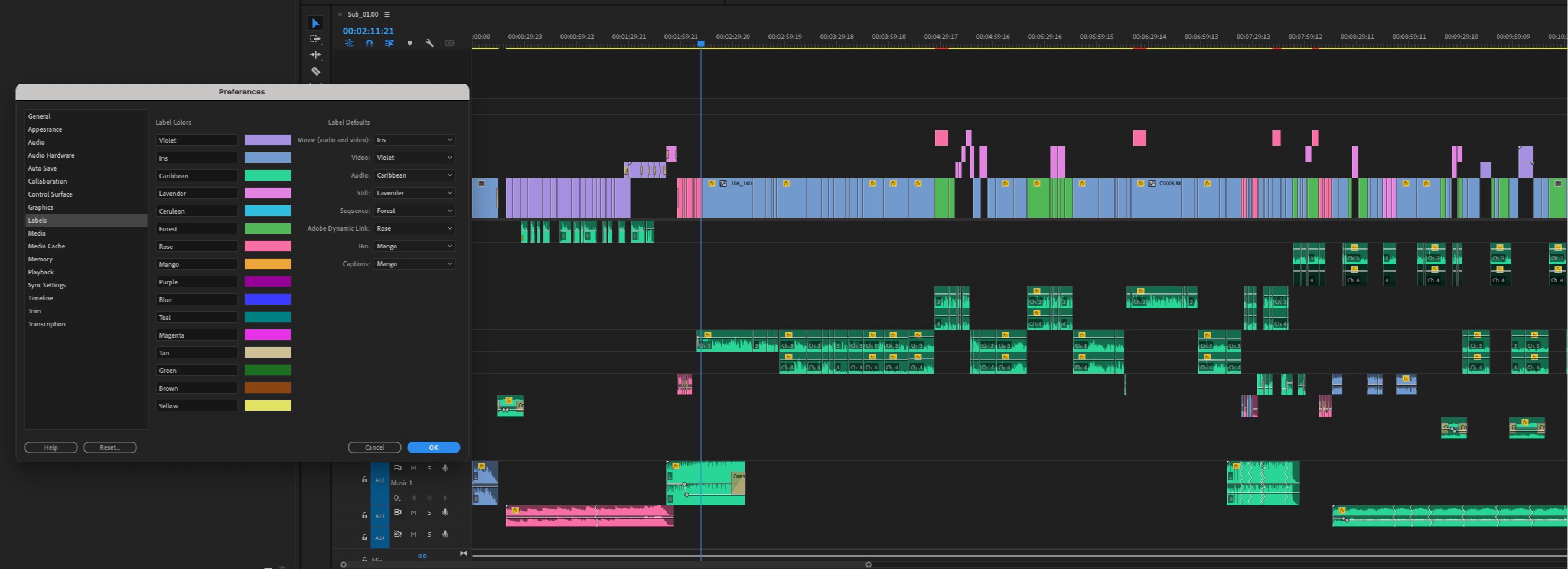
Ok great. But how does that look in practice in the timeline?


And what if you want those old label colors back in v2024? Head to the Settings, of course.

What about those clip badges?
Another note I’ve seen in the discussions concerns the change in the FX badges and Proxy badges. They look different and have moved from one side of the clip to the other. How do you turn these badges on and off?
With these badges turned on, they provide a lot of useful information at a glance.
The above example is for the FX badges. We’ll get to proxy badges in a bit.
And how exactly are clip badges useful?
The FX badges provide information on your clip at a glance. If you need more details on what effects have been applied to a clip, you have to use the mouse, but you can get this information without ever heading to a different panel like the Effect Controls.
Here are the different states of FX badges in the old v2023 version of PPro vs this redesign in v2024.
FX badges when no effects or motion parameter changes are applied.
FX badges with some effects or motion parameter changes applied.
FX badges when a SOURCE clip effect is applied.
Source clip effects are very useful in that you can apply an effect to a source clip in the bin or the Source monitor, and the effect stays with that clip whenever it’s used. I like that FX badges reflect that.
Right+click on the FX badge to see what is applied
While you can hover over an FX badge, as seen in the gif above, a right+click on that FX badge will show what effects might be applied.
Something potentially useful in this case is that when you right-click on that FX badge and choose one of the parameters in the submenu, a keyframing rubber band line will pop up on the clip. You can drag that rubber band up and down to change parameters and add keyframes.
While adjusting something like clip scaling might seem useful right in the timeline, I often find the adjustment increments too large. When I hold down the COMMAND key on the Mac (CTRL on a PC) Premiere, it will “gear down” to smaller increments, but it’s still clunky compared to the Effect Controls.
Proxy badges also provide useful into about … proxies!
With Show Proxy Badges checked in the timeline wrench menu, you also get quick, at-a-glance data about proxies. If no proxy is attached, you see no Proxy badge.
I think the different colors on the FX and Proxy badges are more useful and more easily identifiable in the old versions of PPro but I don’t design the PPro interface so I don’t get to make that decision.
And what about that Program monitor mouse scrolling?
Another change that caught some PPro users off guard was a new behavior in the program monitor when scrolling a mouse wheel. Previously, scrolling a mouse wheel when the cursor was over the Program monitor would scrub the timeline playhead. The new behavior zooms the Program monitor in and out. From the Adobe help pages about this specific feature:
You can now smoothly zoom into the Monitor using your mouse’s scroll wheel and quickly pan around the Monitor by holding the middle mouse button and dragging.
While the ability to scroll the timeline playhead with the mouse button was removed, a minor update added that back so if you hover the mouse over the Program monitor mini-timeline or the transport controls you can scrub the playhead once again.
I was somewhat baffled by a lot of the yelling about the removal of the timeline playhead scrolling. I never use this feature as it’s so much less precise than using JKL scrubbing, and you have to have your hand on the mouse. But to each their own, there are always many different ways to achieve any one thing in Adobe Premiere Pro.
Always keep an eye toward Adobe’s What’s New page and all of these updates are documented as they are released.
Prepare yourself for the Spectrum design
Just to get ahead of another upcoming change to the Premiere user interface, Adobe has the Adobe Spectrum design model in the Premiere beta now so users might want to give that a look so they aren’t totally surprised when this change ships.

