Two of the more intriguing new features in After Effects CS4 (and other members of the Adobe Creative Suite 4 family) are updated pixel aspect ratios, and the ability to display 4:3 “center cut” safe area guides inside 16:9 widescreen compositions. I applaud both. But as I work with them more, I realize there are some slight errors in where the safe area guides are being drawn, particularly in light of the new pixel aspect ratios. First I’ll cover the relatively minor 4:3 case, and then move on to the far more egregious 16:9 case.
Safe Area Review
As you probably know, you’re not supposed to use the entire frame when composing a shot or graphics for video; you have to compensate for a TV’s bezel cropping off the outer edges, and for old CRTs distorting the image as you get close to that edge. (In reality, these problems are all but eliminated by digital video and flat panel displays, but unfortunately, video production remains constricted by legacy issues…) Thus, we have Action Safe and Title Safe zones:
- Action Safe is inset 10% from the outer edges of the frame (5% on each side). Don’t put anything you expect the viewer to see outside of this area.
- Title Safe is inset 20% from the outer edges of the frame (10% on each side). Don’t put anything that viewer has to read outside of this area.
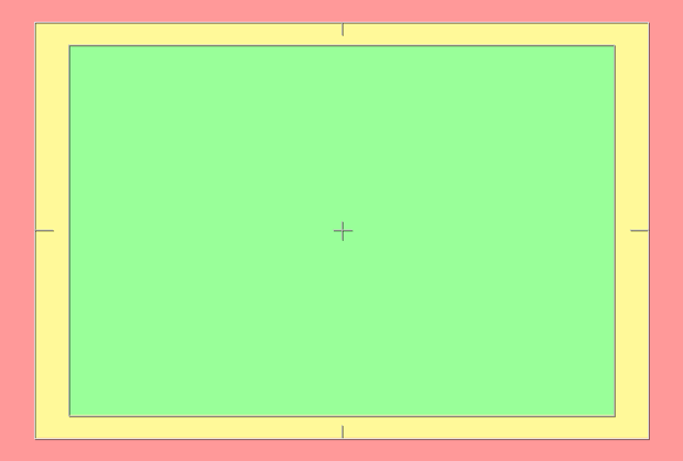
In Preferences > Grids & Guides, After Effects defaults to drawing these guides at the 10 and 20% marks. It even compensates for non-square pixels.

The default safe area overlays in After Effects. The red zone is beyond Action Safe; the yellow zone is beyond Title Safe but inside Action Safe; the green zone is inside Title Safe.
4:3 Clean Aperture
(This section is only for those who like to be pedantically correct. The far bigger problem is the 16:9 center cut case; feel free to skip to the next page if you like.)
One of the biggest under-the-hood changes in After Effects CS4 was the introduction of new pixel aspect ratios for standard definition compositions and footage. They recognize that the 720 horizontal pixels in a NTSC or PAL D1 or DV video frame actually contains more information than the viewer is supposed to see. These 720 pixels are referred to as the Production Aperture – all of the pixels you’re supposed to move through the production chain. In 525 line “NTSC” systems, only 712.8 (rounded down to 712) of those pixels make up the Clean Aperture – the actual 4:3 image for viewing (minus the TV bezel etc.). In 625 line “PAL” systems, it’s 702.9 pixels, rounded down to 702. (If you want to make your head explode, I wrote a big article on this subject elsewhere on PVC.)
You could certainly argue that the safe areas should be based on the Clean Aperture (which contains the 4:3 image), not the Production Aperture (which contains additional pixels for technical reasons). But if you place a 712×486 image inside a 720×486 composition, you will find that the safe area guides no longer align:
The true safe areas for a Clean Aperture image (the colored boxes) are slightly inset on the left and right from the default guides in After Effects. The black strips down the sides are the difference between Safe and Production apertures. The differences are larger for PAL footage and compositions.
So, if you wanted to be pedantically correct, in the NTSC case, you would want to inset the Action Safe areas approximately 10.1% on the left and right (but still 10% on the top and bottom – it’s only pixels on the left and right that get cropped), and 20.2% on the left and right for Title Safe. In the PAL case, these numbers would be approximately 10.2 and 20.5.
As the differences are so small (not to mention how imprecise these areas actually are in practice, that it’s not possible to enter different vertical and horizontal safe area guides in After Effects, and that every other program on the planet currently ignores this issue), blissful ignorance is probably your best approach: leave After Effects at its defaults. But in the case of creating template files in Photoshop and the such, it would be nice to see Adobe update the guide placement to the pedantically correct locations in the future.
next page: problems with the 16:9 center cut case
16:9 Center Cut
One the banes of our current existence is trying to shoot or create content that works in both 16:9 and 4:3 aspects. Unfortunately, most 16:9 content merely has its left and right sides cut off to create the 4:3 version (and even if it is letterboxed, different people use different letterboxing amounts – I discussed these issues in more detail in the archived articles Open Wide and The HD Checklist).
Fortunately, After Effects CS4 added a feature where center cut Action and Title Safe guides are automatically displayed alongside the other guides when you create a widescreen composition. Unfortunately, their default placement (based on a particular studio’s guidelines) don’t match up with the 4:3 center cut guides most others seem to use:
Our color-coded 4:3 safe area guide image placed in a widescreen composition. Note how the inset vertical lines – the center cut safe area guides in After Effects CS4 – don’t align with the traditional Action and Title Safe zones in the 4:3 image.
Fortunately, the placement of these guides can be changed in Preferences > Grids & Guides. Running the math using a 1080 line HD image as our model:
- 1080 x (4/3) = 1440 pixels wide for a 4:3 image
- 1440 x 90% = 1296 pixels for Action Safe; 1440 x 80% = 1152 for Title Safe
- 1296 / 1920 = 67.5%, putting center cut Action Safe at 32.5% (not the default of 30%)
- 1152 / 1920 = 60%, putting center cut Title Safe at 40% (not the default of 35%)
Entering our new numbers for the Center-cut Safe Margins in Preferences > Grids & Guides (above) results in these guides now aligning with the traditional 4:3 safe areas (below).
(For those who slogged through the Clean vs. Production Aperture discussion on the previous page, fortunately in HD these two sizes are the same. It is a slight issue for SD content, but even I have my limits of perfection…)
Safe Areas in HD
Now that we have the center cut guides sorted out, that leaves us with the safe areas for a high-def frame. After Effects uses the same safe area guide placement replacement of composition size, so it defaults to the standard 10% and 20% insets as commonly used for standard definition 4:3 compositions.
However, the safe area margins are not defined anywhere in the HD spec. Everyone I’ve spoken to says the safe area margins are “some, but less than SD.” In reality, the area cut off by an HD display’s bezel can be anywhere between 0% and 10% depending on the model of TV and how the user has the preferences set. (And of course, it’s 0% for web video where there is no bezel. That said, I think you should be cropping some image yourself when creating web video, in order to replicate the cropping that takes place on a normal TV. That’s a discussion for another time…)
More importantly, some clients (such as broadcasters, disc replicators, etc.) may still expect you to respect the full 10% and 20% guides, even though image distortion outside of the Title Safe area in particular is not a real issue any more. So – as stupid as it may seem – honor them for now.
This is all a long-winded way to say “change the center cut numbers in the Grids & Guides preferences to 32.5% and 40%” – but you know me; I always feel compelled to tell you why you should eat your spinach…
The content contained in our books, videos, blogs, and articles for other sites are all copyright Crish Design, except where otherwise attributed.


