This is the second in our series of blog posts highlighting the amazing work done by some of the industry’s best VFX artists using Adobe After Effects in a few of this summer's blockbusters.
Stephen Lawes, creative director and co-owner of Cantina Creative and Cantina VFX Supervisor Venti Hristova raised the bar once again on the heads-up displays (HUDs) for Marvel’s Iron Man 3, which premiered in May and releases on DVD September 24, 2013. The film features Robert Downey Jr. as superhero Tony Stark, along with Gwyneth Paltrow, Don Cheadle, and other top stars in supporting roles. Lawes and Hristova’s primary task was the creation of 100 HUD-only shots in the film, used with multiple versions of Iron Man and other character’s suits. Lawes and Hristova discuss how they used Adobe After Effects to create the next-generation HUDs for Marvel’s latest superhero hit.
Adobe: Some people might not fully understand what a HUD is. Can you explain it to us in layman’s terms?
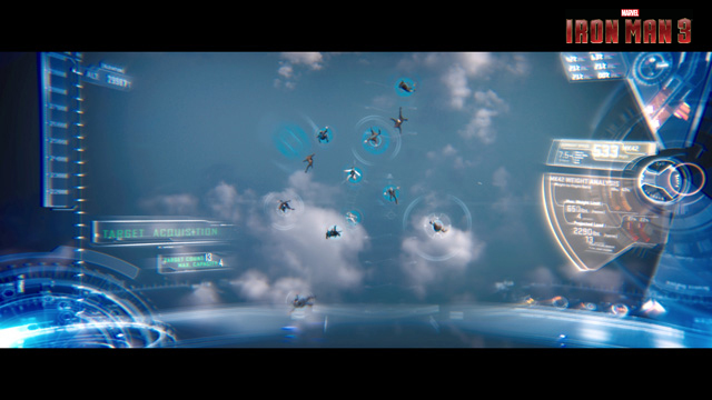
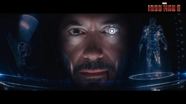
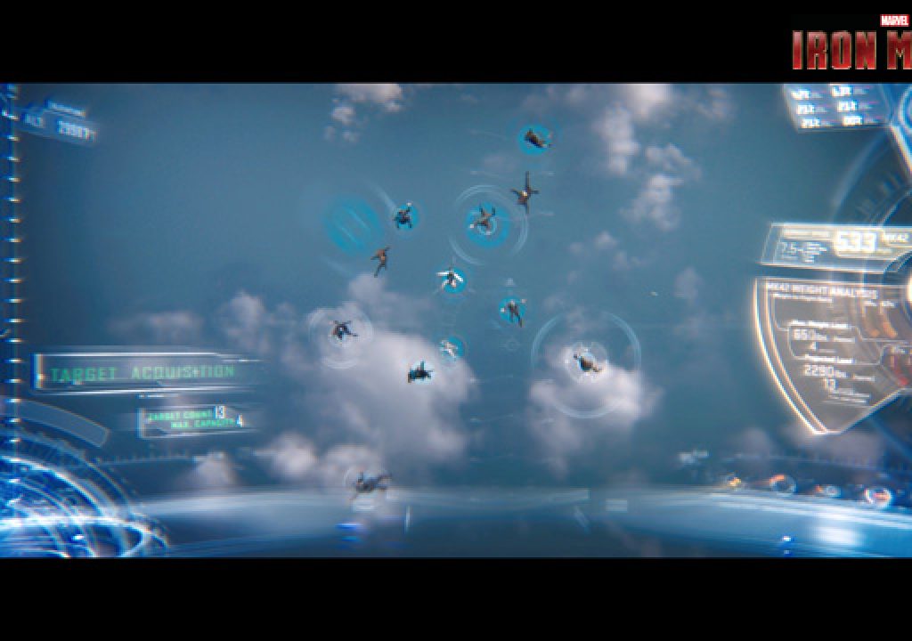
Lawes: Basically, a HUD shows what Stark (Iron Man) is seeing as a graphical representation when he’s in one of his suits. It represents either what he sees from his point of view when he’s looking out, or what is reflected in his visor.

Adobe: What made Iron Man 3 especially challenging?
Hristova: We had to do 100 HUD-only shots, which is pretty daunting. Then we also discovered that in a very short period of time, the CG Iron Man suits had made a huge leap. We met with production VFX supervisor Chris Townsend and VFX producer Mark Soper in September of 2012 and learned that the armor-like CG suits used in movies like Marvel’s The Avengers and Iron Man had gone through multiple generations, from Mk7 to Mk42. They had broken new ground in terms of the number, design, and complexity of the suits, so the HUDs had to match the new suits seen in the film.
Adobe: How did you go about taking the HUD experience to the next level?
Hristova: We needed to push the visual sense that 2D elements would really have a 3D feel, a physical presence like a hologram. We built two laser lights into the actual HUD, and were able to project holograms from them. We also gave the graphics a more tactile, textural feel. They glow in a glassy way that feels photorealistic. I know the word photorealistic can be misconstrued in many ways, but in this case it just meant that we really had to create the optical illusion of 2D objects genuinely feeling and looking 3D and even adding light streaks to the objects. We used both After Effects and MAXON Cinema4D to accomplish this. Toward the end, we started using the 3D capabilities in After Effects so that we wouldn’t have to re-render a shot every time we added a new dimension. That really sped up the process.

Adobe: When you’re working with HUDs, it’s very procedural and it’s crucial to maintain consistency from one graphics effect to another. That requires a lot of complex math. How did you deal with this in Iron Man 3?
Lawes: After working on HUD VFX for three different movies, including The Avengers, we created a rig that sets up the math expressions so that they are embedded within the script. The rig uses 3-point tracking in After Effects that captures the two corners of the eyes and the tip of the nose and triangulates that data to create a virtual 3D space. The VFX artists can focus on being artists, not programmers, and that’s what we want to achieve. We also train each artist on how to maneuver, track, and animate the HUD with some intuitive booklets we’ve created so they don’t have to know the math behind it. One caveat: most of our VFX artists are experienced and have previous knowledge. We don’t want to take risks with the HUDs because they’re pretty difficult to wrap your head around (no pun intended). We averaged only about seven to a maximum of ten experienced artists over five months because we’d prefer to use fewer experienced artists, dedicated for longer periods of time.
Adobe: How did Cantina create the graphics shots?
Hristova: At Cantina, we work together to maximize our strengths and many artists contribute to most shots. The graphics on this project were created in After Effects with a team of artists and production staff that included Sean Cushing, Lily Shapiro, Alan Torres, Leon Nowlin, Matt Eaton, Aaron Eaton, Lukas Weyandt, Jon Ficcadenti, Johnny Likens, and Jayse Hansen.
Adobe: Did you also create the HUDs for other characters?
Hristova: Yes, we created a HUD for Rhodey and other characters. We did around 40 HUD CG shots just for Rhodey. Again, we combined mini-teams and assigned them to specific projects so that everyone could maximize his or her strengths.
Adobe: As you move into using Adobe After Effects CC, are there any features you’re especially excited about?
Lawes: Specifically for us, the integration of Cinema4D in After Effects CC is fantastic because we won’t have to be hopping back and forth between applications, and rendering time will be greatly minimized. Also super helpful for us in After Effects CC is the 3D tracking and the new scaling algorithms—both have improved by leaps and bounds. Adobe meets in person with us a couple of times each year to exchange ideas. We love it because we’re able to provide technical feedback into how the development team can help solve the issues we face, and the Adobe team is very savvy and responsive.
Adobe: Why is After Effects CC so well suited for what you do?
Hristova: I think in many ways, we’re the ideal customer for Adobe’s video tools. Our work spans motion graphics, as well as VFX for film and commercials. So we cover the same ground After Effects covers. We use After Effects 90% of the time in our workflow.
Adobe: What’s next for you?
Lawes: We are collaborating with our close friends and neighboring office mates, Bandito Brothers, on Need for Speed!, which is based on the popular Electronic Arts game and slated for release in February 2014. This is going to be huge, as in roughly 900 shots. We’ve got a couple of interesting commercials and movies coming up that we can’t talk about yet, too.
One of the things we’re most excited about is that Venti and I are starting to co-direct commercials that are spec projects with no client involved, so we’re letting our creativity run wild. We’re using more craft-oriented animation techniques, from hand-drawn pieces to stop-motion and 3G, incorporating more of a mixed media approach. Ultimately, this will encompass the launch of an entirely new spin-off company, Little Foot, and the productions will appear on social channels. It’s very entertaining for us, and, of course, creative freedom always makes us happy.
Learn more about the video apps and services in Adobe Creative Cloud
Download a free trial of Adobe Creative Cloud


