Literally the evening after I posted my Digital Printing 101 article, my sister came over to print out some mandala/spirograph-like iStock images to decorate her office with. I opened the images, loaded the correct printer/paper profile (HP Z3100 onto Breathing Color Vibrance Luster photo paper, with gloss enhancer enabled – helps prevent “bronzing” when there's a lot of black in the print), and printed, feeling quite full of myself.
The first one came out great. However, the second one didn't match what we saw on screen. Obviously, I had a bit of egg on my face, after just proclaiming to the world I had the answer for reliable, correct digital printing. However, a bit of sleuthing revealed:
- It wasn't my fault – but…
- I could have fixed it before wasting paper and ink – and losing face.
{C}
It's an Imperfect World
First off, it bears repeating: Just because you're using a correct color-managed workflow doesn't mean the final print is going to match what you see on your screen; it just means you'll get the closest match possible given the limitations of your tools. Monitors, printers, and paper are all imperfect, and each is imperfect in its own way. And synthetic, computer-generated images such as the ones I was printing for her (as well as heavily color-enhanced photographs) have a greater probability of having out-of-gamut colors that your monitor, printer, or paper may not be able to reproduce.
Color profiles document those imperfections; color management does its best to compensate for them. Adobe Photoshop has a feature called Proof Colors that gives you an opportunity to view those imperfections before printing. Problem is, although the Proof Colors setting is remembered per image while you're in Photoshop, it defaults back to off when you open an image fresh – and I failed to enable it when I opened these images, before printing them. Too bad; it would have pointed out the problems I encountered before I encountered them.
The Proof Is In The…
Enabling Proof Colors requires just a couple steps:
- Turning on View > Proof Colors. It may be toggled off and of quickly by typing Command+Y on Mac (Control+Y on Windows).
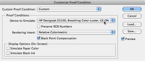
- Setting View > Proof Setup to Custom, and then in the Customize Proof Condition Dialog that opens, setting the Proof Conditions to match the printer/paper combination you intend to use:

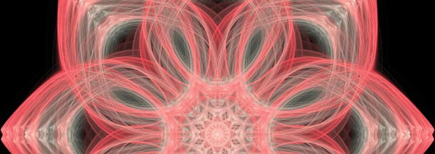
Here is the result of enabling Proof Colors:


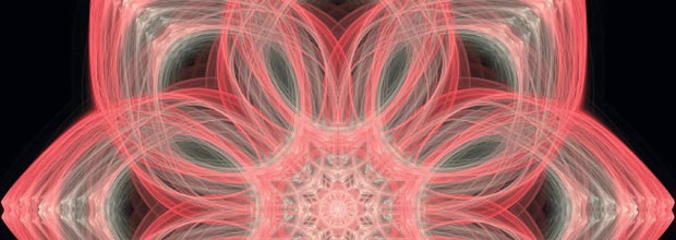
The top image is a screen capture with Proof Colors turned off; the bottom image is a screen capture with Proof Colors on. Notice the slight desaturation and reduction of contrast, as well as the wispier areas bending toward violet. image #2842163 courtesy duncan1890/iStockphoto
If I had enabled Proof Colors before printing, I could have added a couple of adjustment layers and attempted to minimize these shifts before printing. (Another option for other situations is experimenting with the Rendering Intent settings, as this affects how out-of-gamut colors are compensated for; it had no positive effect in my case.) Yes, I would still have the imperfections of my monitor to deal with, but I would be a lot closer to The Truth.
It turns out the above image was particularly problematic; we've had trouble in the past with the blue-through-violet range confounding both cameras and printers alike. The first image we printed – with docile reds through grays – had far less of an issue:


The top image is with Proof Colors off; the bottom is with Proof Colors on (Z3100, Breathing Color Luster). Almost indistinguishable – and it printed that way, too. image #1569319 courtesy Atropat/iStockphoto
In Praise of Custom Profiles
The image pair above was the result of using the “stock” color profile provided by HP for Breathing Color Luster, dated 2007. As it so happens, I had used the Z3100's built-in profiling feature to create a custom profile for my particular printer and paper stock in 2010. Interestingly, my profile contained fewer compromises than the stock one, showing how useful it is to go ahead and have custom profiles made for your printer, using whatever your current ink and paper stock are as sometimes these improve over initial production. I'll repeat the original images so you can more easily compare them side by side:


Top: Original image, proofing off. Middle: My personal 2010 color profile, proofing on. Bottom: HP's 2007 color profile, proofing on. Although both of the proof images show a reduction in contrast, my custom profile exhibits slightly less color shift.
Don't Forget the Document's Color Profile
Every document has a color profile of its own, based on either on how it was captured (i.e. the profile of the device it was shot or scanned on), or in some cases the profile of the monitor the artist was looking at when they created it. Used to living with lowered expectations, I assumed these stock images must be in lowest-common-denominator, often-default-setting sRGB, but some research – as well as comparing them to iStock's web thumbnails viewed through a color-managed browser (Safari on Mac) – turned up that iStock uses the wider-gamut Adobe RGB as their recommended standard.
You can use Photoshop's Edit > Assign Profile function to set the profile for untagged images, or ones you suspect may have been tagged incorrectly. In this case, there was a significant visual difference between sRGB and Adobe RGB:


Top: Adobe RGB profile assigned; bottom: sRGB profile assigned. Proofing is off in both cases. Note the Adobe RGB version has more cyan in the middle. Aesthetically, I prefer the sRGB one, but the Adobe RGB version is a more accurate representation of the creator's intent – assuming they processed and tagged the image correctly before sending it to iStock…
Of course, I knew all of this; in the heat of the moment, I just forgot. What would Socrates have said?
FTC Disclosure: We bought the HP printer and Breathing Color paper out of our own pocket, with no manufacturer subsidy. We have relationships with both Adobe and iStockphoto, which do result in us getting software and images for free. However, my sister picked the images, and we've used Photoshop since long before we met anyone at Adobe.
Our photographs and artwork, as well as content contained in our books, videos, blogs, and articles for other sites are all copyright Crish Design, except where otherwise attributed.

Filmtools
Filmmakers go-to destination for pre-production, production & post production equipment!
Shop Now


