This is the third in our series of blog posts highlighting the amazing work done by some of the industry’s best VFX artists using Adobe After Effects in a few of this summer's blockbusters.
Resurrecting the classic science fiction franchise of Star Trek is certainly a challenge that any motion graphics and VFX artists would gladly accept. For the latest installment, Star Trek Into Darkness, Andrew Kramer of Bad Robot and author/owner of the site Video Copilot was the lucky one tapped to create more than 30 title sequences for the movie. Production studio OOOii eagerly took on the job of designing all user interfaces and future technologies within the movie. Kramer, OOOii CEO Kent Demaine, and Lead Designer Jorge Almeida all shared their great experiences working on the latest seminal Star Trek film (available on DVD September 10, 2013).

Adobe: What were some of the unique challenges of creating titles for Star Trek Into Darkness?
Kramer: I’m sure the folks at OOOii will agree that one of the biggest hurdles was that the film was shot in stereo so everything had to be “true” 3D from start to finish to look realistic and fully dimensional. We used After Effects and Video Copilot’s Element 3D plug-in to create real 3D object-based particles within After Effects. We had a short timeline to create 30-plus titles, so we did not have the hours or need to delve into what people might consider a full-fledged 3D tool. The other challenge was that we had to stick to the same basic Star Trek aesthetic, but make everything more refined and pay strict attention to details.
Adobe: Tell us about the work you did on the film.
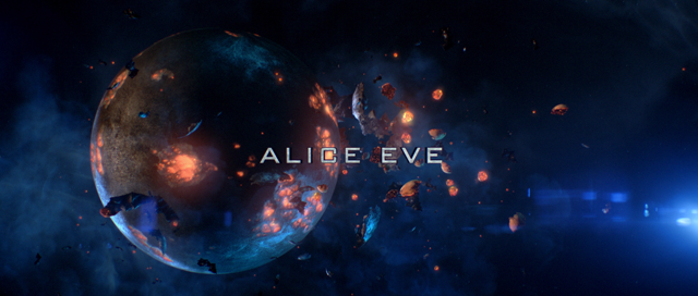
Kramer: With a short timeline to create and finalize the titles—filled with very long days and nights—we created more than 30 different titles. JJ Abrams, the film’s director, asked me to come up with a more refined, updated-look for the extreme space fly through title sequence. We had a small modeling team that created a library of high-quality 3D planets, from moons to asteroids and ice planets. The planets were color-corrected and we even designed a planet that broke into pieces of debris. We replicated the pieces hundreds of thousands of times and had them breaking off to give the scenes a sense of depth.

There were multiple “spacescapes” and we needed to make sure they were colorful, vivid, and tangible with debris, asteroids, lens flares, and so on. The cool thing about the lens flares is that they are built from scratch by filming them and then isolating each individual lens flare frame iris in Photoshop and then adding textures. We got some really fun effects. Ultimately, we wanted each title scene to have its own unique world. For example, we created one unique world with the sun burning with hot-looking tendrils as the core. We built a texture using animated fractal noises. As you can tell, we had a lot of fun and tried new techniques that we never had before. The ability to work natively in After Effects for a stereo workflow, not having to render out each planet individually, and being able to make changes dynamically that affected all of the designs was pretty critical.
Adobe: Kent, what was your team’s primary role?
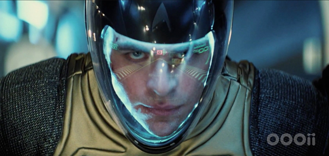
Demaine: OOOii worked closely with the art team and the Production Designer Scott Chambliss to develop iconography and a visual language for this iconic film. Our interfaces and vision of future technologies helped define the revamped USS Enterprise and Starfleet and support the unique vision of the filmmakers. Our specialty is information technology design and human-technology interaction. This involves the creation of things such as holograms, digital signage, and interfaces on devices. Our use of this expertise in films helps provide a vision into new interaction modalities with technologies such as mobile phones—everything we do focuses on natural interaction models that happen between users and information.
Almeida: All of our designers are set up with full Adobe Creative Cloud pipelines. We started by creating some concept art that gave an idea of the style and then we designed based on those concepts, using the previous movie as a guide. Initial designs were done in Illustrator and Photoshop, but by the middle of the film when we had a lot of the elements built we would just go straight into After Effects. Once we hone in on a look everyone likes, we start showing animation tests. There is a lot of back and forth, but as the production moves along everything becomes more specific.
Adobe: Can you give us an idea of the scope of the work that OOOii did on the film?
Demaine: We created more than 300 production and post-production shots over a year’s time. We do the designs and we often composite them, too, but in this case ILM composited the graphics and HUDs into the scenes.
Adobe: Here’s a question for both you, Andrew and Kent: did you use Adobe Premiere Pro for any of your work on Star Trek Into Darkness?
Kramer: We used Adobe Premiere Pro for editing, timing, and prepping primarily. We would do all of our timing and figuring out the music beats, bring in the score, and lay in the still frame designs before we did the camera movement and final compositing. We also used Premiere Pro to determine reference points of different locations for animators so that everything moved in one flowing, orchestrated whole. This was important because there were thousands of layers involved because of the complexity of our stereo camera rig.
Also, one of the key things in the title sequence was getting the color right. For that, we used Adobe Bridge to open the screen shots of each planet design, for instance, and show them all on the screen at one time to see what color palette looked the best: blue highlights, green highlights, too much red, needed more monochrome, and so on. We used it as a color reference for final output before animation.
Demaine: We were traditionally an Avid or Final Cut Pro shop but we’re now exclusively Premiere Pro. We do a lot of plate acquisition through RED cameras, and with Premiere Pro we’re able to drop whatever we are given onto the timeline. We can get camera data from ILM and render out graphics using that information. Like Andrew, we also used Bridge as a file management tool because it let us preview files, visualize layers in files, and drop them into different programs with ease.
Adobe: What about Adobe Creative Cloud? Are you using it, and if so, what are you most enjoying about the newest version of Adobe’s cloud-based video and creative software?
Kramer: I’ve been using Creative Cloud for a while now and, although I know it’s not an entirely new feature, the Warp Stabilizer in After Effects is definitely more advanced and mature. The stabilization movements seem more fluid, and that saves a lot of time. Also, After Effects seem to work more responsively with plug-ins, with faster GL rendering speed, so that saves a lot of time. The quality is magnificent, akin to IMAX feature quality.
Almeida: I’m having a lot of fun using the 3D features in After Effects to build animations. I’ve also just started to dive into Cinema4D and look forward to exploring what that integration can do. The speed and flexibility of After Effects are what I like the most. I often get to the point in post where I’m designing directly in After Effects as much as anything else. I actually prefer it because I can start building things that are more of a finished product and After Effects just lets me design on the fly.
Demaine: Adobe Creative Cloud came along right when we were finalizing this project, but we were already beta testing it and we are impressed. We really like the instantaneous feature updates and more predictable pricing that Creative Cloud offers. I think it’s a good step forward that will let us take advantage of Adobe innovations even faster than before. We’ll also continue to venture into other areas of Adobe’s tools without additional charge. For example on this project, we worked with BlackBox Digital and used Adobe Flash Professional and Adobe AIR extensively to create a cool mobile app that revolves around some of the most impressive VFX scenes in the movie. We think this is just the beginning of what Adobe Creative Cloud will facilitate.
See how Andrew Kramer created the titles for Star Trek Into Darkness using After Effects and Element 3D.
Learn more about the video apps and services in Adobe Creative Cloud
Download a free trial of Adobe Creative Cloud


