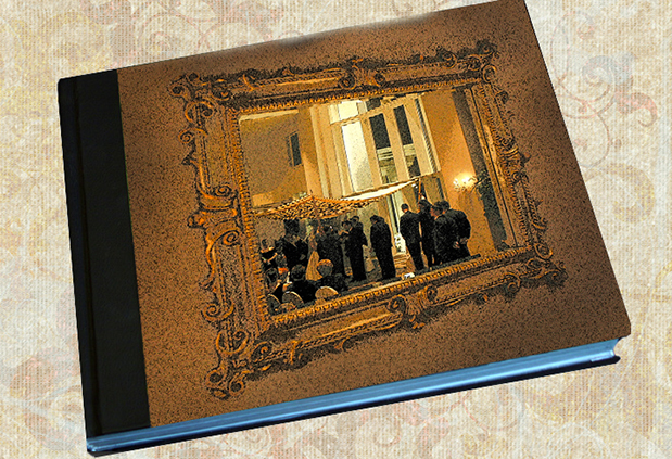
It’s true that we more likely pick up a book in the store is we’re attracted to the cover image. The same goes for wedding albums. After a long interval where minimalist, plain black leather covers were the most popular, recent years have had a happy resurgence of interesting materials, color and most importantly of cover art.
The contemporary twist on the oval portrait inset common on wedding album covers in the 50’s and 60’s is content. Cover images are now usually an iconic photo that expresses the emotion, personality, style, venue or heritage of the wedding, rather than just a cameo.
Frame-in-a-frame theme
Couples, if they even go so far as to commission an album these days, want to make a statement about themselves, about their lives joining. Where to do this most effectively in pictures? On the album cover. There’s no limit to the scene selected: first kiss, leaving in the limo, walking barefoot on the beach or in this case a very traditional chuppah-covered Jewish ceremony.
A side wall of the wedding hall provided an unexpected artistic element – a baroque framed mirror far enough away from the seating that I could get close to it and frame the wedding in progress unobtrusively. Probably “accurate” exposure and white balance would have done little good, because mood would be best preserved with some yellow-dark bias. Available darkness prevailed at this traditional Jewish wedding. Just a few candles made the exposure level a challenge (back in earlier days before the stratospheric ISOs). White Balance presets of the time for tungsten were just not low enough Kelvin to get anything but yellow from candlelight.
The frame-in-a-frame theme worked well with the couple’s upbringing, which was filled with music and art. They loved the “unseen observer” viewpoint of the image taken in a baroque framed mirror. Early digital capture showed a high level of noise and yellow tone, consequence of limited ISO and Kelvin settings available at the time. I had to max out the ISO available to get a hand-holdable shutter speed of 60th and then the highest ‘stop I could get was 4 on a 16-28mm lens at 28mm. Naturally I wanted to grab focus on the image in the mirror some 50-60 feet away, but at the same time reasonable sharpness on the frame only about three feet away from the camera.
Rather than clean up the noise and bring color neutral, my inspiration dictated enhancing of the old world feel by emphasizing those characteristics in Photoshop.
4 Recipes for the manipulated images I presented for the couple’s selection. The bride’s Father, a Master Photographer himself, loved them all.
Version 1
- on a duplicate layer I ran Filter>Artistic>Watercolor at default settings which darkened and made the image more mysterious
- adding a white layer mask, I painted the image only back in with a black, hard-edge brush at 50% opacity, going over the people a second time to lessen the filter effect on them
- merge layers, add new dupe layer
- I ran Filter>Blur>Gaussian Blur at 6
- adding a black layer mask, I painted the blur in just on the wall loosely around the frame to smooth the image noise
- with the regular lasso tool (L) I drew a loopy outline to create an edge vignette, feathered it by 150 pixels and inverted the selection (? shift I or Control shift I)
- taking the burn tool at 50% opacity I darkened the area loosely to give an idea of ancient darkness
- on a duplicate layer I ran Filter>BrushStrokes>AccentedEdges at default settings which gave a painterly feel and greater contrast and sharpness to the frame
- adding a white layer mask, I painted the image only back in with a black, hard-edge brush at 50% opacity, going over the people a second time to lessen the filter effect on them
- merge layers, add new dupe layer
- I ran Filter>Blur>Gaussian Blur at 6
- adding a black layer mask, I painted the blur in just on the wall loosely around the frame to smooth the image noise
- with the regular lasso tool (L) I drew a loopy outline to create an edge vignette, feathered it by 150 pixels and inverted the selection (? shift I or Control shift I)
- taking the levels tool (?L or ControlL) I pulled the middle slider to darken the vignette to my liking
- on a duplicate layer I ran Filter>Artistic>PosterEdges at default settings which darkened and made the image look something like Victorian drawings, not a real frame
- adding a white layer mask, I painted the image only back in with a black, hard-edge brush at 50% opacity, going over the people a second time to lessen the filter effect on them
- merge layers, add new dupe layer
- I ran Filter>Blur>Gaussian Blur at 6
- adding a black layer mask, I painted the blur in just on the wall loosely around the frame to smooth the image noise
- with the regular lasso tool (L) I drew a loopy outline to create an edge vignette, feathered it by 150 pixels and inverted the selection (? shift I or Control shift I)
- taking the burn tool at 50% opacity I darkened the area loosely to give an idea of ancient darkness
Version 2
Version 3
Version 4
Lastly, thinking grunge and old, damaged, water-soaked, time-faded I overlaid a grungy painting.
- I used the Accented Edges image as the base
- added the grunge layer and pulled its size to match the base, paying no attention to resolution, as I didn’t care about sharpness
- adding a white layer mask, I painted the main image detail very loosely back in with a 50% opacity black brush, brushing several times over the black suits in the image
Couples who actually invest in a handmade wedding album are my best references, and I want to treat them to the best I can offer. I rarely make a wedding album now without cover art. My favorite covers are a slab of acrylic, backed with a full-bleed metallic print. Several companies offer this option. The Australian brand Seldex – distributed in the US by FiINAO – is tops in my book. Check out everything FINAO has to offer; they’ll surprise you.

